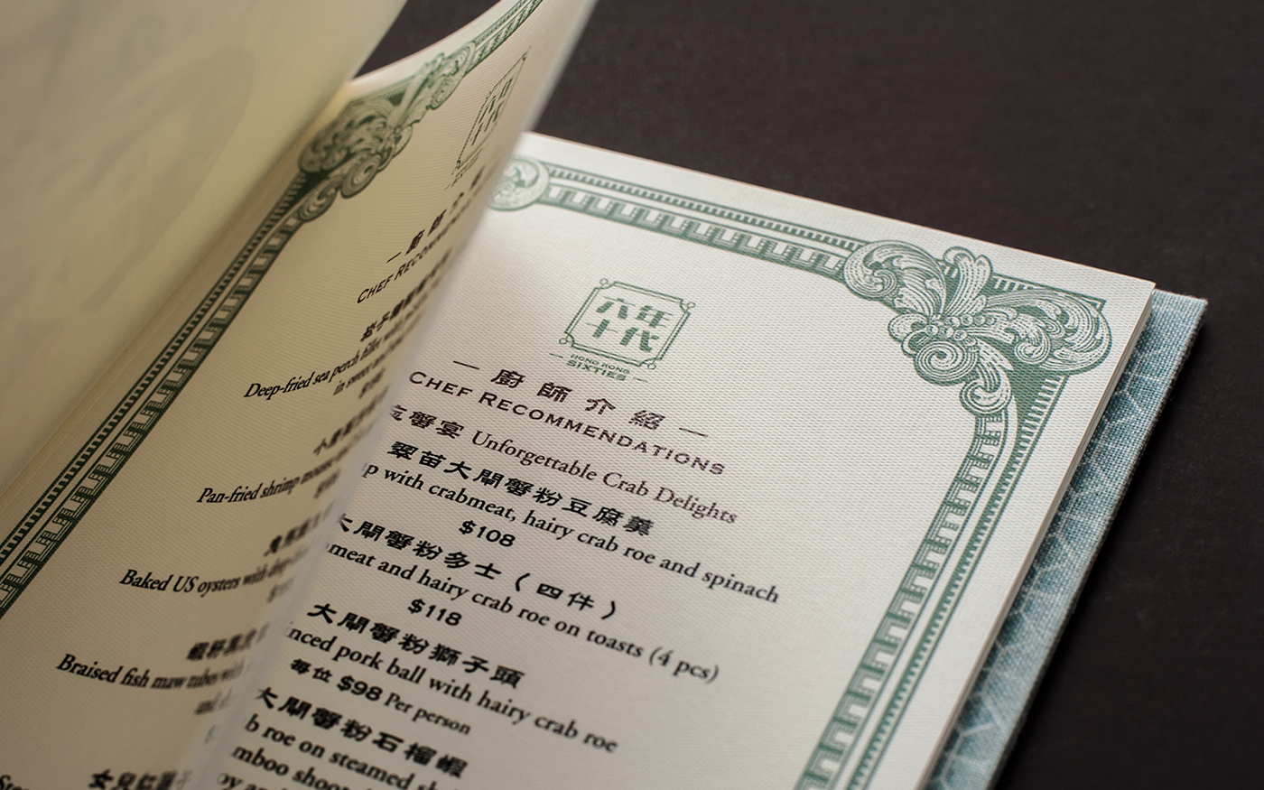
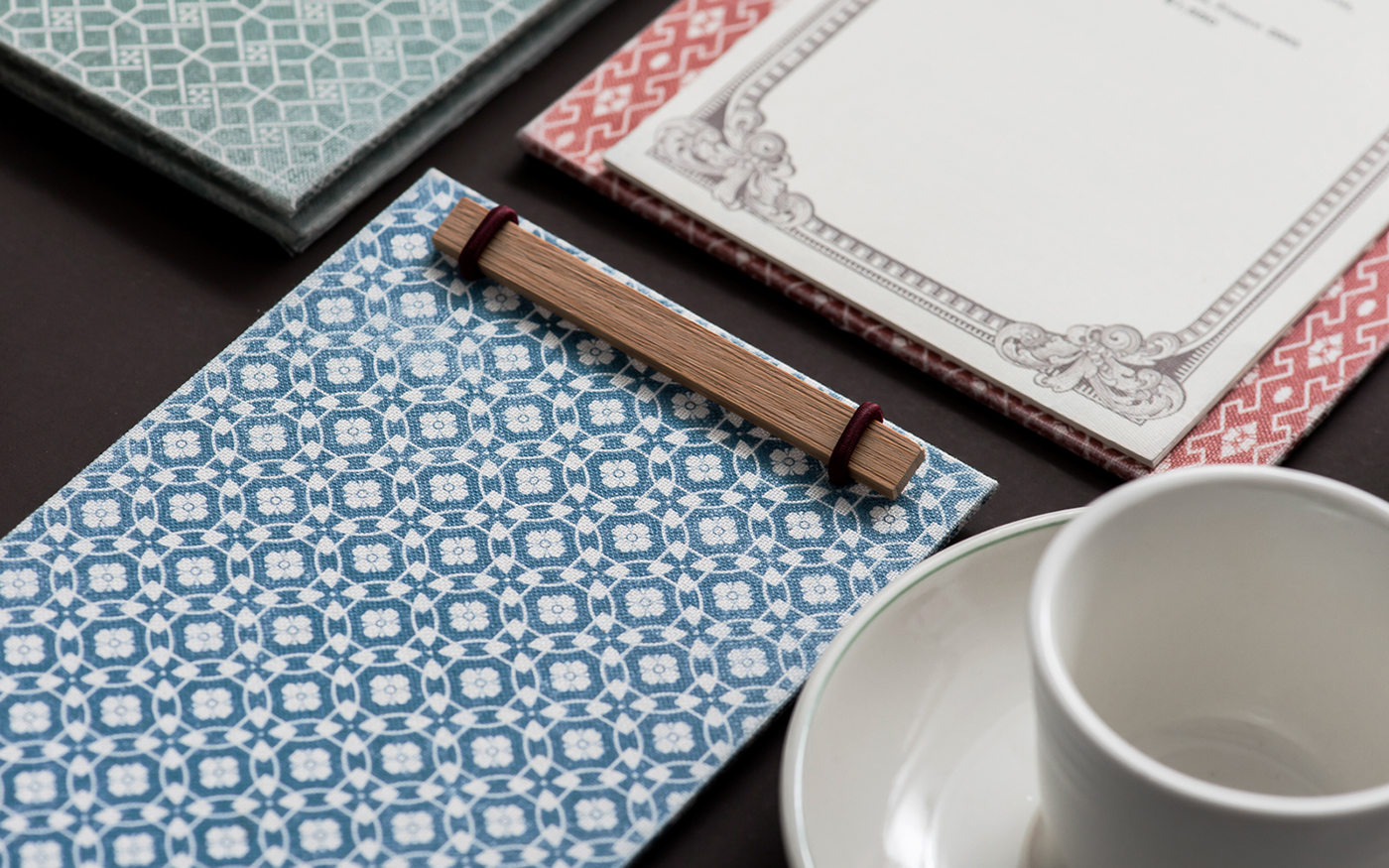
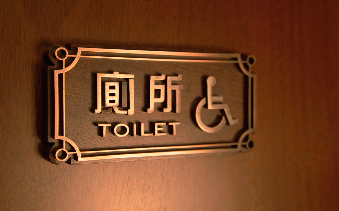
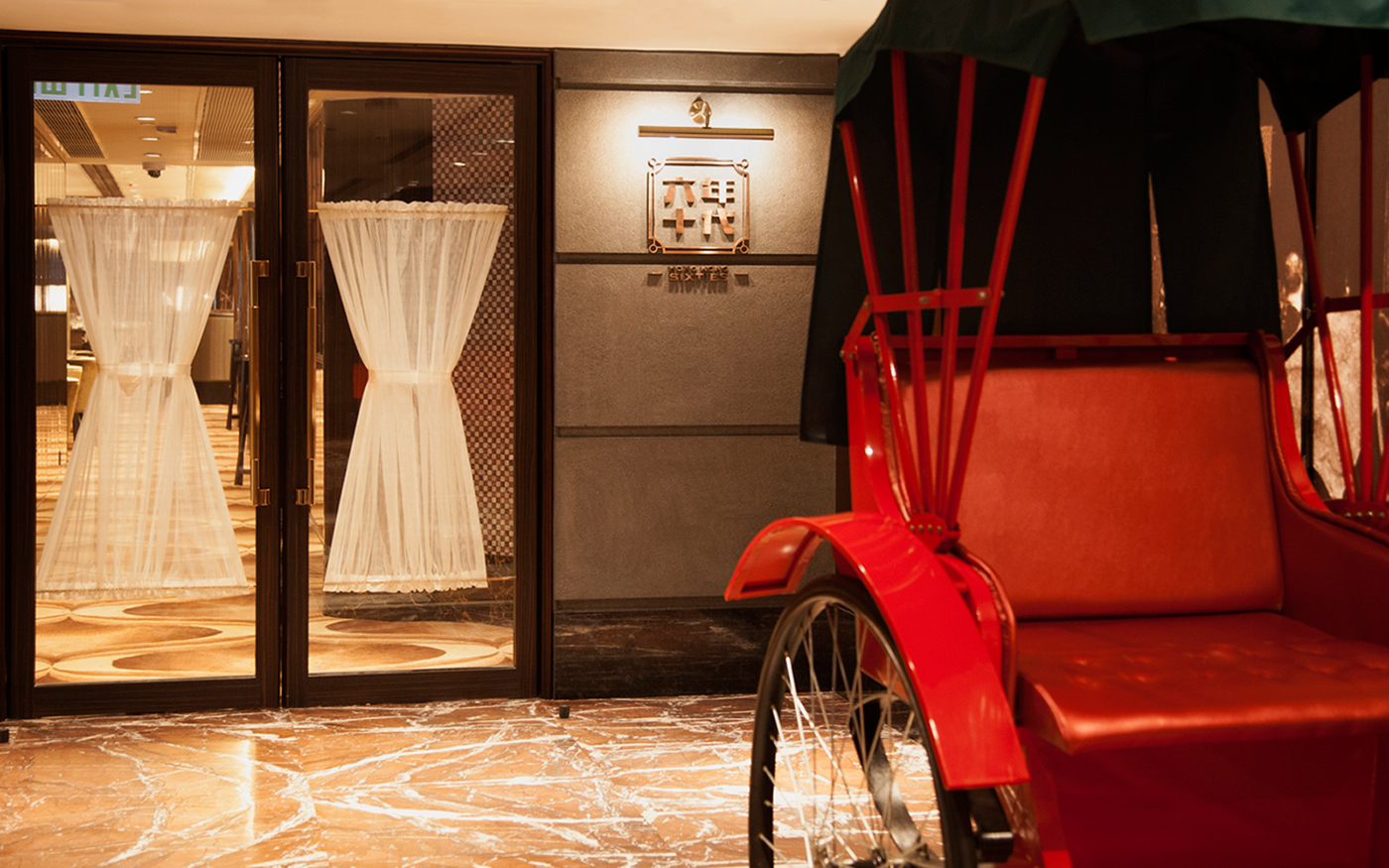
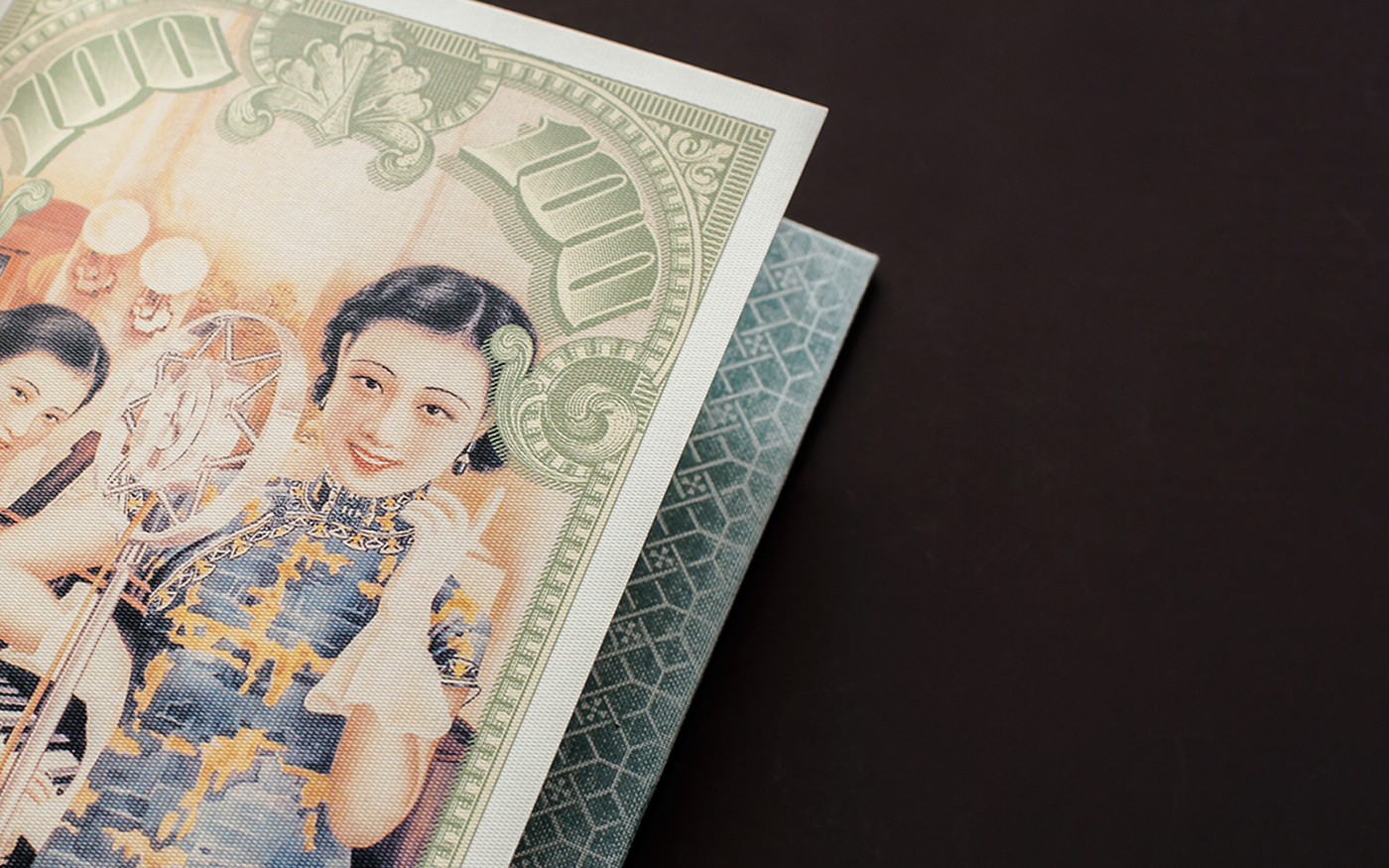
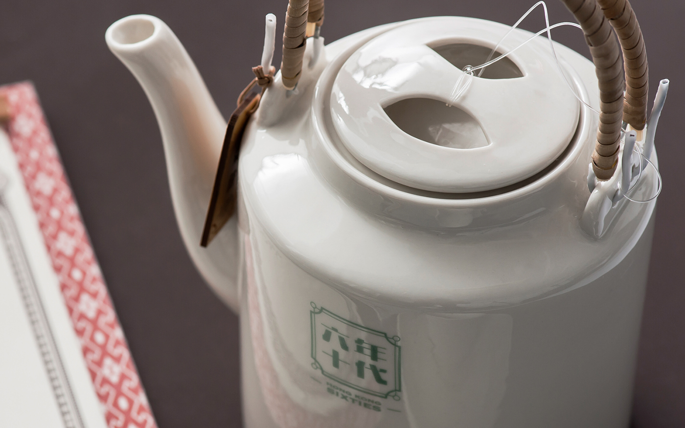
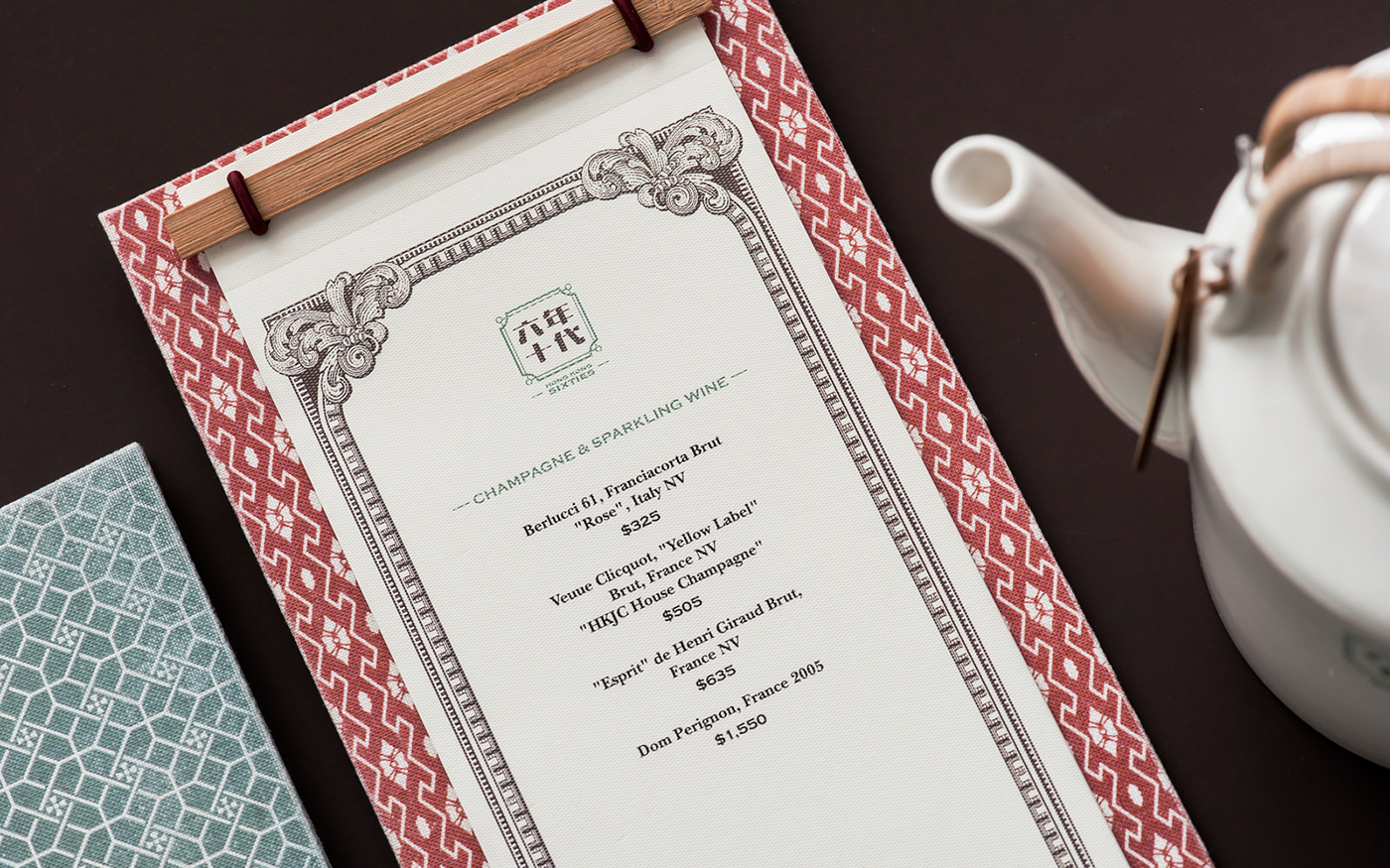
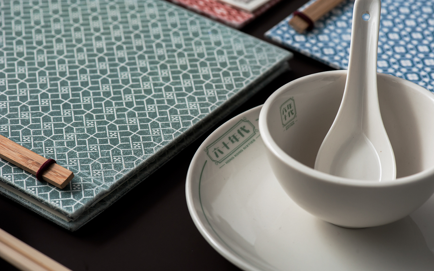
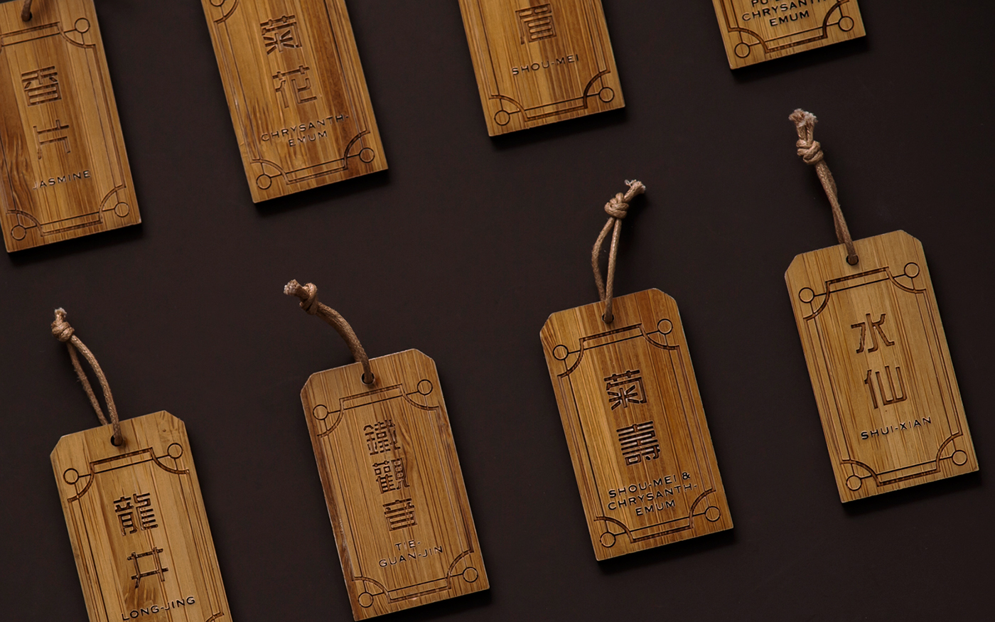
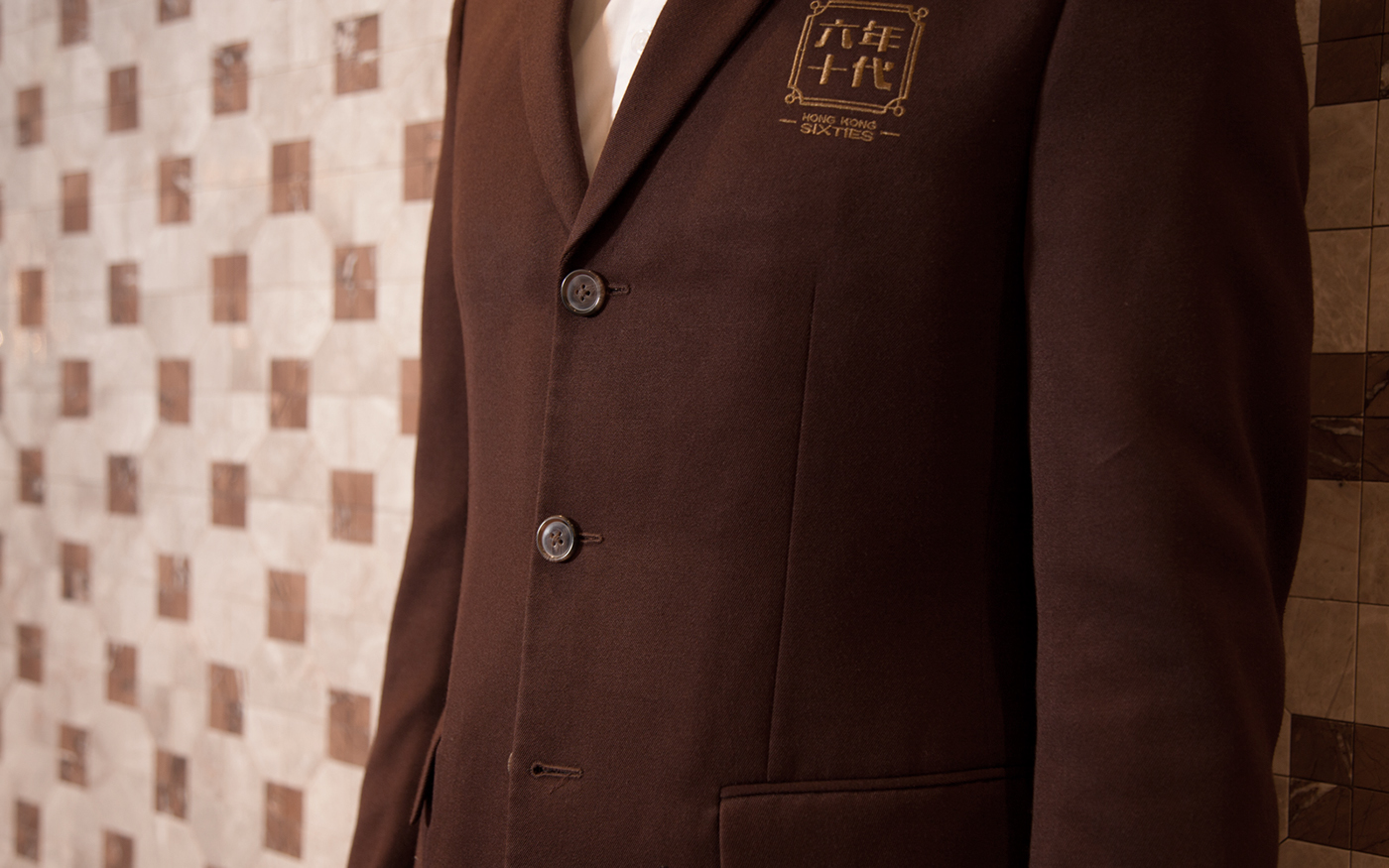
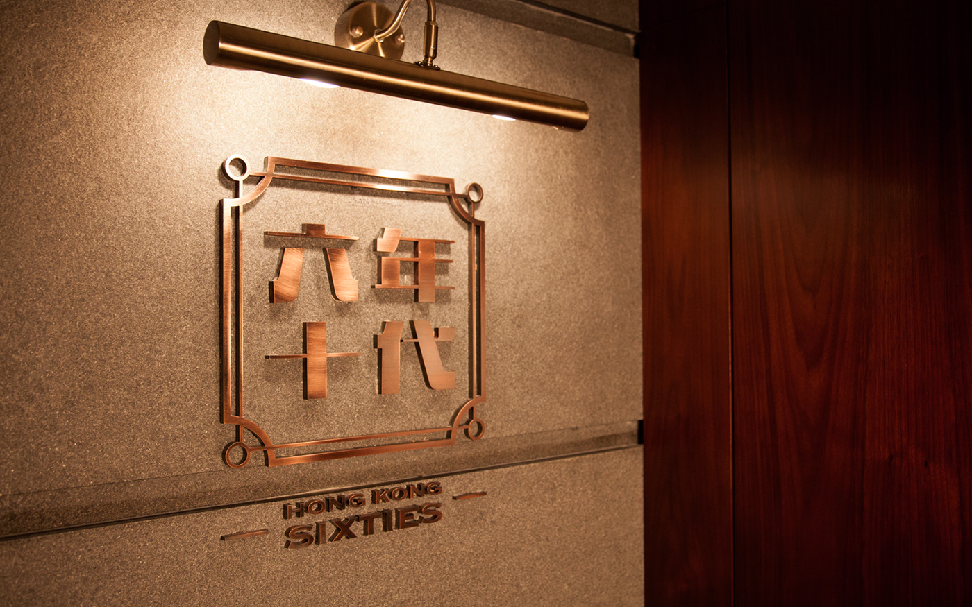
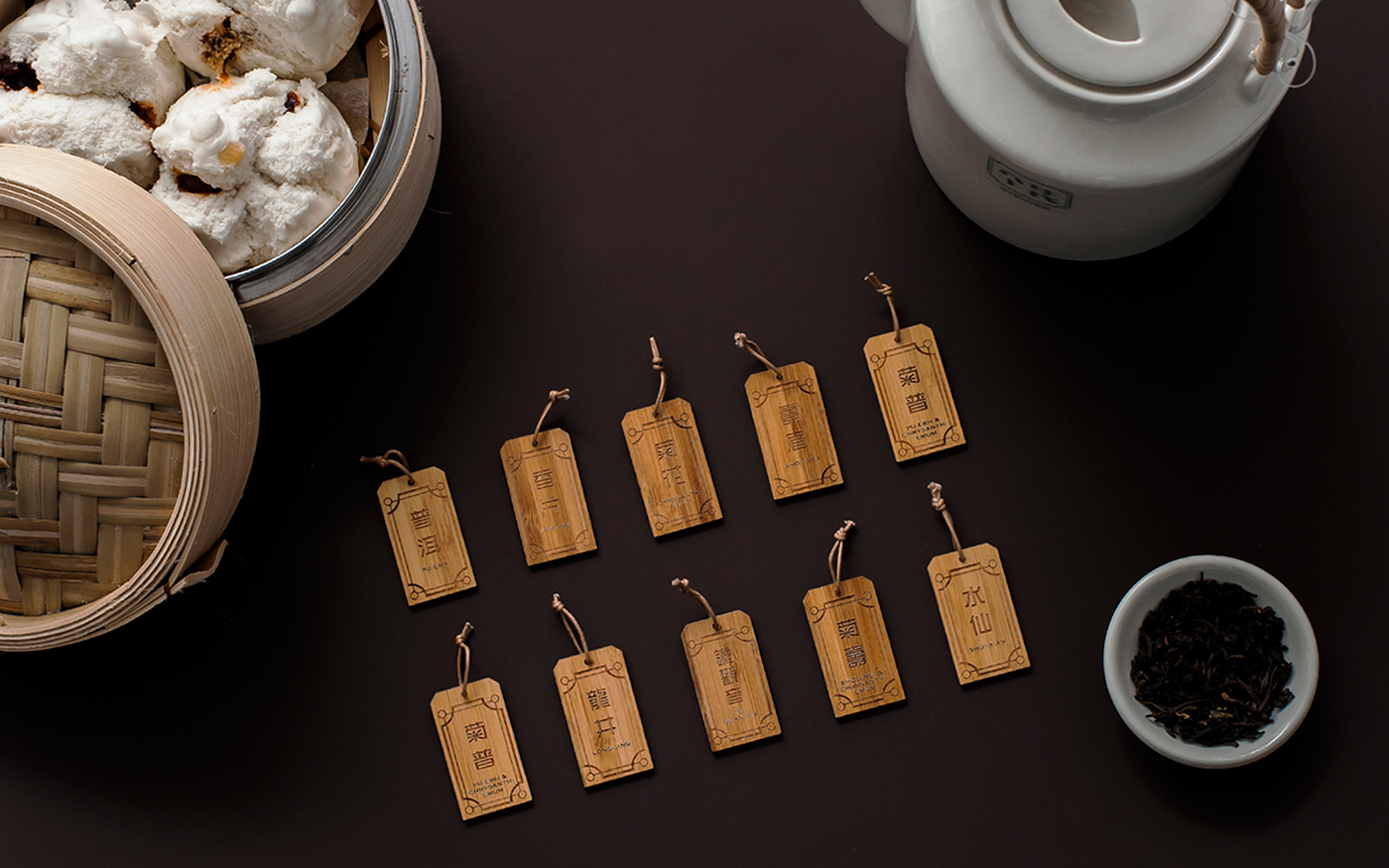
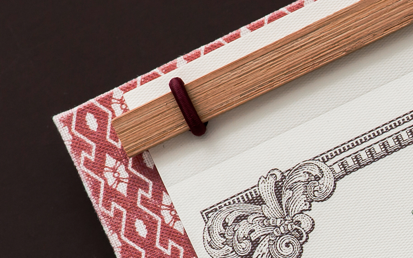
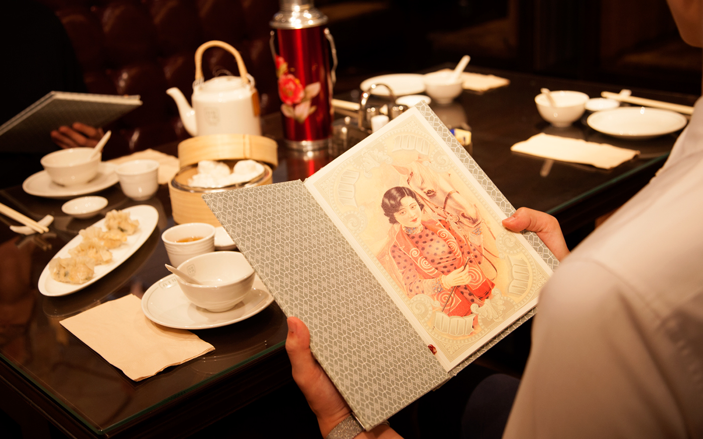
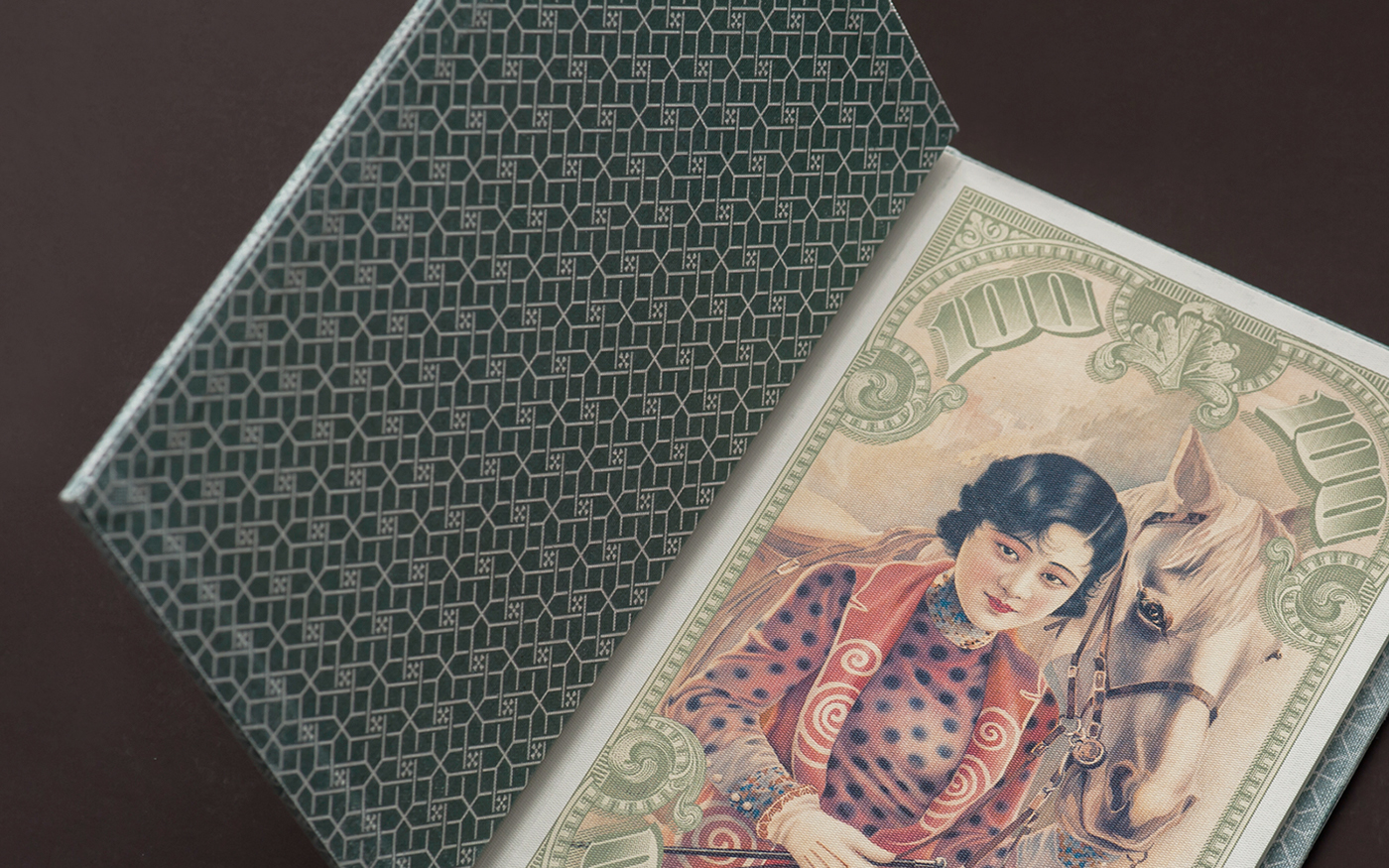
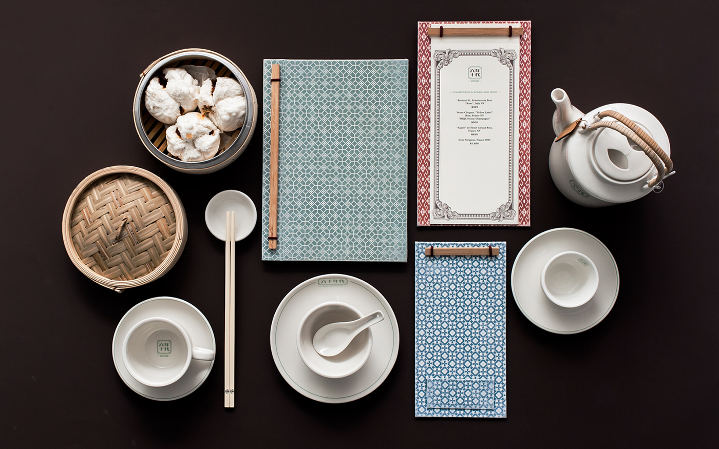
Hong Kong Sixties’s visual identity system has a clean, sophisticated air to it. Gorgeous patternwork wraps each menu and board, setting the groundwork for the detailed, financially-inspired border treatments of the interior pages. I wasn’t able to find a whole lot of background regarding the rationale for the design choices made by Party Choi, so forgive me for taking some interpretive liberties. This project, to me, plays on the idea of eastern culture vs western culture, and the affluence of foreign money (or money in general) in Hong Kong. Divider pages within the menus feature beautifully rendered and historically informed illustrations of women surrounded by the kind of decoration you’d see on paper currency, dressed in a manner that I assume was popular in Hong Kong in the sixties.
Hong Kong Sixties Restaurant Branding by Party Choi.