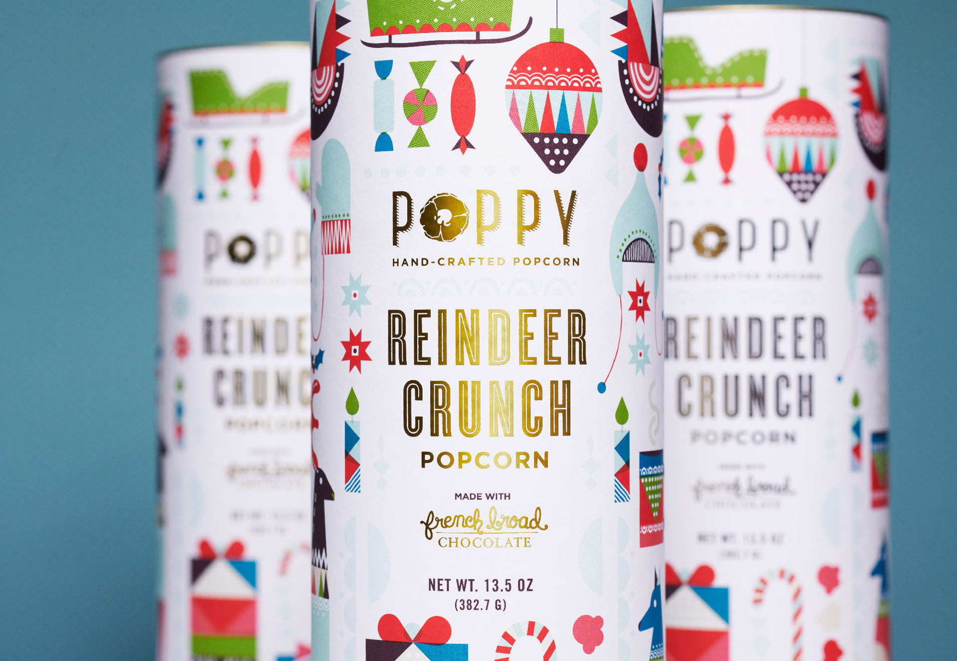
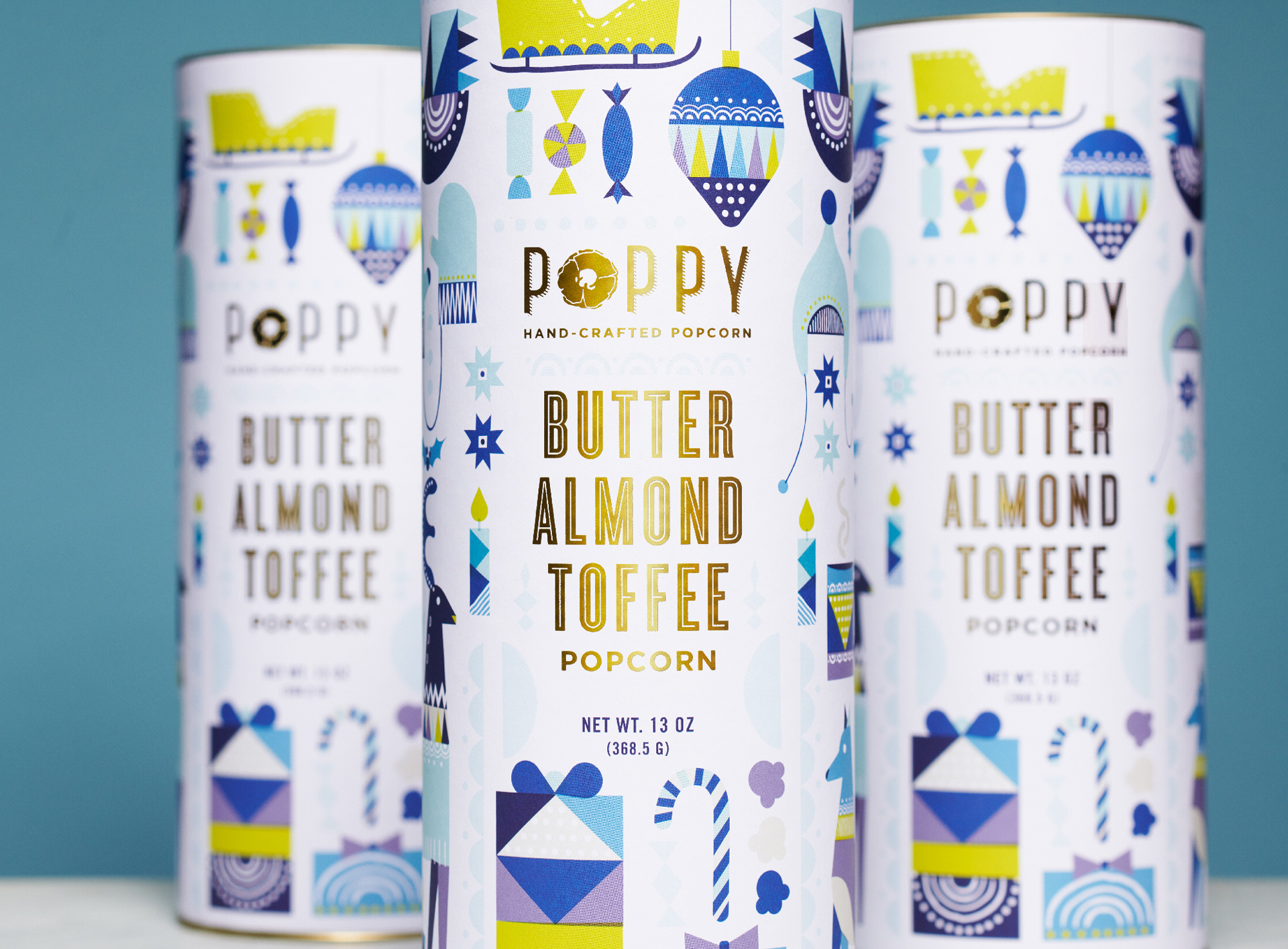
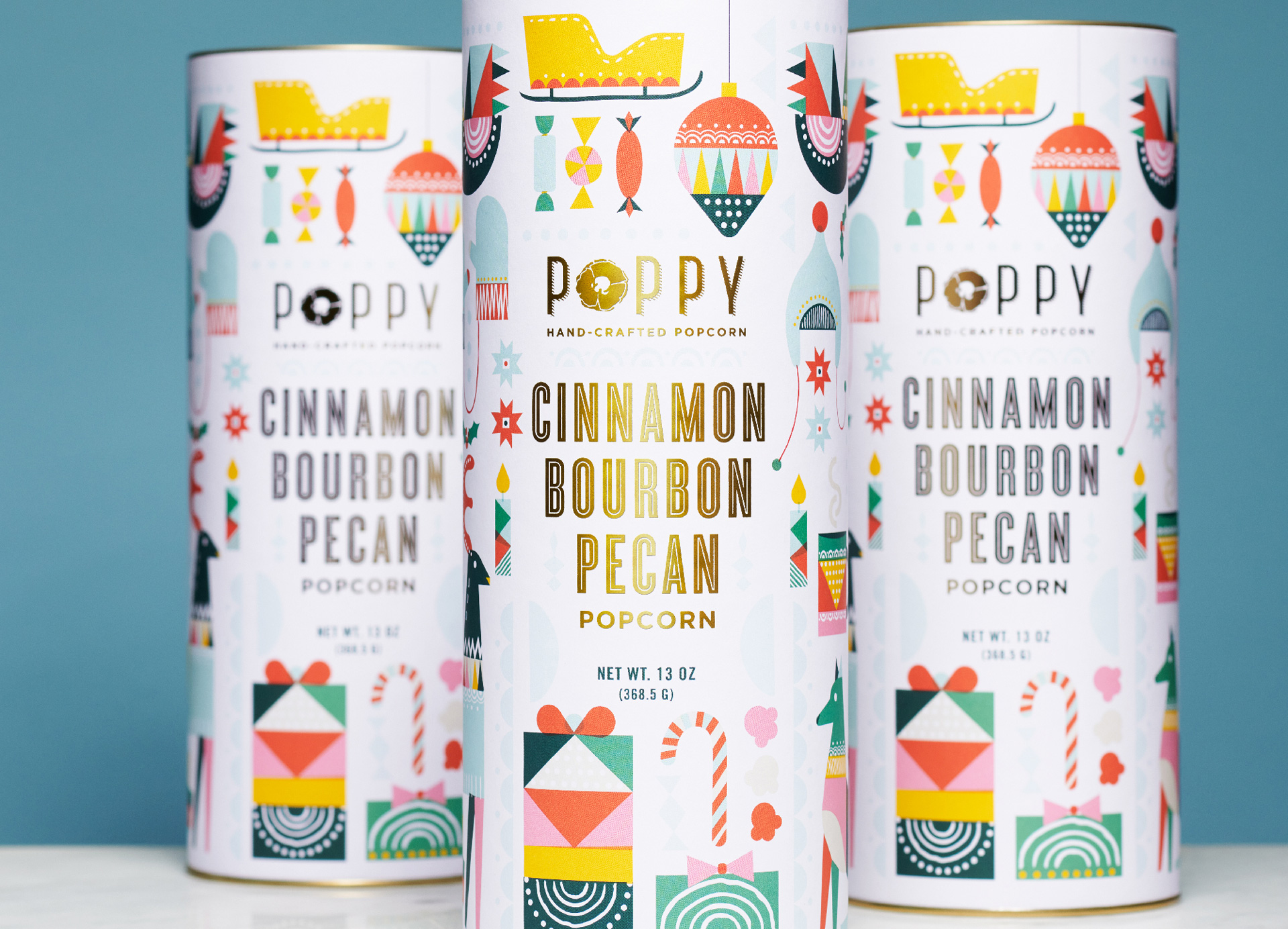
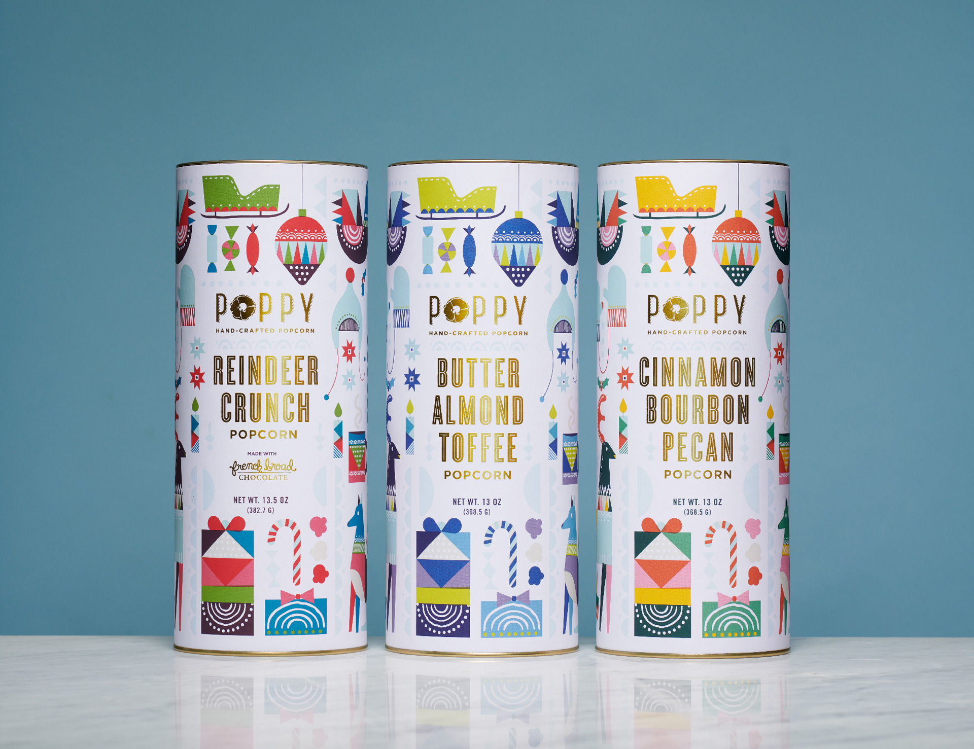
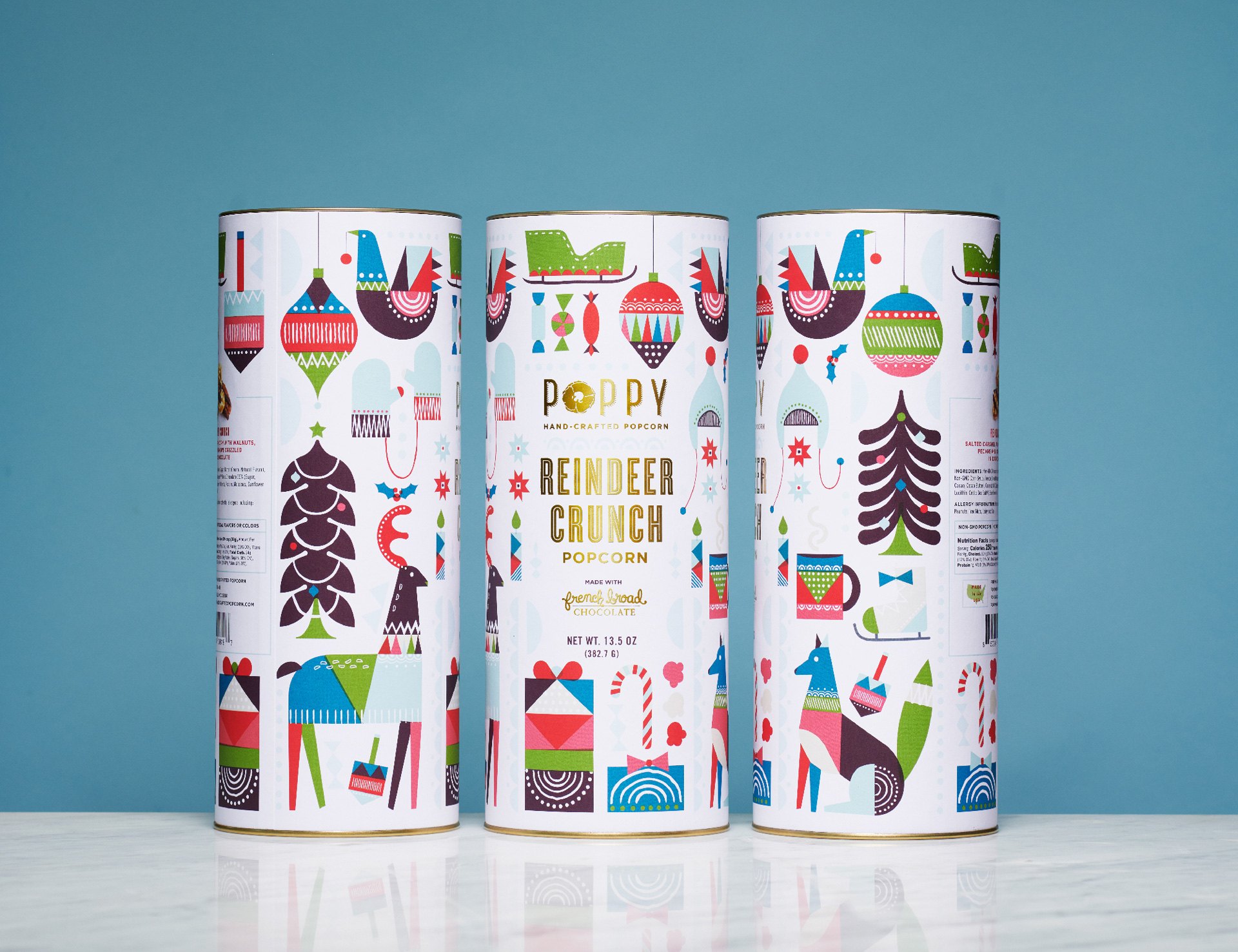
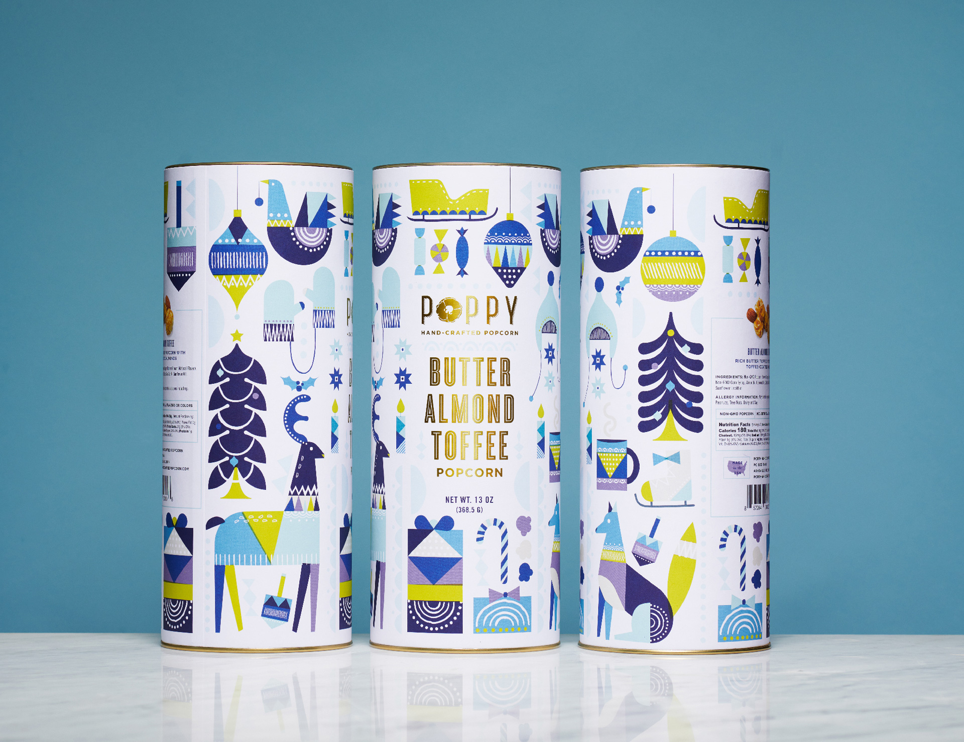
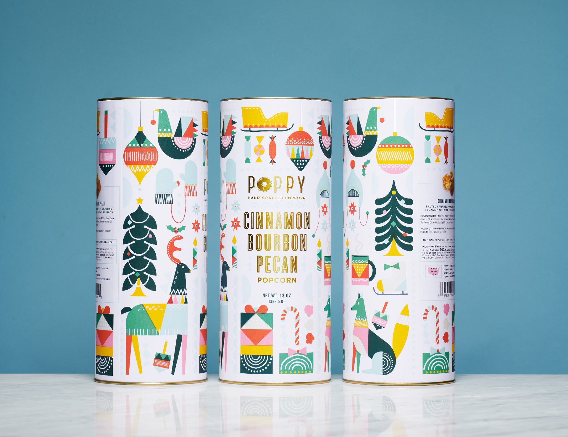
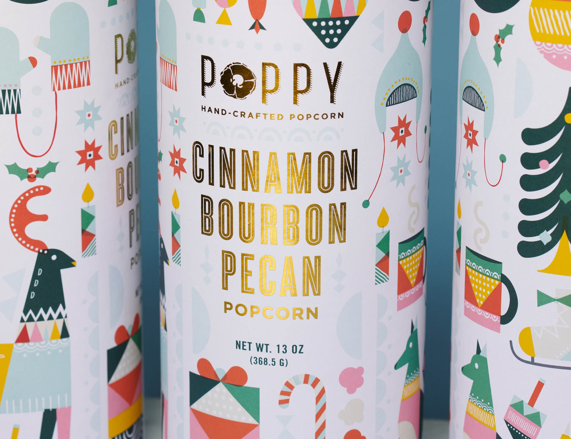
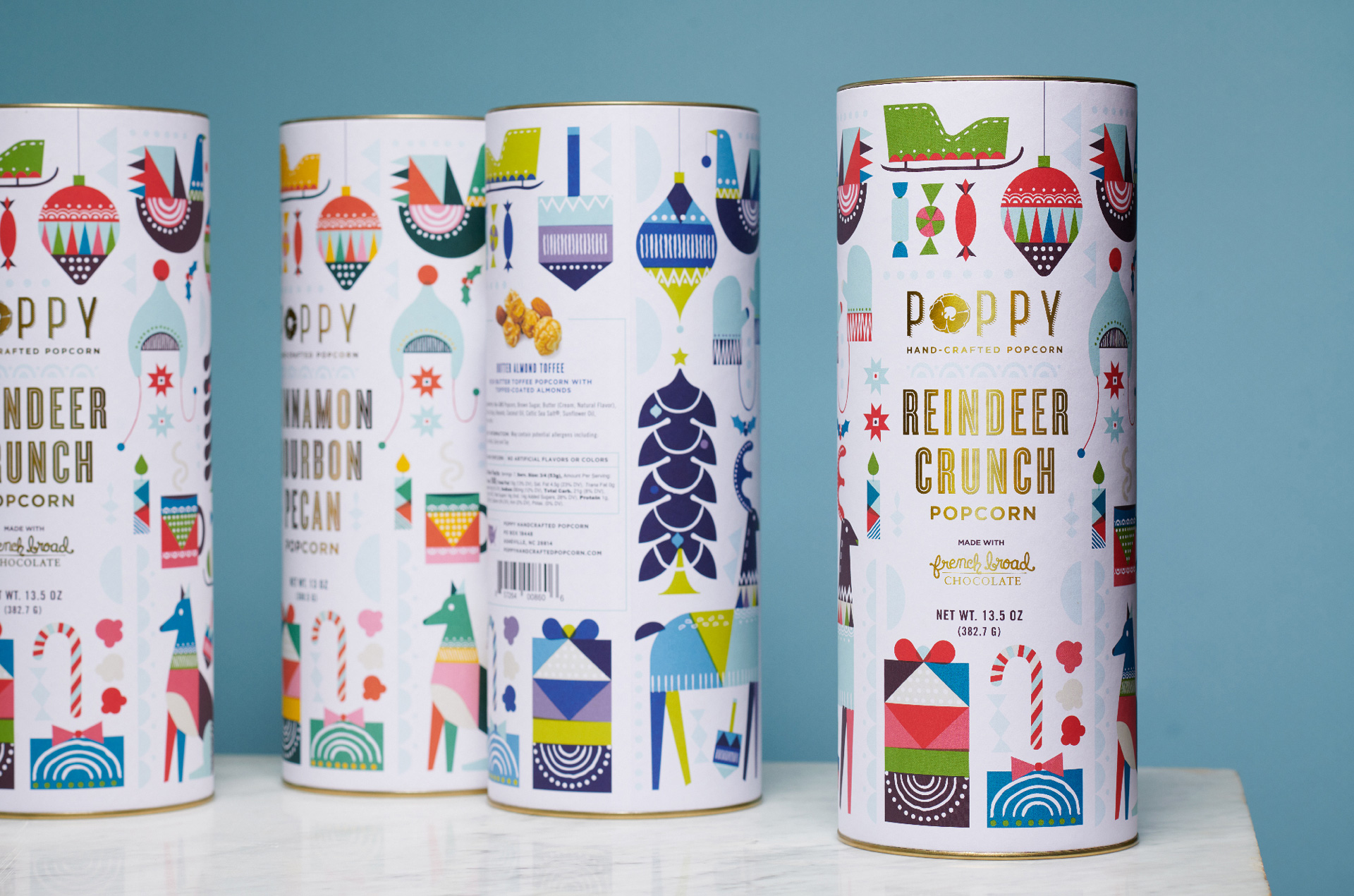
We would be amiss to not post some sort of holiday-themed packaging before we went on break. Poppy’s Holiday packaging is the definition of festive; bright, lively color paired with heartwarming, imperfect illustrations feel cozy and inviting. Offset with the brand typography and flavor descriptors in clean and gold-foiled characters, it makes for a great example of how to do Christmas packaging without being over the top cheesy. But enough rambling from me, I’ll let the folks at Atlas talk about the project themselves:
Atlas Branding is a design and packaging studio based in the Southeast that focuses on crafting brand experiences for food, beverage and lifestyle brands. Atlas was approached by Poppy Handcrafted Popcorn to help the client break into the wholesale and gift markets. Atlas worked closely with Poppy to design and develop an overarching brand position and packaging design theme that could be extended from their market bags to their higher end speciality packaging from year-to-year. This holiday packaging design for Poppy’s 2020 line features midcentury modern inspired color themes and illustrations of notable holiday and Christmas related imagery and bright colors. The custom illustrations from Atlas Branding wrap around the paper tube like a holiday totem telling a colorful, bright and festive story of celebration. This specialty line was designed to command a higher price point and be featured in high-end retailers such as Bloomingdale’s, Food 52, Anthropologie and Union Square Market.
Poppy’s Holiday Packaging Design by Atlas Branding.
