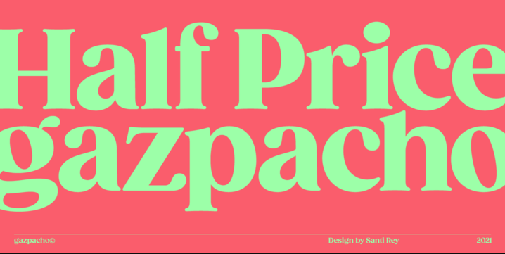
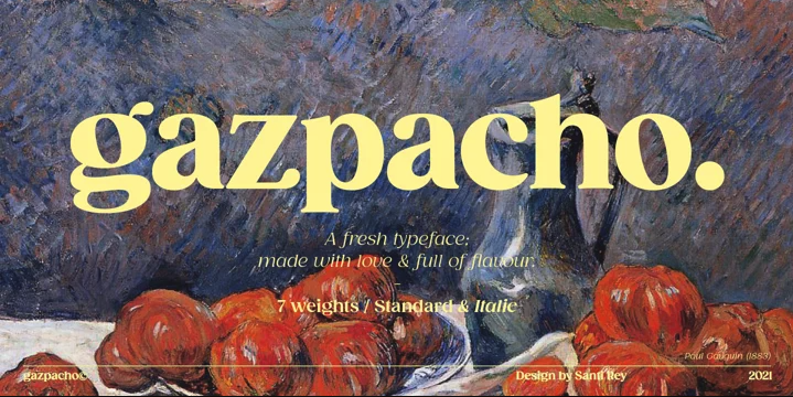
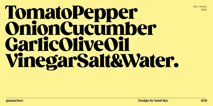
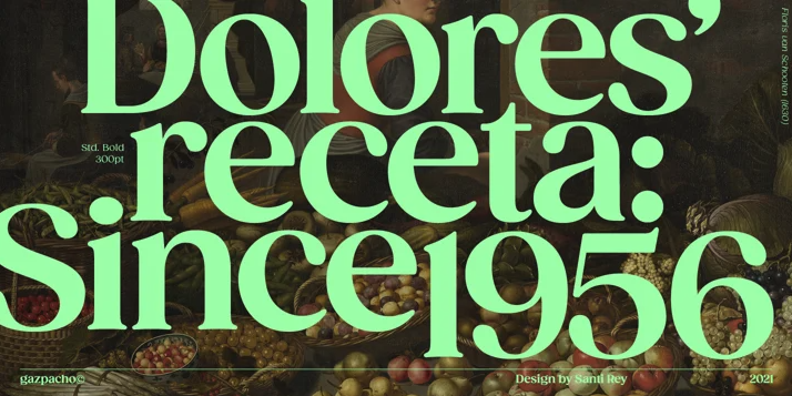
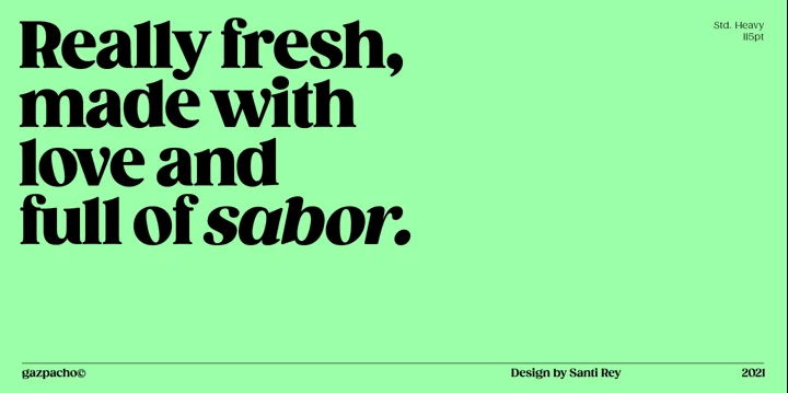
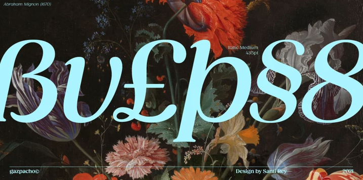
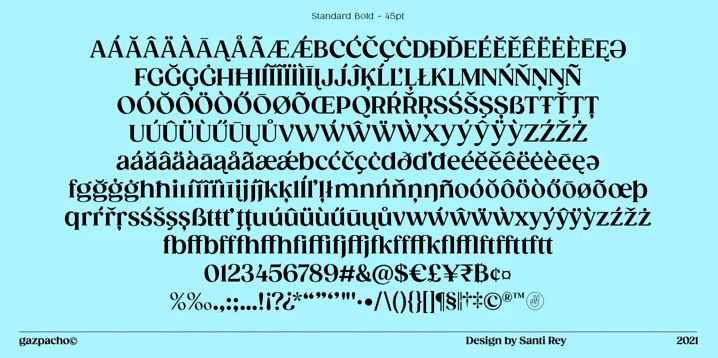
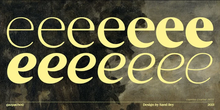
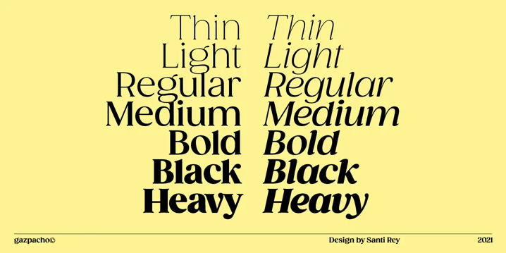
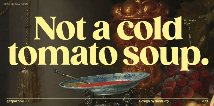
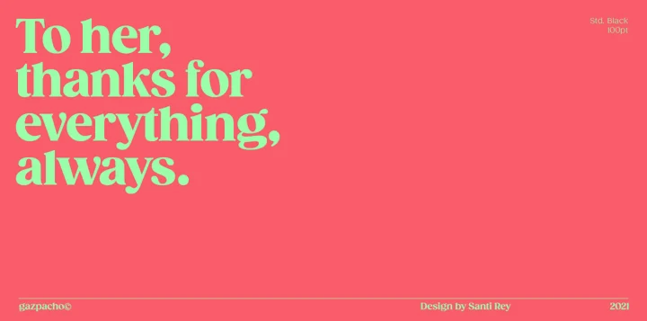
I know vintage, the 70s inspired fonts are starting a bit passé, but I can’t help but be drawn to the retro curves of Gazpacho. Inspired by the serif typefaces used in editorial media in the 70s and 80s, type designer Santi Rey has made a gorgeous typeface ideal for logos and big bold headlines. Gazpacho is reminiscent of Recoleta in some of its letterforms, but with more upright characters and larger bowls, Gazpacho is more legible at smaller sizes than most retro-inspired typefaces. Though Gazpacho is more high-contrast than its counterparts, its tall x-height and thick strokes make me wary of using it as a body copy font. I personally think Gazpacho would look absolutely stunning as a header or subheader on a menu, used in pullquotes, or to add some character to a suite of numerals. Gazpacho comes in 7 different weights and 2 styles (Standard & Italic).
Gazpacho Font by Santi Rey — Type Tuesdays.
