From Ragged Edge’s case study:
East London Liquor Co. is up for a fight. Forget botanical bathtub bullshit. You can have decent drinks, made by decent people, at a decent price. This is a rebrand that takes a stand.
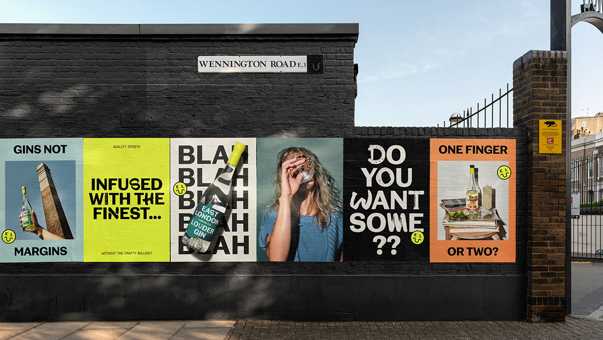
ELLC had already established themselves among bartenders. Certainly a nice position to be in. But this rebrand is designed to reach drinkers everywhere. To take the fight beyond the idiosyncratic world of craft spirits. It had to be unpretentious, unapologetic, and unabashed in its flagrant disrespect for the limits of the category. It needed two fingers of fighting spirit.
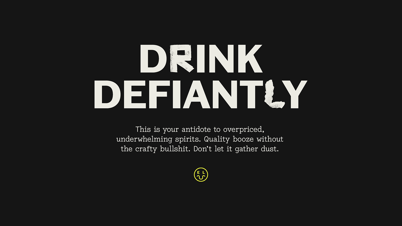
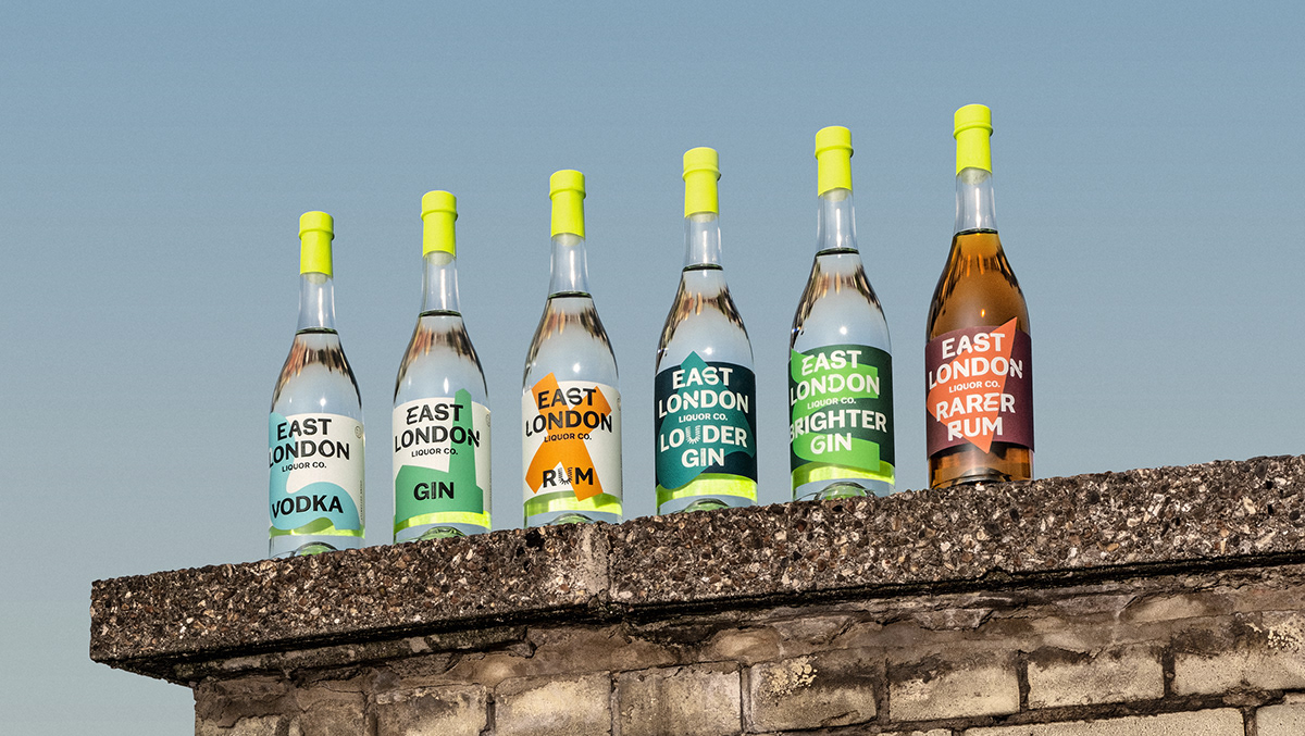
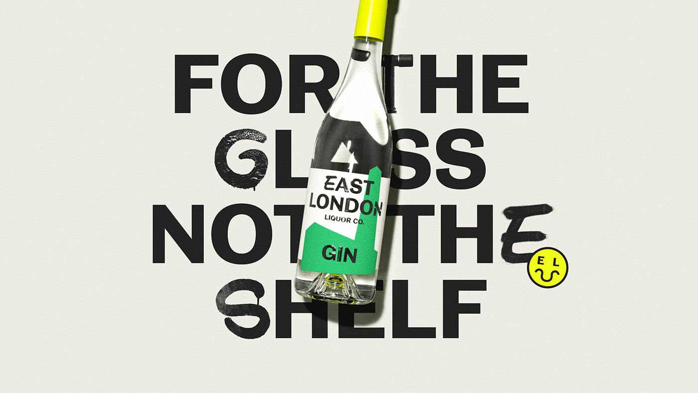
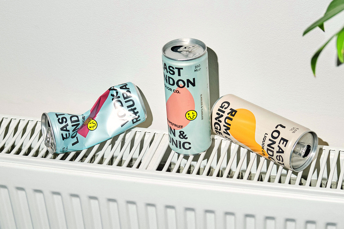
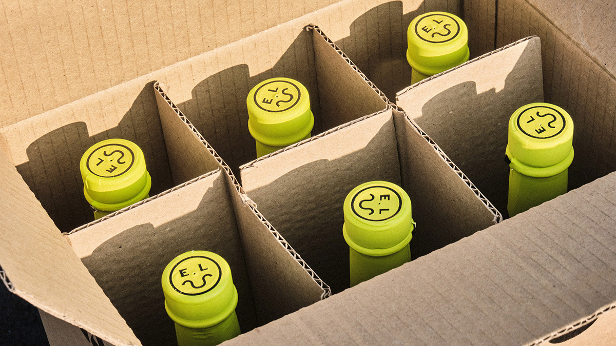
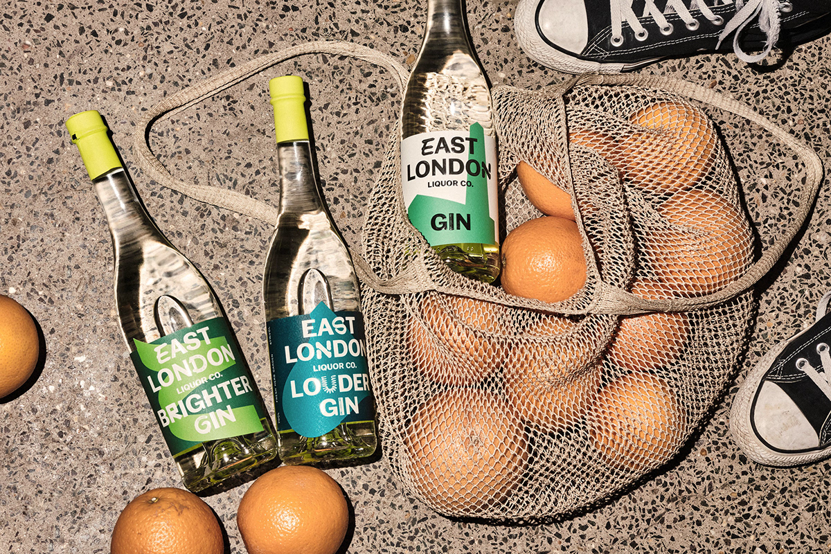
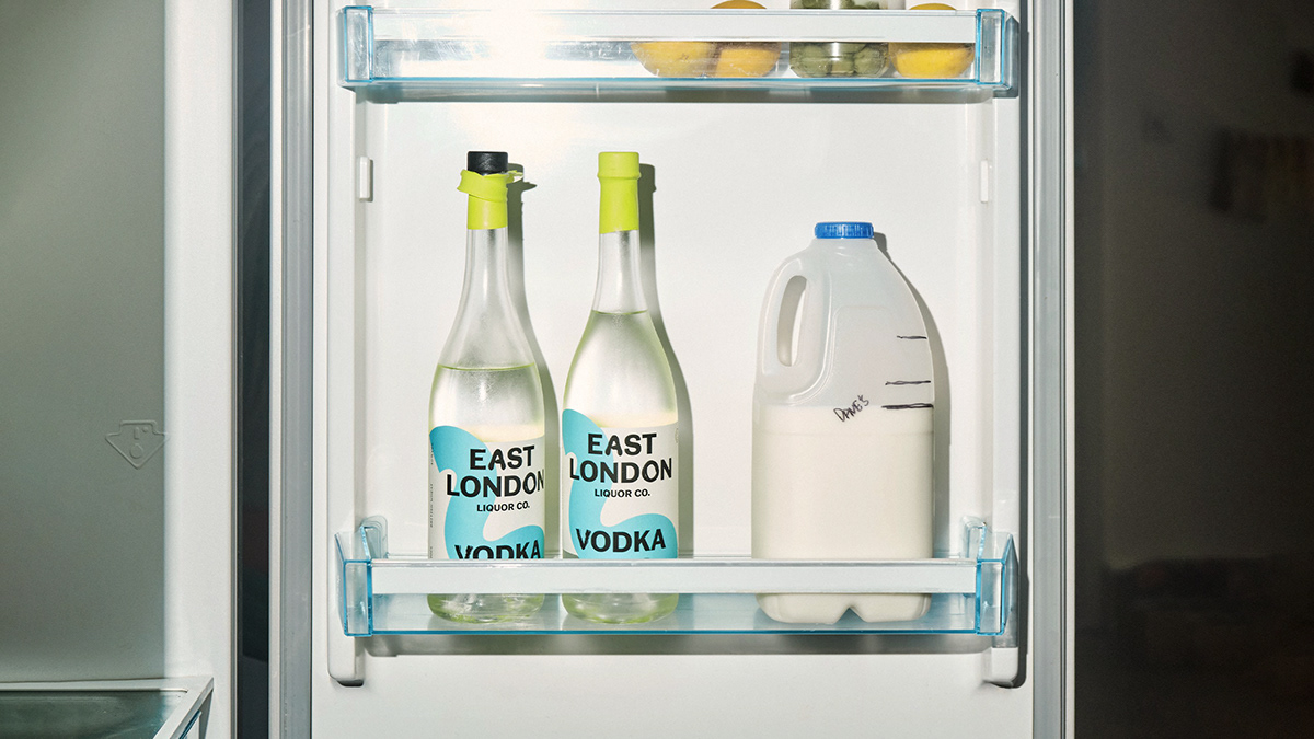
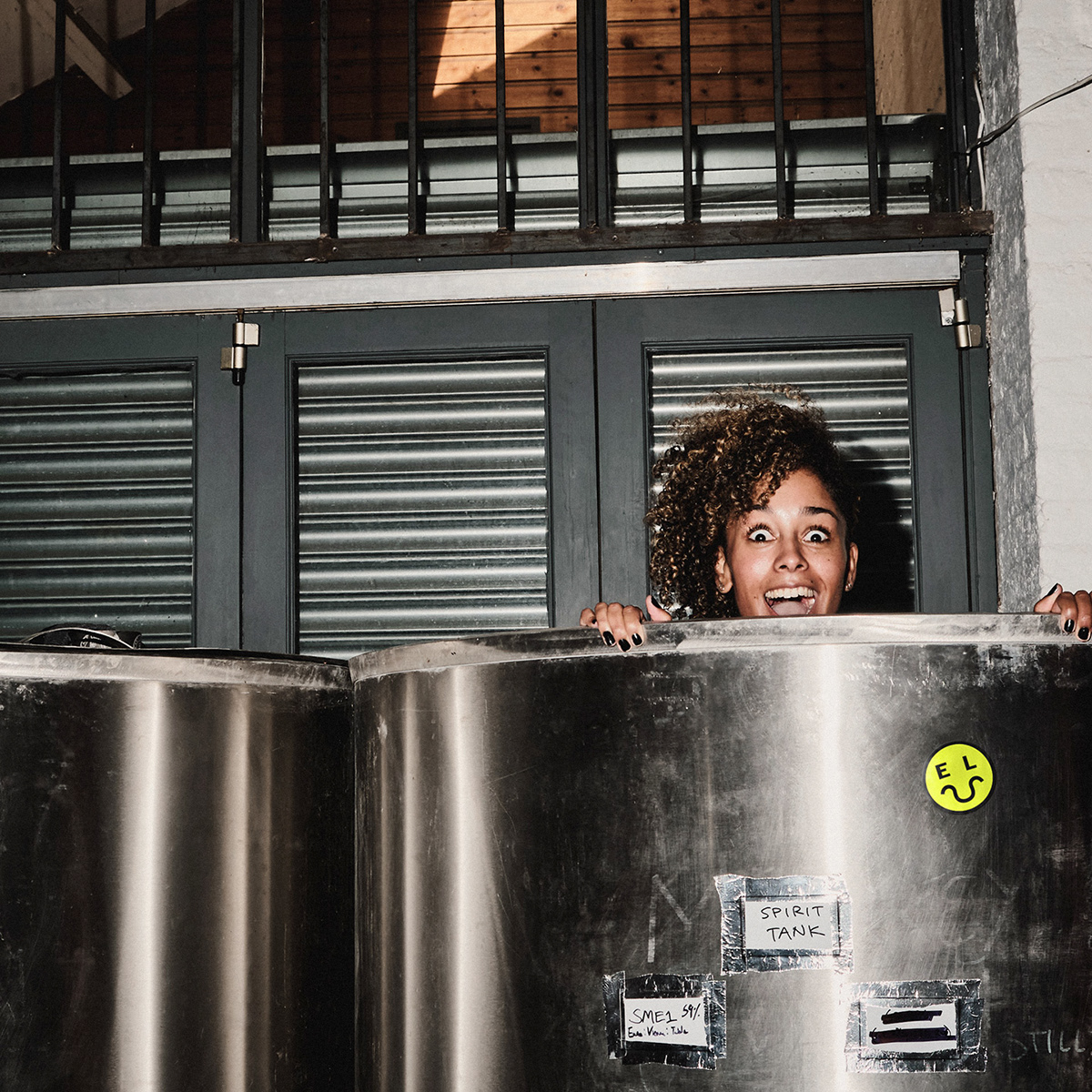
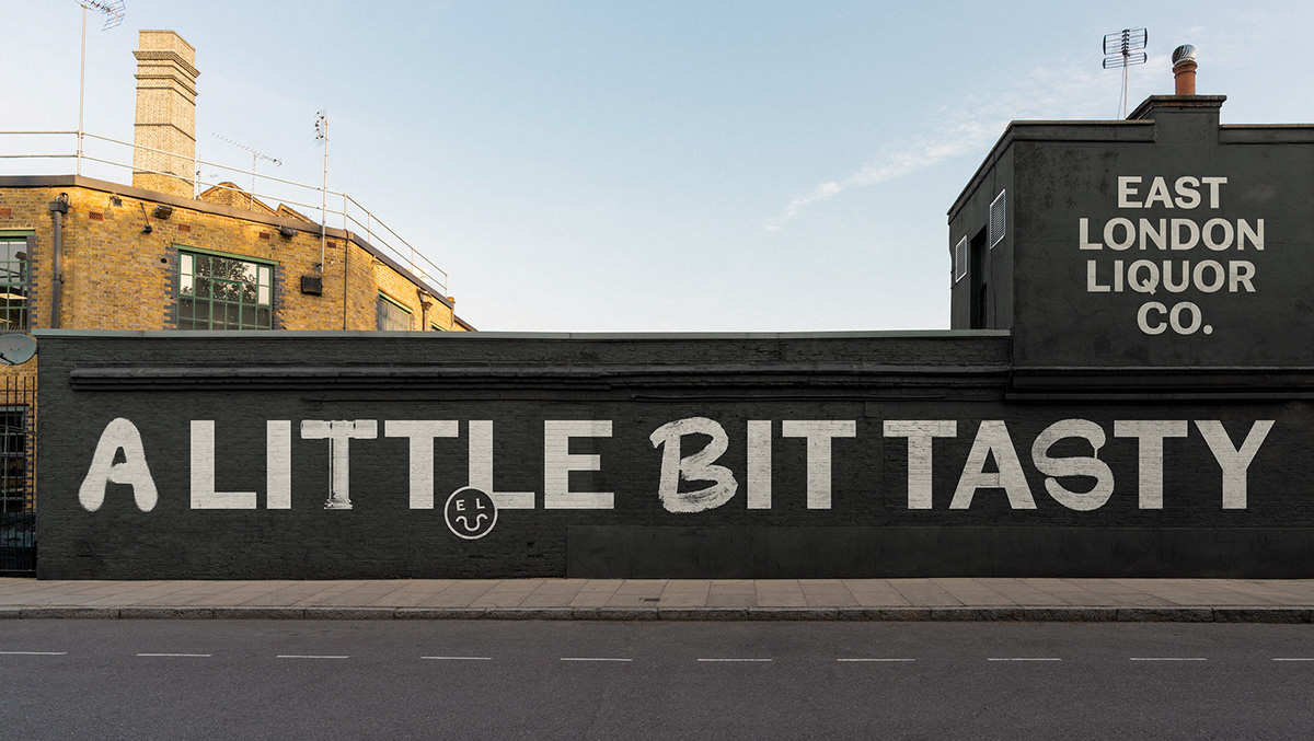
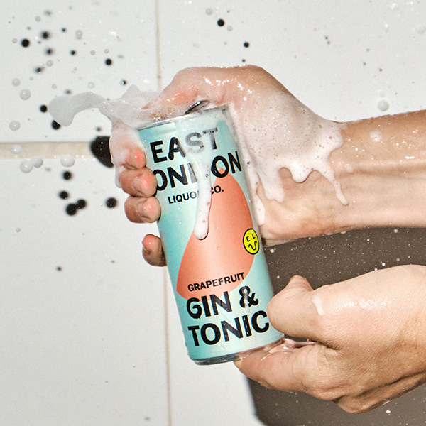
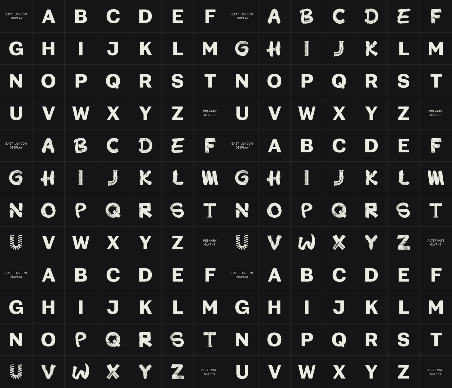
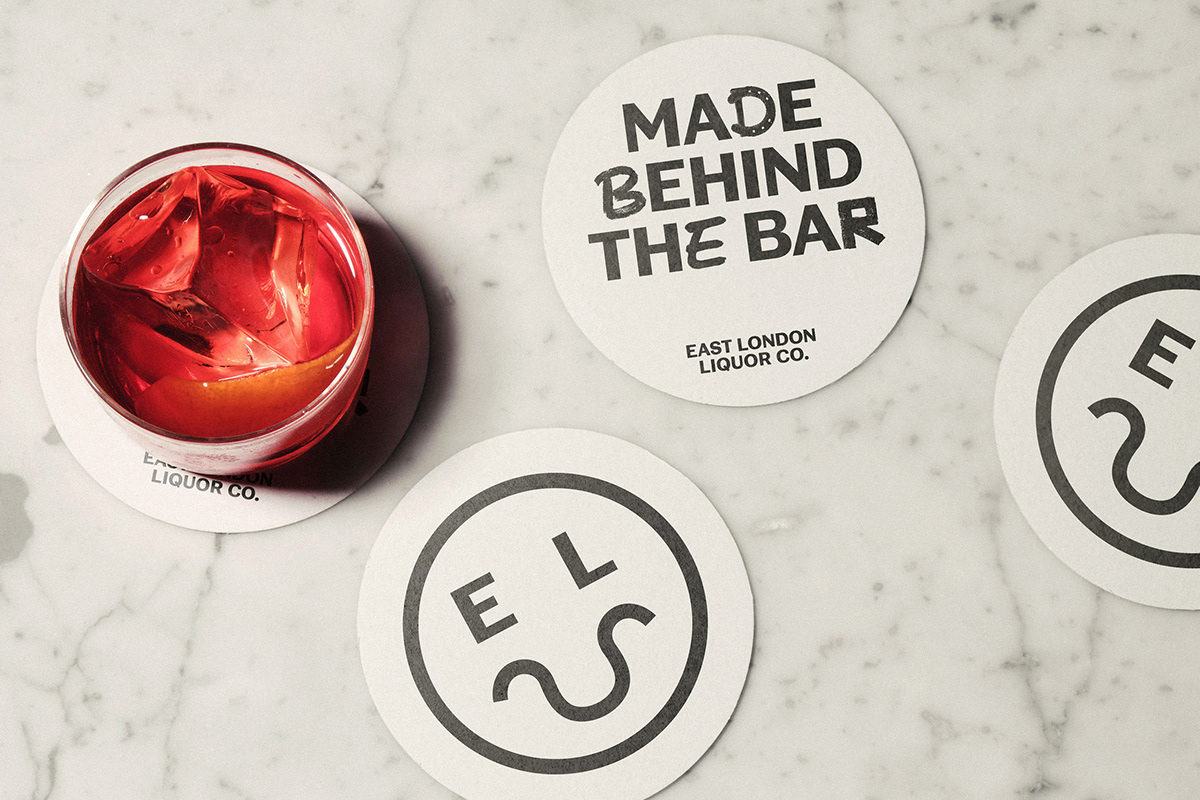
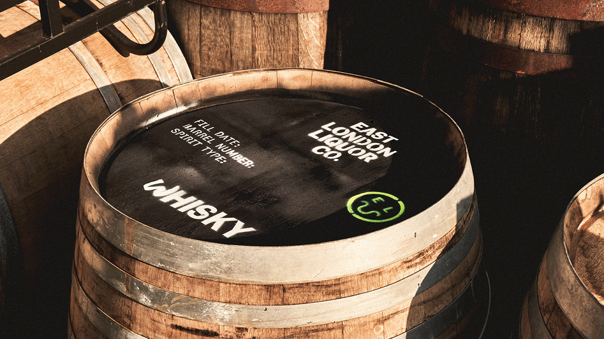
We started by helping ELLC revolutionise every part of their approach. Everybody and everything associated with the brand had to ooze fighting spirit. Next we tackled the identity, stripping away the fluff and pouring in the spirit of East London. We found inspiration for our custom typeface, glyphs and labels in our distillery and local area. Then we added fluro yellow and a “smiler” icon you can’t ignore. And topped it all with a defiant tone of voice.
East London Liquor Co Distillery Branding & Packaging Design by Ragged Edge.
