Alright, so I know we just posted another case study about frozen pizzas. I honestly thought this was an awesome case study for a pizzeria until I sat down and translated the case study from Paloma Nieri Studio. And so its going to still be shared today because it is that awesome, that it transcends categories.

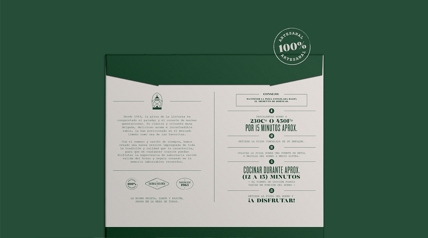
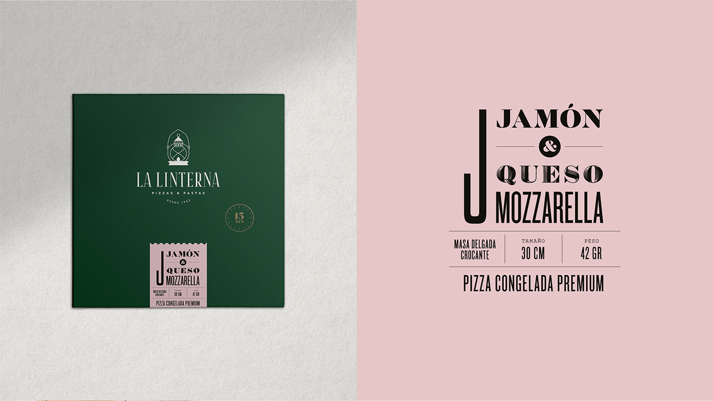
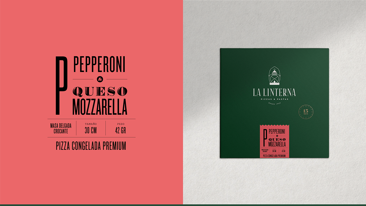
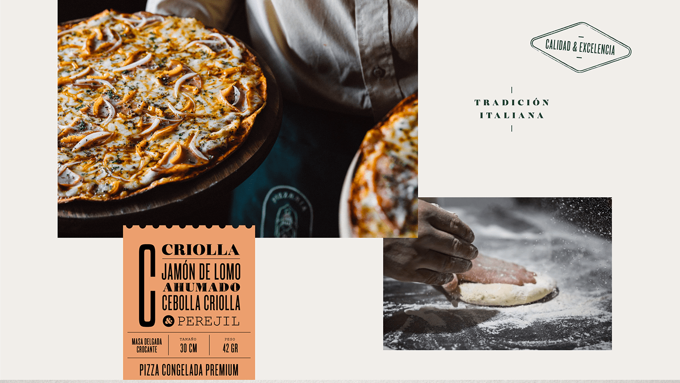
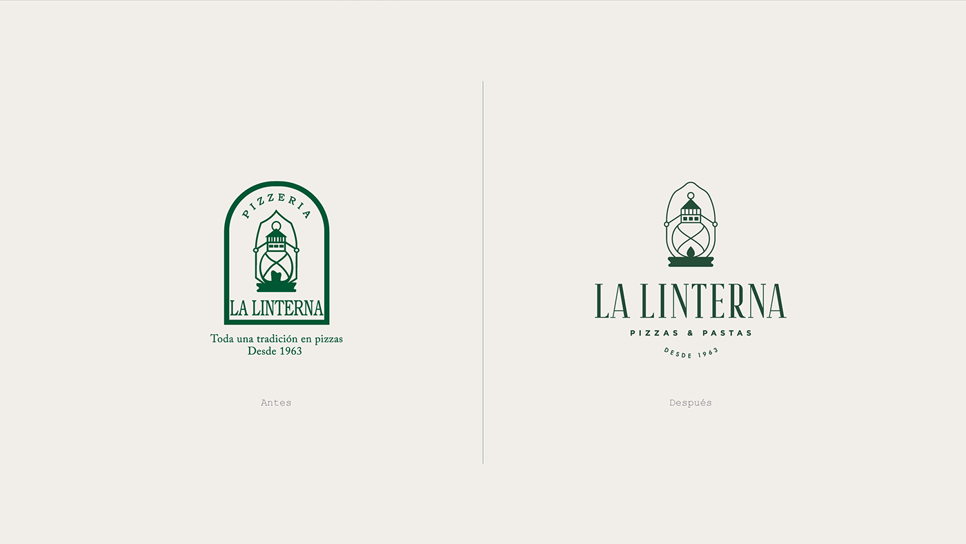
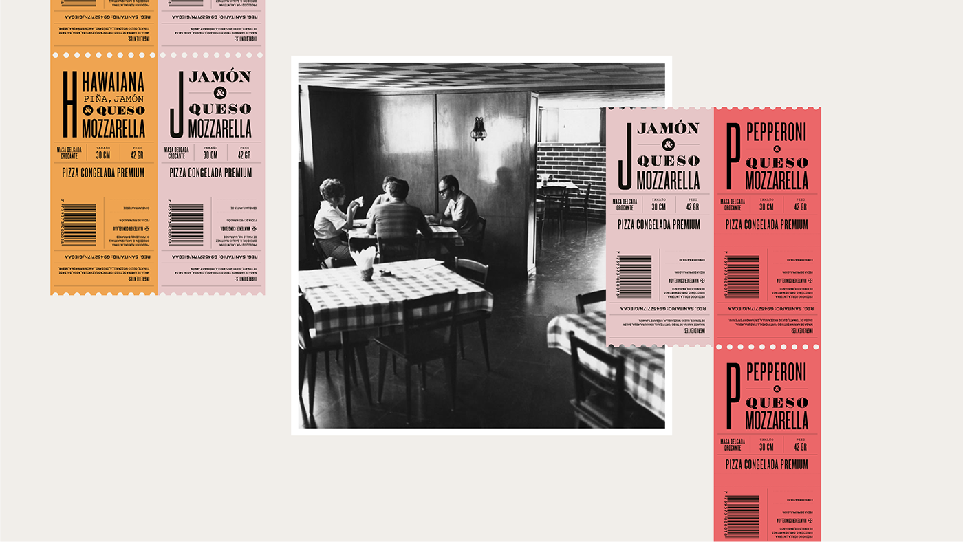
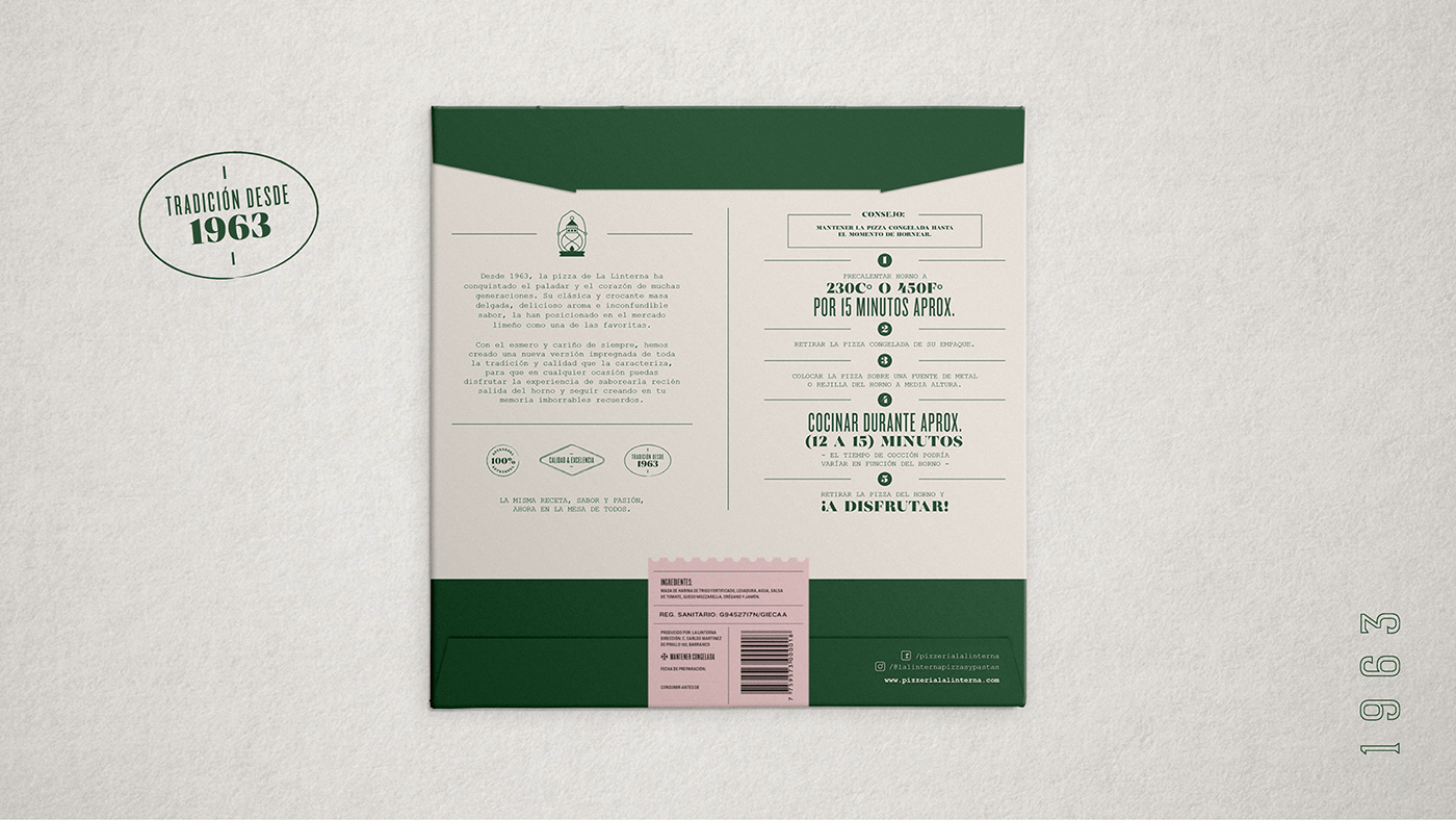
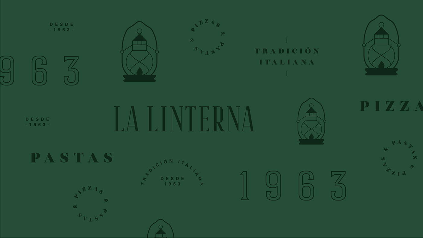
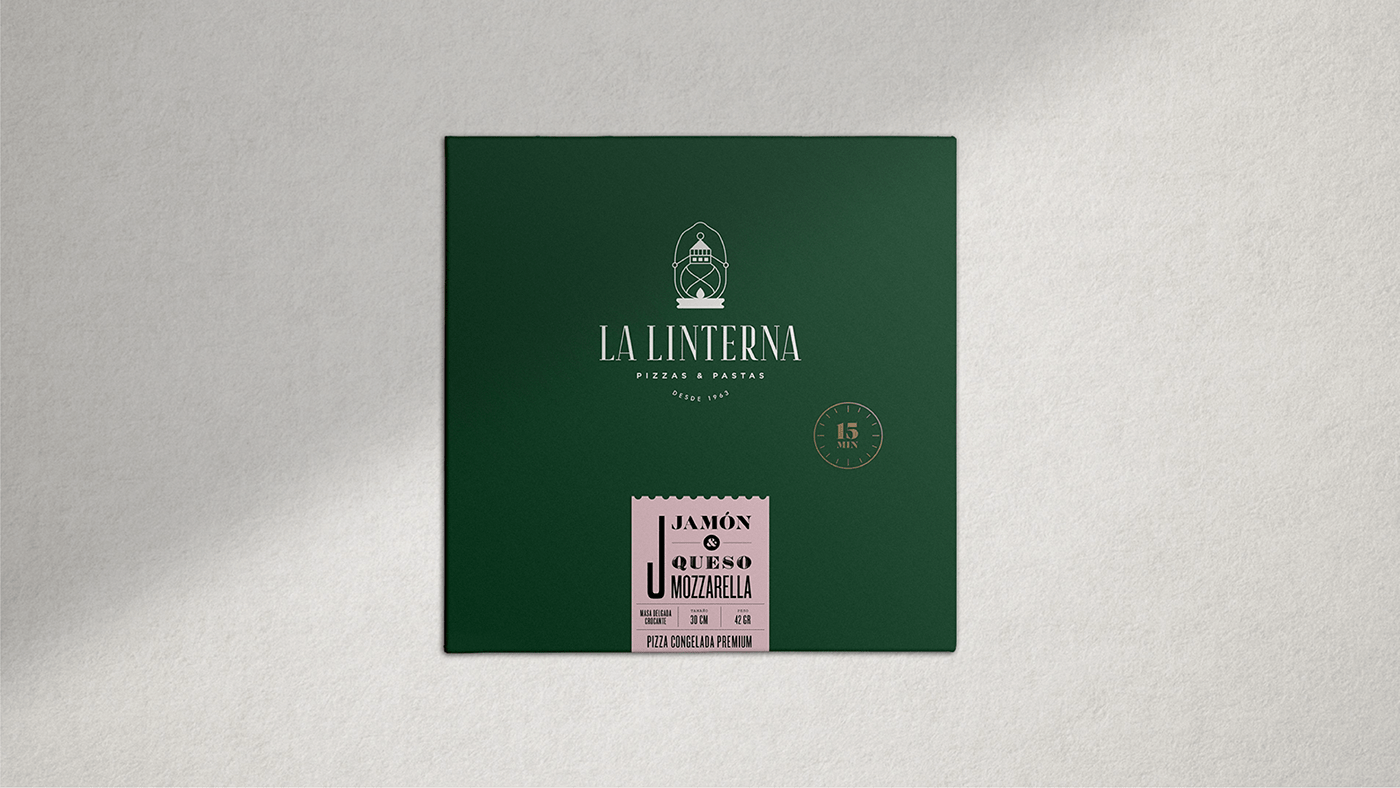
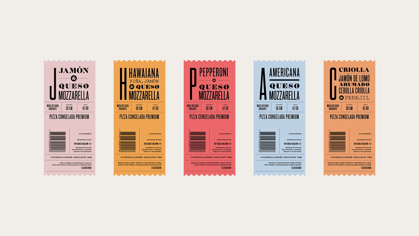
Paloma Nieri Studio revisited the La Linterna brand for this new line of products, refinining the visual identity overall before applying it to a sweet suite of packaging. They found a beautiful balance between the traditional and the contemporary, relaying a message of tradition, experience and quality through the visual system. I really love the modular system that was developed; each pizza comes in the same box, but it is the sealing sticker than changes from sku to sku, defined by a different color and typography representative of the product inside.

La Linterna Frozen Pizza Branding & Packaging by Paloma Nieri Studio.

