From Studio Sun:
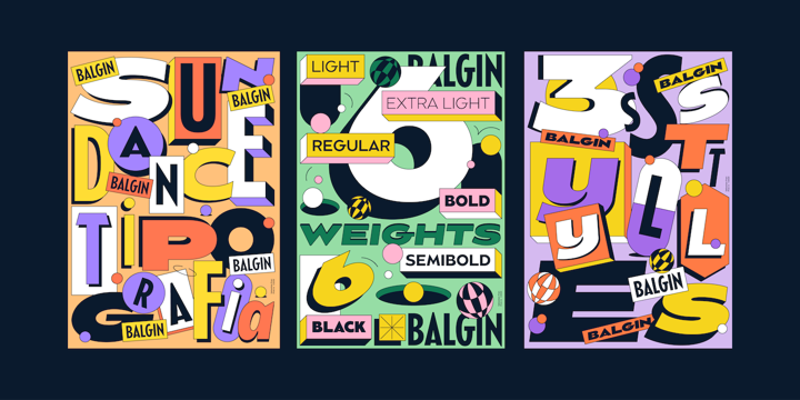
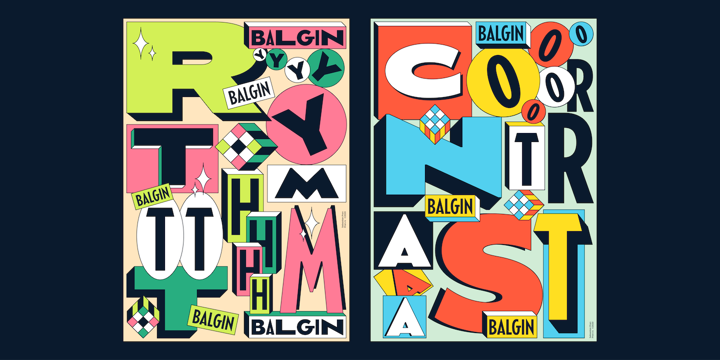
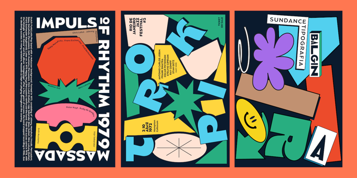
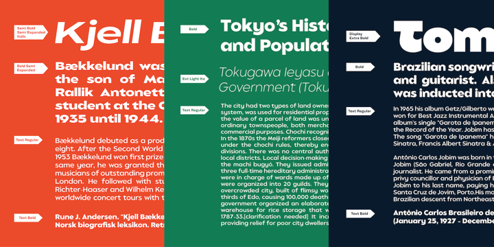
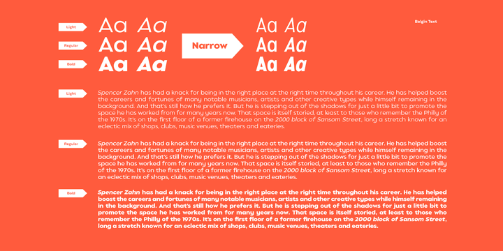
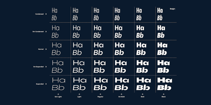
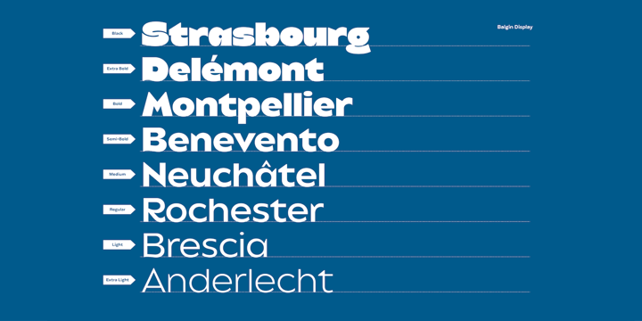
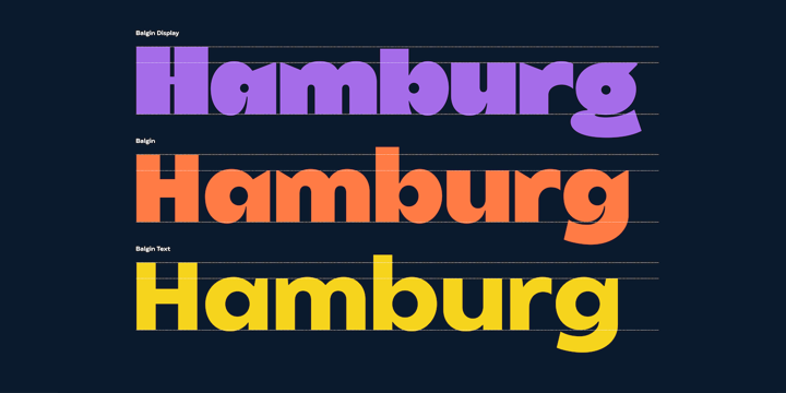
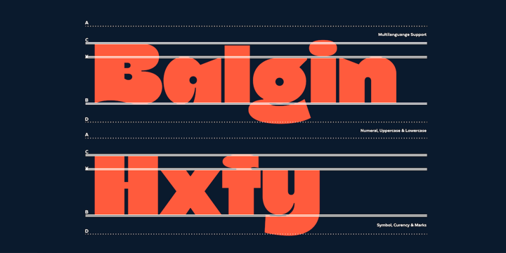
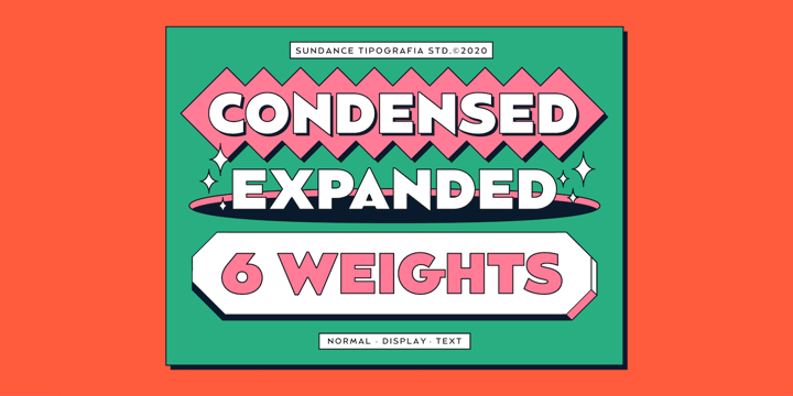
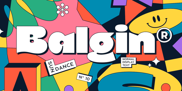
Balgin brings back the nostalgic era of 90’s. The 90’s were a magical time – a time of the Docs, Game Boys, and Cartoon. As everything that was once old is new again, the 90’s are making a come back. The basic of typeface are from geometric/basic shapes (Triangle, Square, Circle) form. Some character in Display font are modified, like ‘R’K’ stroke are more dynamic. and the tail of ‘g’ are more generic. Balgin are available in 3 Flavour Typefaces (Display – Normal – Text) and have 6 different weights (For Normal are available on 5 Widths).
I really like Balgin as a display typeface. To me, it every weight is different and dynamic so it’s like you’re getting an array of different fonts that still work beautifully together. I don’t personally have a legibility issue at the chunkier weights, but that may not be the case for everyone.