Is Monday too early in the week to post a bar branding case study? Nah.
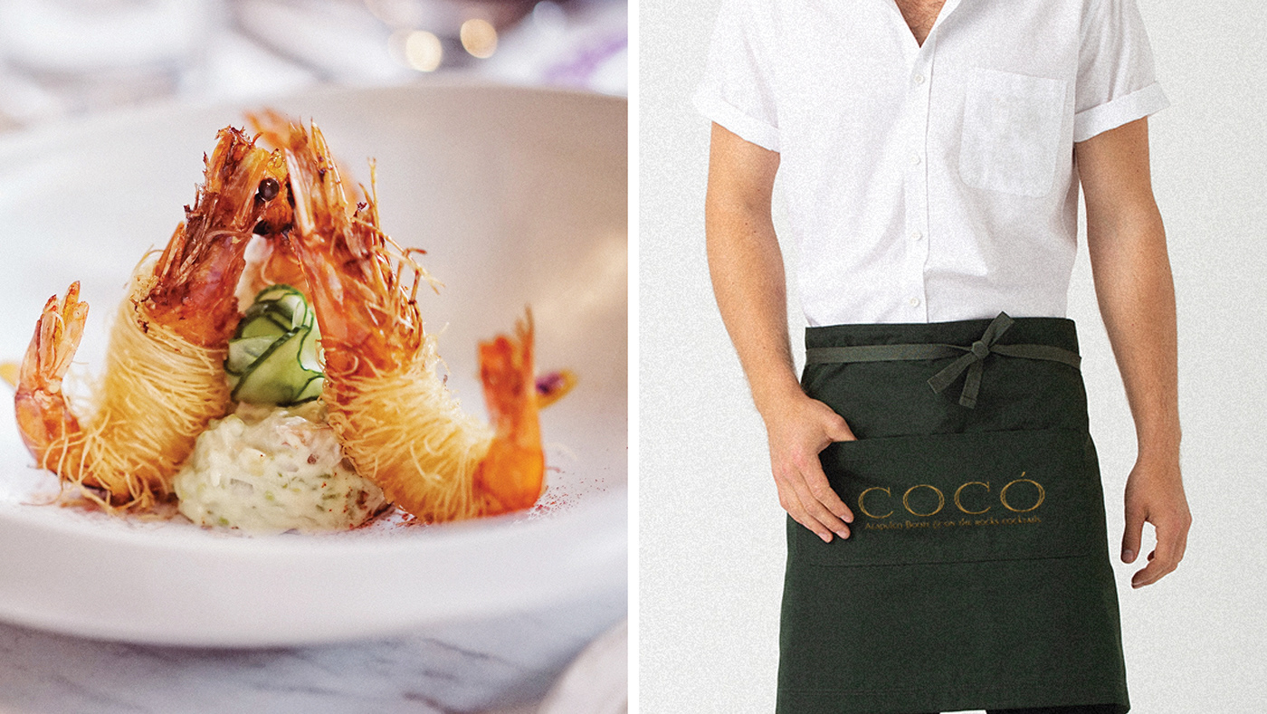
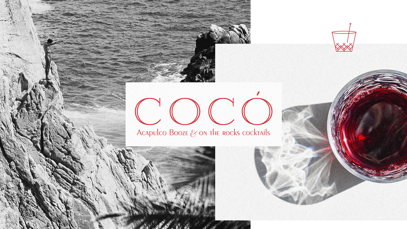
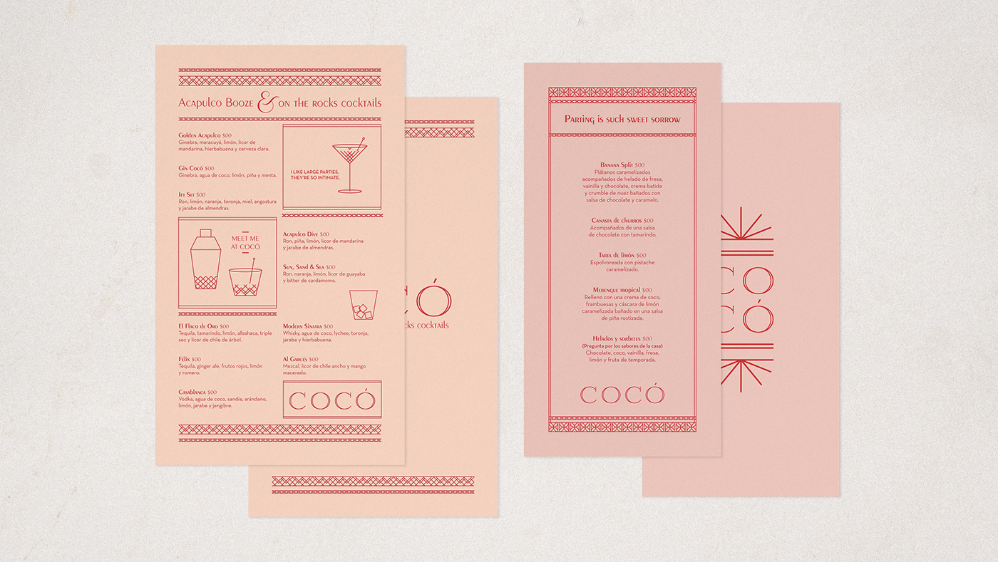
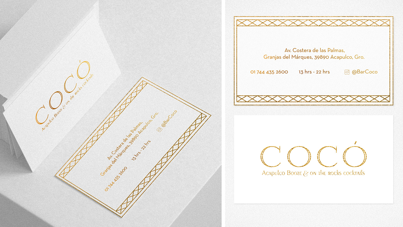
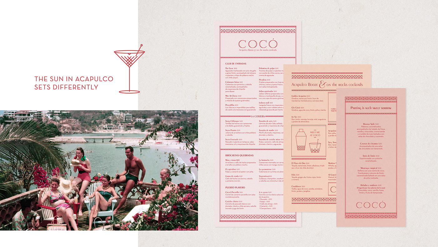
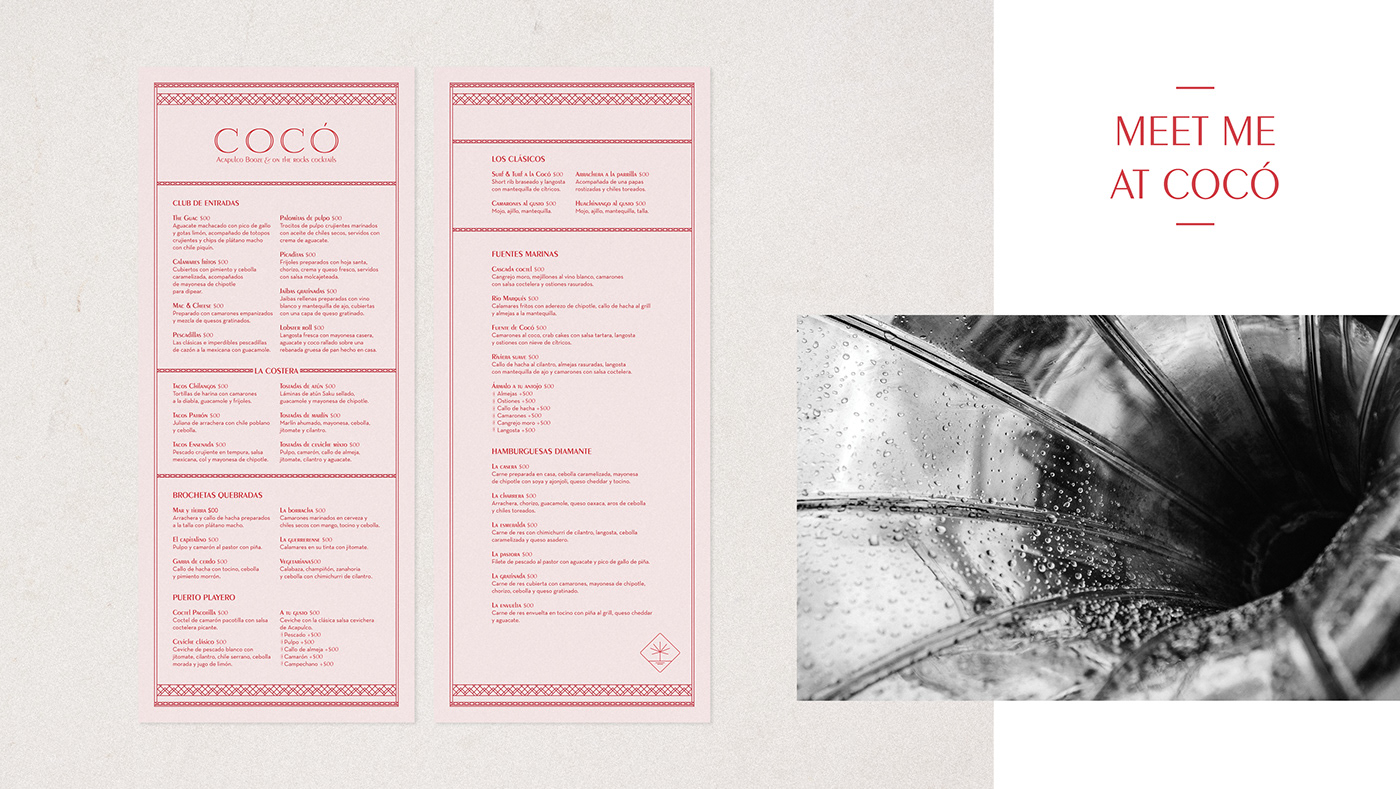
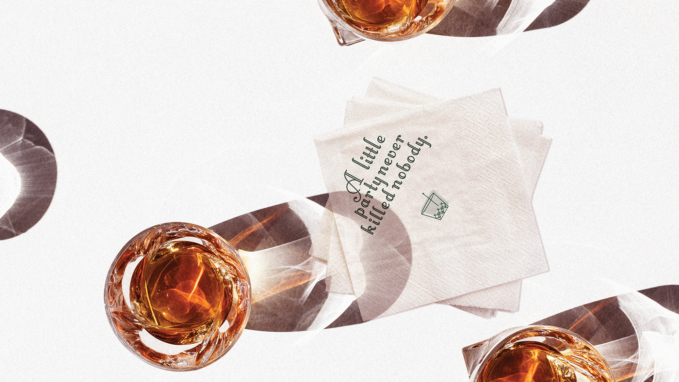
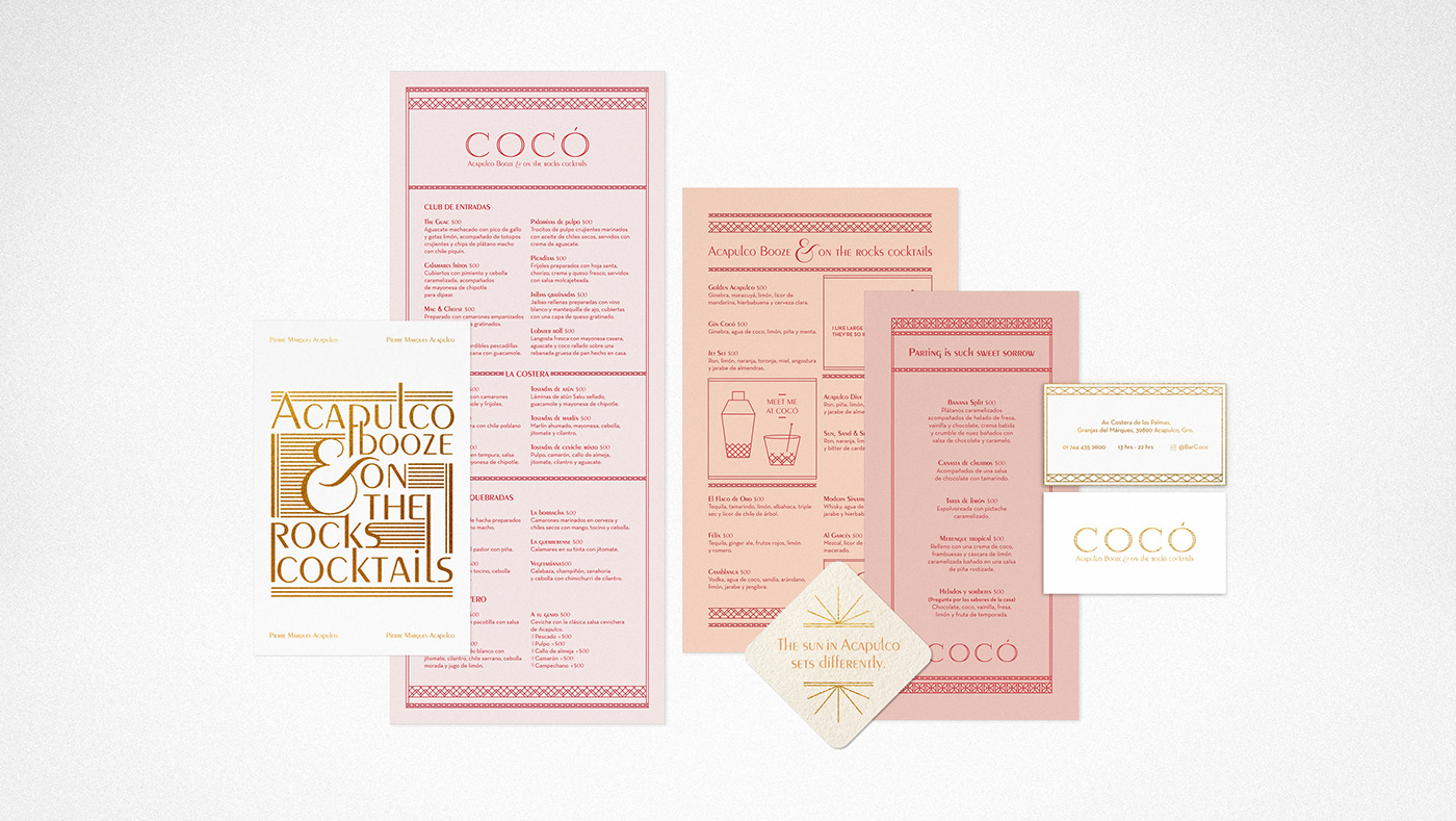
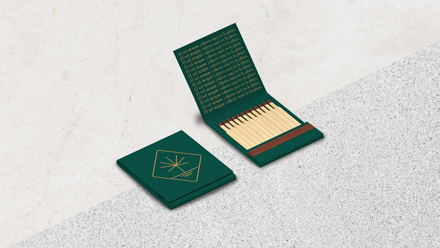
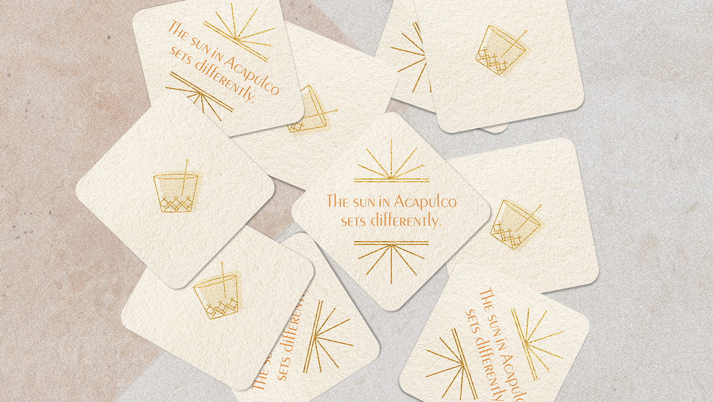
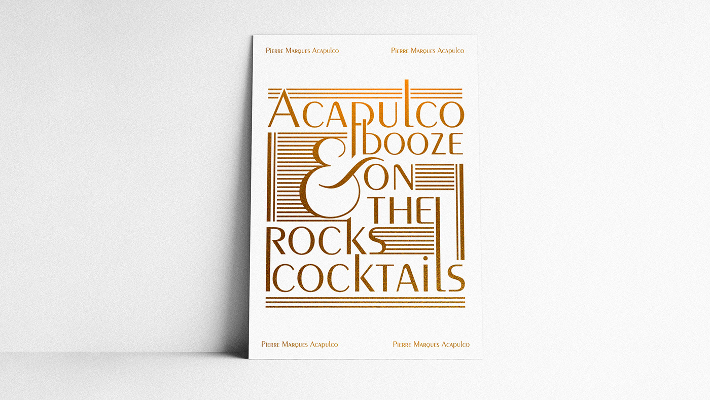
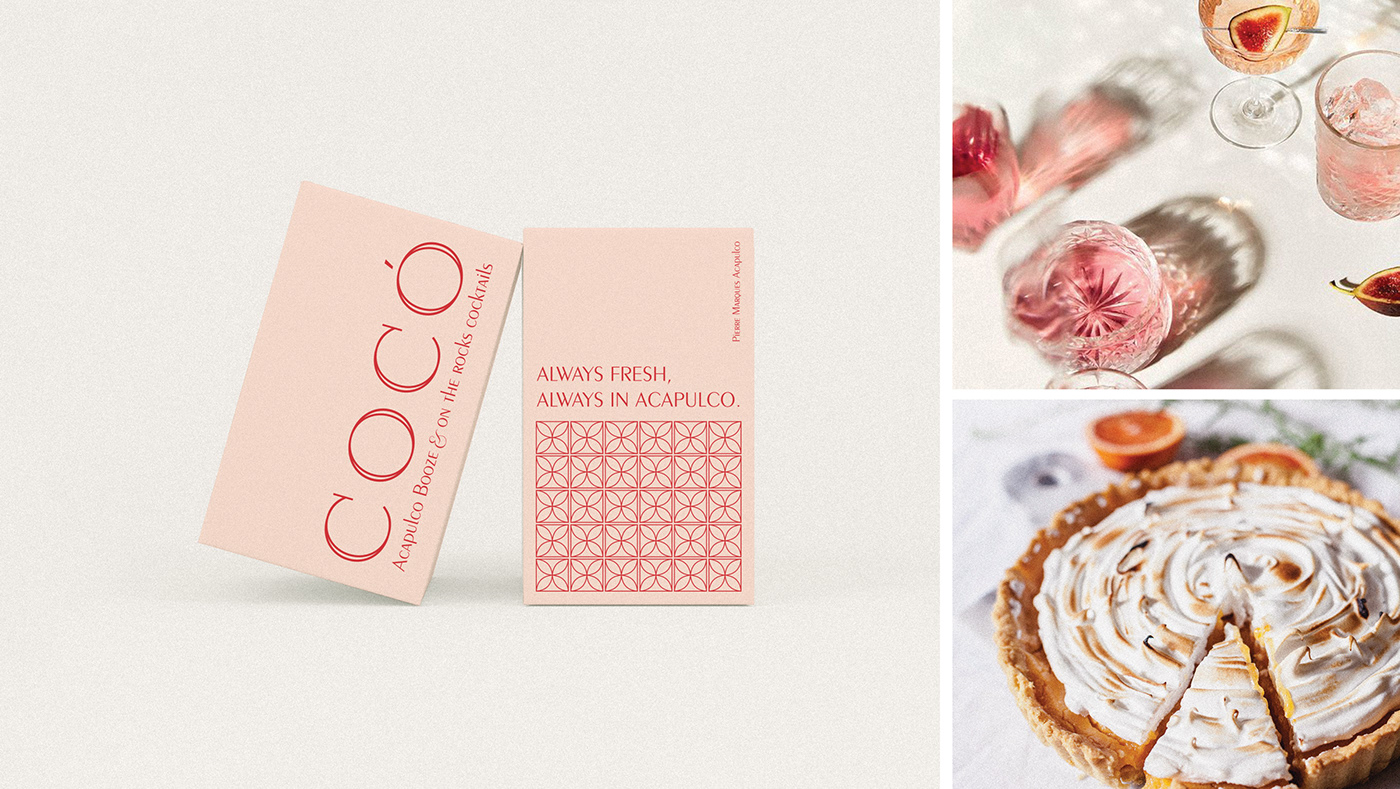
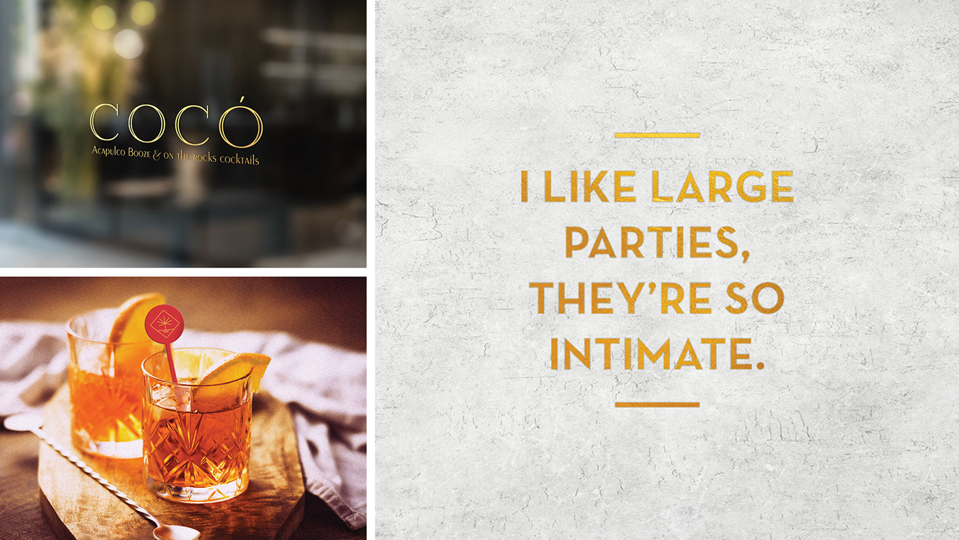
Coco is a seafood restaurant and cocktail bar inspired by the golden years of Acapulco, Mexico. Now, I know nothing as to when the ‘golden years’ were, but based on the brand identity and its use of ornate frames and gold foil, I’m going to guess it was the 1920s. Art Deco flair graces each of the printed menus, and the use of transitional, geometric sans serifs gives Coco a fashionable, flirty flair. I personally love the warm colors used throughout the brand. Typically when we see something that is Art Deco inspired, there are a lot of dark navys and greens and blacks paired with the gold. For Coco, there’s a litany of warm, sunset beachy colors, from the menu stocks to the printed type, that pairs beautifully with the gold, creating a unique look.
Cocó Restaurant and Bar Branding by Ana Patron Toffano.
