
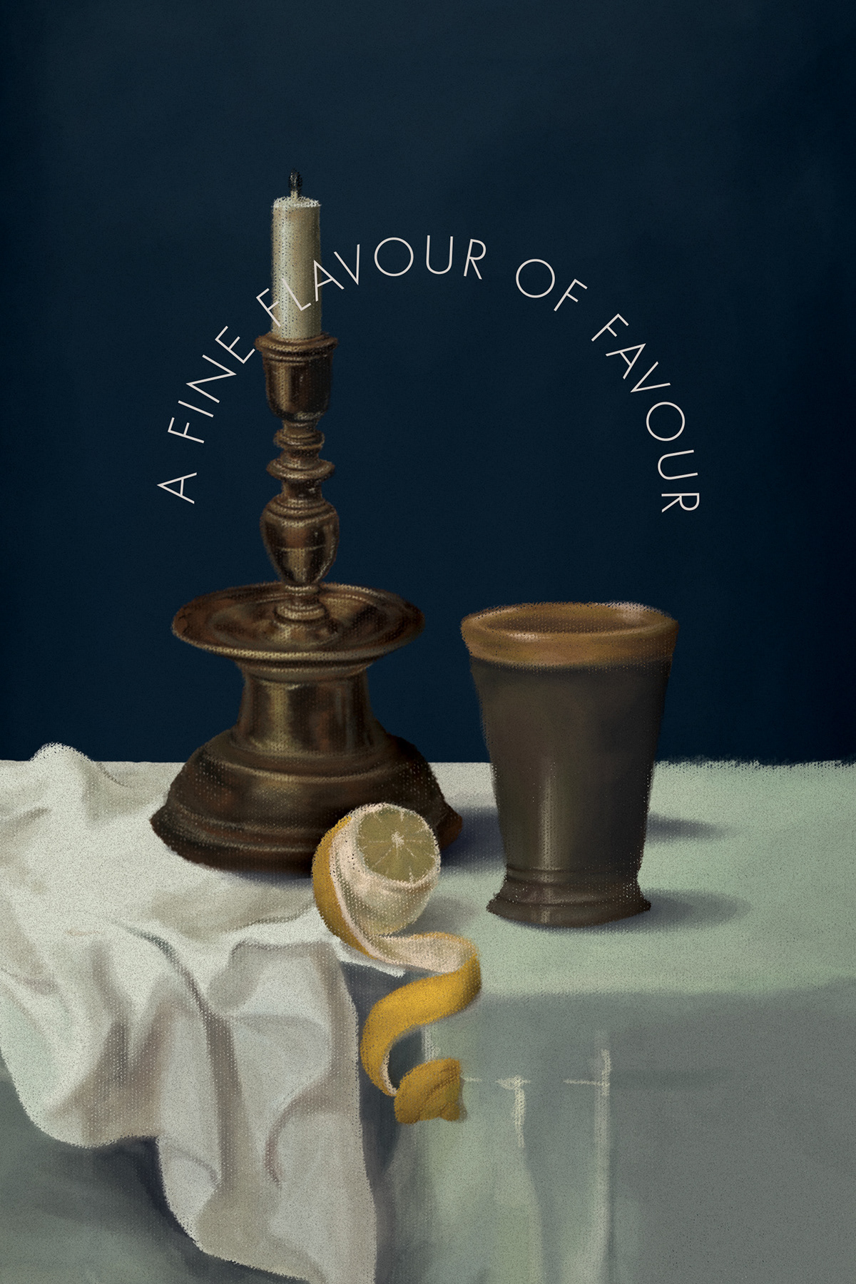
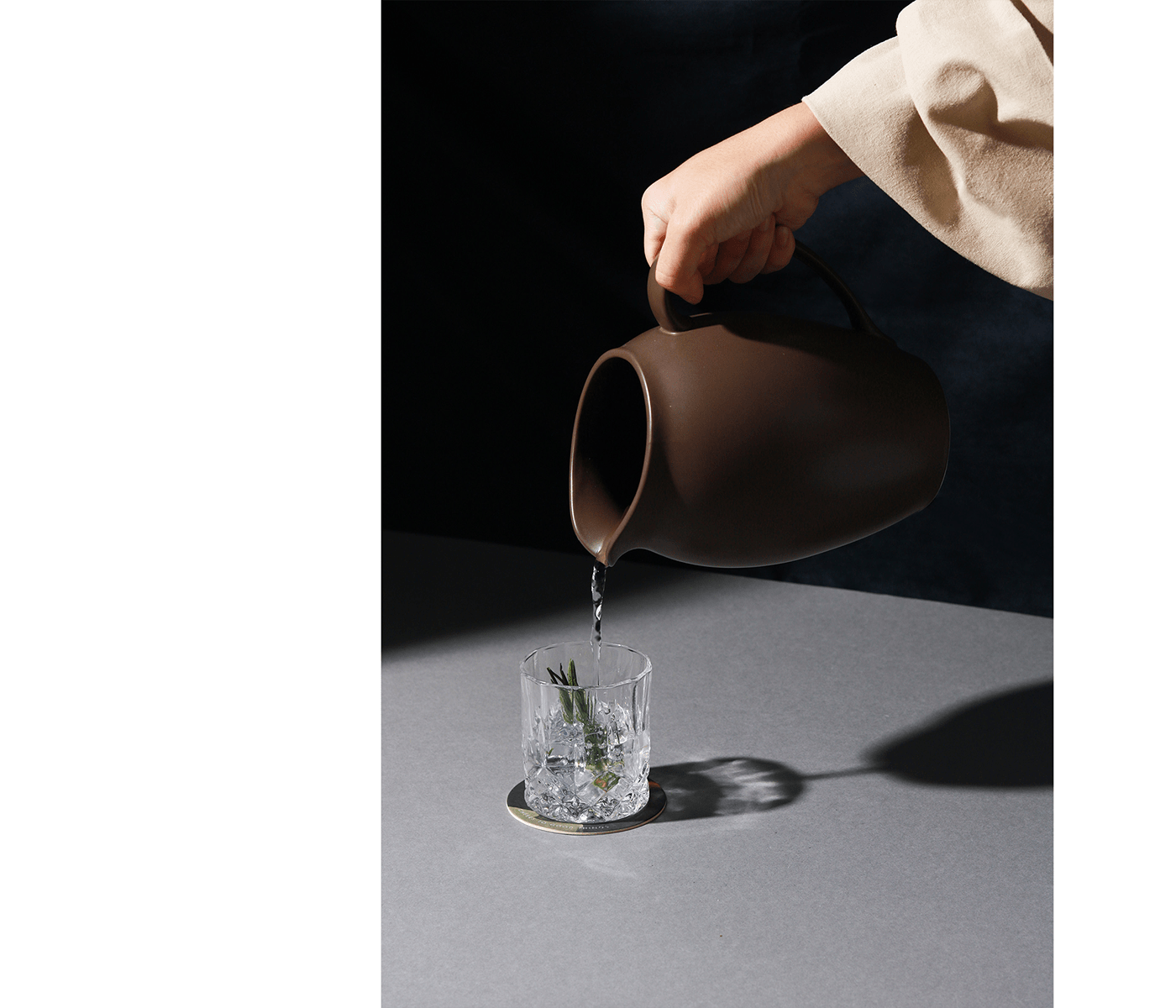
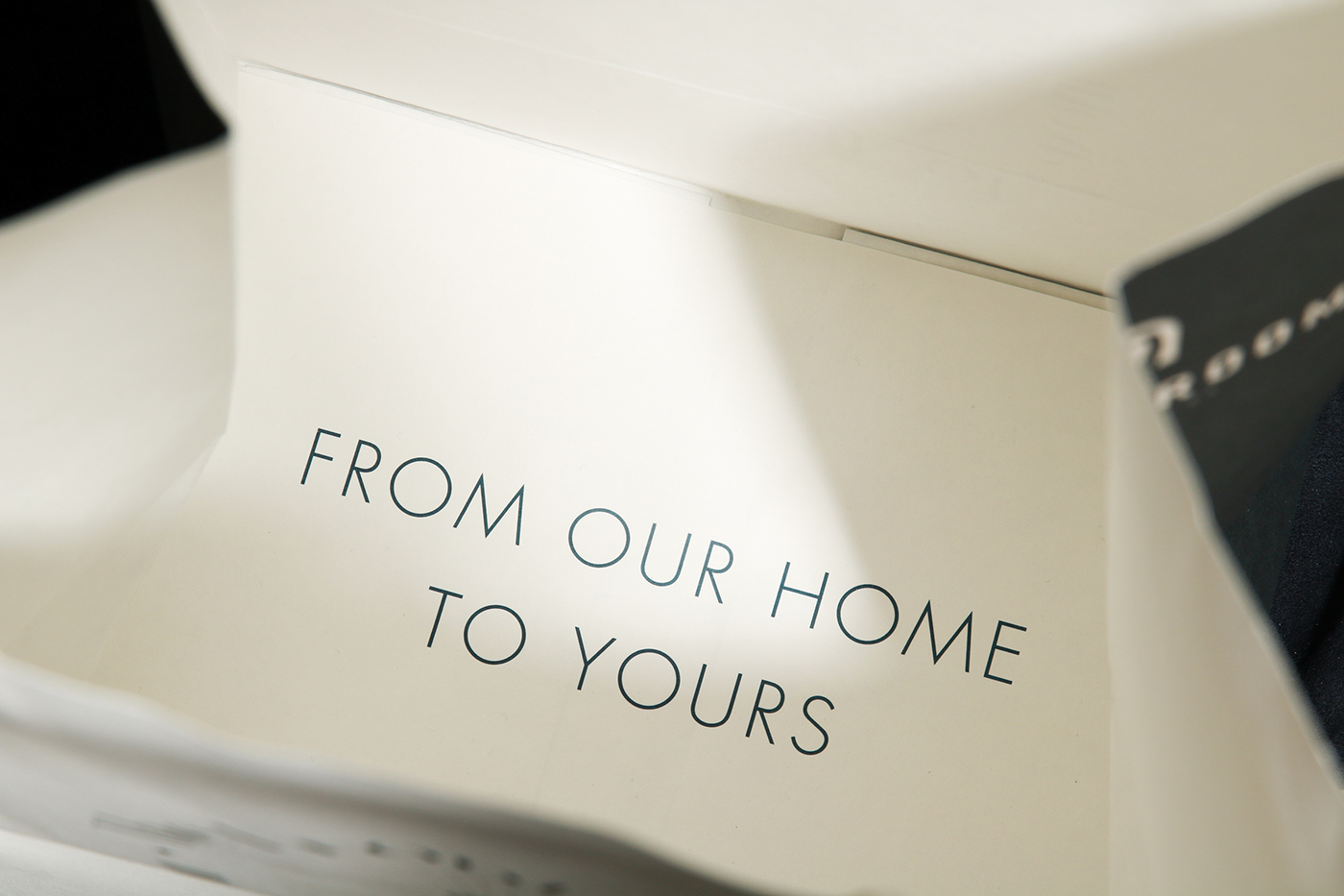
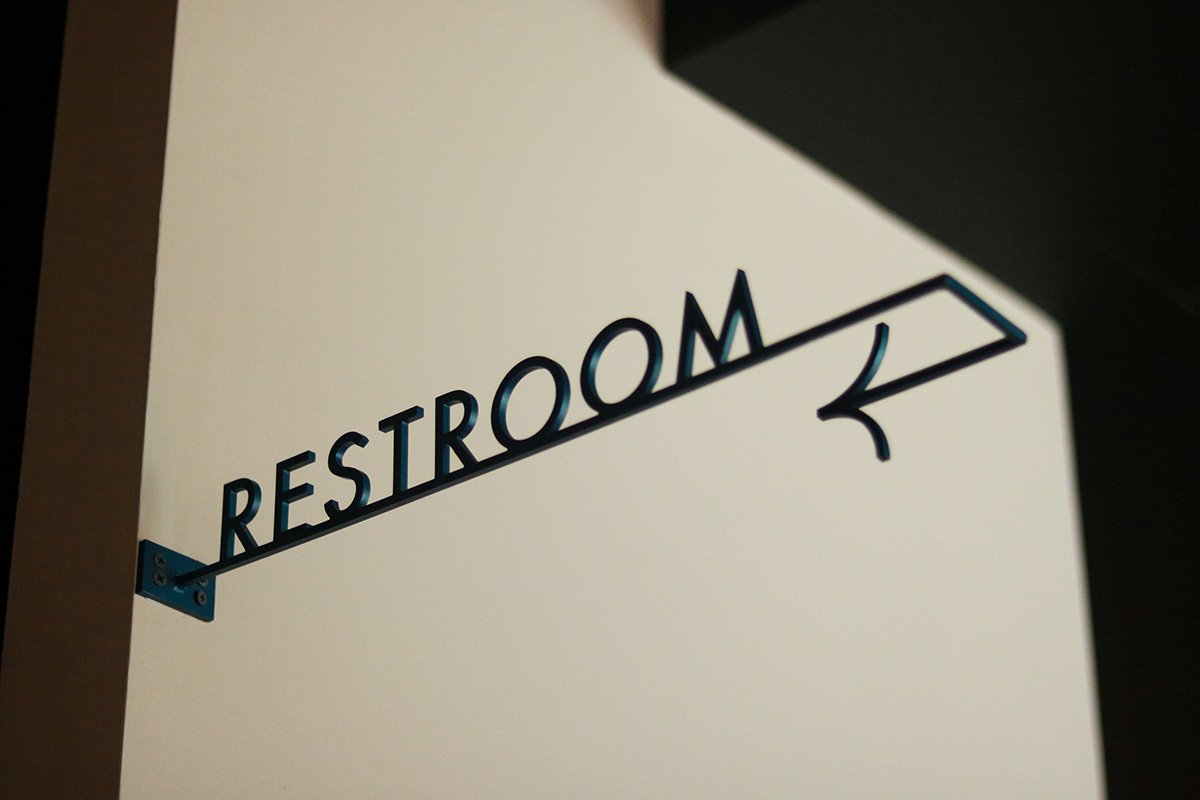
The Front Room’s branding can be summed up in one word: striking. Every touchpoint has been thoroughly considered and designed with purpose and form making every moment with this brand an absolute joy.
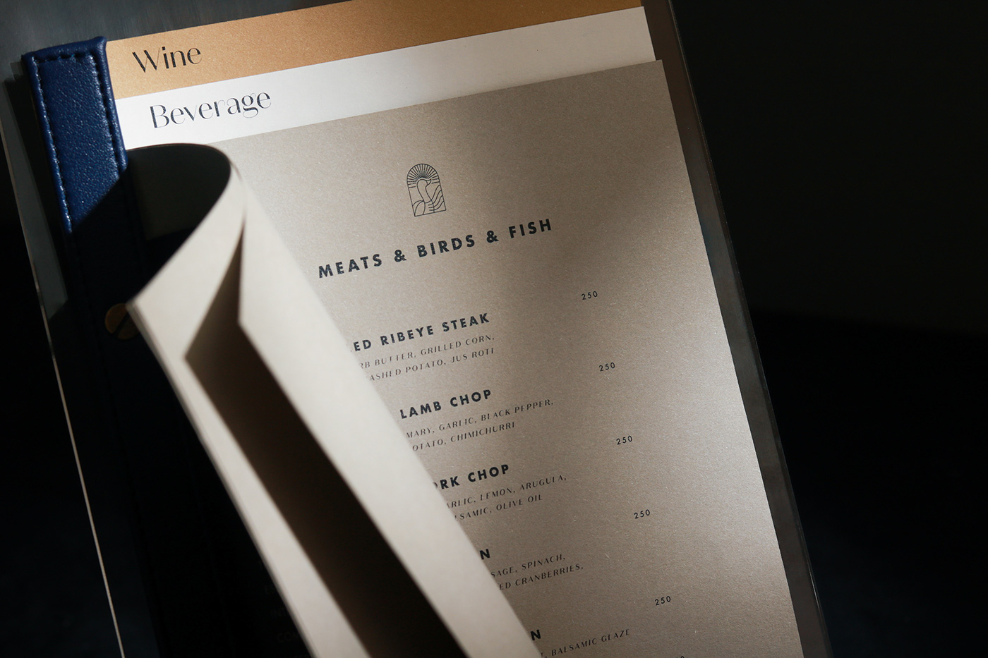
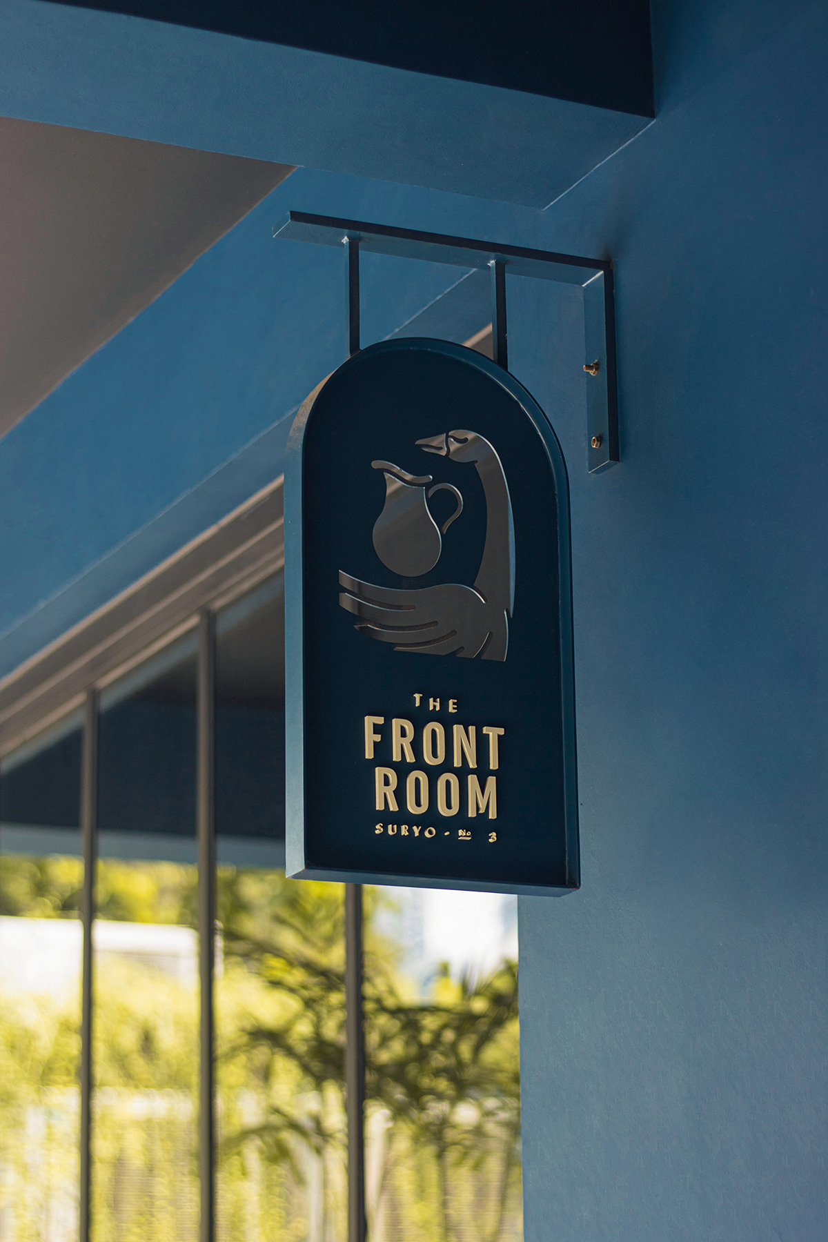
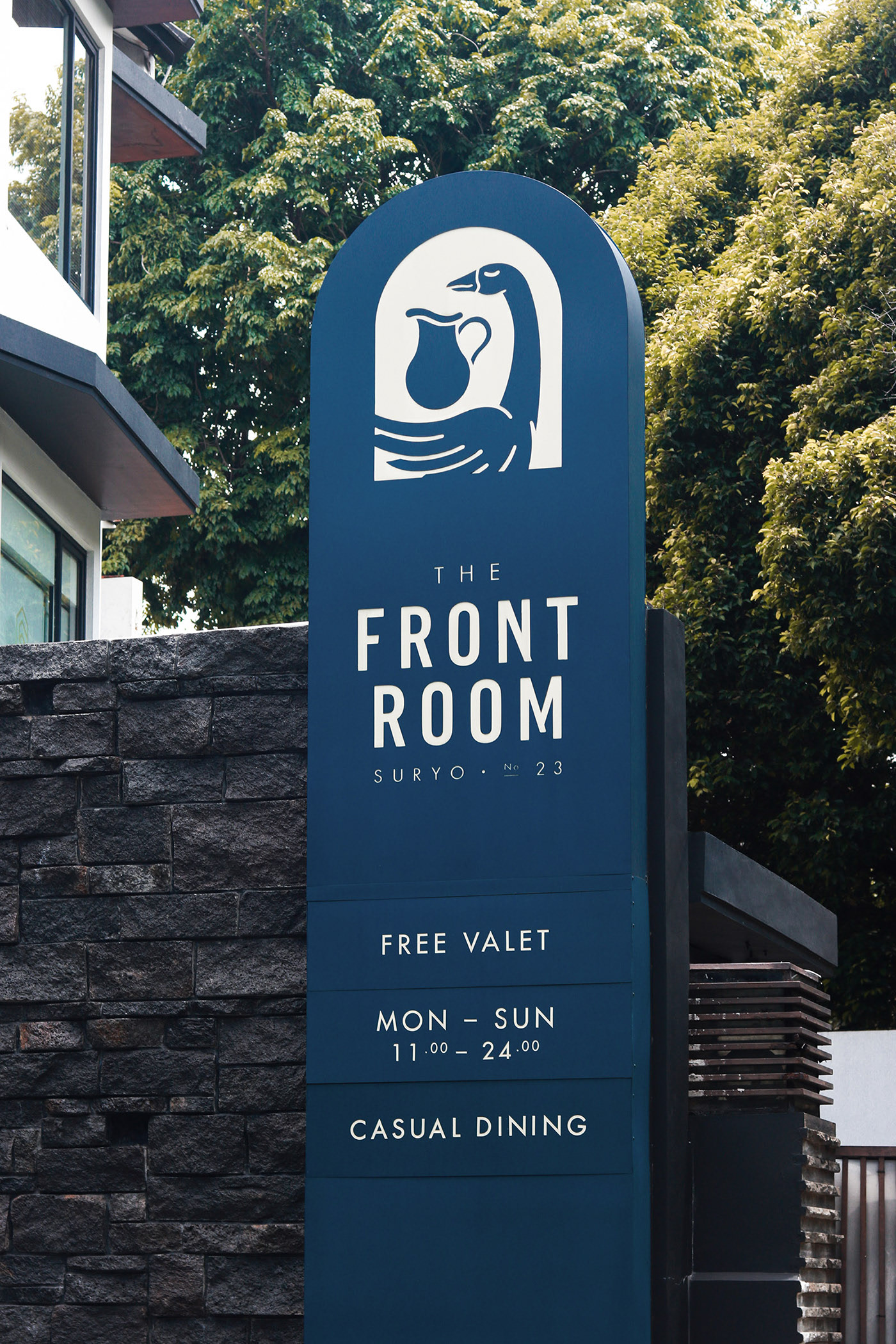
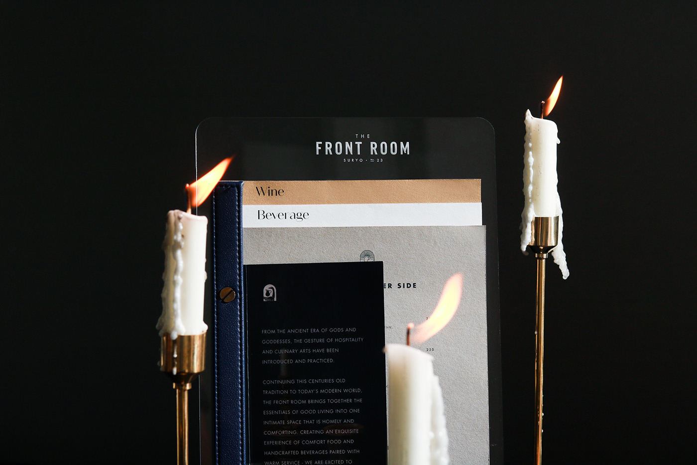
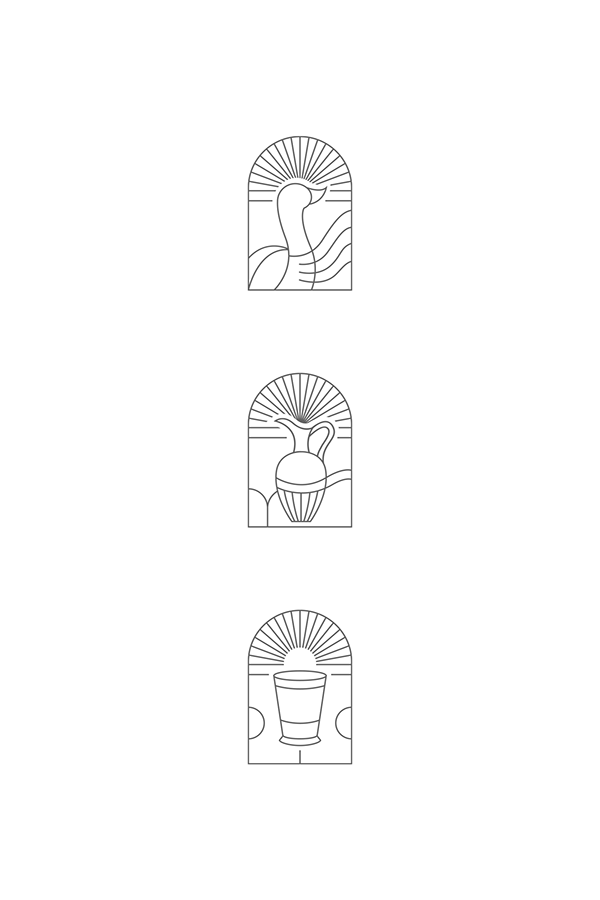
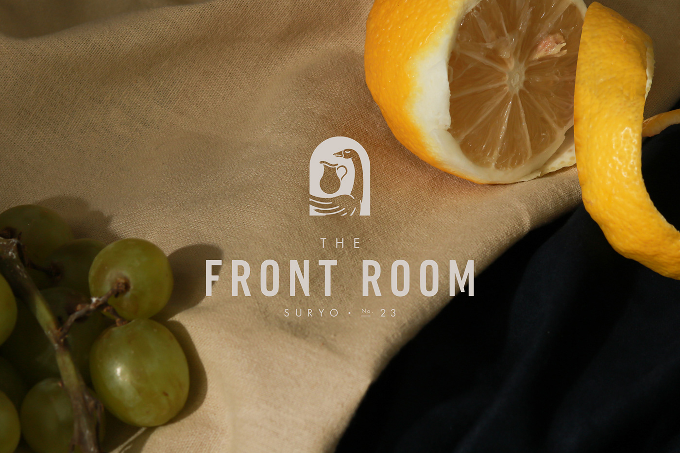
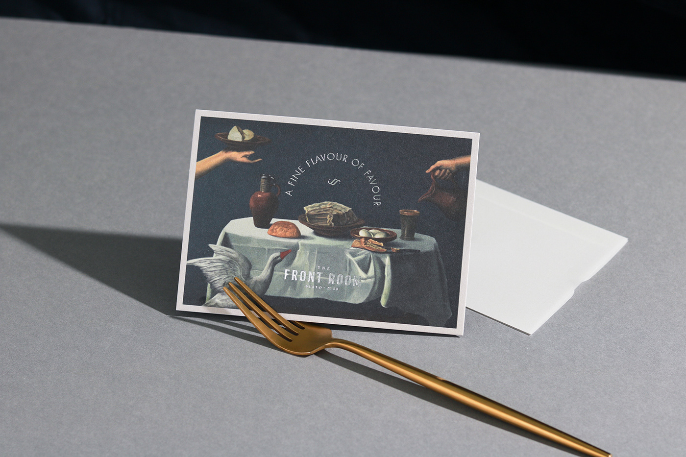
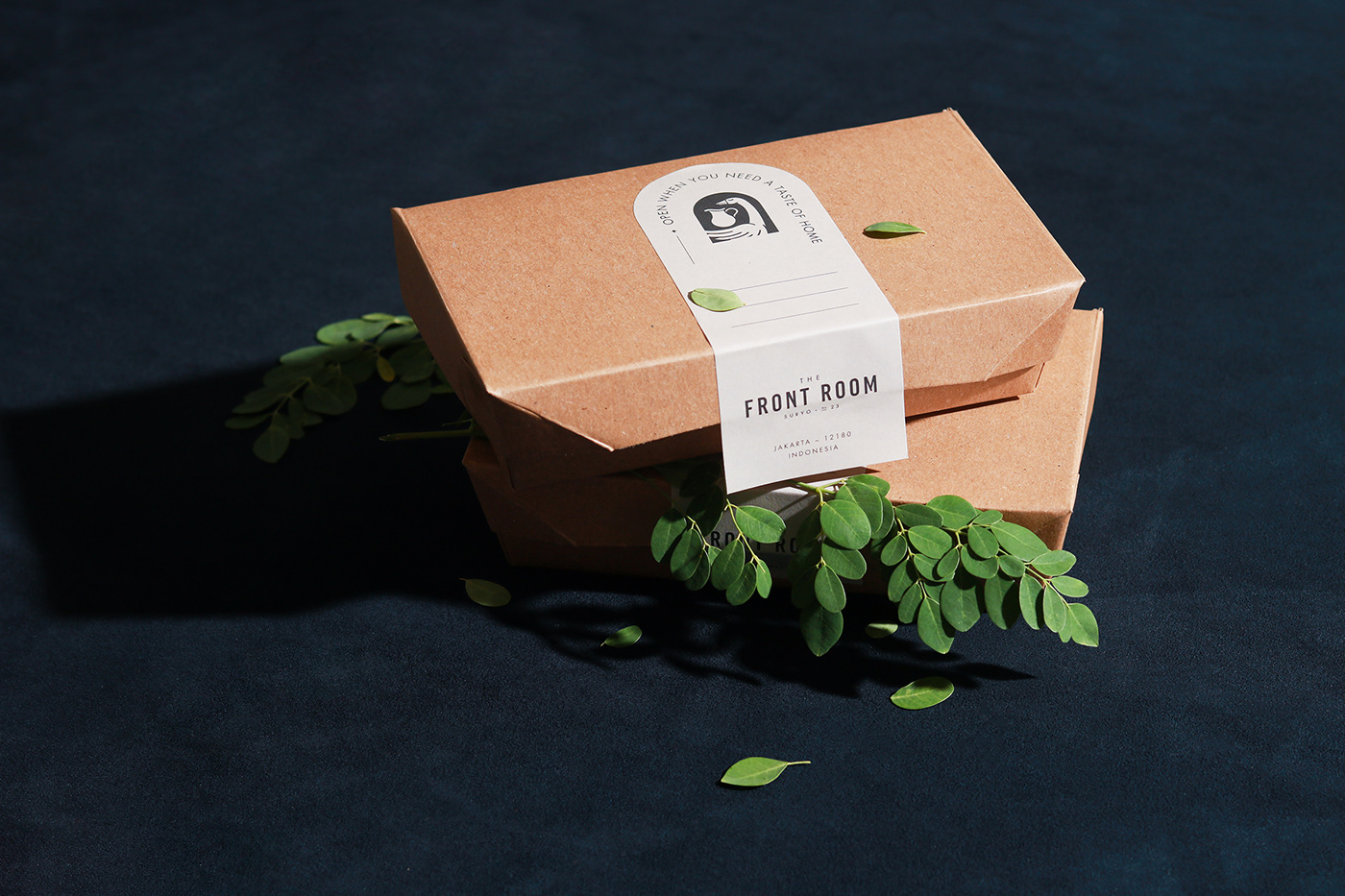
The brand is spearheaded by an archway design device that anchors the brand across the suite of touchpoints. This device houses numerous line art illustrations as well as the core identity element; the goose and pitcher. From custom die cut cards through intelligent use of text effects, the arch centers this brand in while still exploring remarkable layouts.
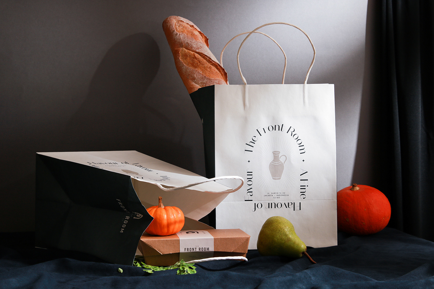
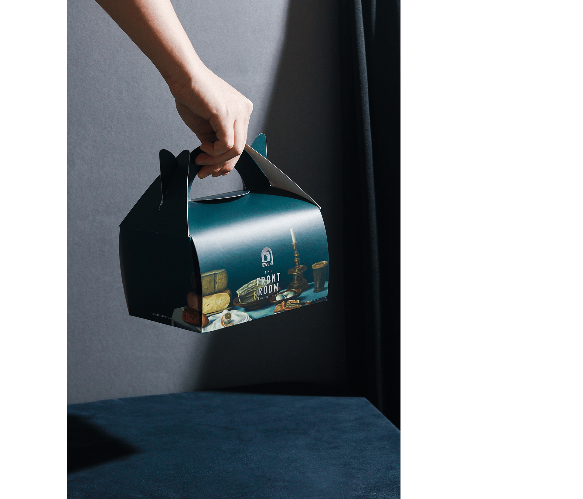
The packaging for The Front Room is especially noteworthy. From the carryout boxes that are full color printed to the simple, but confident takeout bags, the brand’s identity shines bright.
Note: Don’t spread butter with business cards, please.
Designed by Thinking Room in Jakarta


