Emmy Squared Pizza Restaurant Branding by Saint-Urbain

From Saint Urbain’s case study:

Chef Matt Hyland’s contemporary ode to Detroit-style pizza and arguably one of the best double-stacked cheeseburgers in America.

We were tasked with selecting a color and font kit, creating a new set of pizza & burger characters and developing new menus, collateral, and business cards.

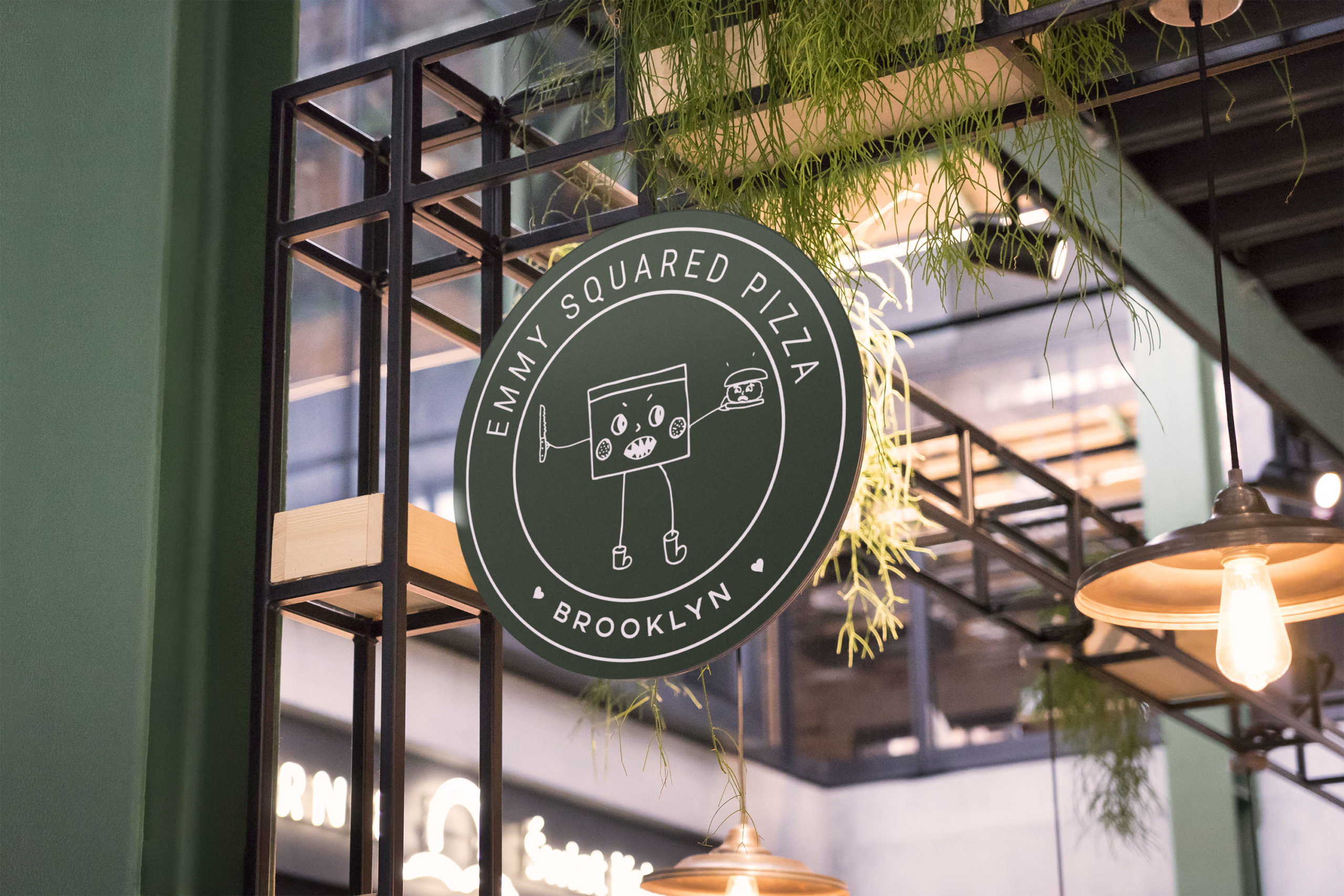
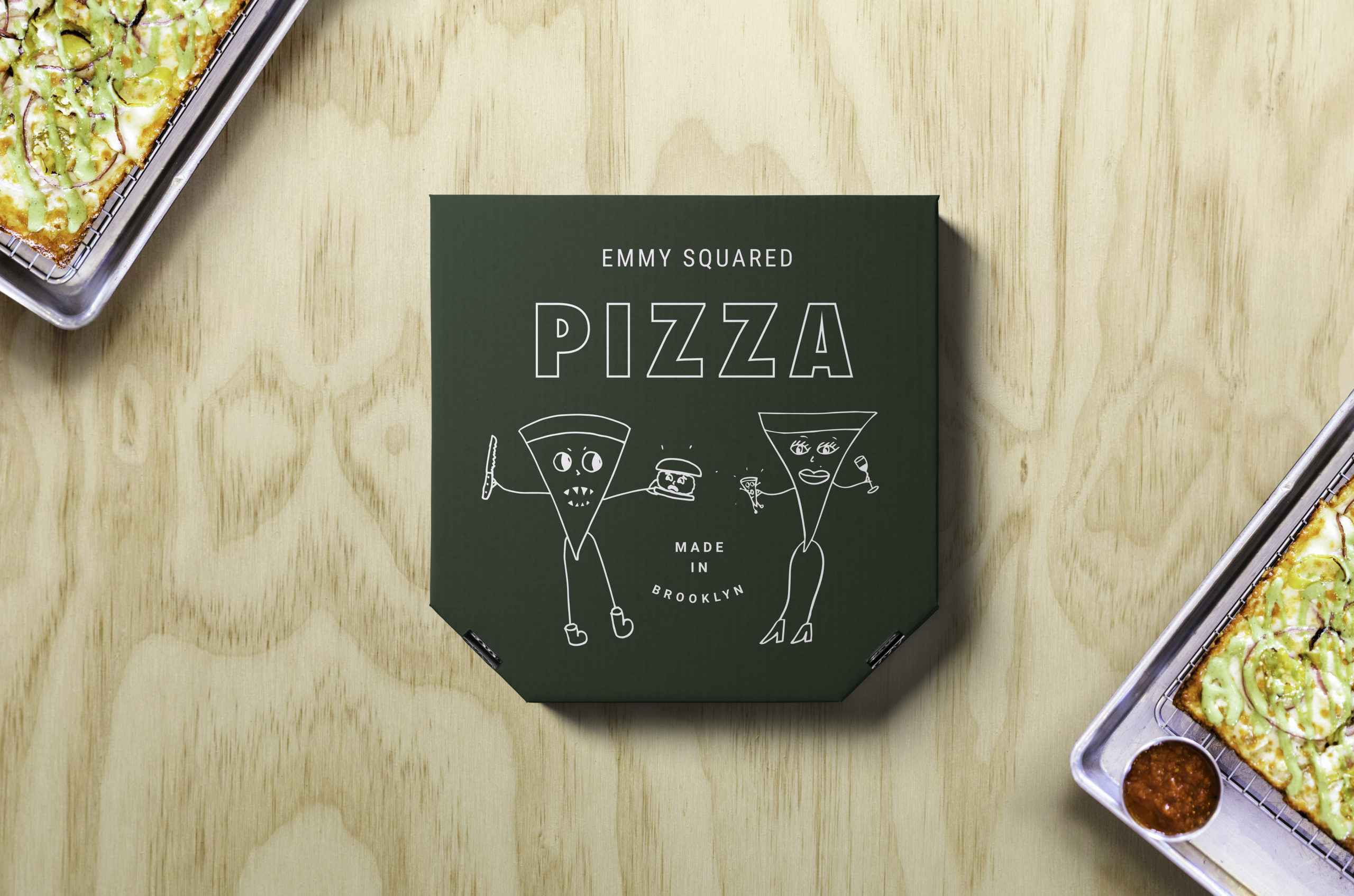
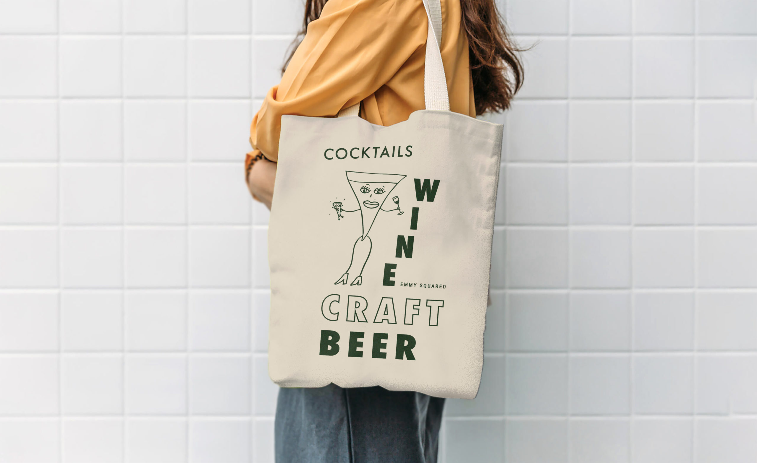
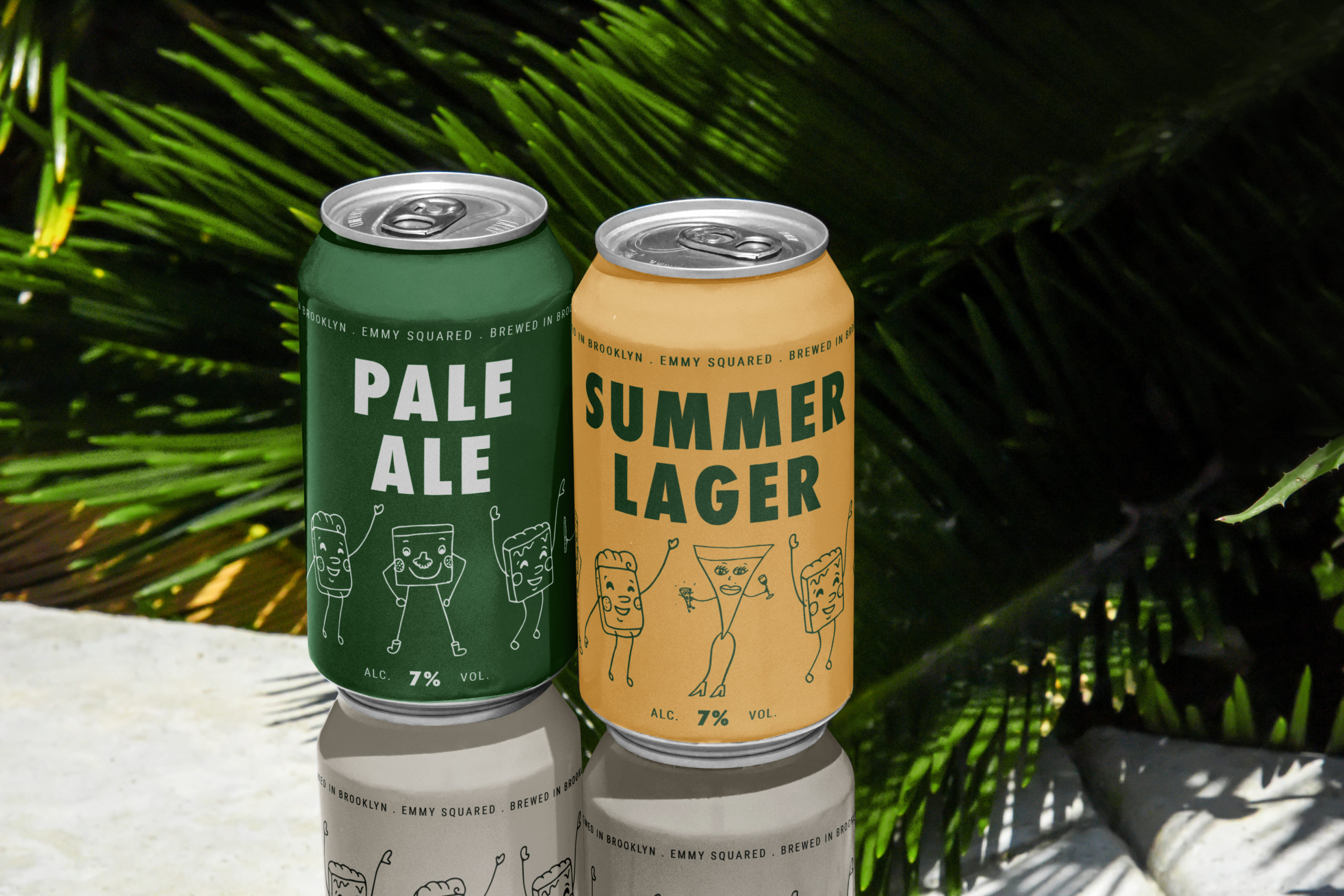
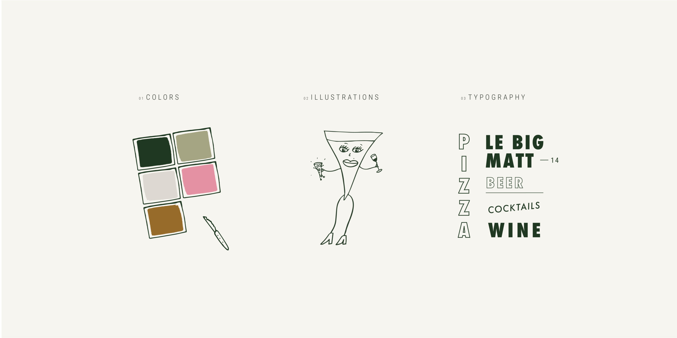
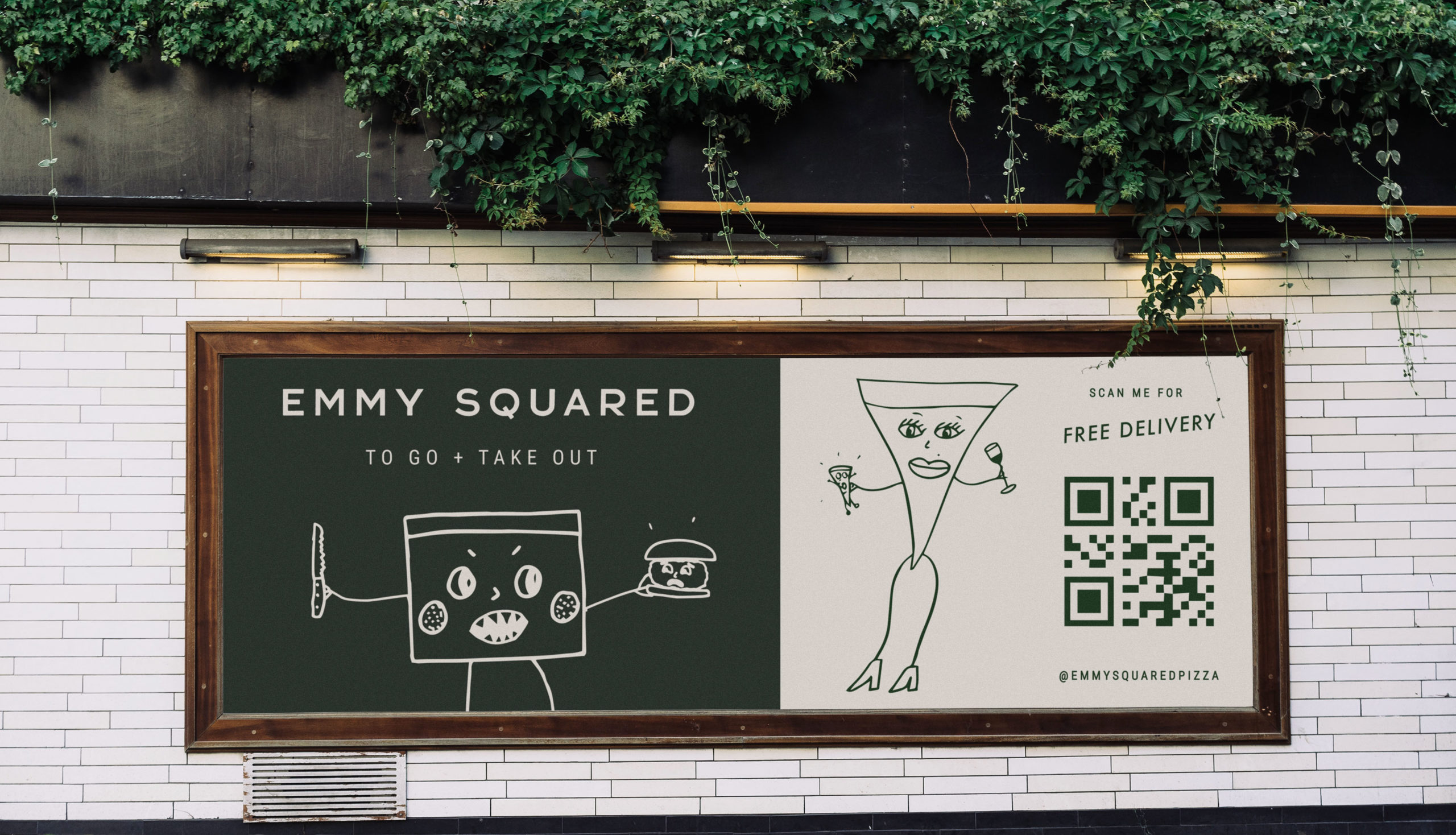
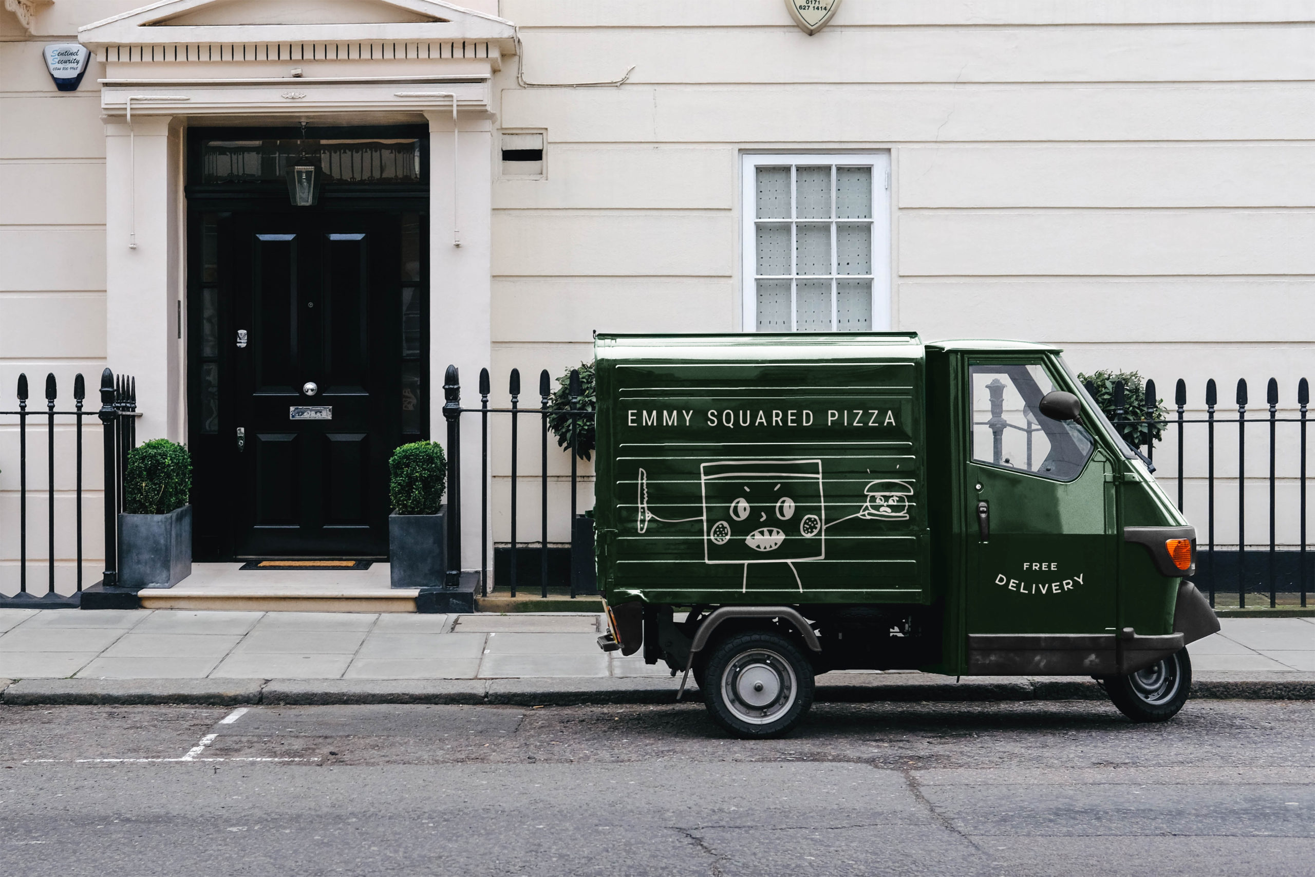
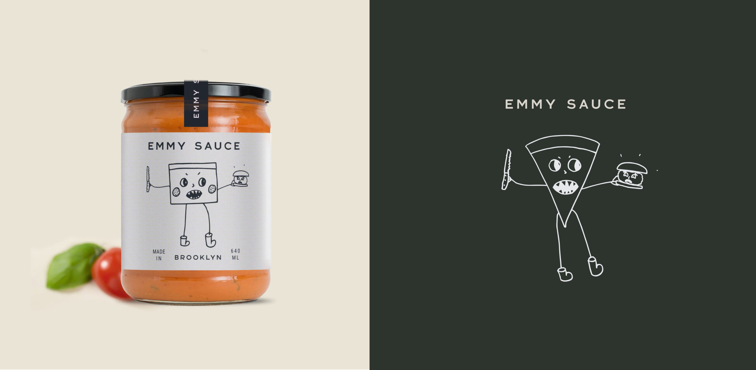
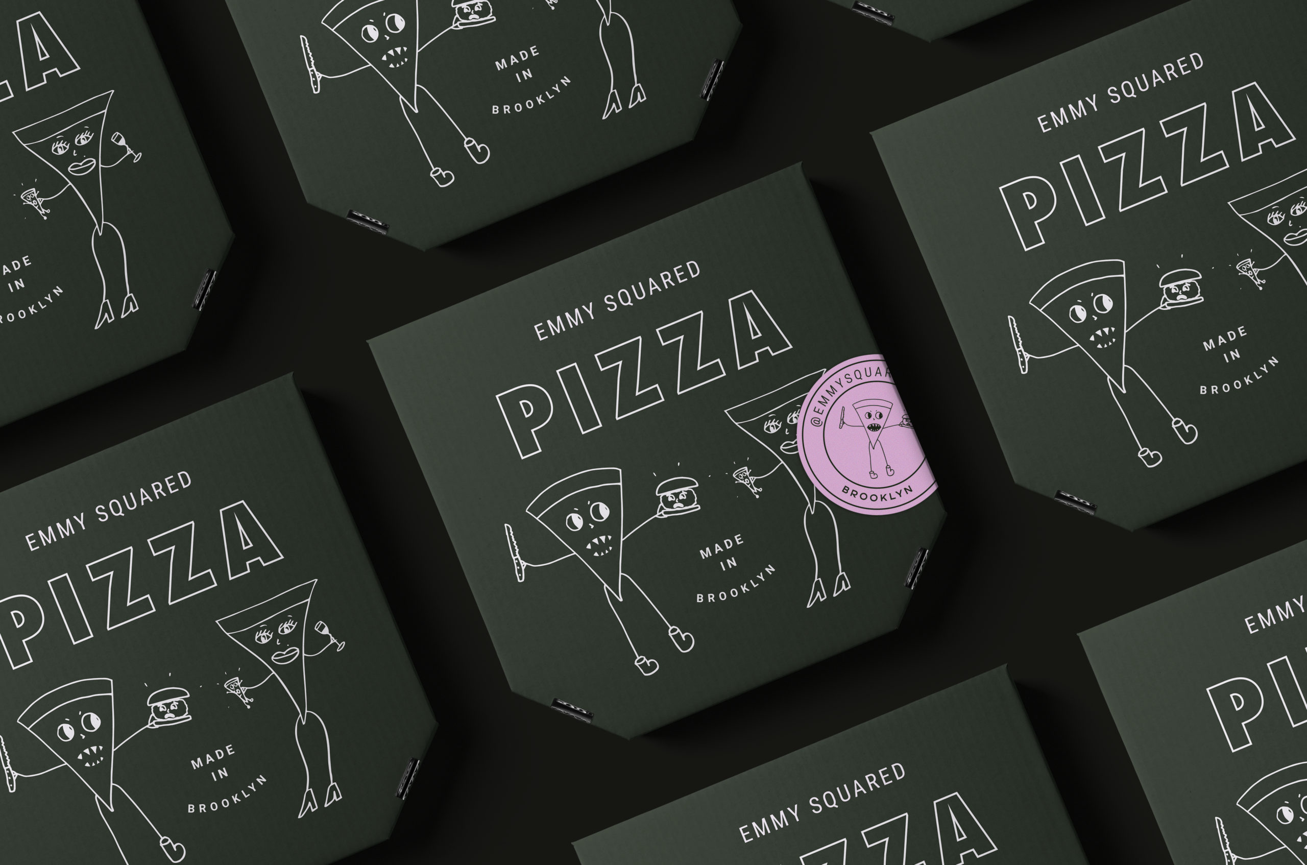
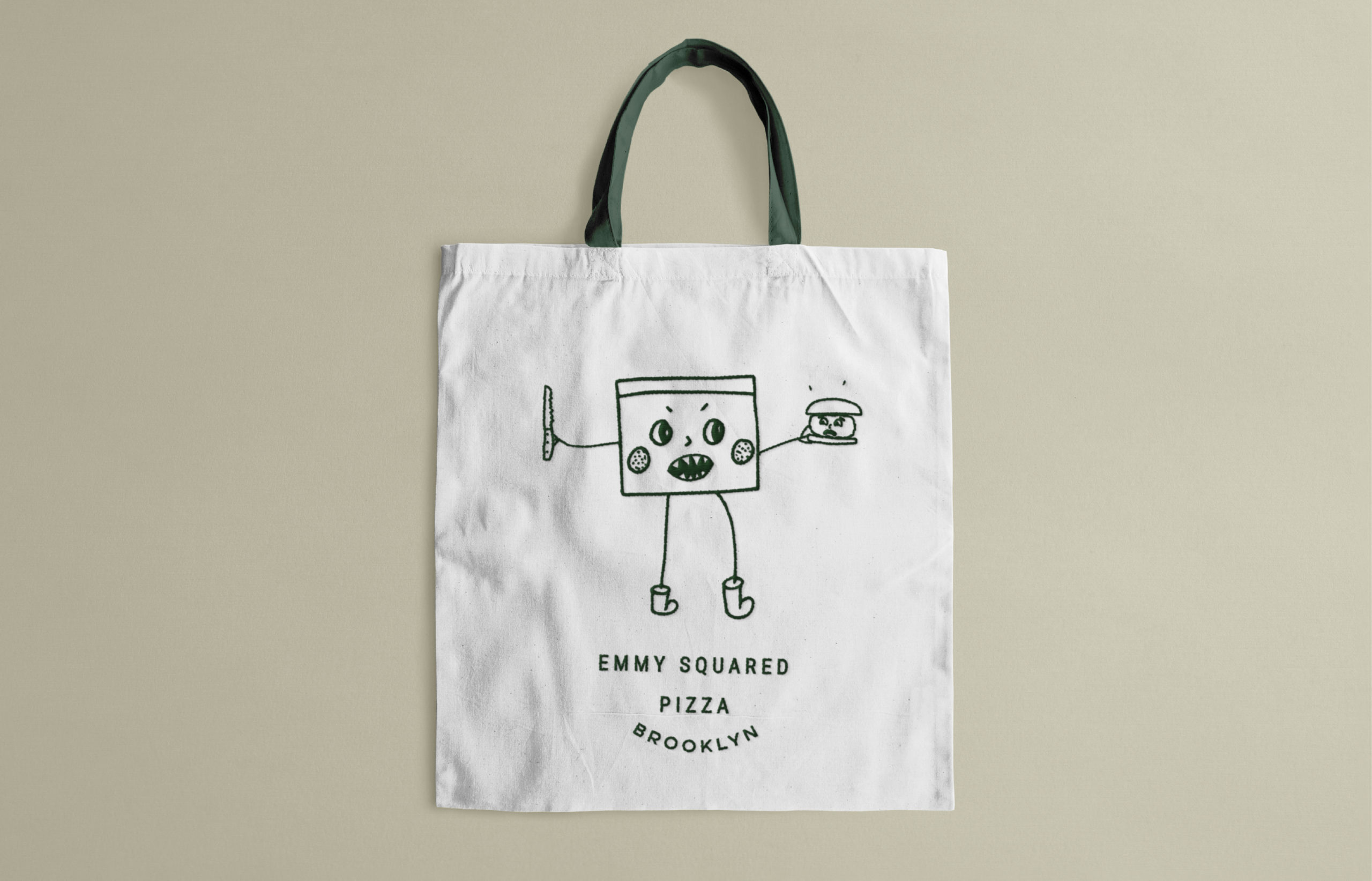
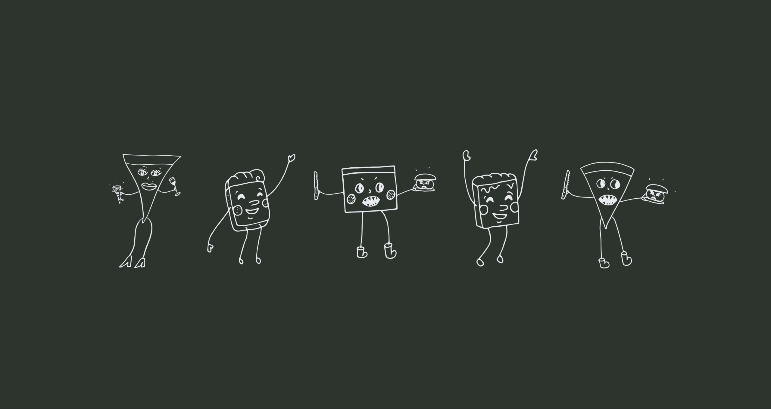
In our exploration of various pizza characters, we also stumbled upon a few new ones, including drunk burgers, happy eggs, and more. Our font and color choice present a modern hipness, that also draws inspiration from the menu items.

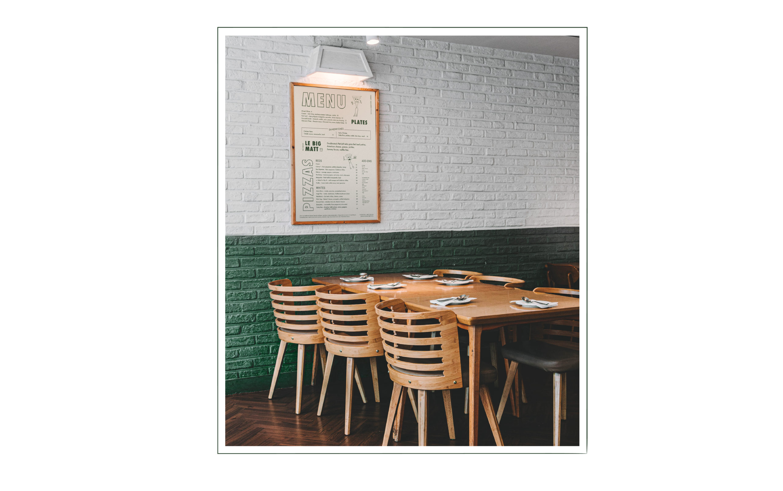
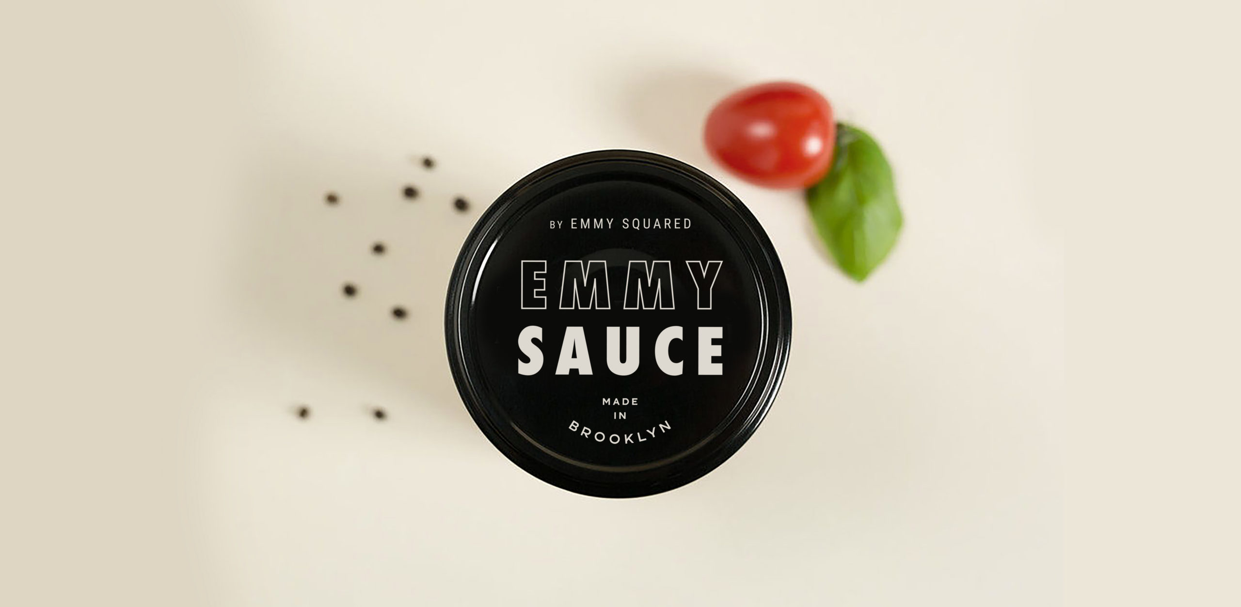
Emmy Squared Pizza Restaurant Branding by Saint-Urbain.

Discuss this Project

Leave a Reply

This site uses Akismet to reduce spam. Learn how your comment data is processed.

The Forktales Podcast™: Interviews with restaurant industry leaders and visionaries

Restaurant and advertising industry headlines and thinking

Reviews of restaurant experiences from around the globe 

Reviews of our favorite design, business, & restaurant books

Our favorite typography and fonts

Inspiration in your inbox

Get the latest inspiration in your inbox every Monday morning, for FREE!

"*" indicates required fields

This field is for validation purposes and should be left unchanged.

Delicious Bits in your Inbox!

Get the latest and greatest content delivered to your inbox for free!

"*" indicates required fields

This field is for validation purposes and should be left unchanged.