
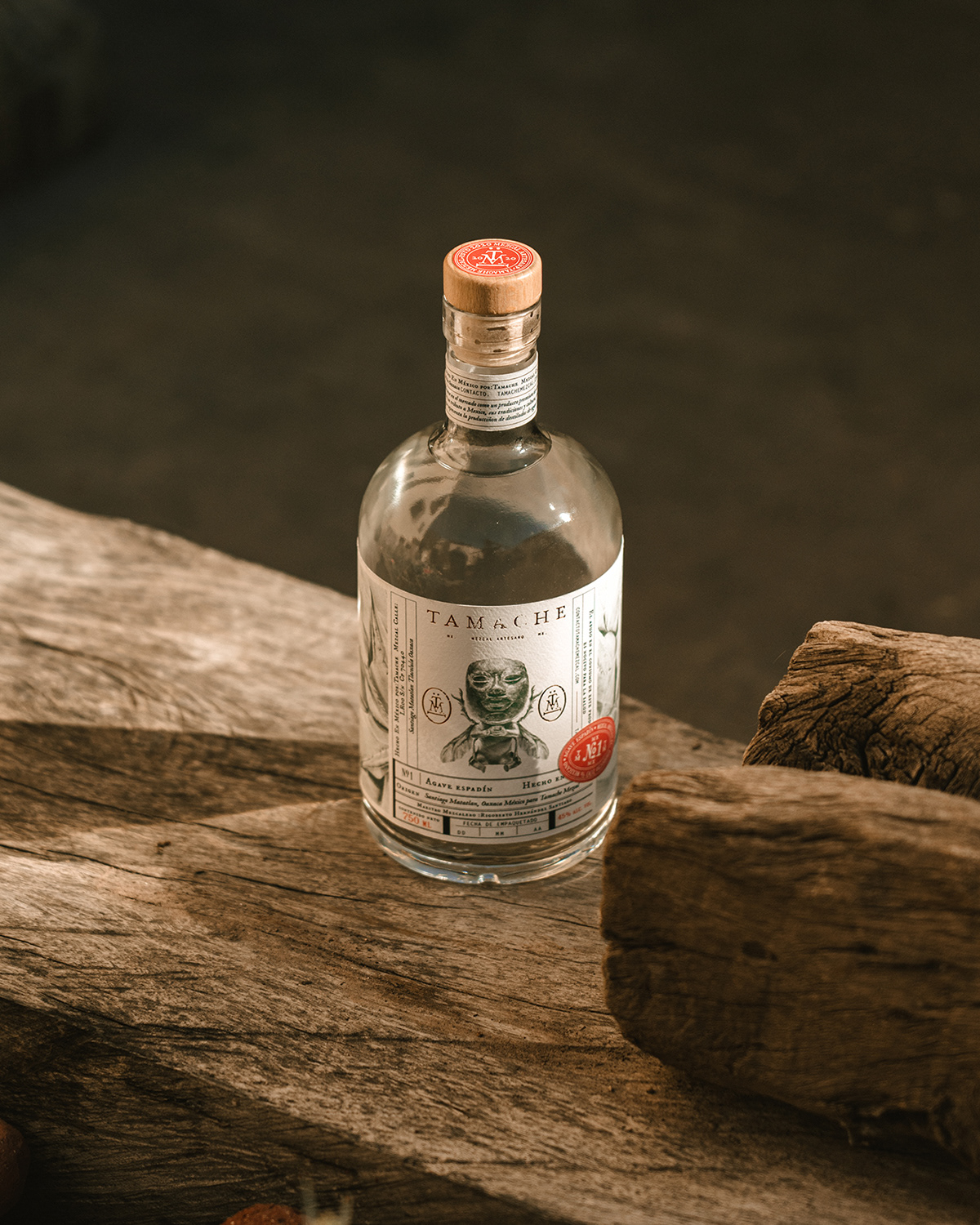
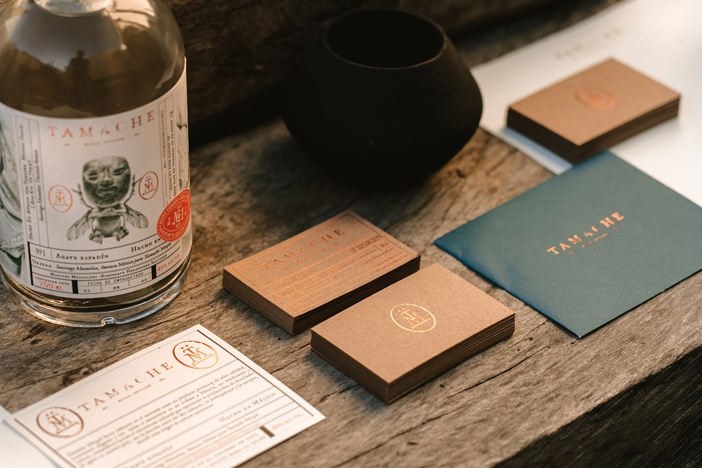
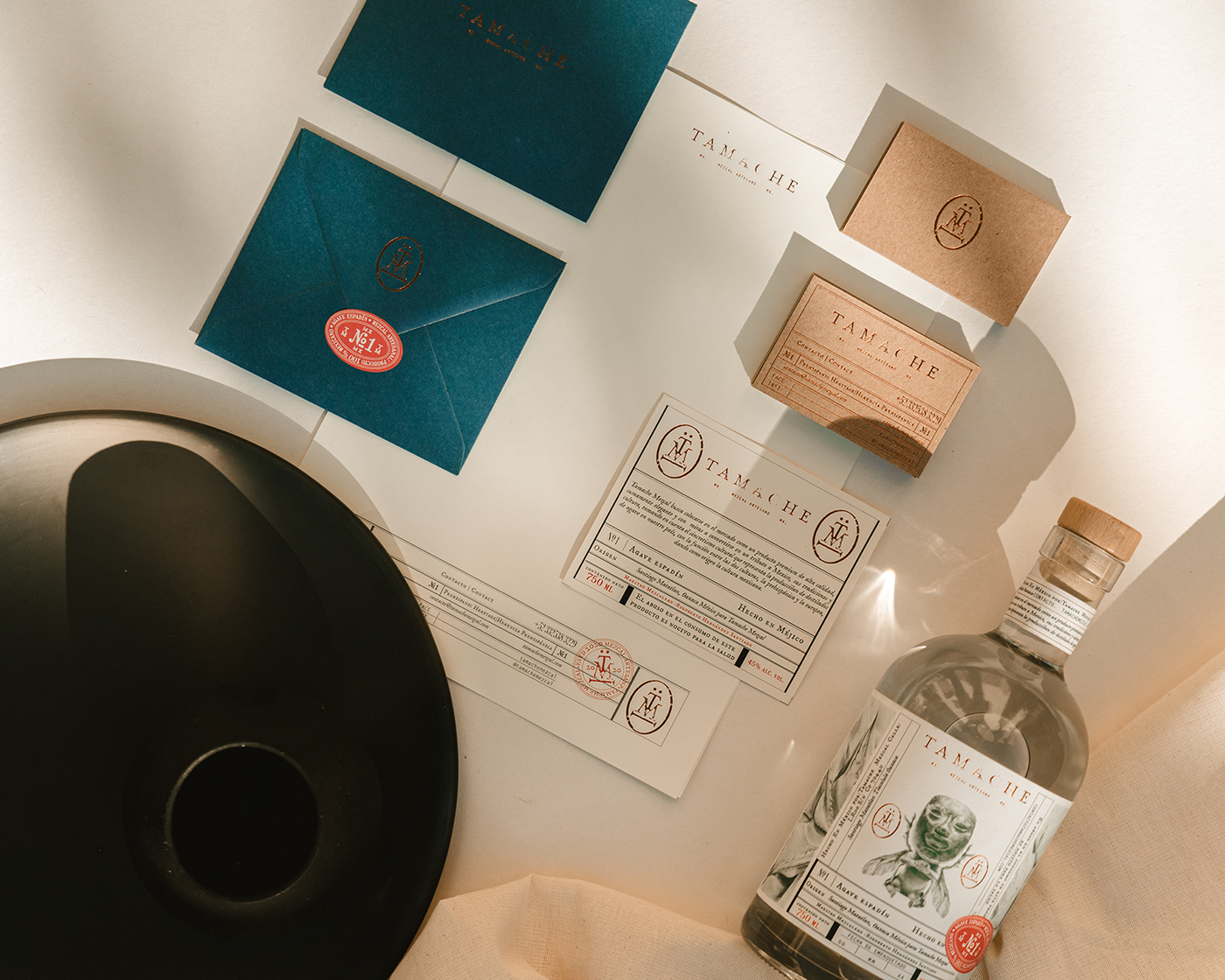
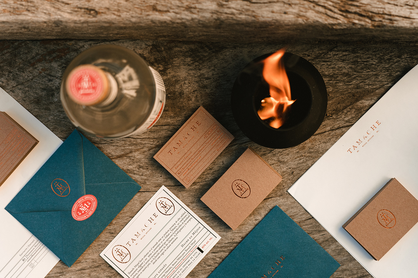
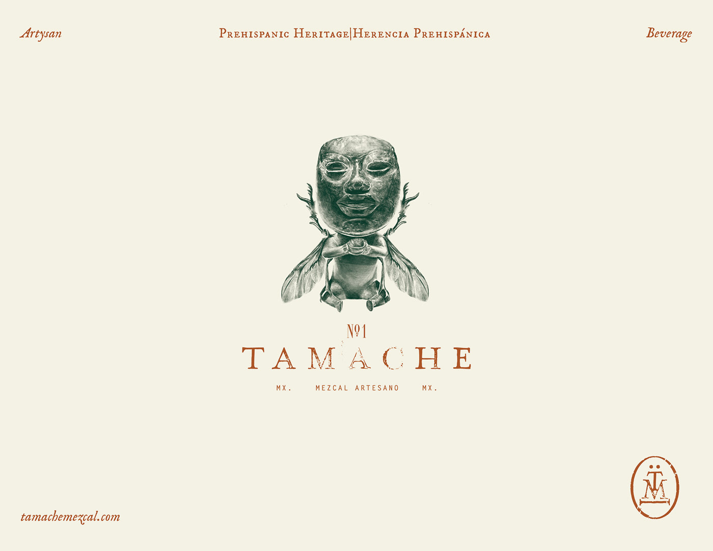
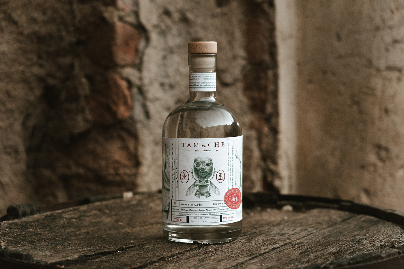
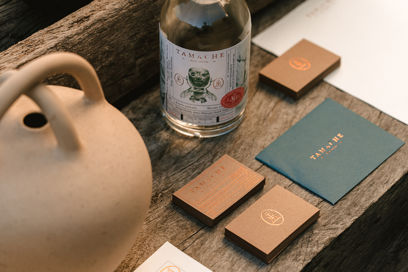
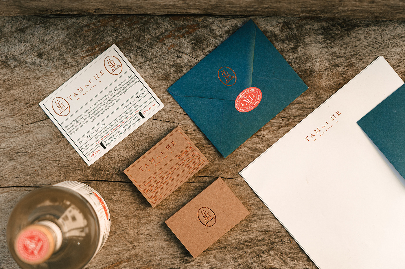
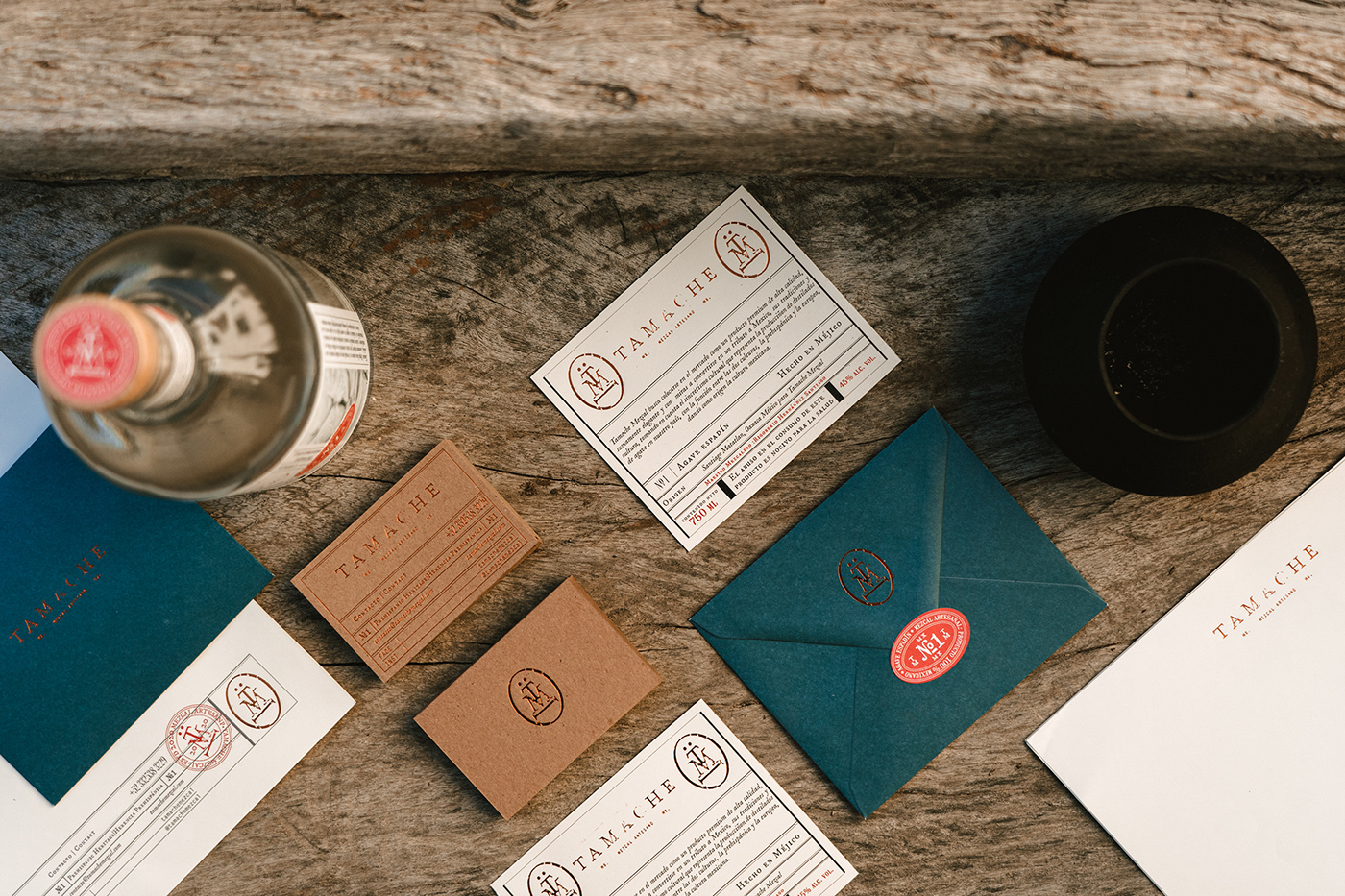
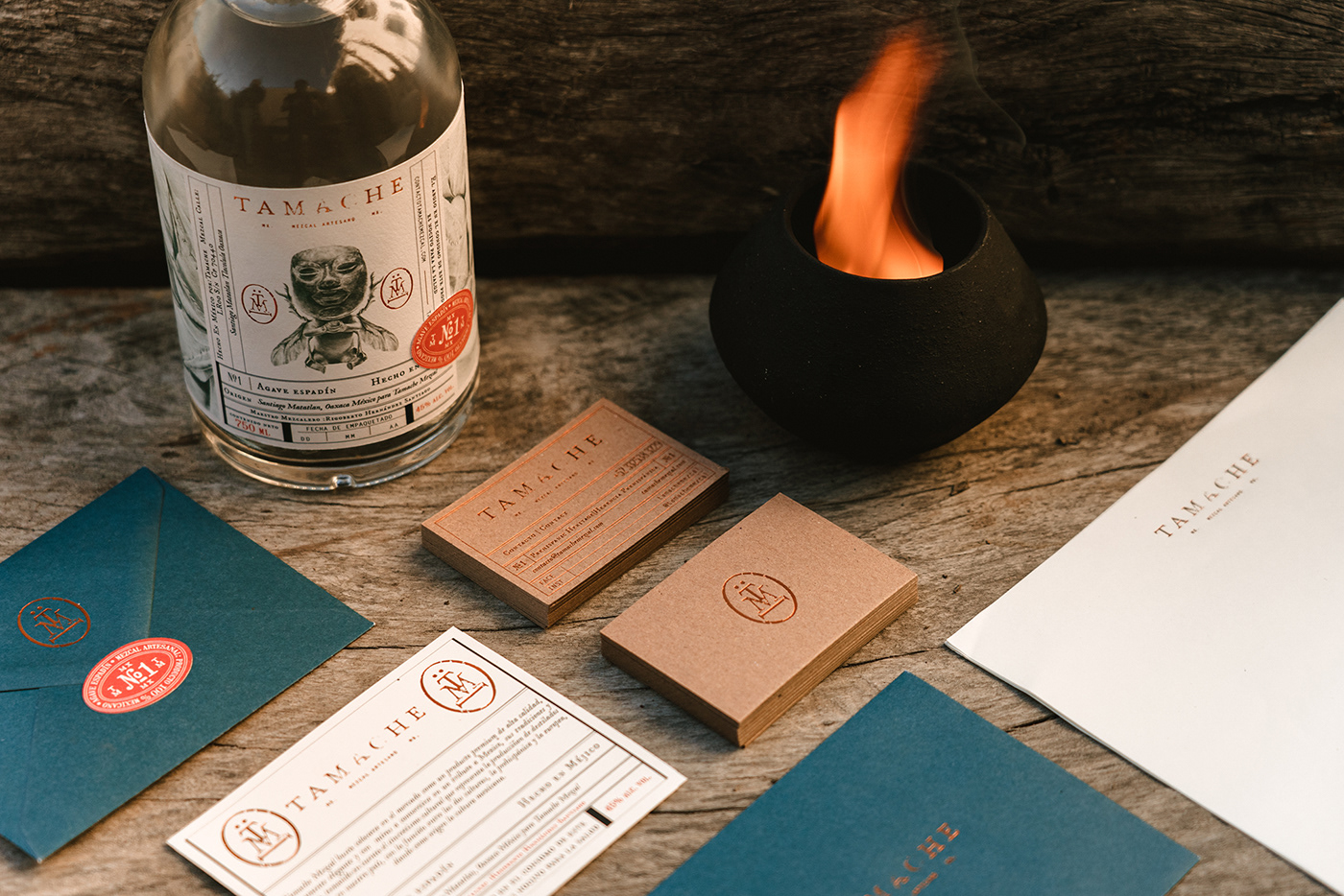
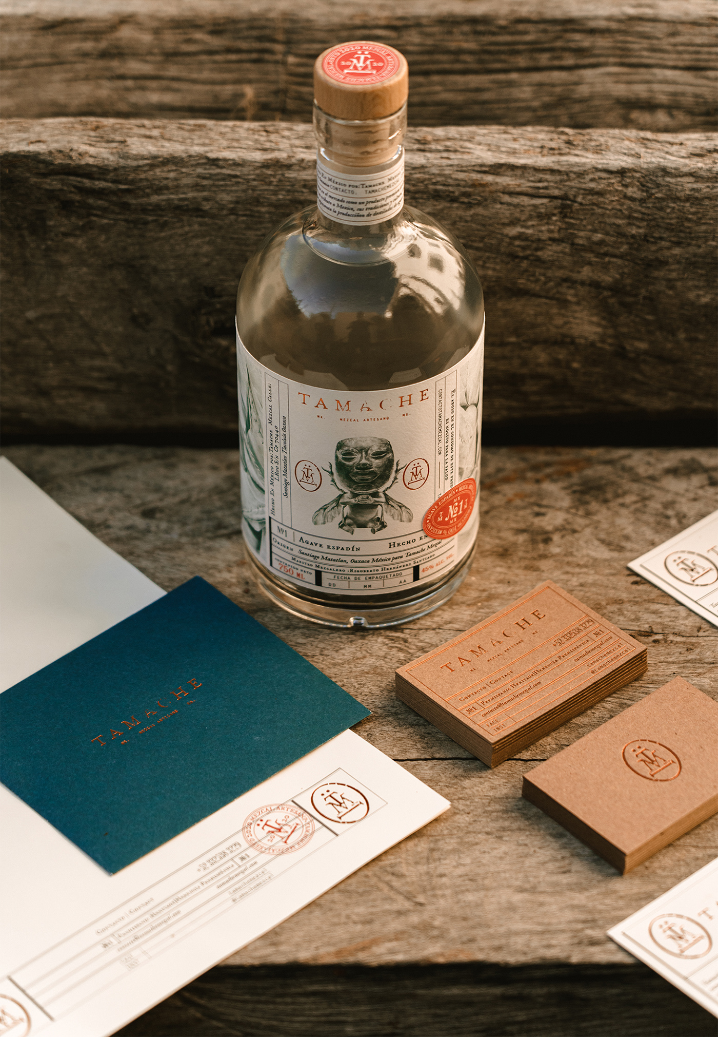
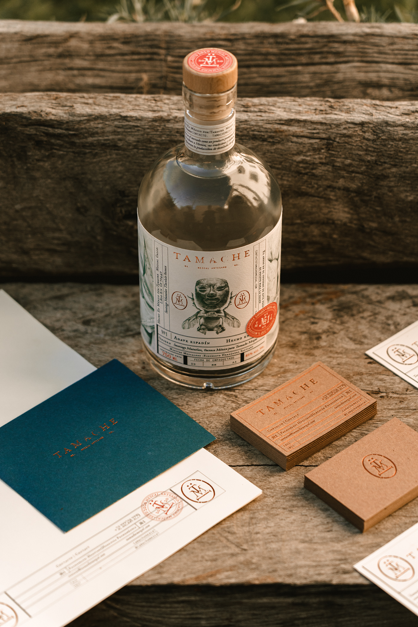
Although a craft spirit, Tamache Mezcal takes the classic “craft” cues to the next level in the branding, packaging, and collateral elements. There exist, of course, the mainstays that have become craft clichés – classic illustration styles, intruding seals and stamps, and the engineering form/table – but the Monotypo team takes things a bit further to create a relatively unique look.
What’s striking to me is how the classic, legacy vibe has been evoked in such a precise way. It doesn’t look like a retro-revival exploration, but a true evocation of an era. The Tamache Mezcal insignia is especially notable in its simplicity and perfection.
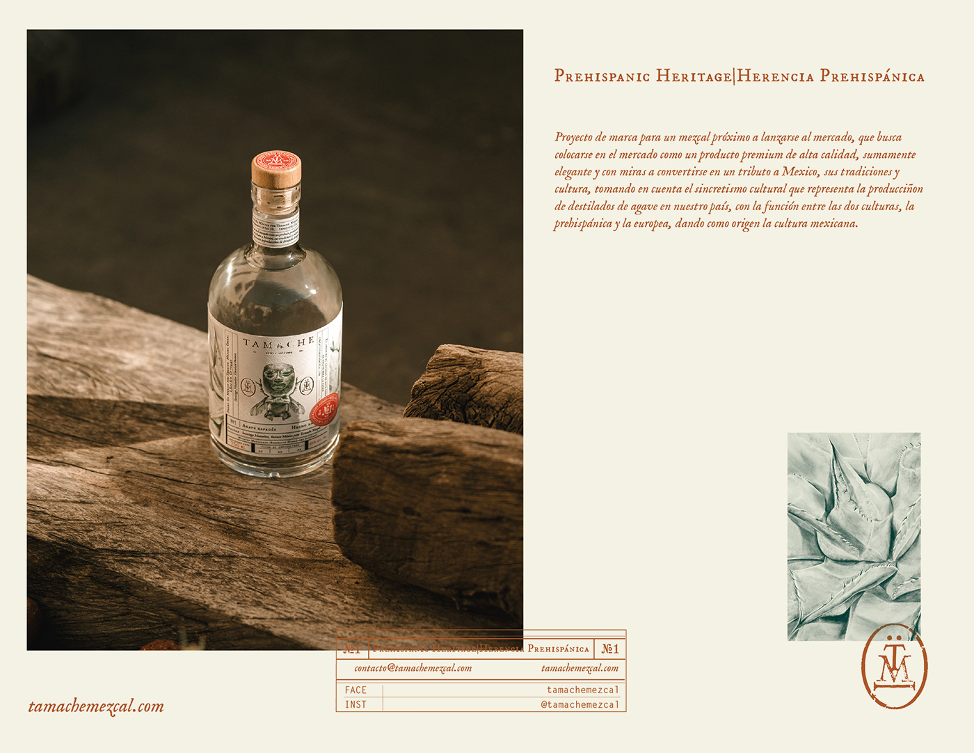
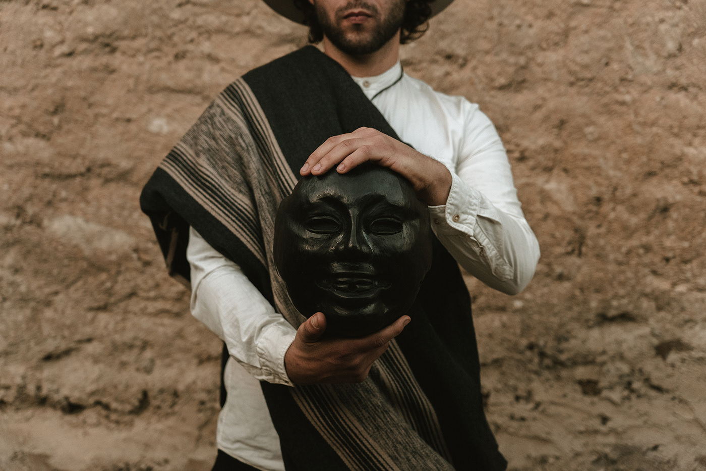
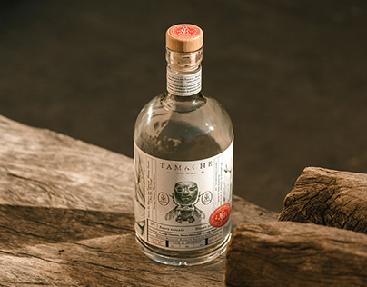
The illustration style of the main image is unique and intriguing. It features the mask of a pre-Mexican cultural icon. Mixed with European influences, this brand takes on a fusion of both cultures and how it evolved into today’s Mexico.
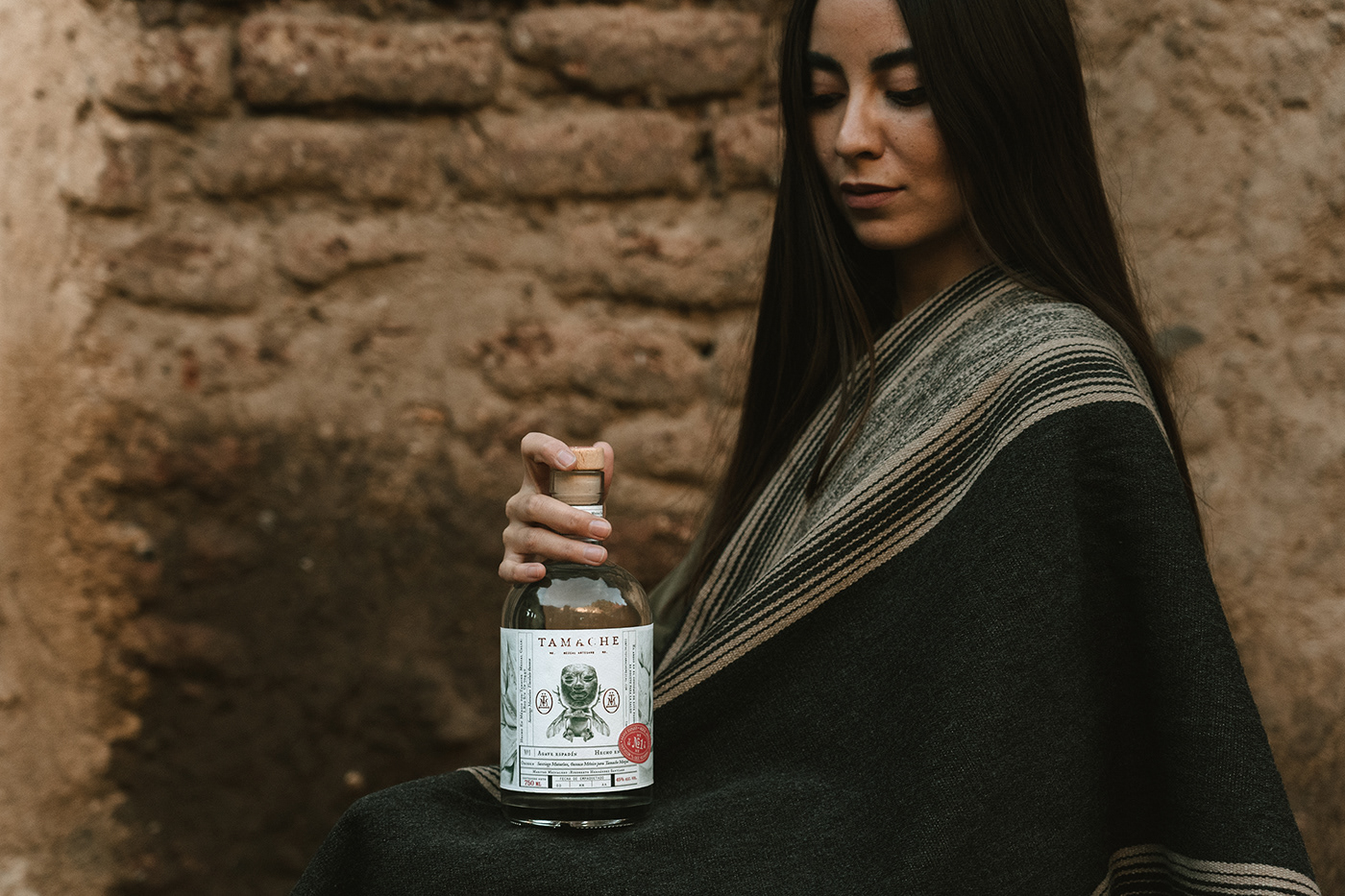
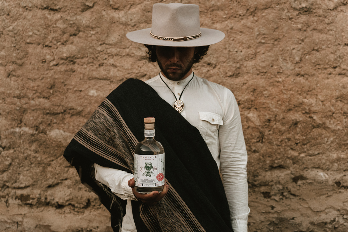
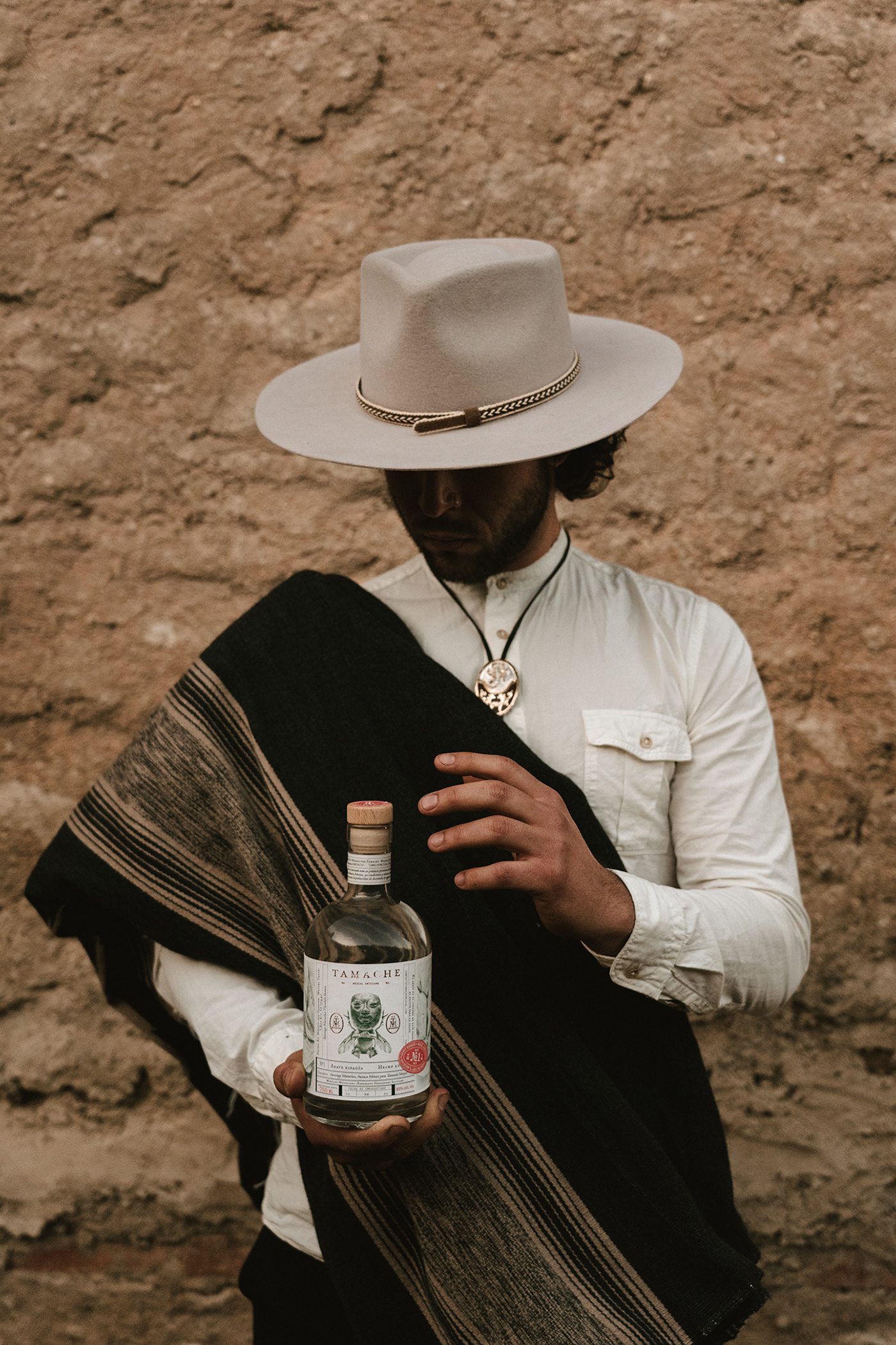
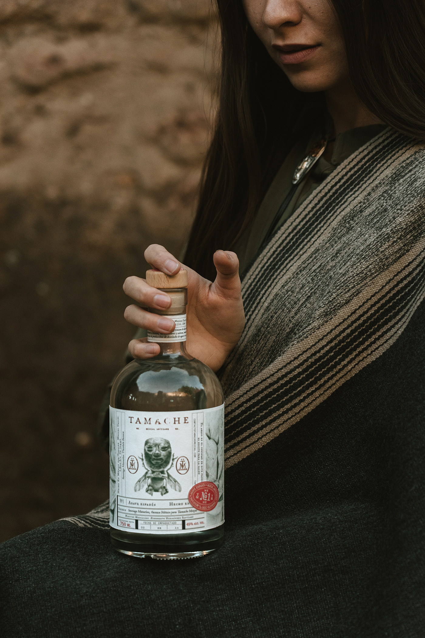
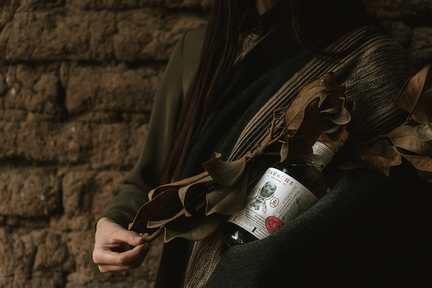
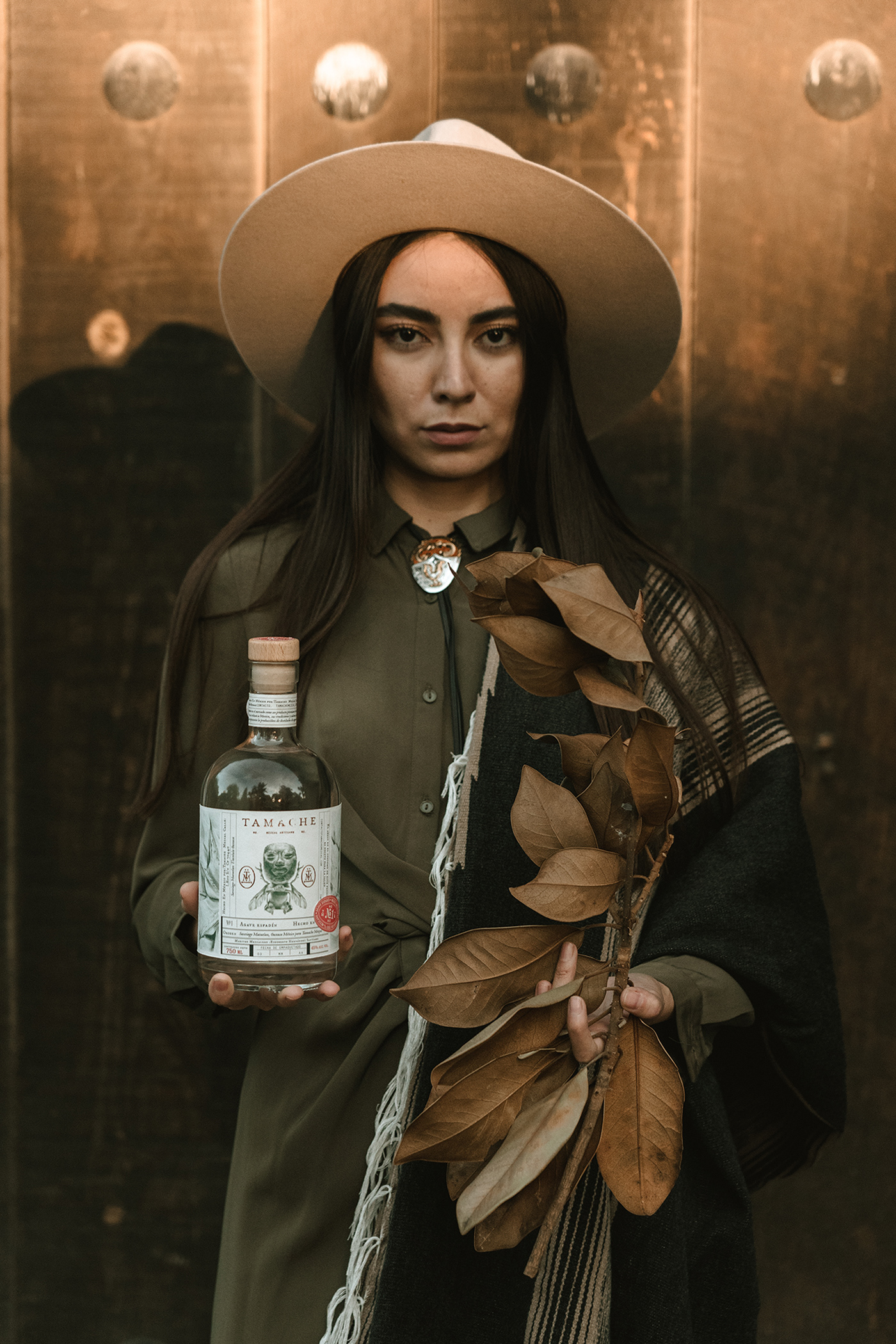
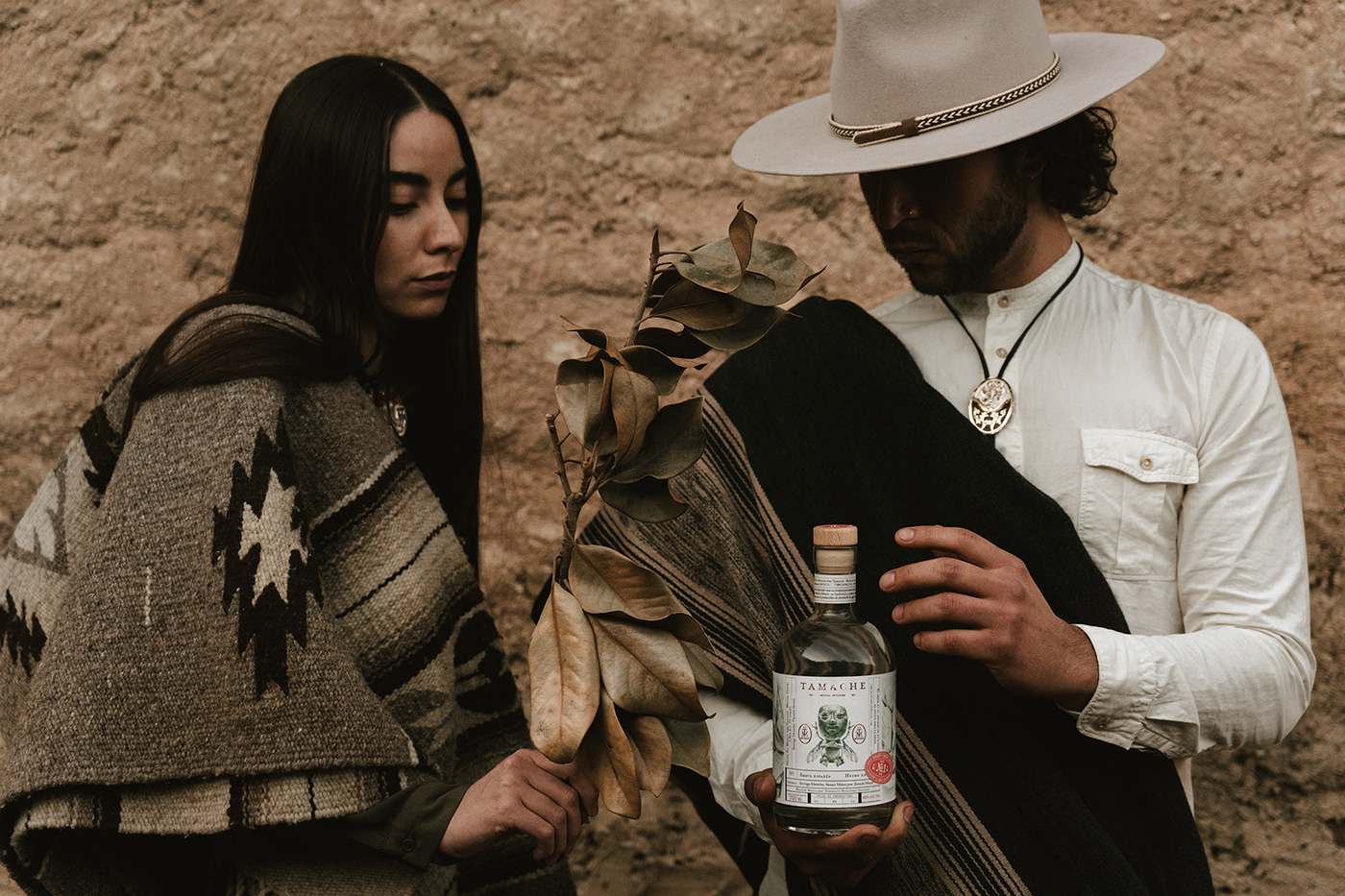
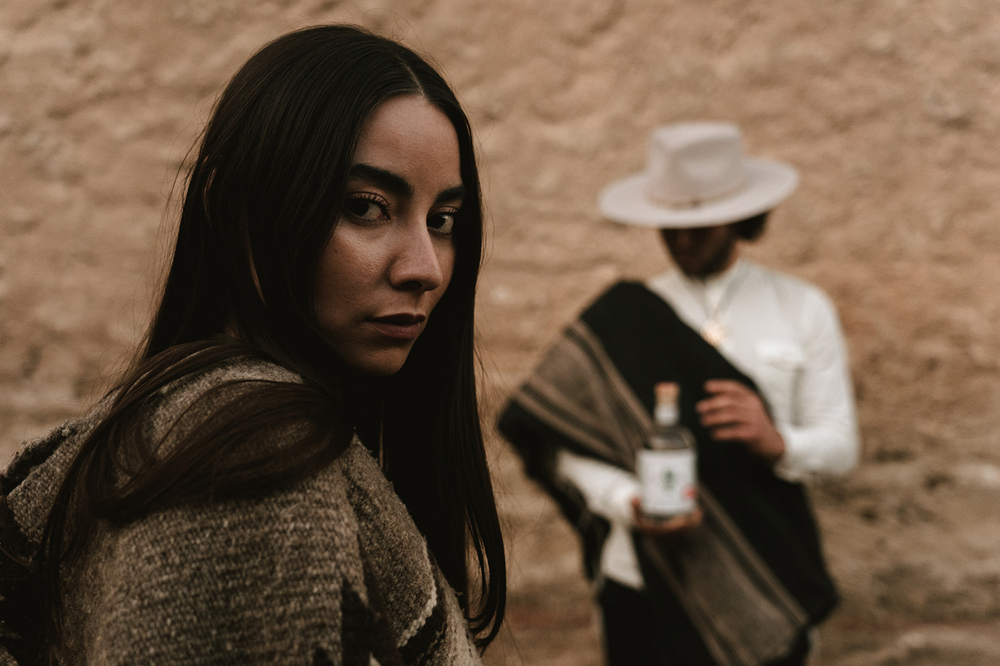
For me, what really sends home the suite of touchpoints is the lifestyle photography itself. It showcases the product and the root of the product’s inspiration in such a lovely way. Very well done.
Designed by Monotypo Studio


