
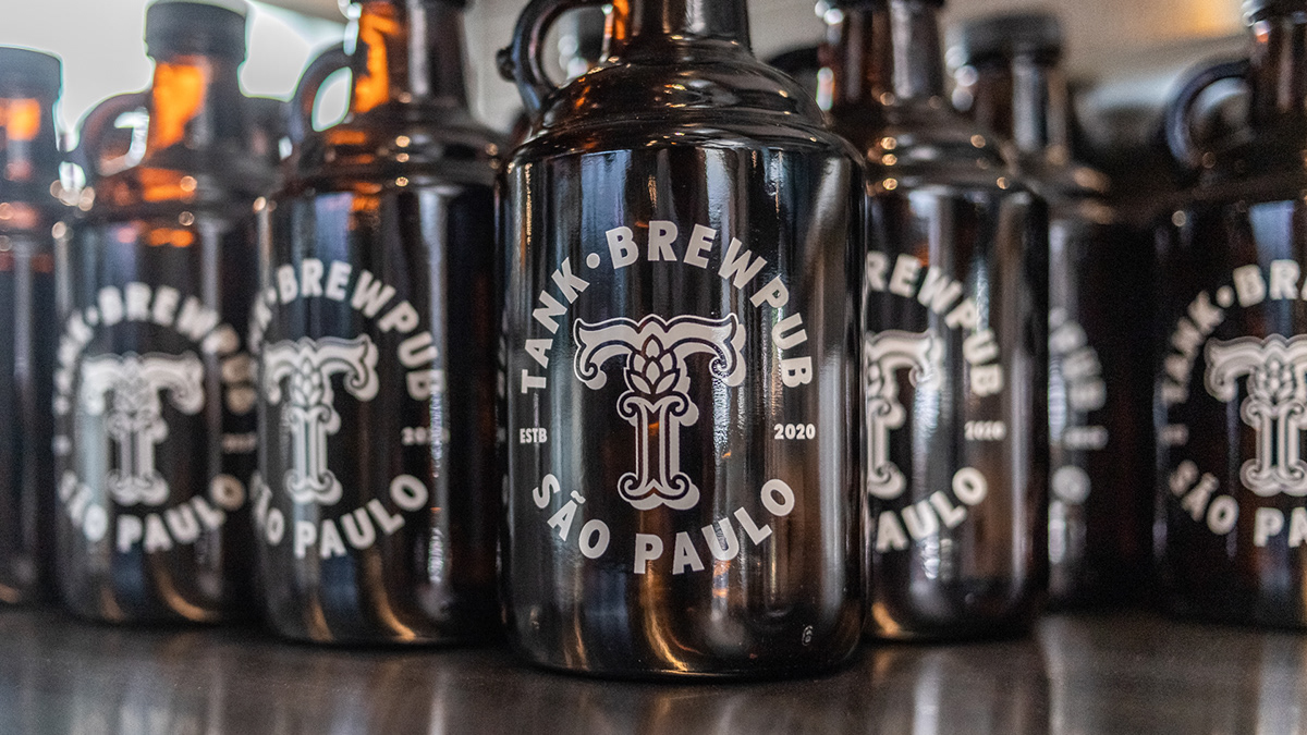
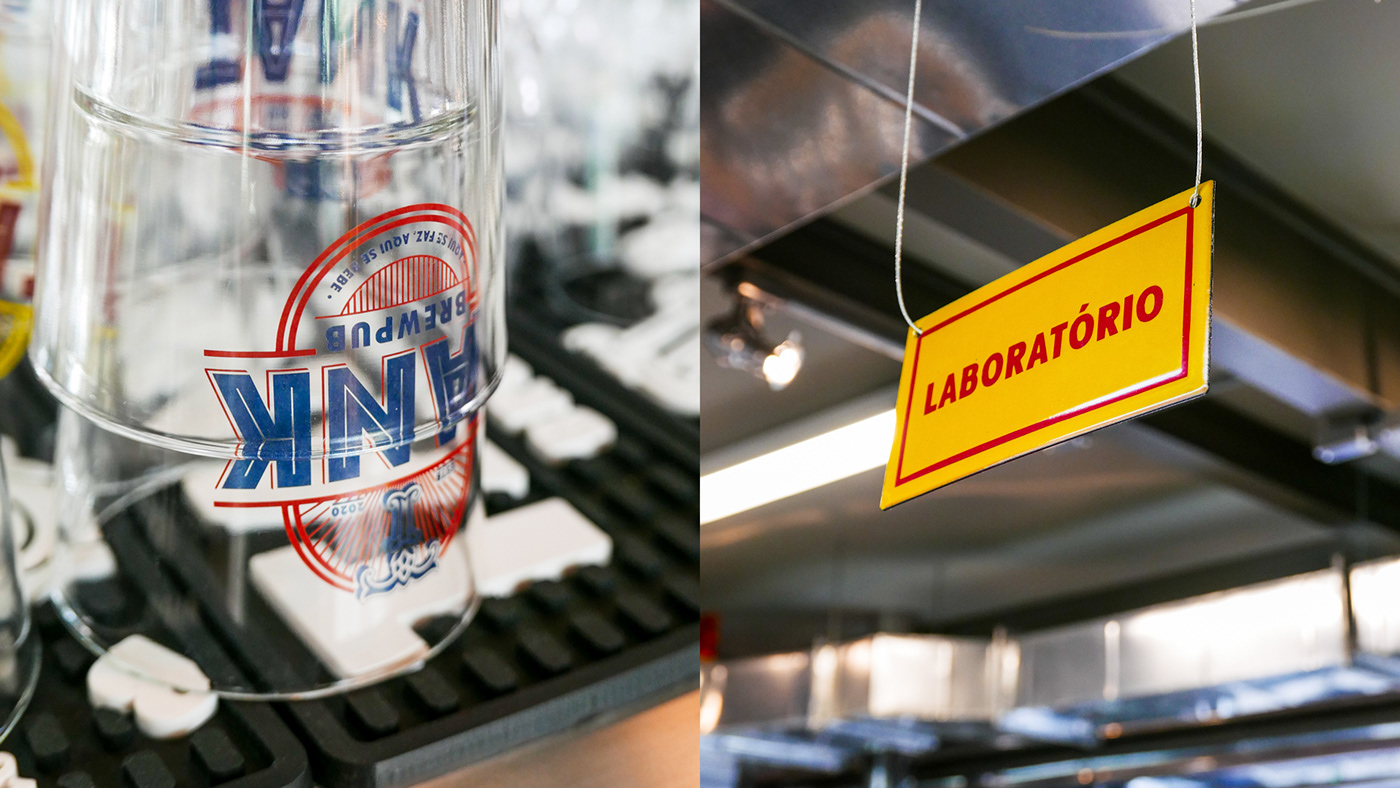
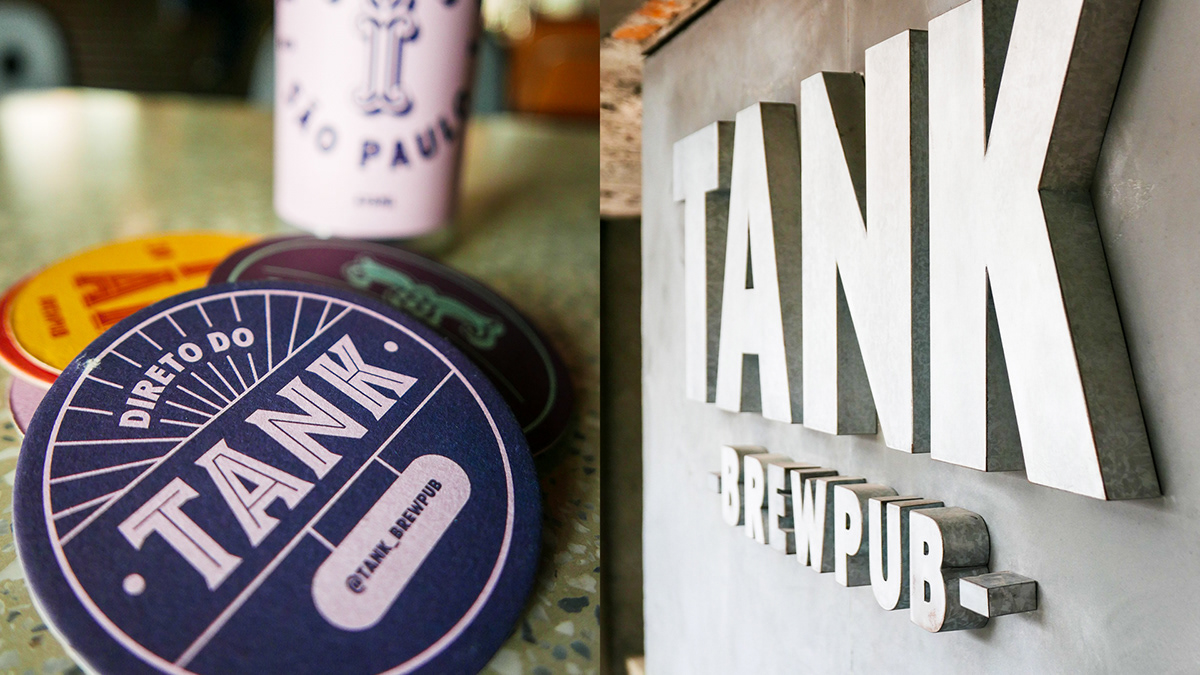
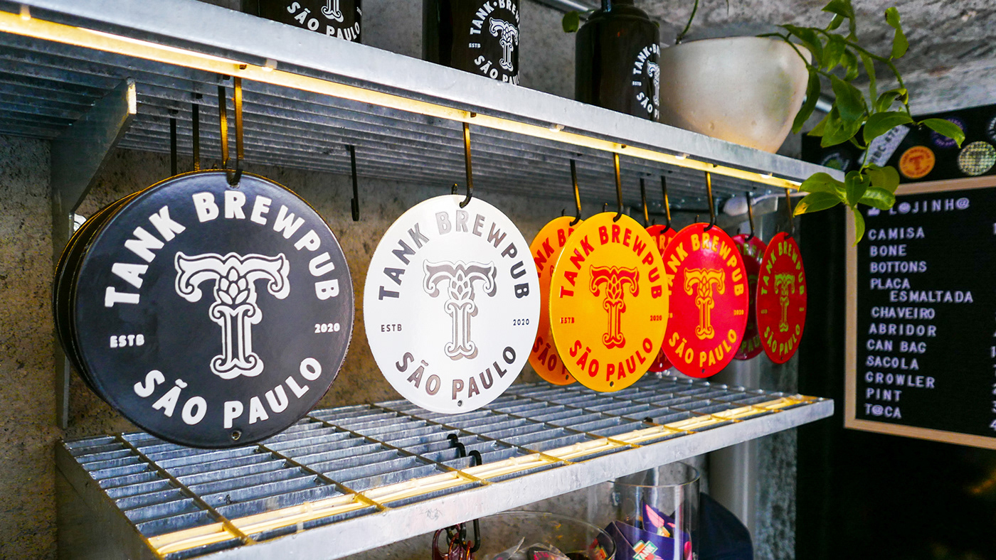
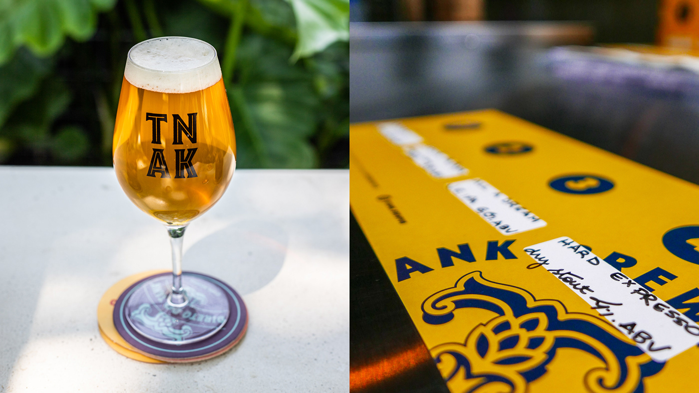
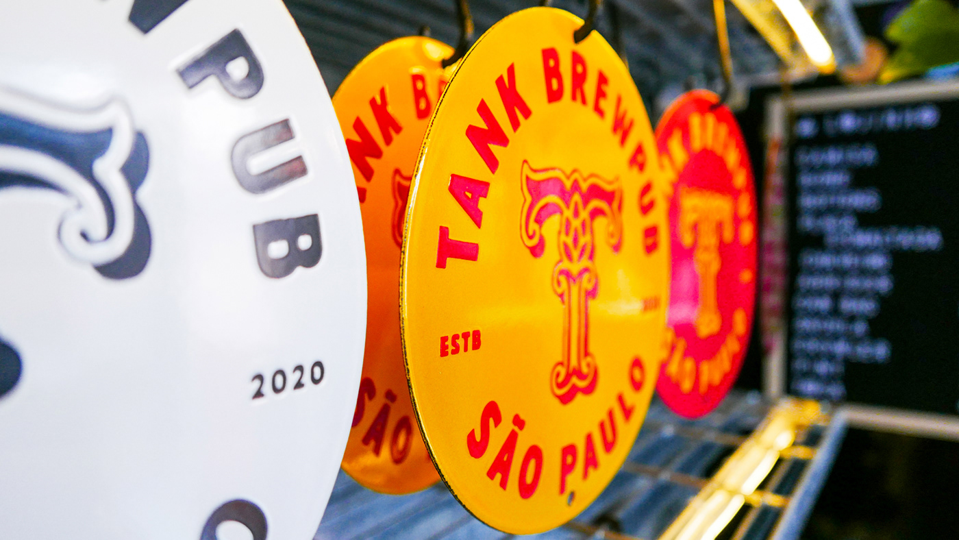
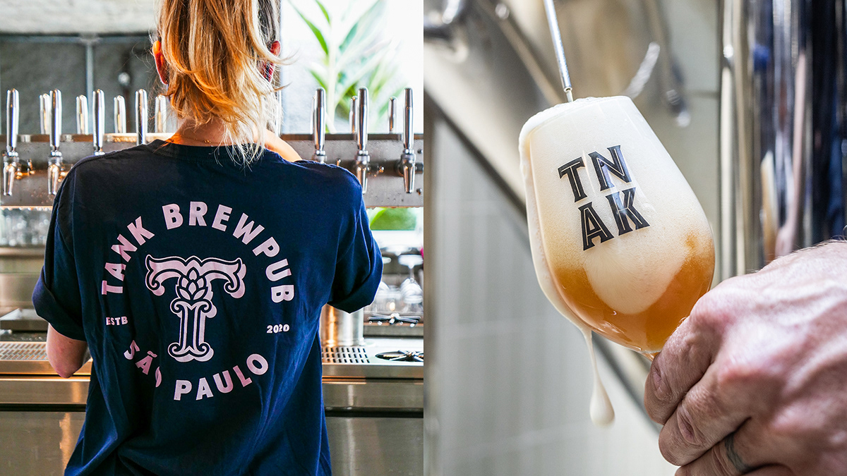
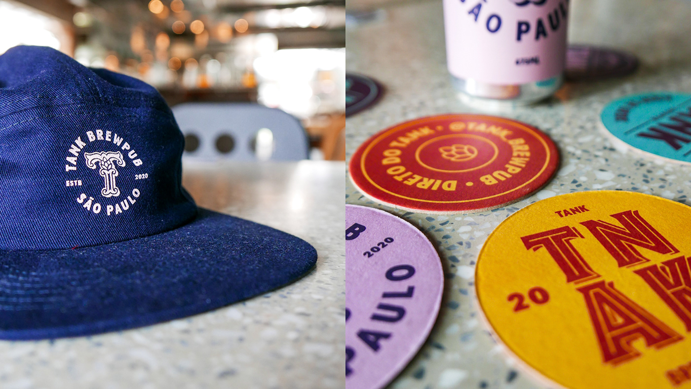
Tank Brewpub is situated in the Sao Paulo neighborhood of Pinheiros in a house built in the 1960s making for a quaint, but remarkable experience. The brewpub’s identity is bold, fun, and a mix of classic made modern.
A large, classicly inspired capital “T” letterform is at the heart of the brewpub’s brand identity. It integrates a hop flower (because why wouldn’t a beer brand show that?) in a way that’s natural and not forced. From this letterform springs forward a brightly colored identity with bold typography that makes a statement. Hopefully the beer does, too!
Designed by Papanapa Design
Architecture by Estúdio Penha


