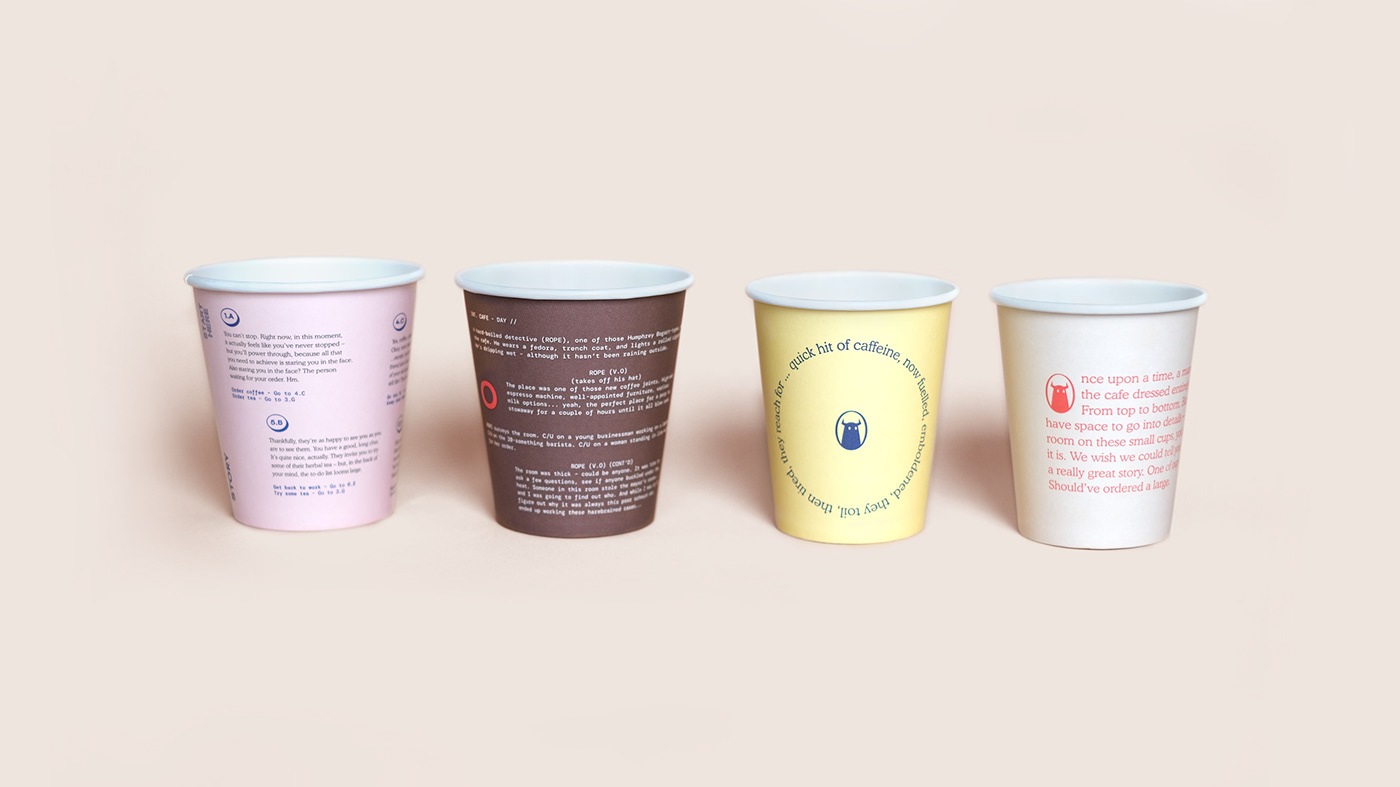
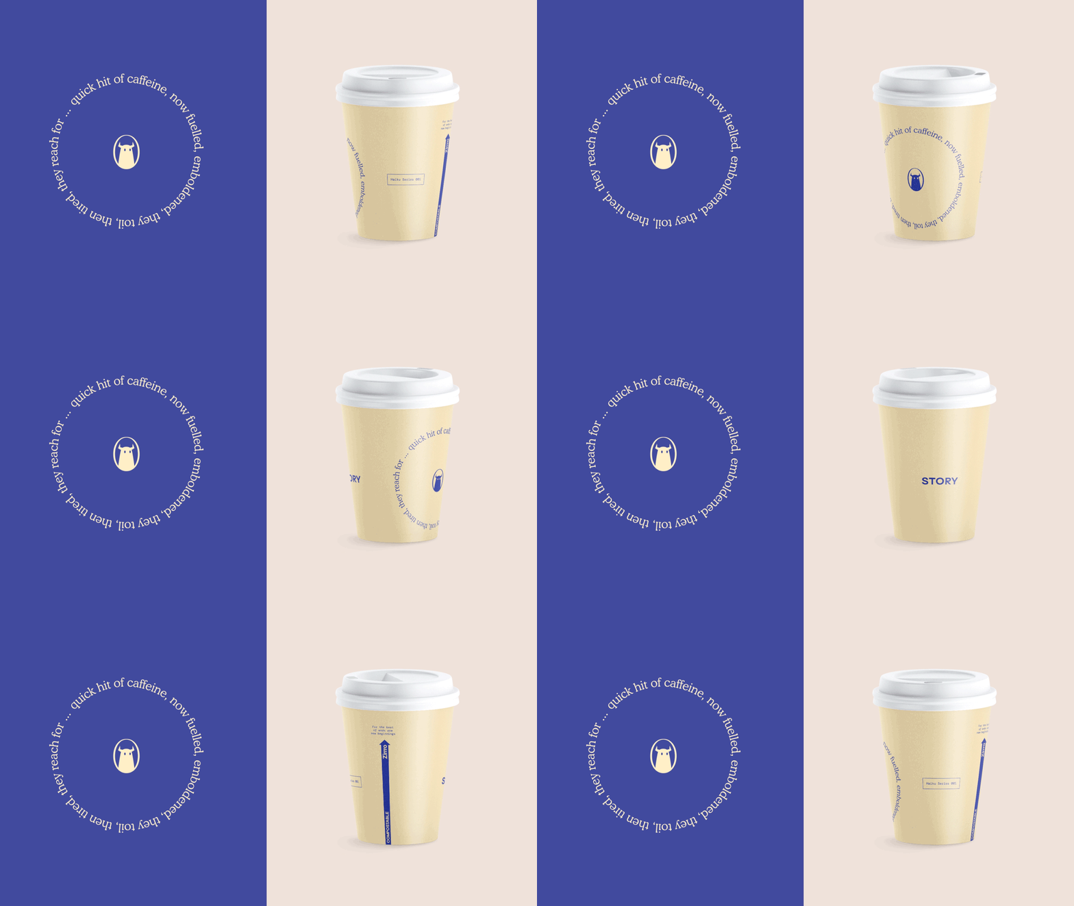
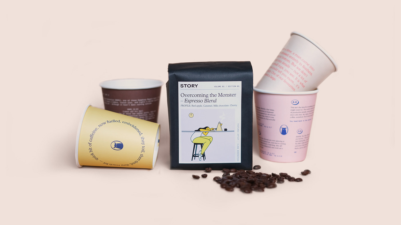
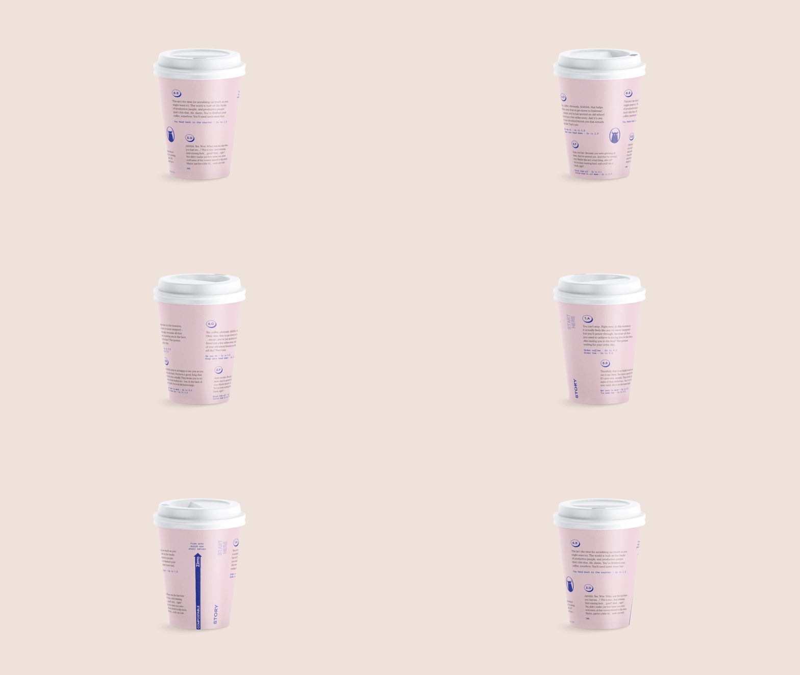
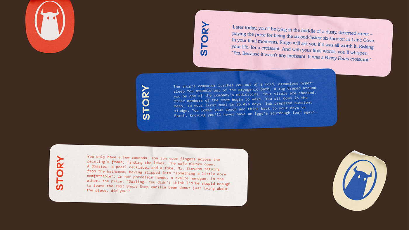
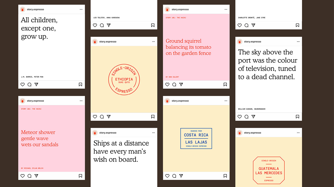
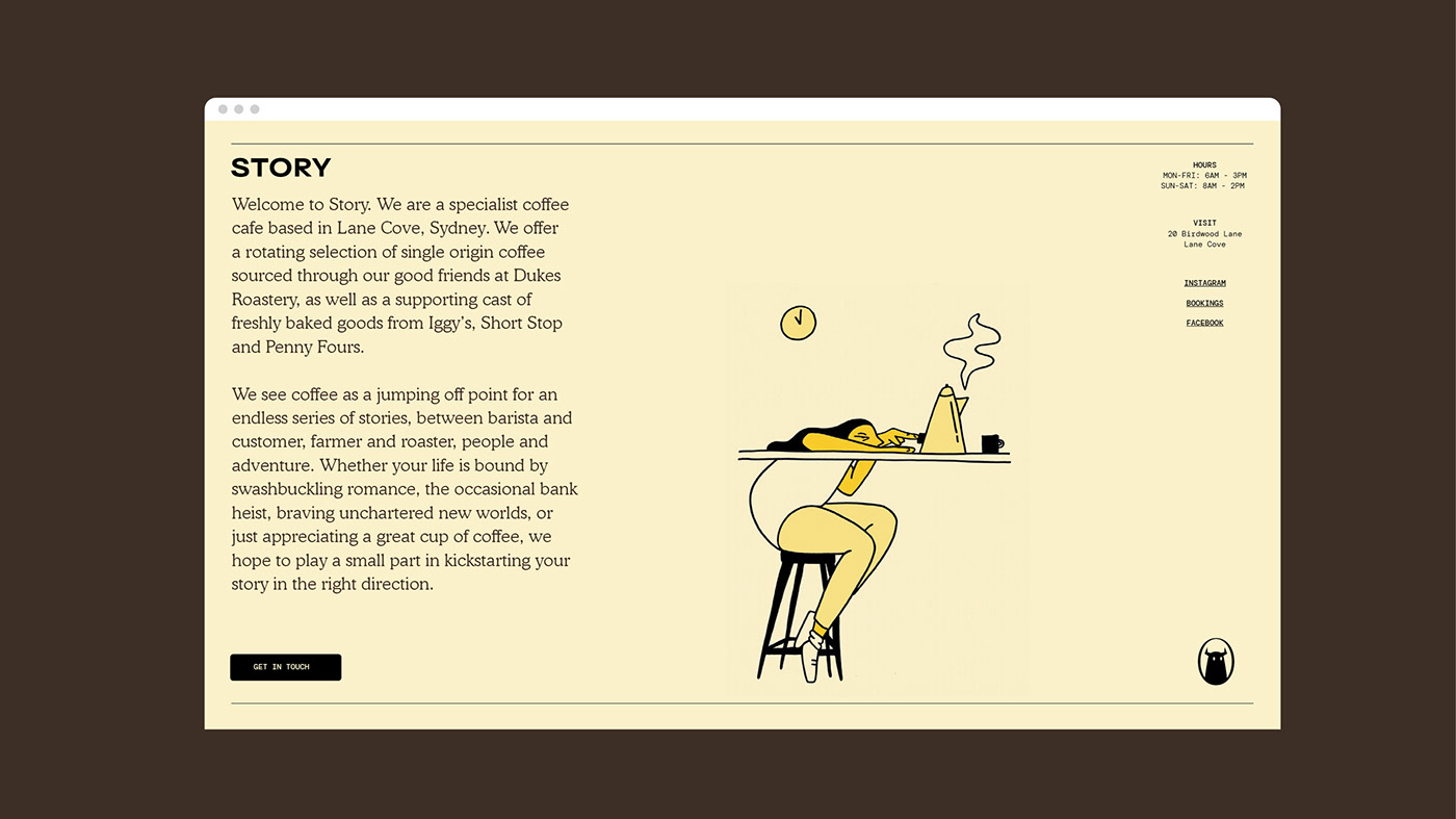
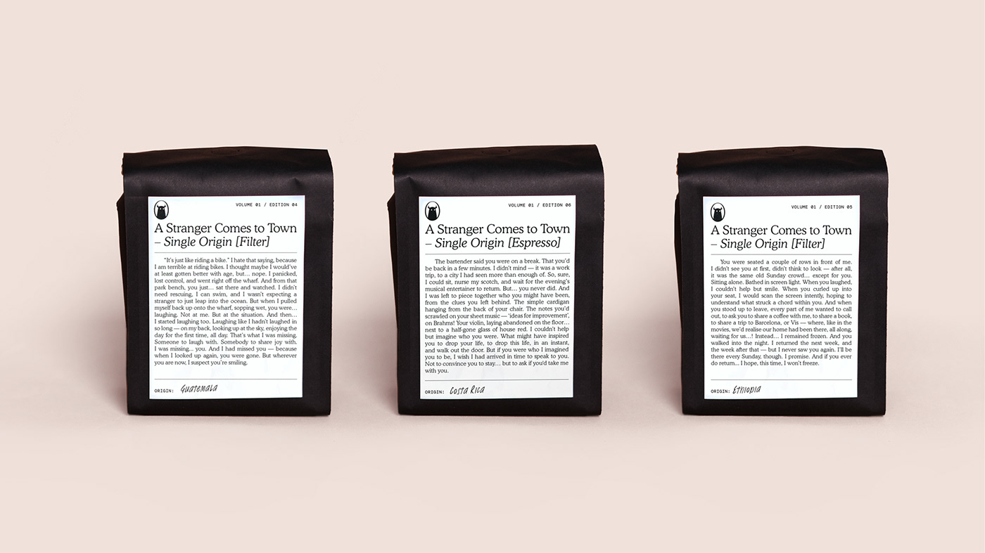
For the People agency branded Story Cafe and espresso with storytelling in mind. Coffee not only brings people together for conversation and catching up, it’s also that quiet solo moment that brings unexpected inspiration. Story’s design keeps consumers engaged throughout the brand experience through the use of methodically placed copy on packaging. The color palette is youthful with soft pastels and complementary bold pops. With the addition of surprise captions and stories, it leaves the coffee drinkers anticipating if they will get to find out what happens next.
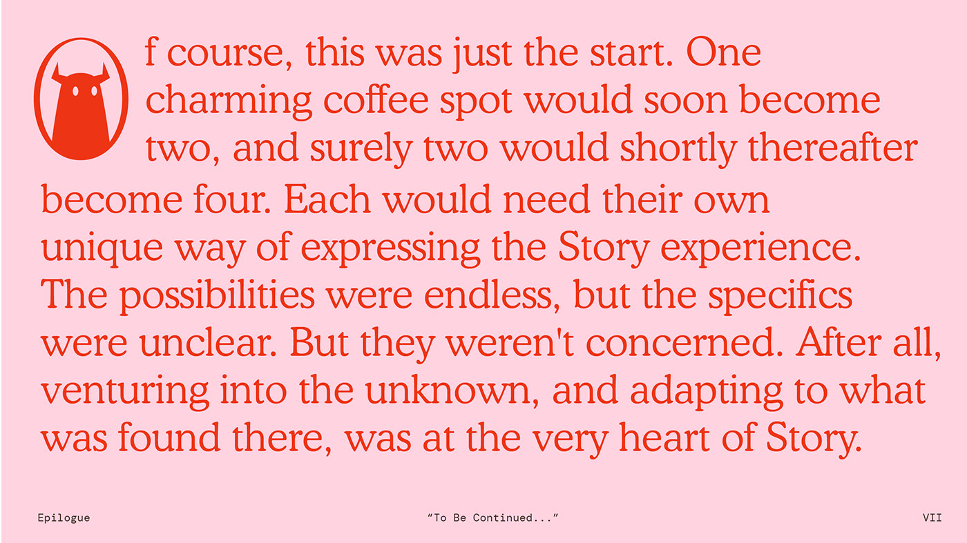
The graphic monster is the representational design element that begins each story. The 2-D design is simple and obvious but a bit mysterious. Shape choices in his eyes shift the emotional connection, making him warm and inviting.
From For the People’s case study:
For so many people, each day begins with a coffee – which means countless stories, no matter how action-packed, romantic or dramatic, all share a single origin. (Or, sometimes, a blend.)
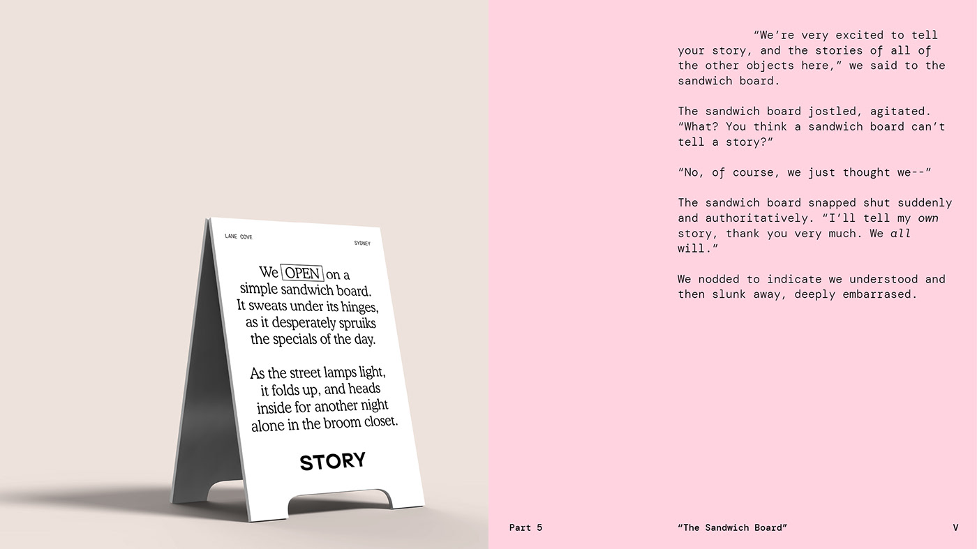
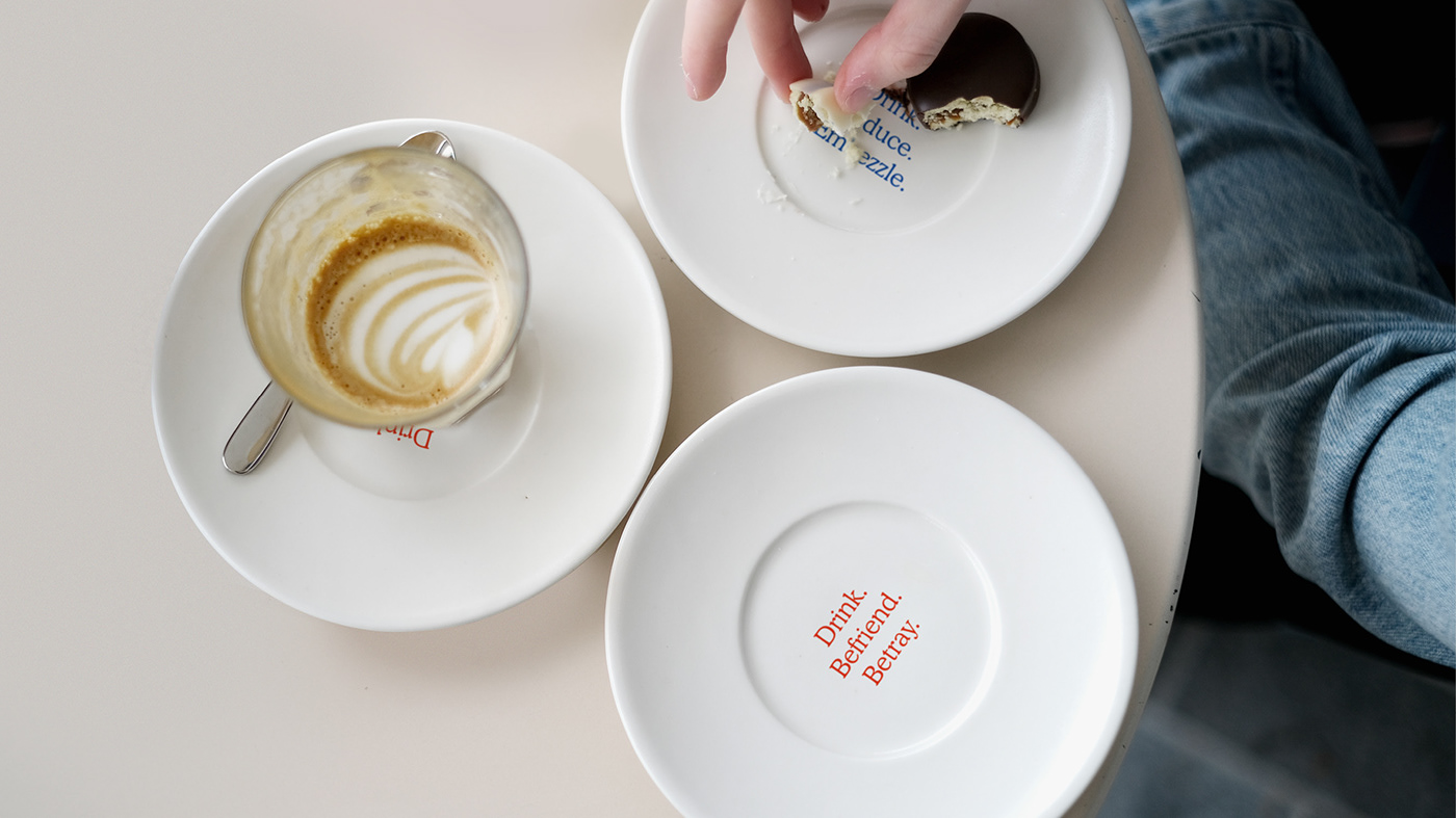
Story Cafe in Lane Cove celebrates coffee’s foundational role in life’s stories, by using every point of interaction as a jumping off point into a new type of story. A conversation over a flat white might become a love affair, for example, or a croissant might become the treasured prize to fight over. And as each new story enfolds, we show our respect to the legacy of storytelling, by exploring various forms (like haikus, screenplays, and branching narratives) or library-esque loyalty cards.
The enigmatic Monster character watches over the proceedings, representing the great unknown of stories yet to be told, and illustration collaborations allow the brand to explore non-verbal storytelling from non-traditional perspectives on limited-edition packaging and merchandise. But all of these different expressions are united by a core belief: as long as you’re open to it, your next great story could be just around the corner.
Story Cafe by For the People
