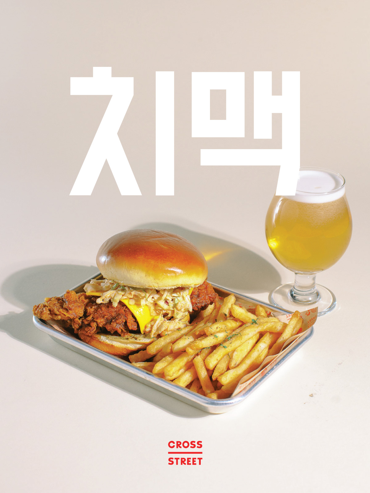
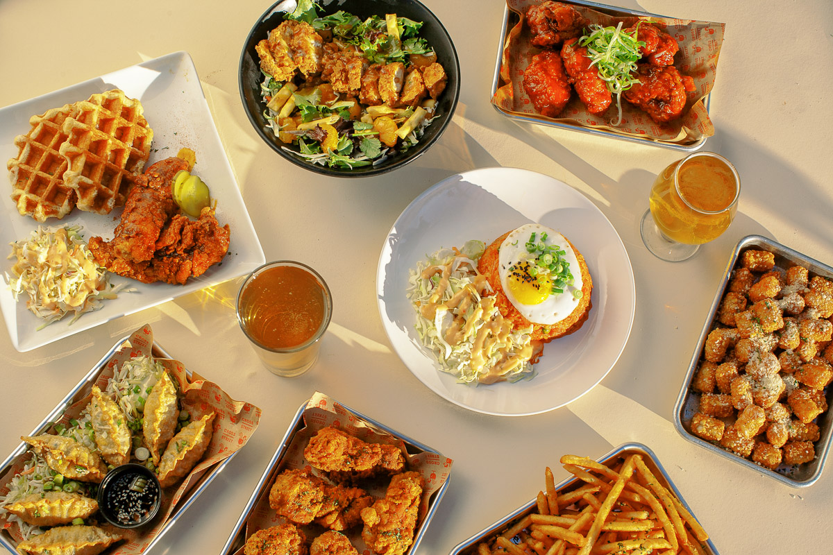
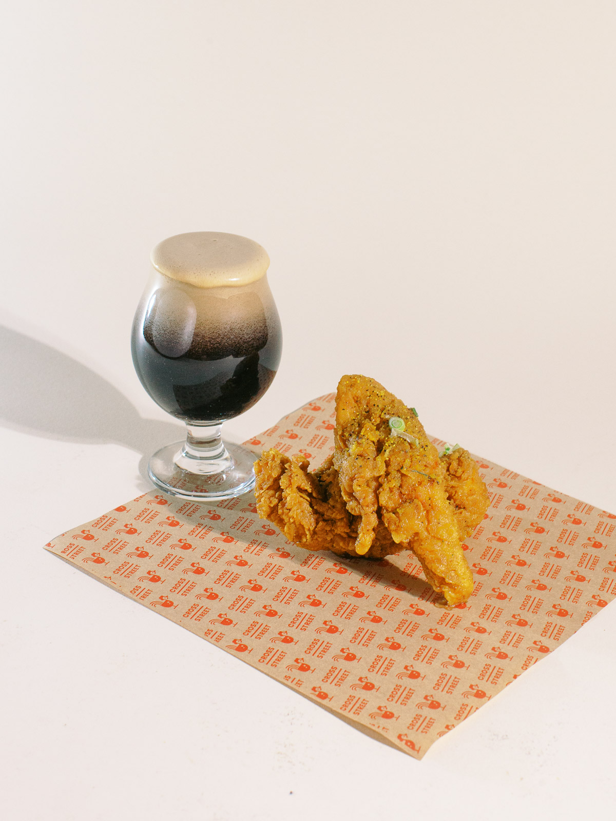
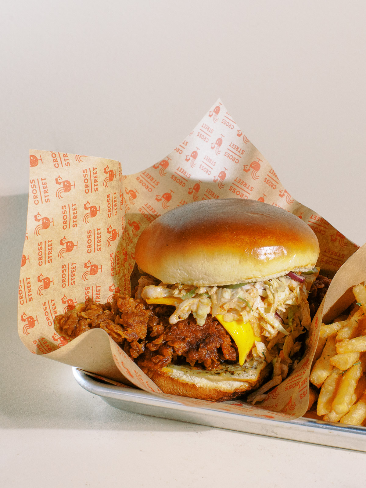
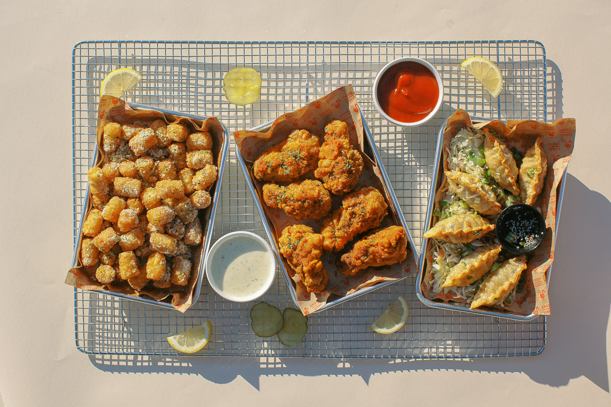
Cross Street is a chicken and beer restaurant explained by the designer as a “Korean Fried Chicken meets Classic Southern Cooking — our heart for both traditional flavors and creative foods meet at a crossroads to bring you extraordinary chicken. Accompany with our 20 Beers on tap with over 5 imports, signature soju cocktails, and specialty Korean bites.”
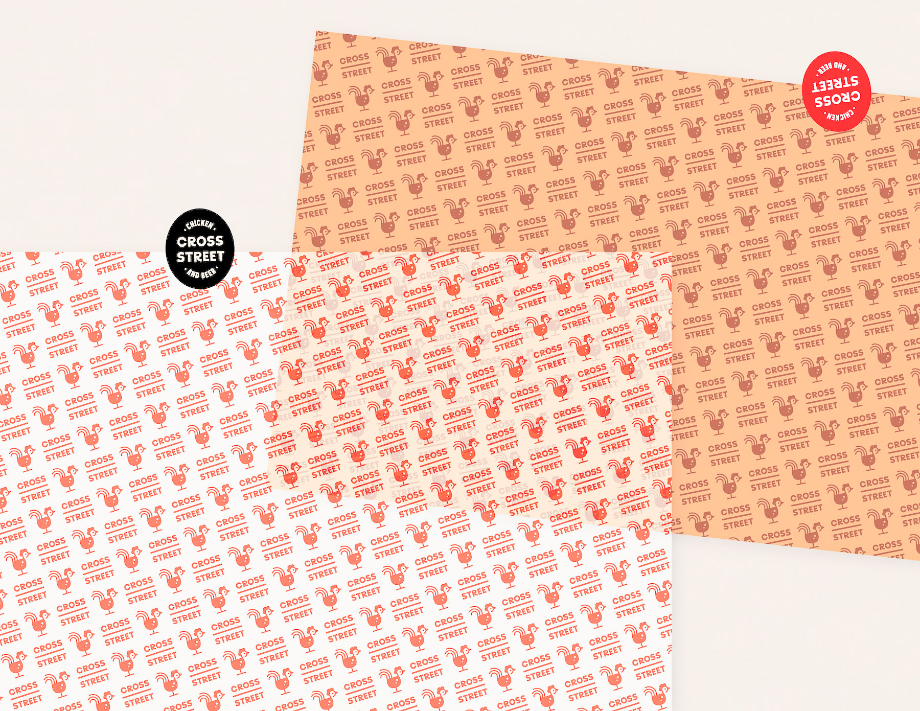
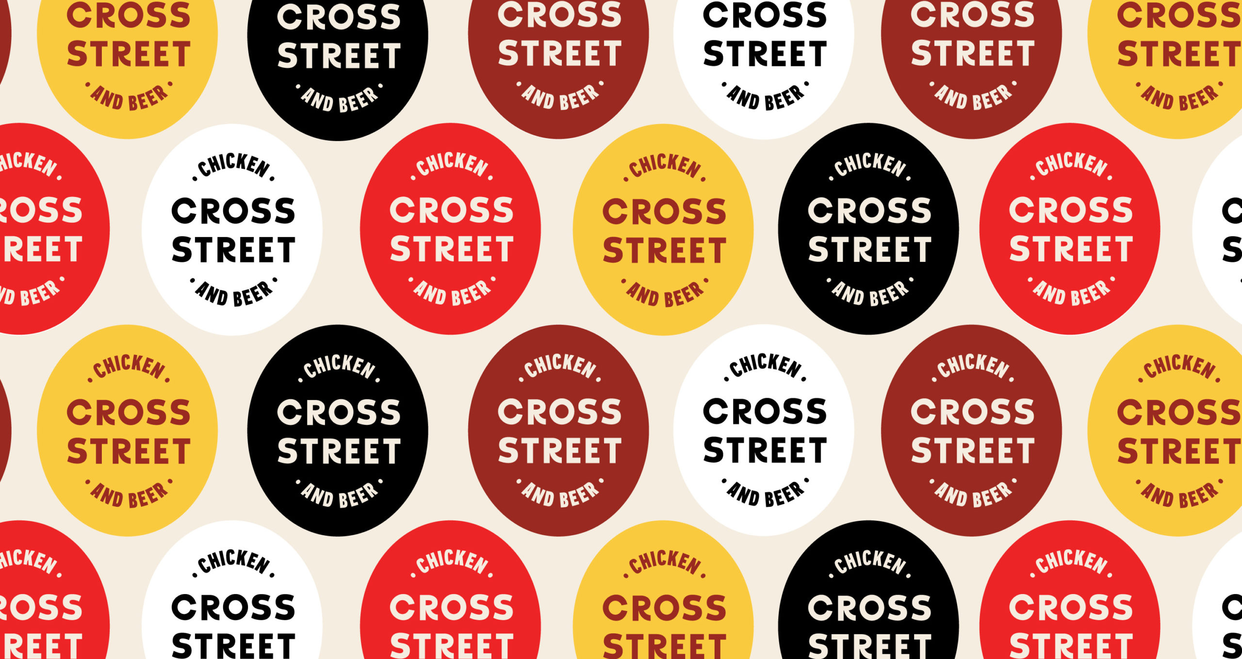
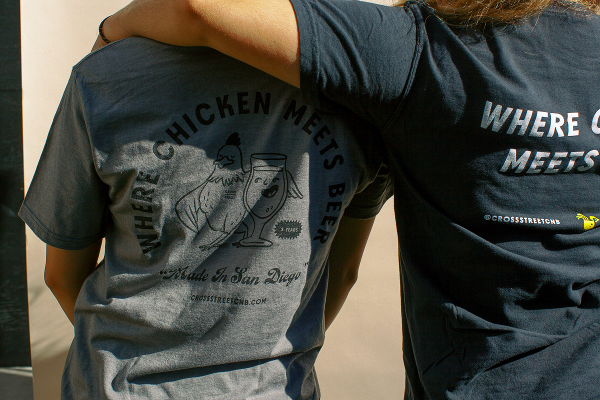
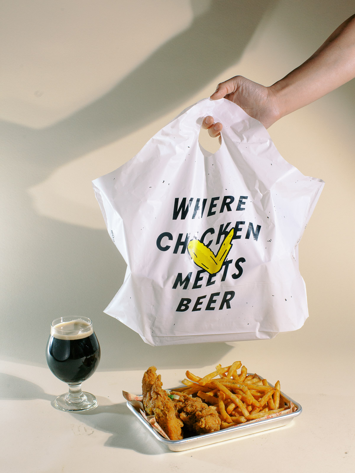
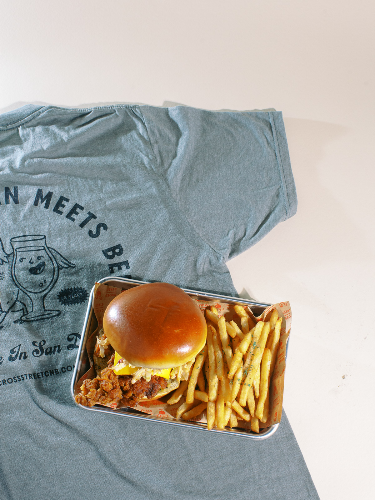
Meiwen See, the brand’s designer, takes the visual identity to a world of whimsy with a combination of cute, lo-fi illustrations mixed with halftone screen textures and strong typography. The warm reds and golden yellows evoke the feeling of condiments and classic restaurant aesthetics to instill a sense of approachability and casual vibes.
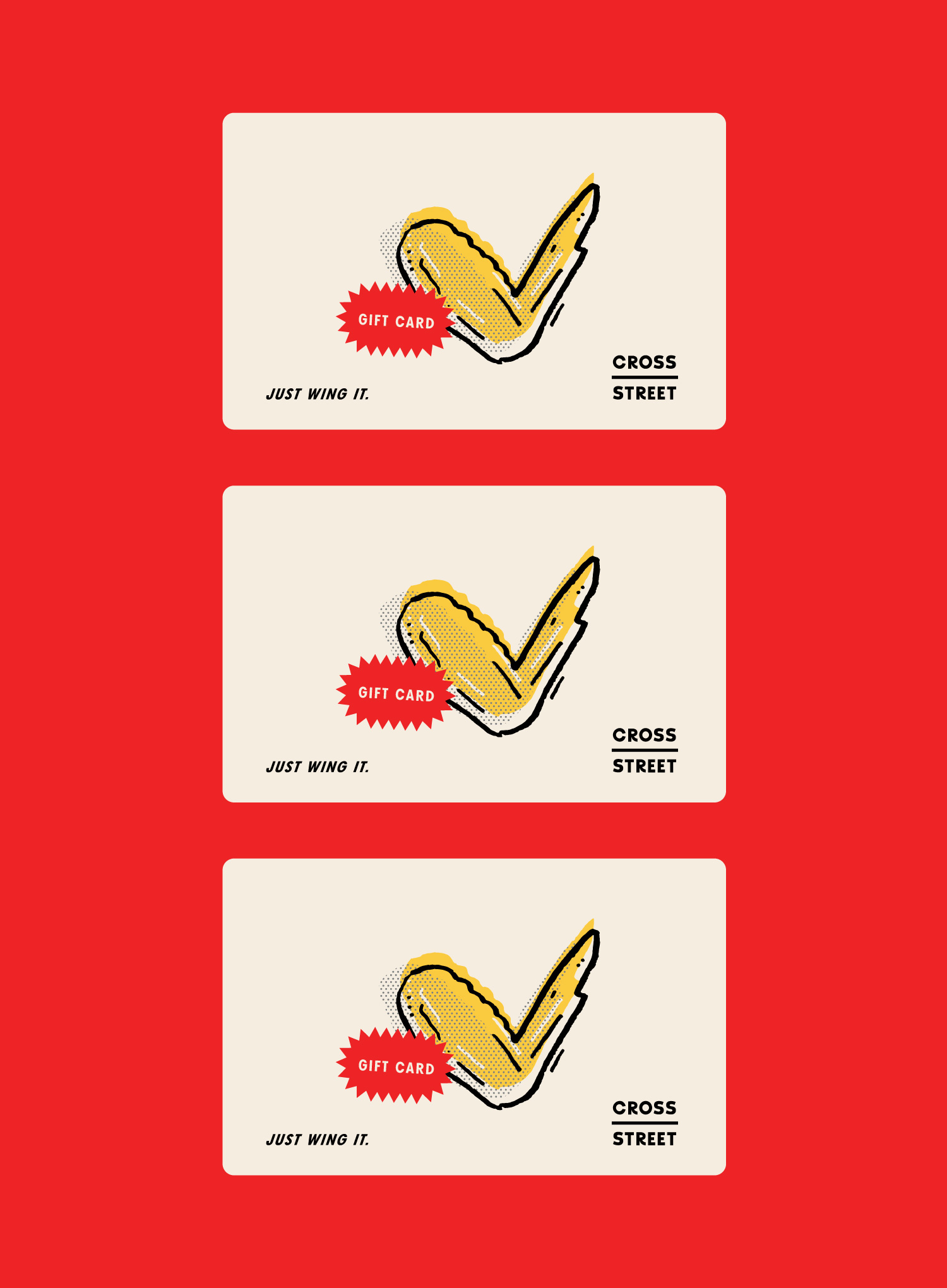
The brand’s verbal identity shines with witty one-liners like “just wing it” and “we pride in fried.” This further instills a sense of approachability with a familiarity that feels fun.
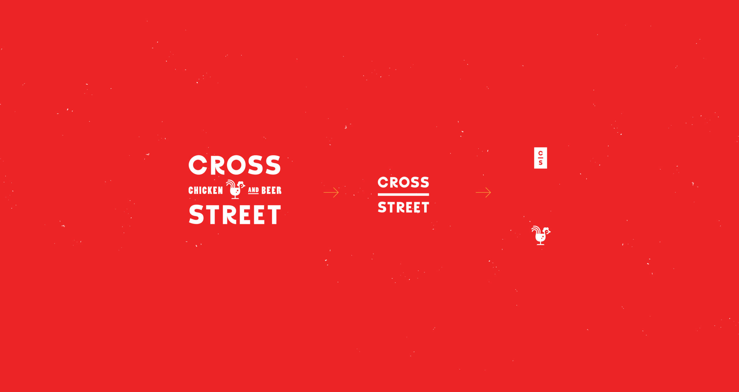
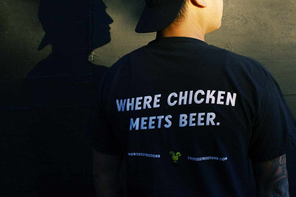
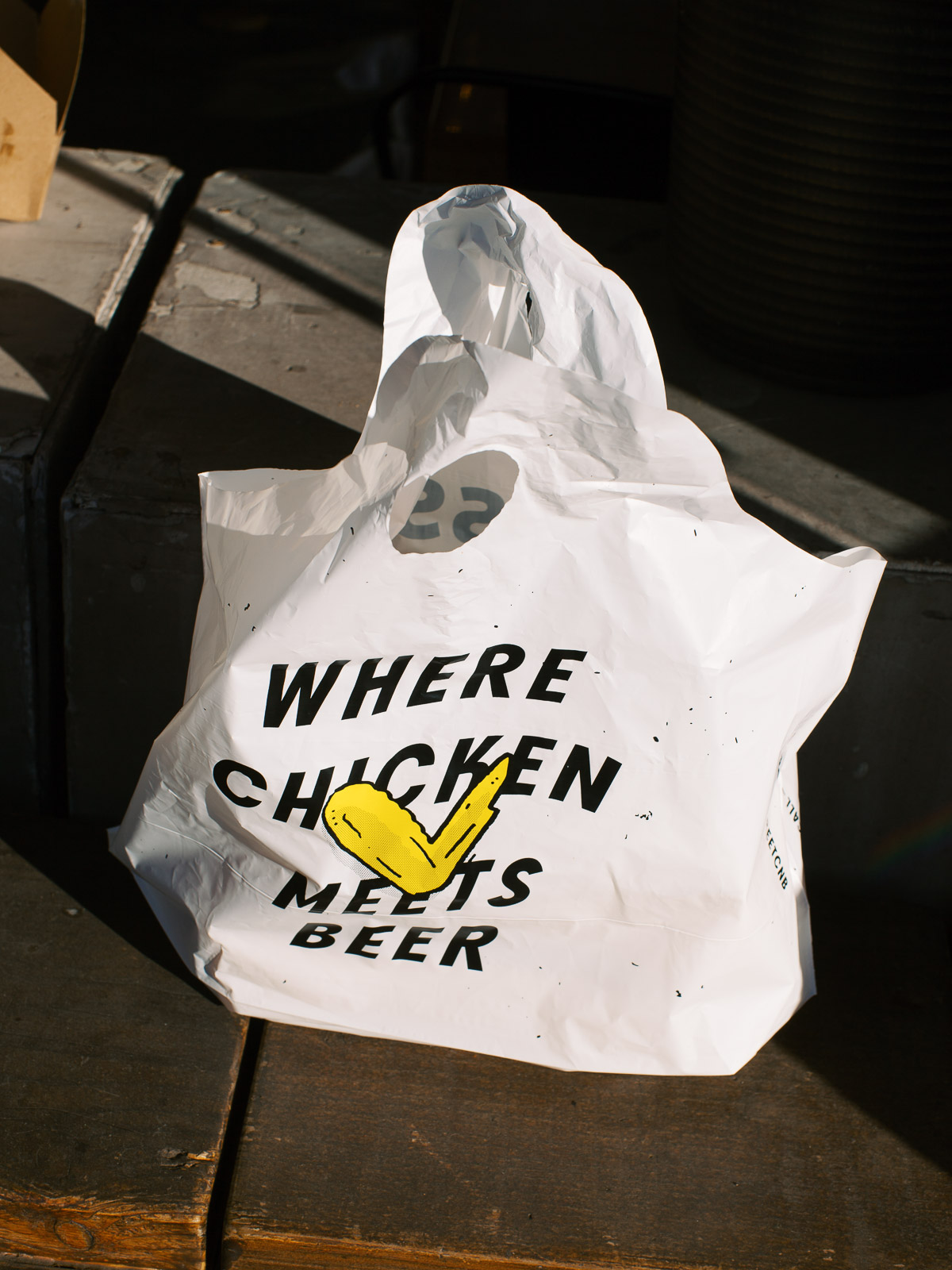
A chicken meets beer class icon serves as the brand’s core brand mark. It’s a brilliant way to represent the restaurant’s core product offering as it delivers a moment of unexpected “aha!” when one finally sees the beer glass.