
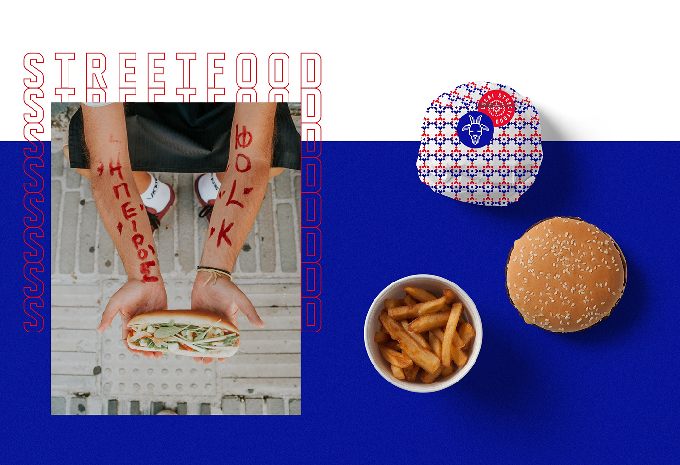
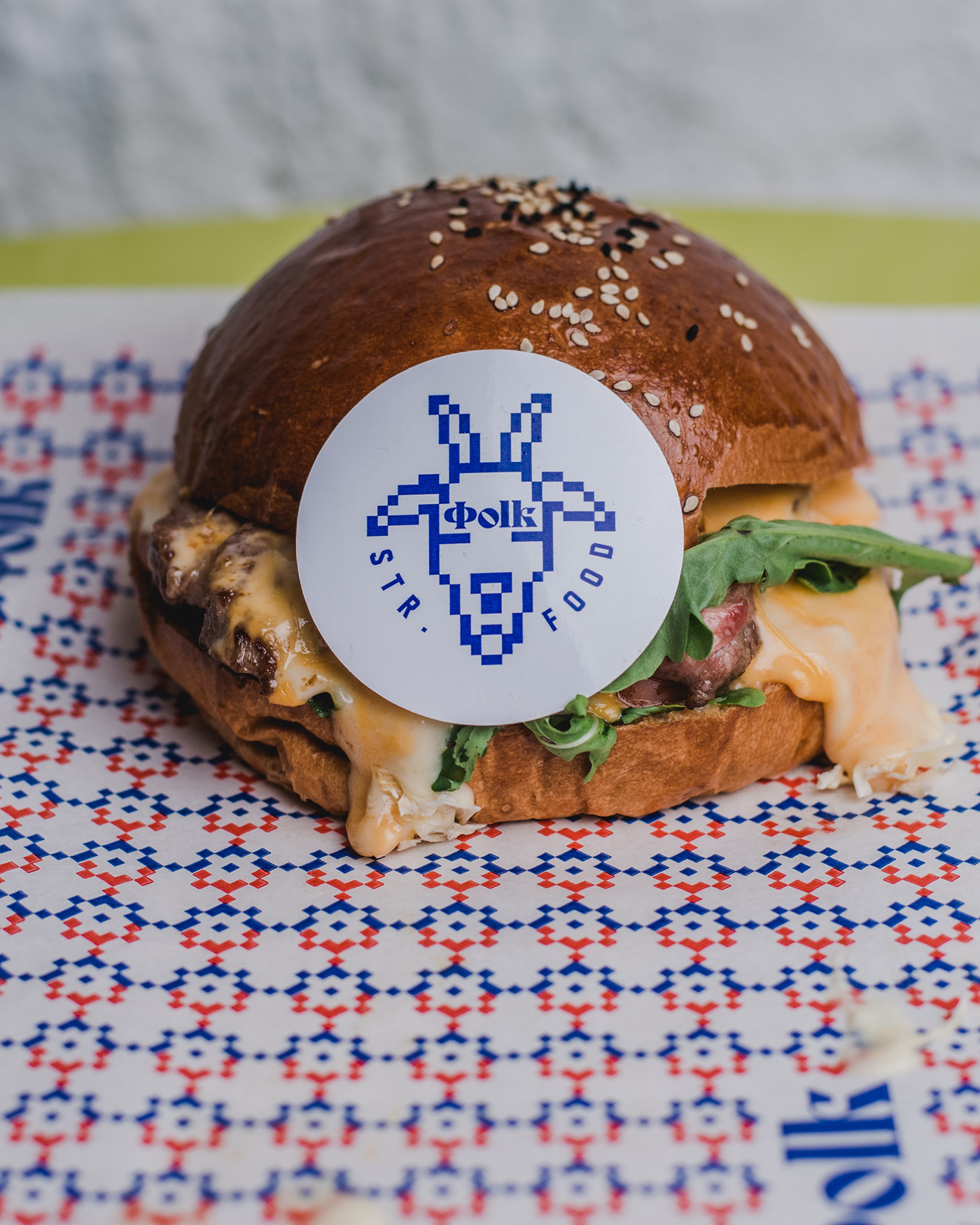
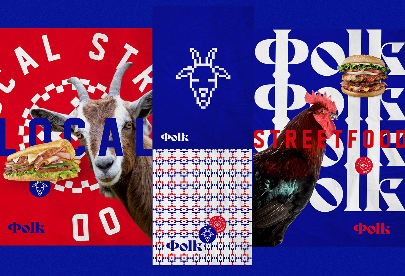
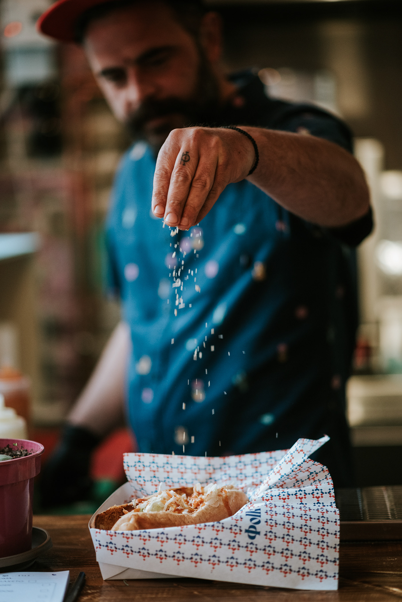
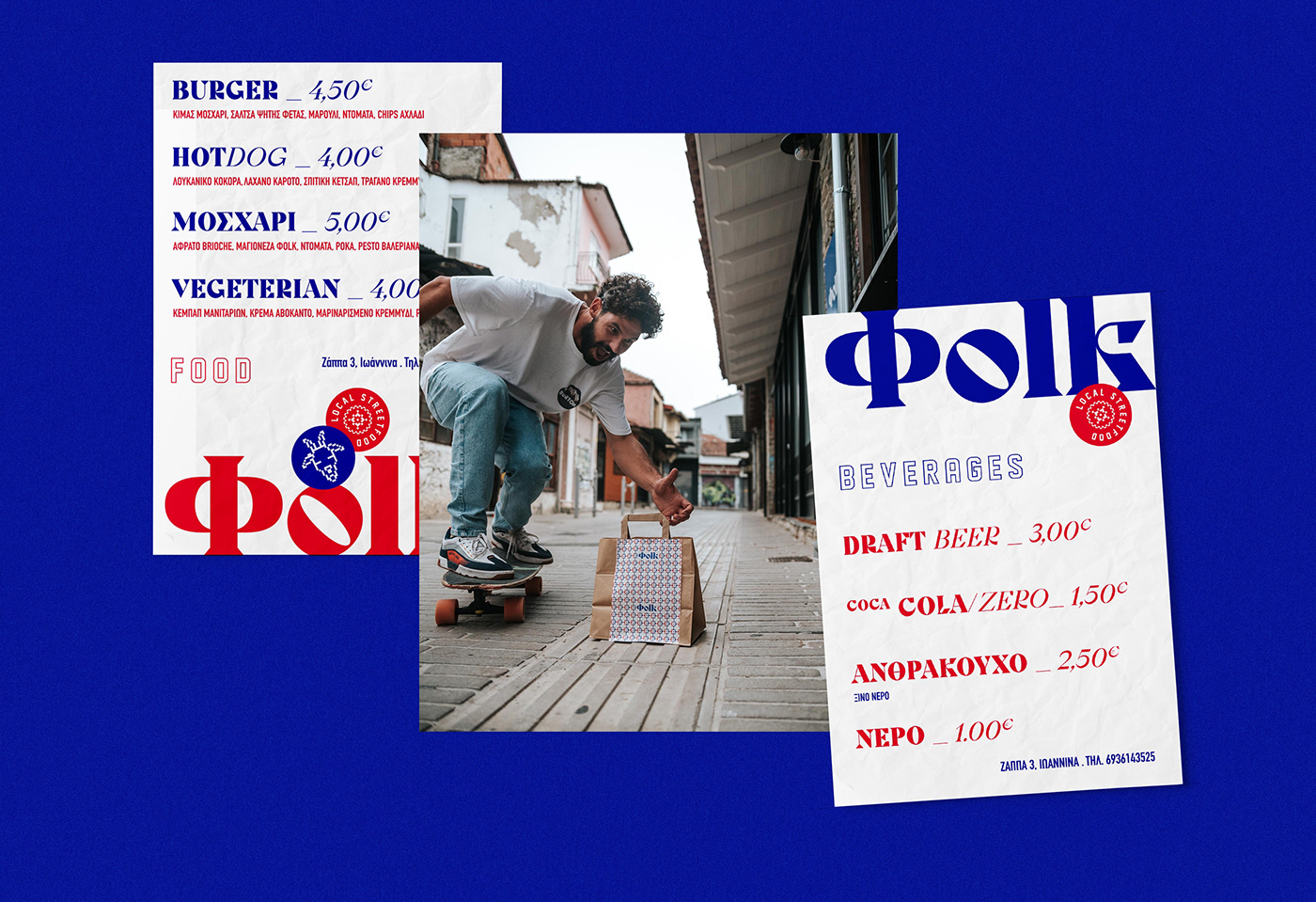
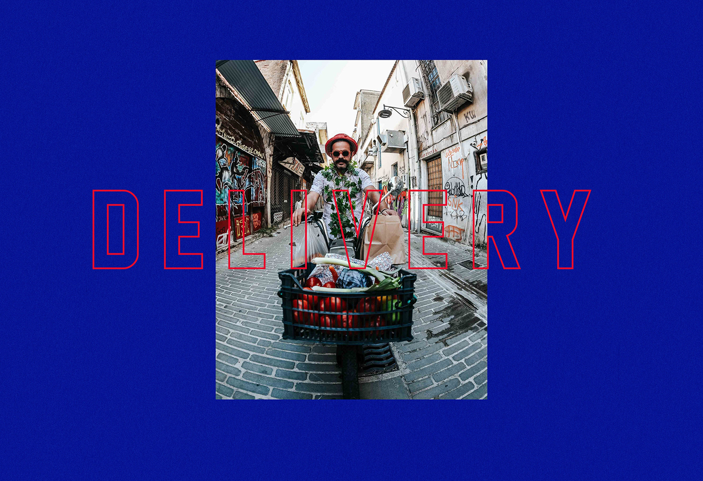
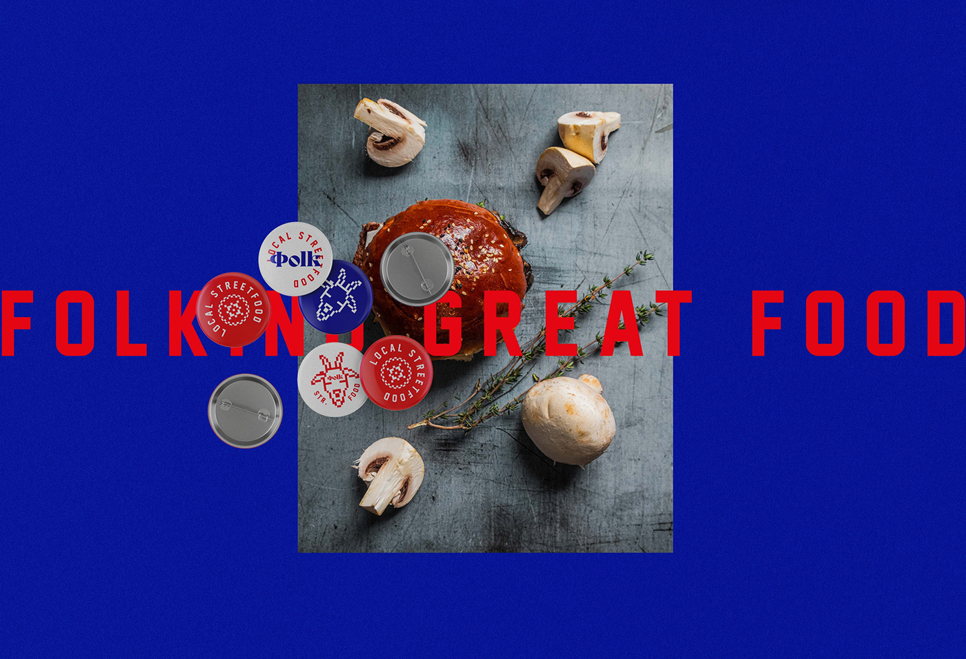
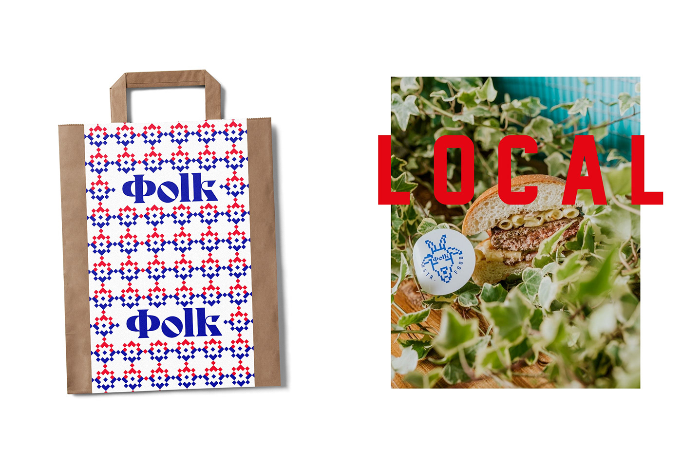
We couldn’t find much information about this project online, but wanted to cover it just the same. Folk is a local street food brand in Greece creating hamburgers, sandwiches and other delights.
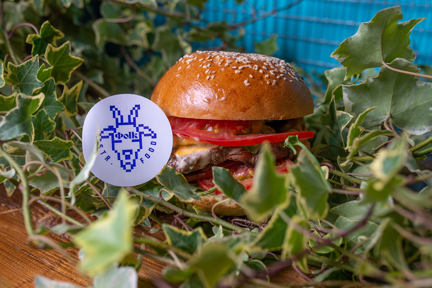
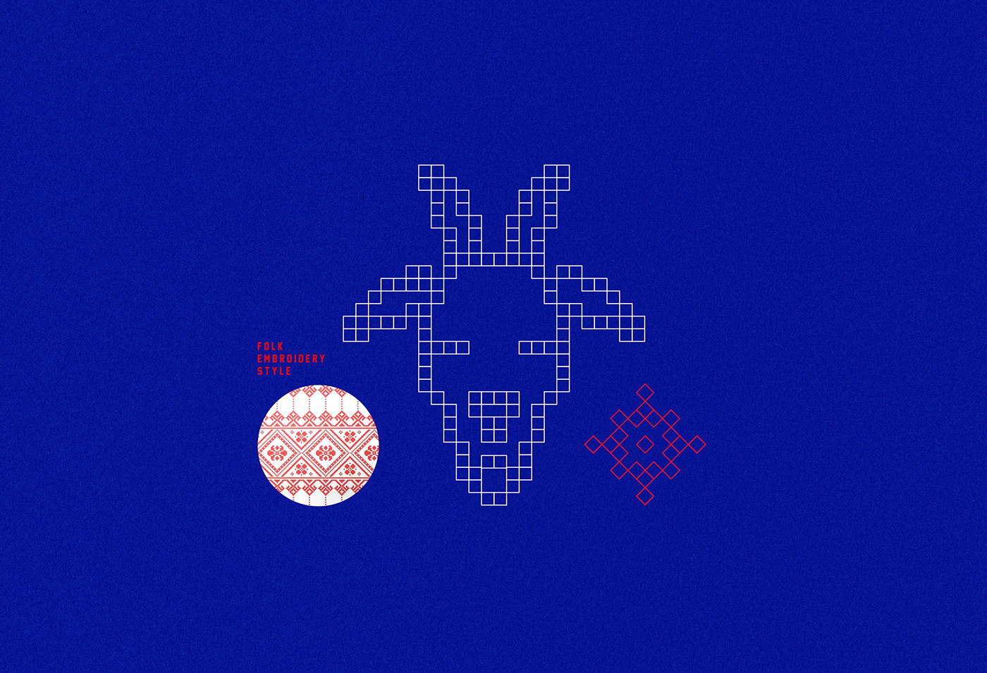
The brand identity for Folk pulls influence from vintage patterns and textures derived from needlepoint work. A goat serves as inspiration for the brand’s mark which is rendered in the same pixelated graphic style.
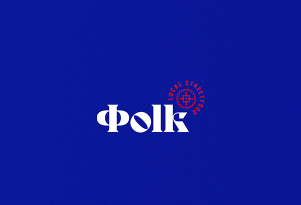
Vibrantly pure reds and blues create a strong visual message while grabbing attention. Blue is always an interesting choice because it’s known to be a hunger subduer, but in this project it works quite well.
The typography for the brand mixes serifs with a ton of character and unique aspects to them, with compressed grotesque. It results in a beautiful merger between old and new.
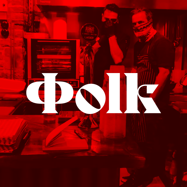
Designed by iframe design studio


