
This past Tuesday Papa Johns announced a brand evolution. The story was broke by Danny Klein at QSR Magazine which is where we’ve pulled these images, courtesy of Papa Johns proper.
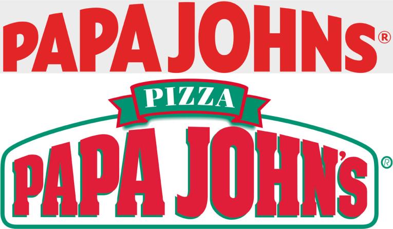
The new look cleans up the classic look for the brand as seen in their core logo. That logo lockup featured an arched typographic effect with a hard drop shadow and a border surrounding the brand’s name. It was topped with a janky ribbon that held the word “pizza.”
Suffice to say the identity was aged and not very well designed. For a brand that touts “better ingredients, better pizza,” they weren’t really living it in the brand’s identity.
Under the direction of new CMO, Katie Carpenter, the brand underwent an evolution from identity through prototype experience. There are pluses and minuses in my opinion so let’s start with the logo shift and go from there. (Continued below gallery)
The logo’s typography is definitely a move in the right direction. It maintains the iconic arch treatment, but it’s rendered much better which maintains readability. Additionally, they’ve shifted to a thick sans-serif condensed type treatment, stepping away from the slab serif used to date. In my opinion, the shift removes some much-needed character. The original typography wasn’t great, but it could’ve been improved instead of dropped to a cold, stark sans-serif.
Also of note, the green border, pizza ribbon, and apostrophe have been removed.
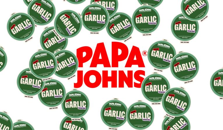
A doughy typeface has been introduced as the new brand typography for use across applications. While I find it attractive, I can help but feel a bit of Burger King from its approach. It’s thick with soft edges and has curves. All reminiscent of Burger King’s recent throwback rebrand.
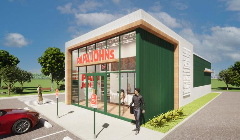
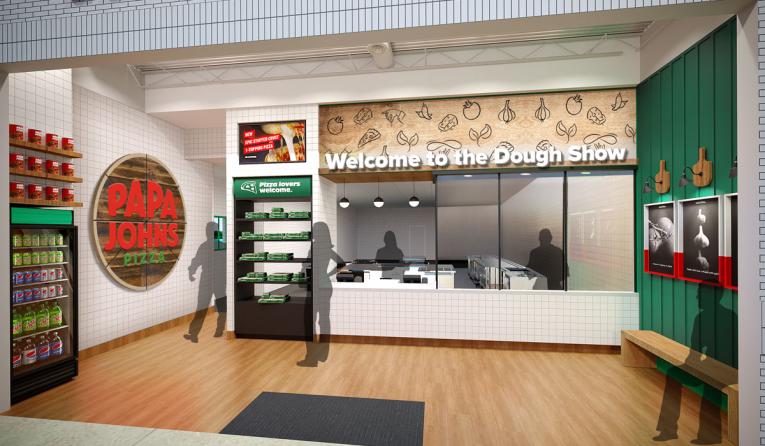
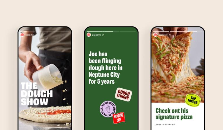
A major shift of note is the prototype design. There is a lot to love about it. The customer flow is on point and it has a clean, modern approach. Very well done.
What I think is a miss is the classic “throw a logo on a wall and call it ‘branding'” approach to evoking the evolved identity. I think more thought should have been given to the merger of brand identity and customer experience.
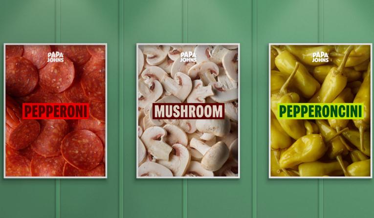
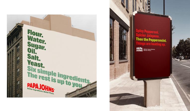
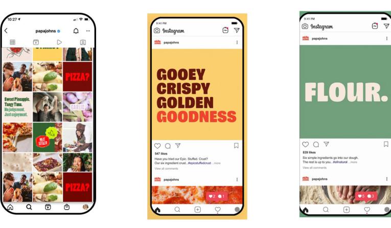
Finally, the advertising. Well, it’s quite honestly boring and misses the mark. Subway took a similar approach to calling out its ingredients. The issue is their ingredients are boring and don’t require a call-out. We all know what a pepperoni looks like.
I get that they want to lean into the simplicity of their food and how that correlates to a higher quality product, but there is a difference between simplicity and boring. I think a little more insights and deeper dives on advertising messaging will go a very long way.
Overall, I give this evolution a B-: good, but could be better.
Note, I could not find the design agency or studios involved. Please message us if you know who they are.


