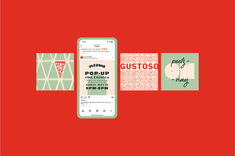
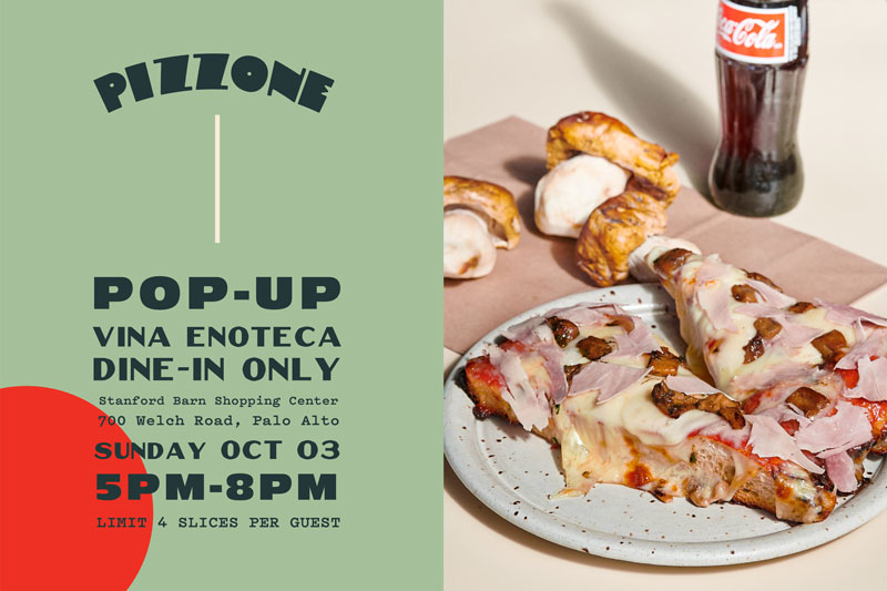
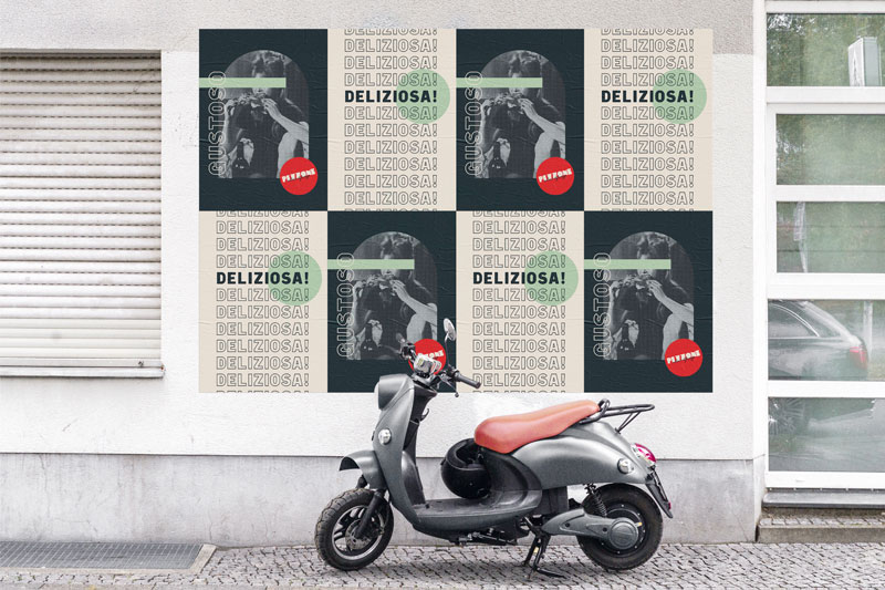
Great restaurant brands are, among other things, uniquely ownable. In a category as ubiquitous as pizza (where there are almost 80,000 restaurants in the U.S.), standing out from the crowd doesn’t come by accident. Carbonate Group’s branding for Pizzone, a Bay Area Milano-style pizza restaurant, is a great example of how it’s done. By focusing on what’s different about the product and drawing inspiration from Milanese culture, they’ve served up something truly tantalizing.
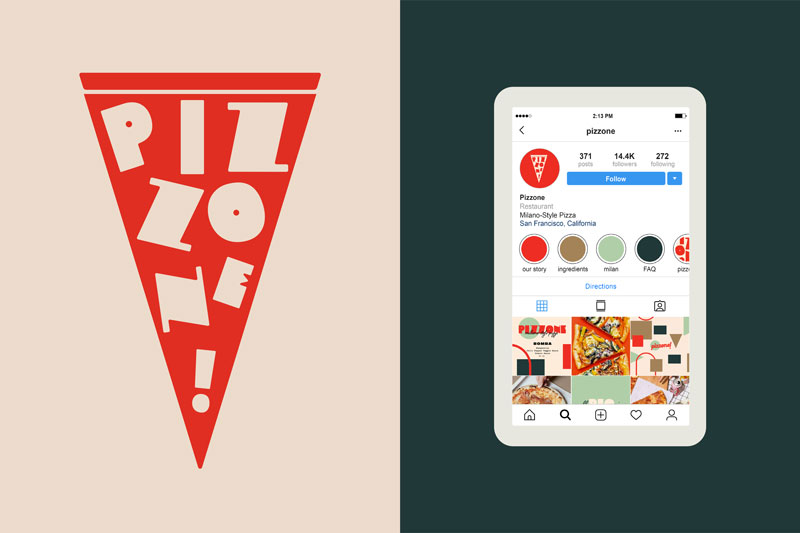
The brand type takes fashionable, high-contrast letterforms and inflates them to playful proportions that evoke Milano-style pizza’s cloudlike crust. Subtle imperfections in the O suggest handmade craftsmanship, while the circular counters punctuate the P and O like two crispy pepperoni. The handwritten descriptor balances legibility with a laid-back attitude.
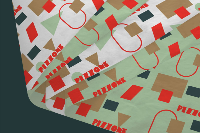
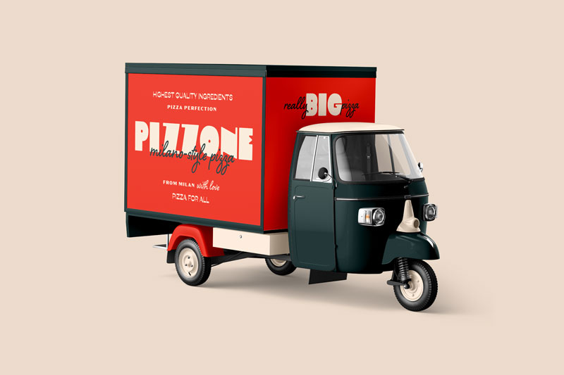
This balance of attention to detail and playfulness is developed throughout the rest of the identity. A suite of geometric shapes, which Carbonate explains are inspired by iconic postmodern Milano design, provide a sense of energetic spontaneity, like toppings scattered on a pizza. This vibe is reinforced by a charmingly diverse selection of supporting typefaces that jostle for attention across the remaining collateral.
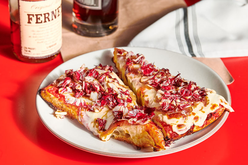
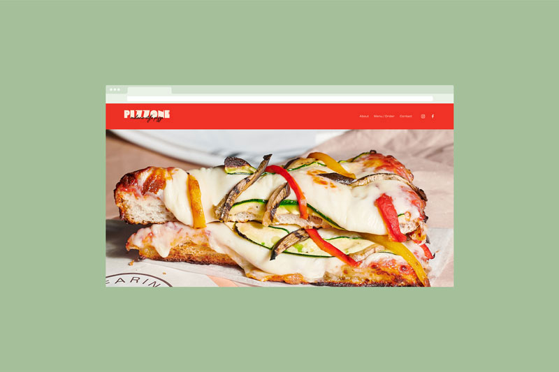
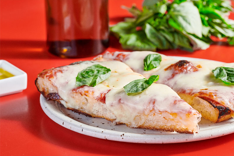
Branded photography featuring punches of the bright palette bridges the gap from Pizzone’s graphic language to product showcasing, adding a final layer of thoughtfulness to an unforgettable brand. Bravo!
