
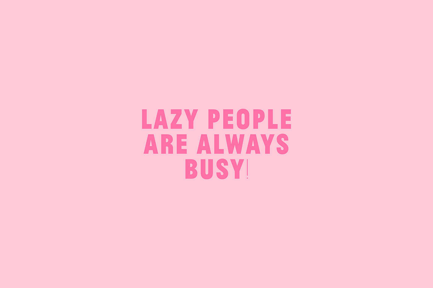
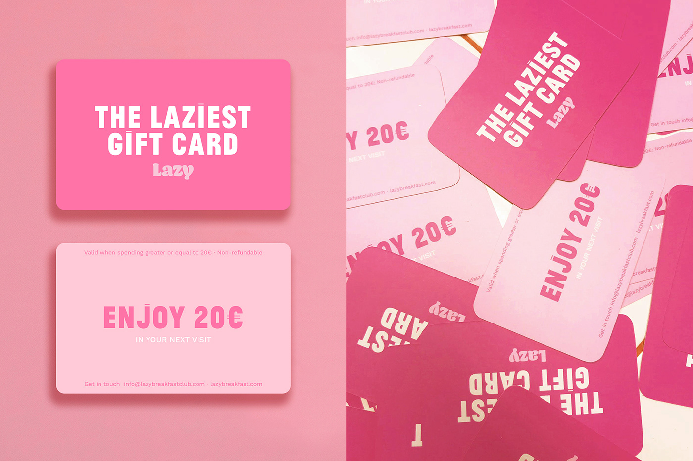
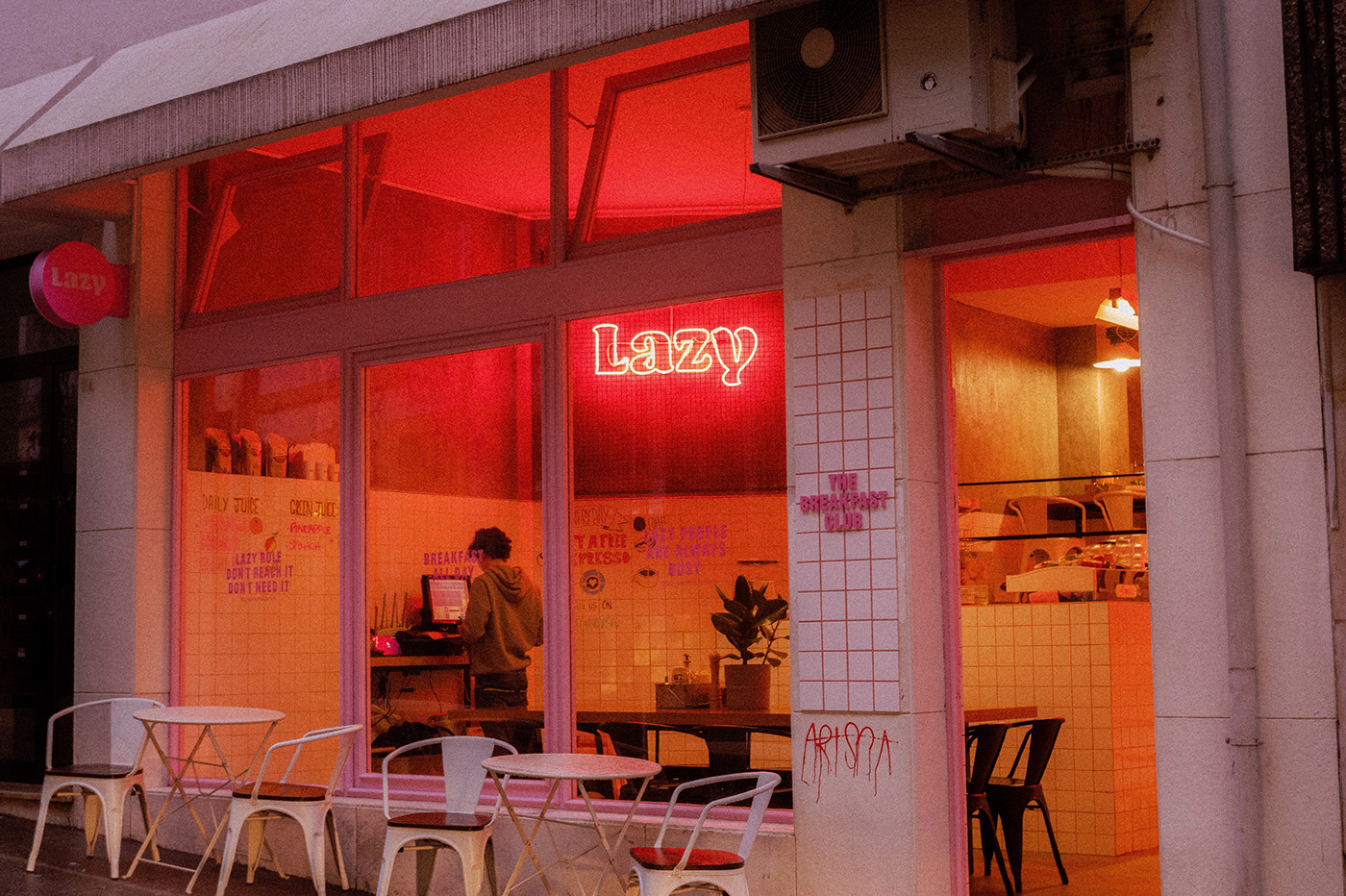
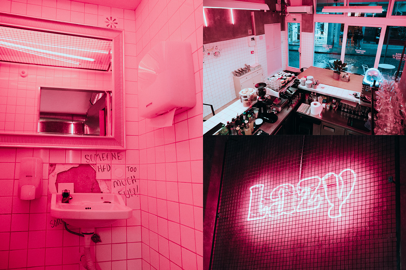
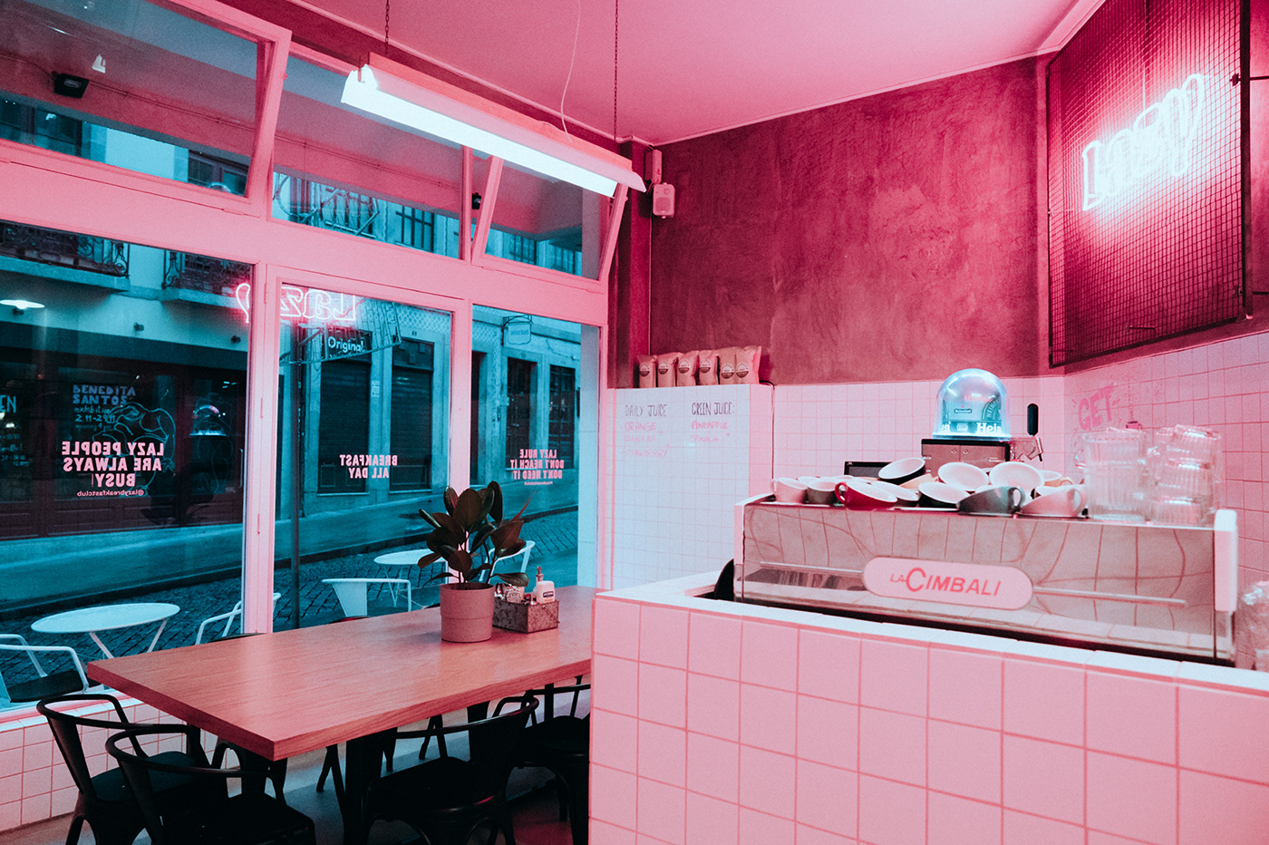
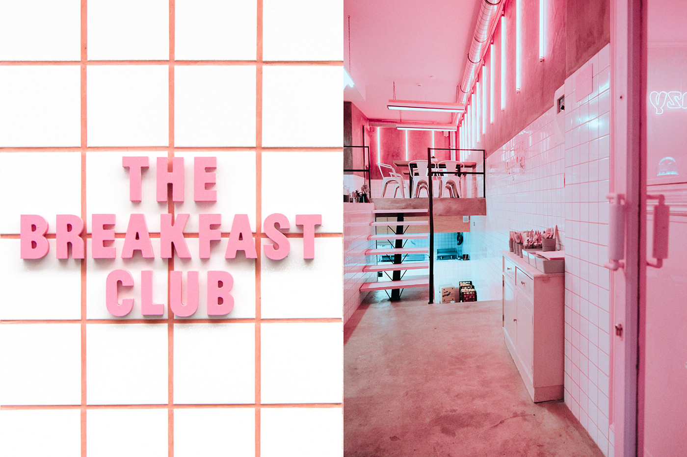
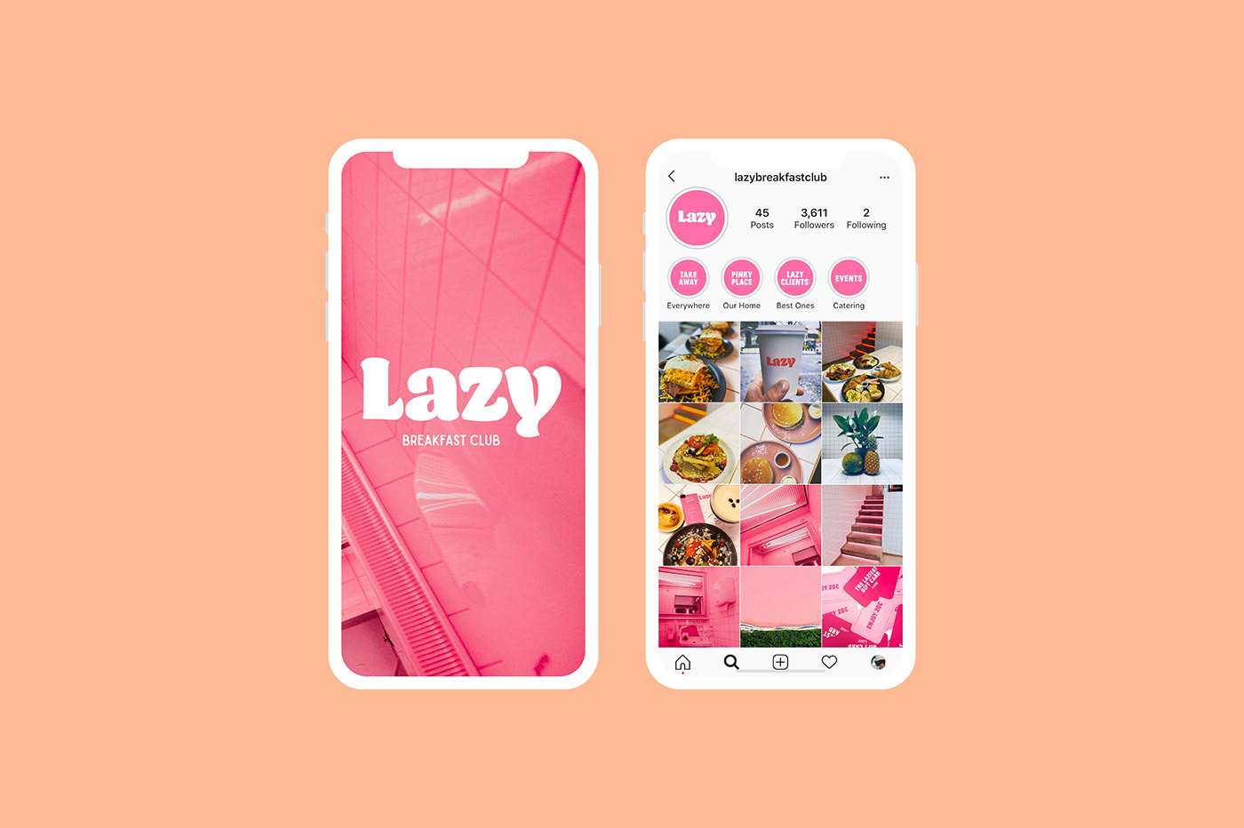
When I fully absorb the identity design work for Lazy, one word comes to mind: Pink. All joking aside, designer Silvia Silva has created a wonderful visual experience using pink as the primary color. In many cases, this wouldn’t go very well, but they’ve found a way to ace the look and create something truly enrapturing.
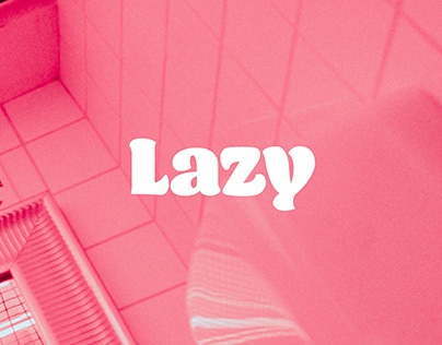
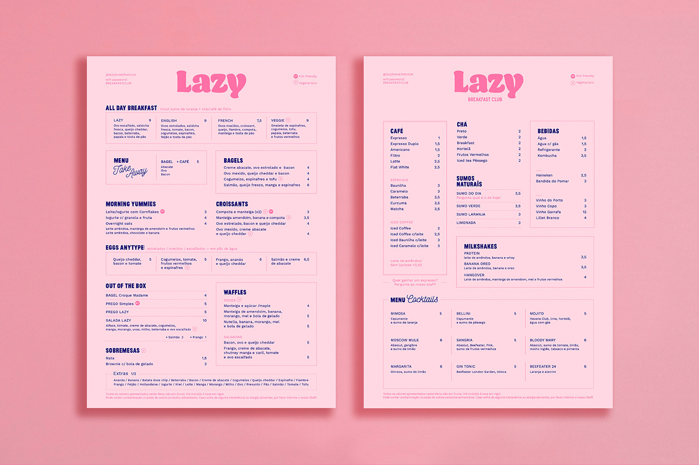
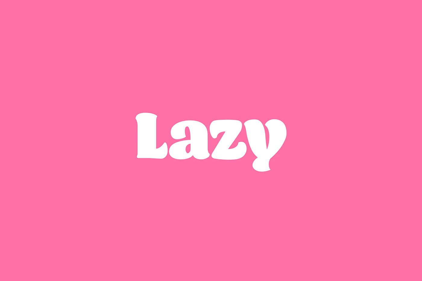
Starting with the thick, throwback typography that’s rooted in 70’s retro vibes, the brand has a lackadaisical feel that invites you to chill out, hang out and vibe. The identity expands from there to offset that thick type with a condensed modern counterpart. It’s a lovely match that adds readability without tainting the laid-back vibe.
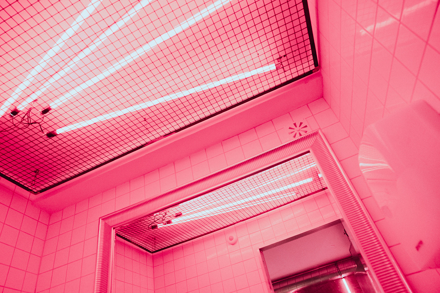
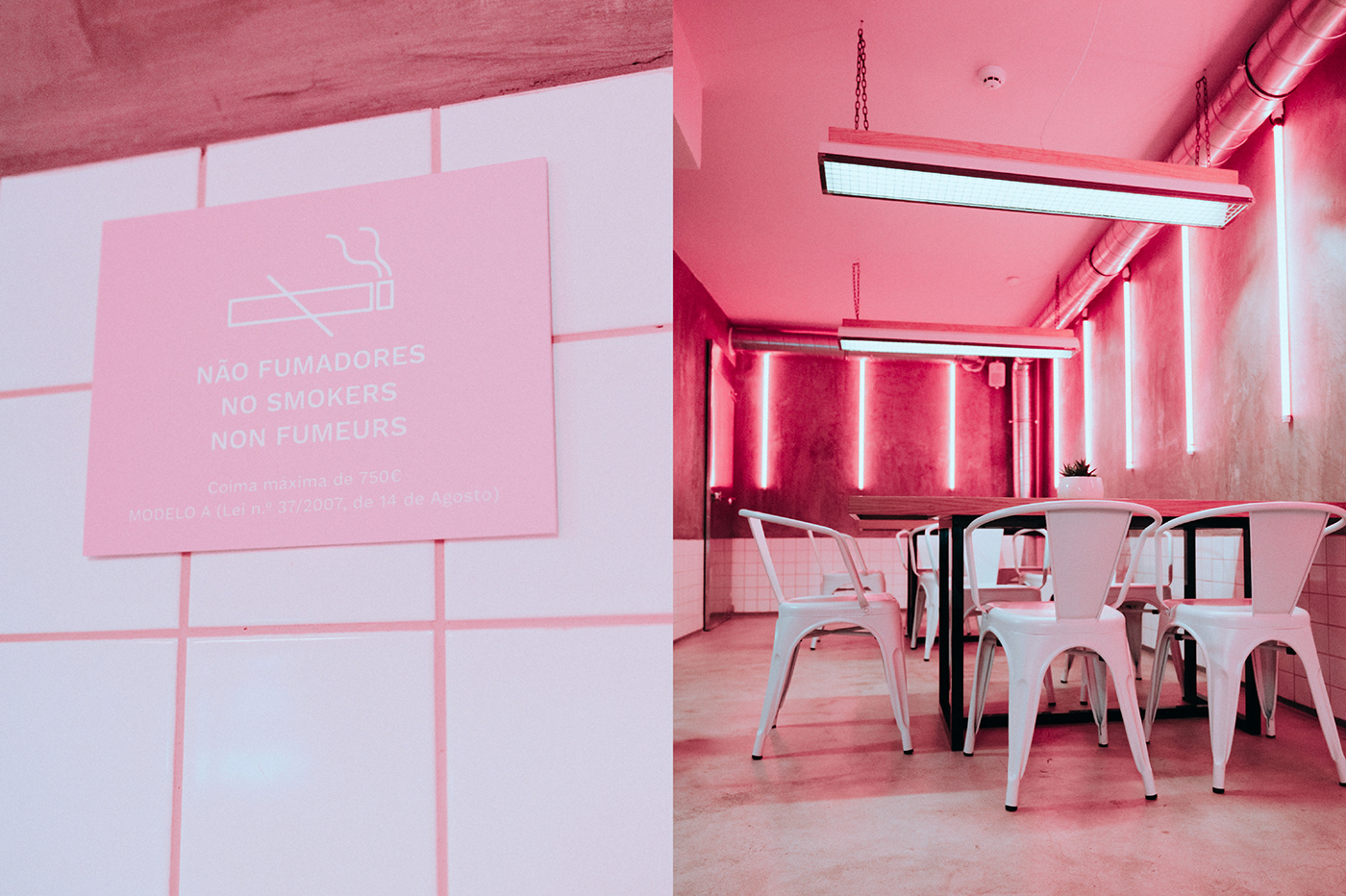
With that basis, Lazy Breakfast employs multiple levels of pink to create depth. Pink lighting adds dimension and texture while accentuating the textures put forth by the various materials including cement, powder-coated metal, and tile, to name a few.
Overall, it’s a well-orchestrated brand identity and a restaurant i would absolutely love to experience in real life.
Designed by Silvia Silva


