
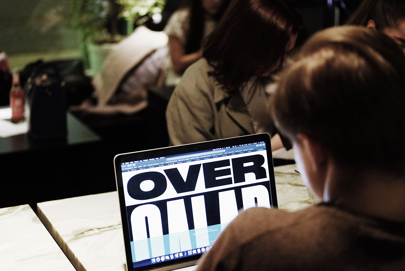
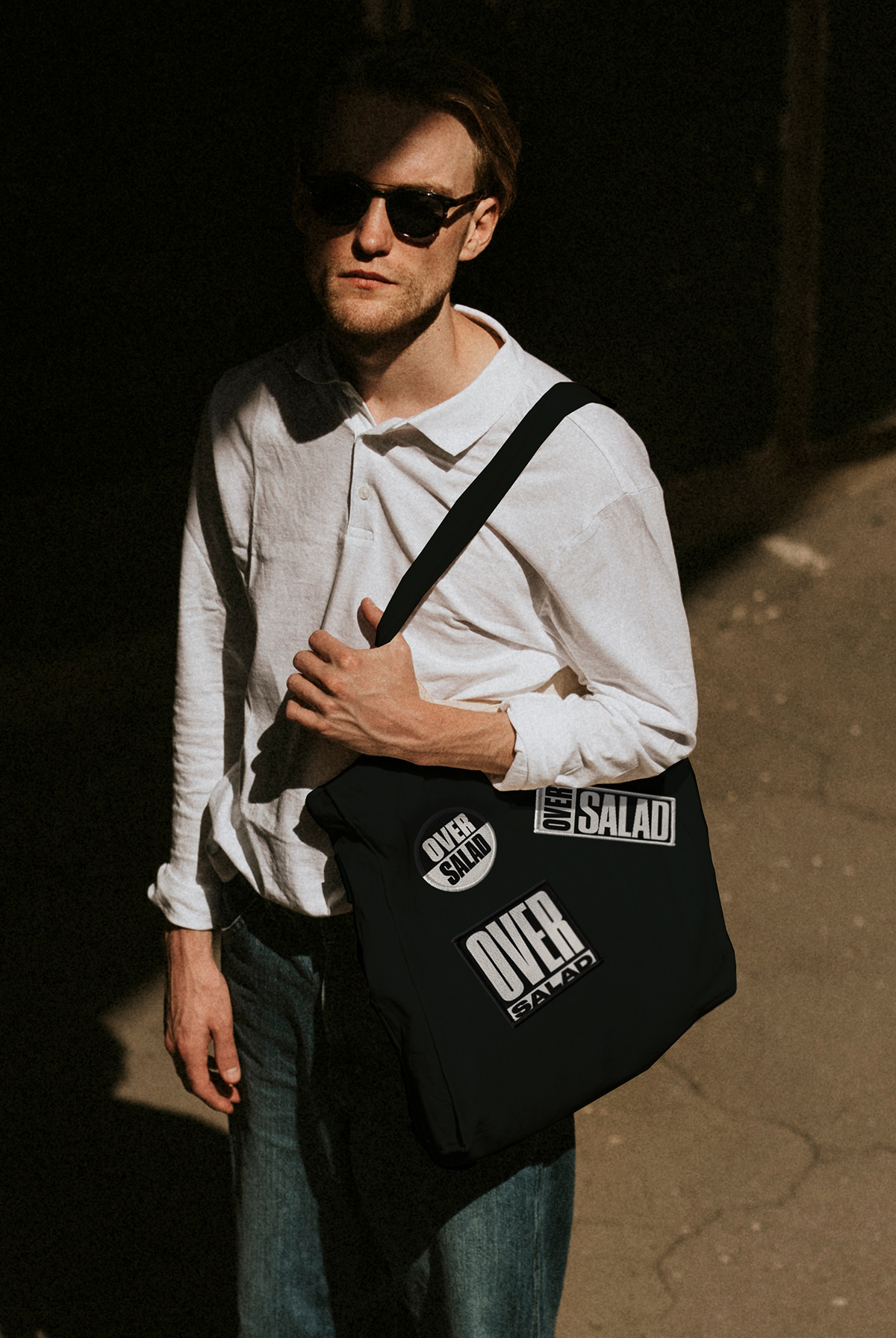
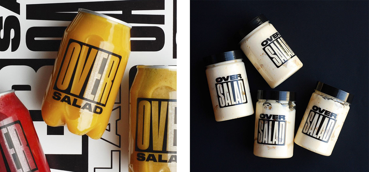
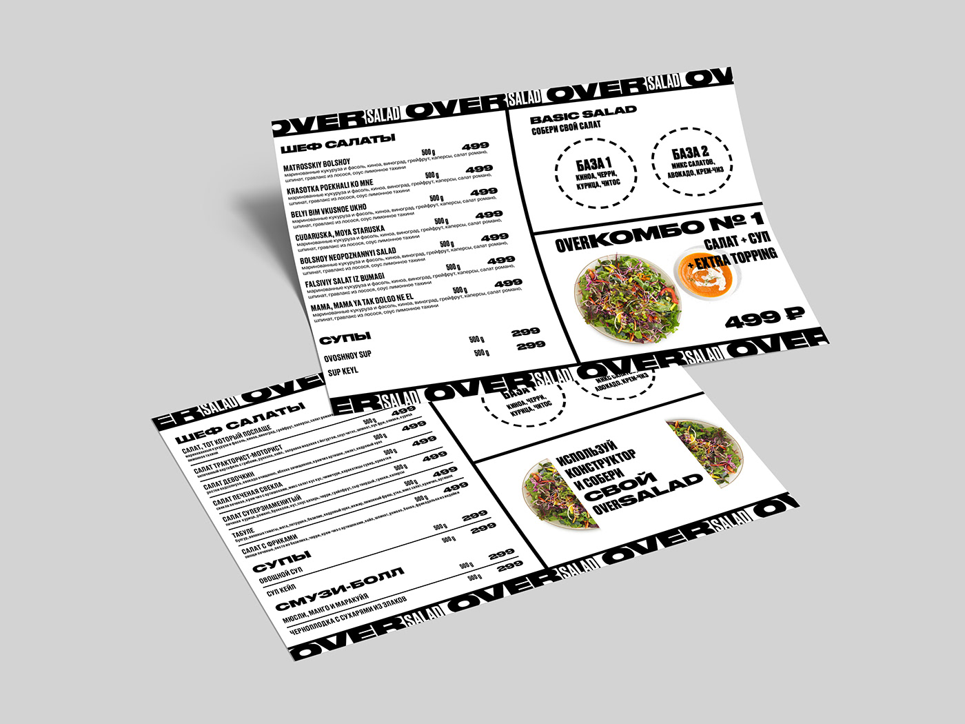
Anastasia Cherepanova’s identity design for Over Salad its an exercise in chunky, bold typography and high contrast chaos. It’s wonderfully bold and domineering vibe is quite the departure for what one would expect from a typical salad concept in all the right ways.
I can’t help but get a sense of the parental advisory sticker when looking at the suite of images. This adds to the bold, daring vibe of the brand.
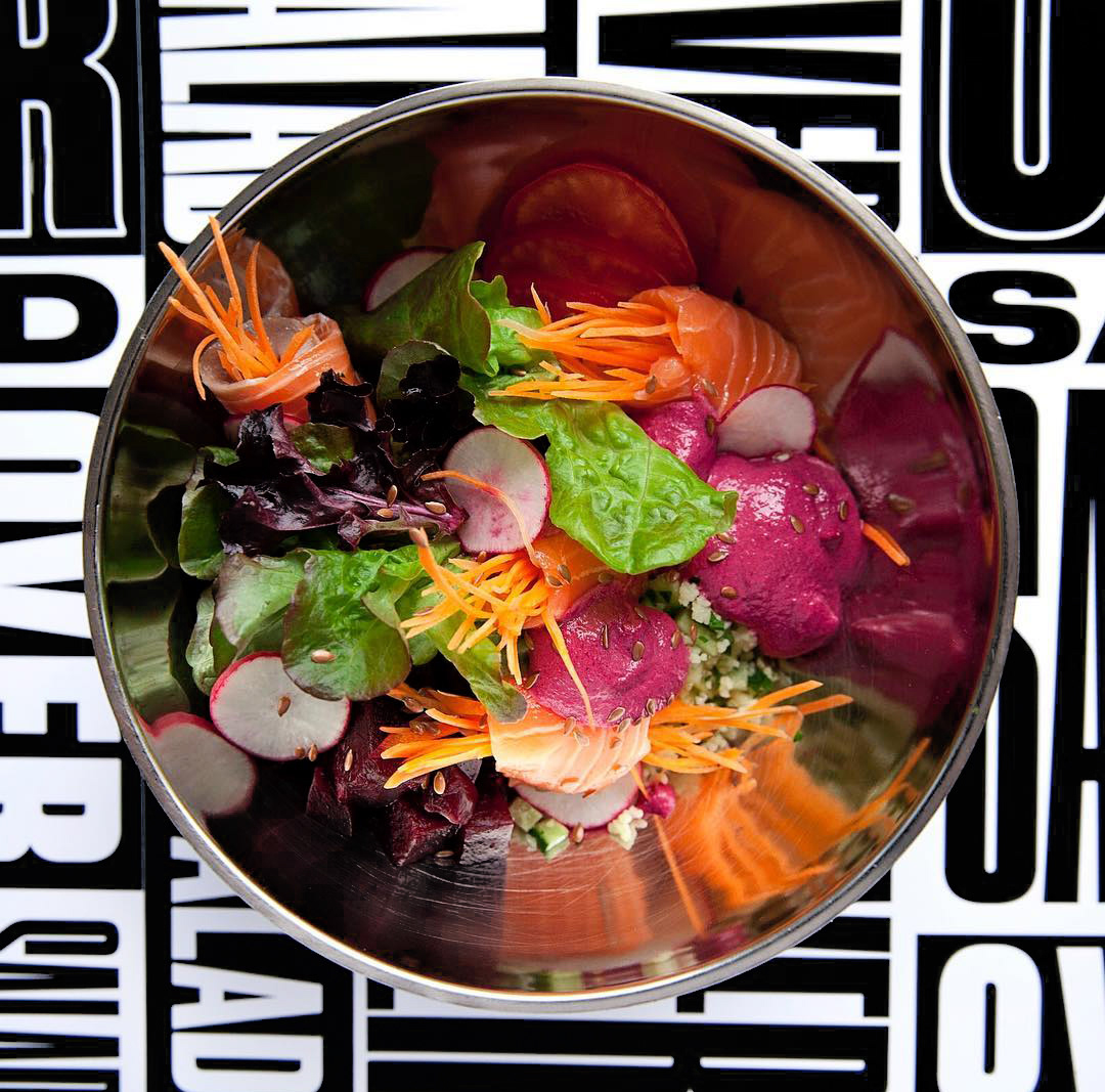
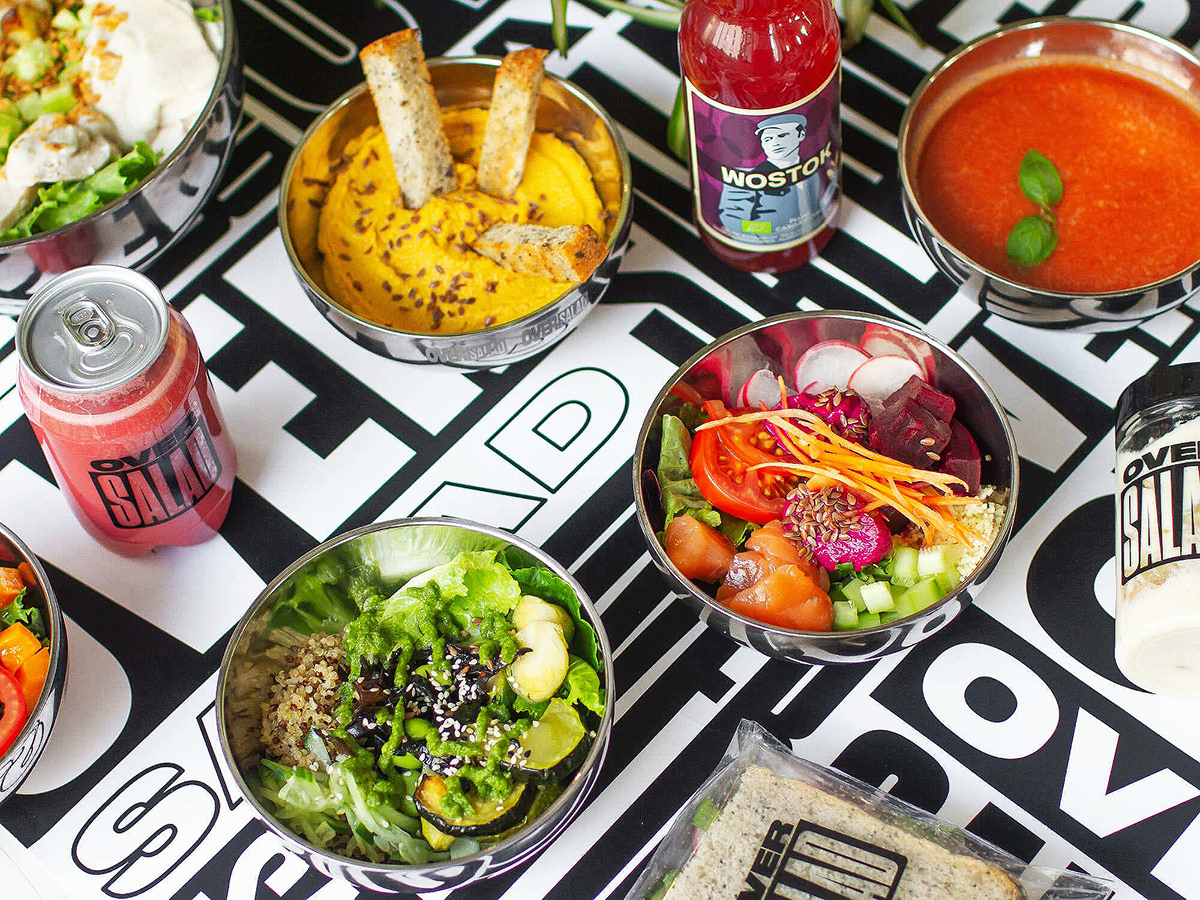
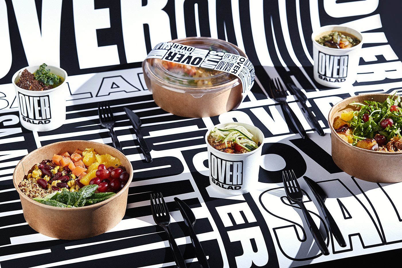
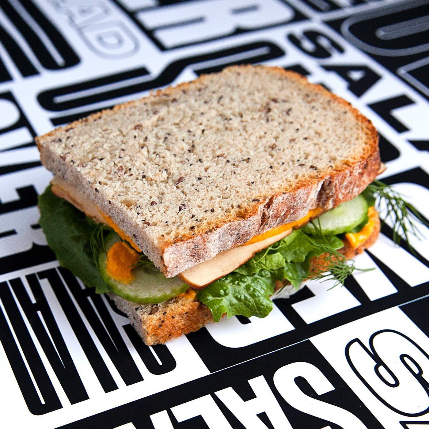
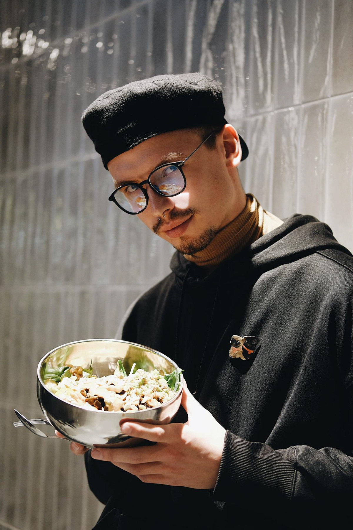
The high contrast black and white palette serves as an accentuating backdrop for the food, making it pop with beautiful colors. This is a fantastic feature because salads tout some gorgeous natural colors worth highlighting.
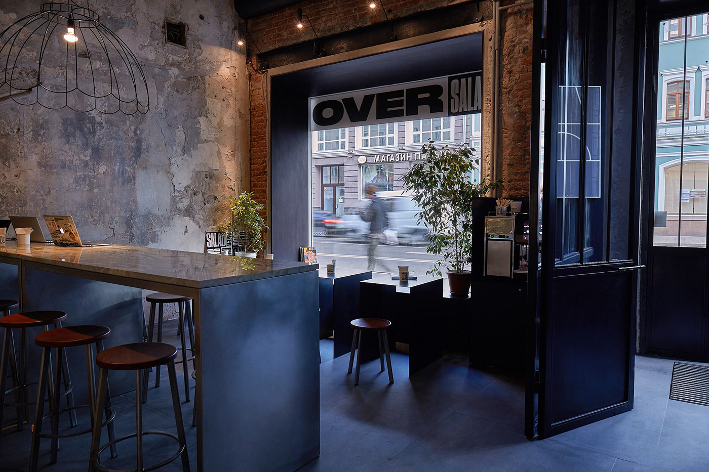
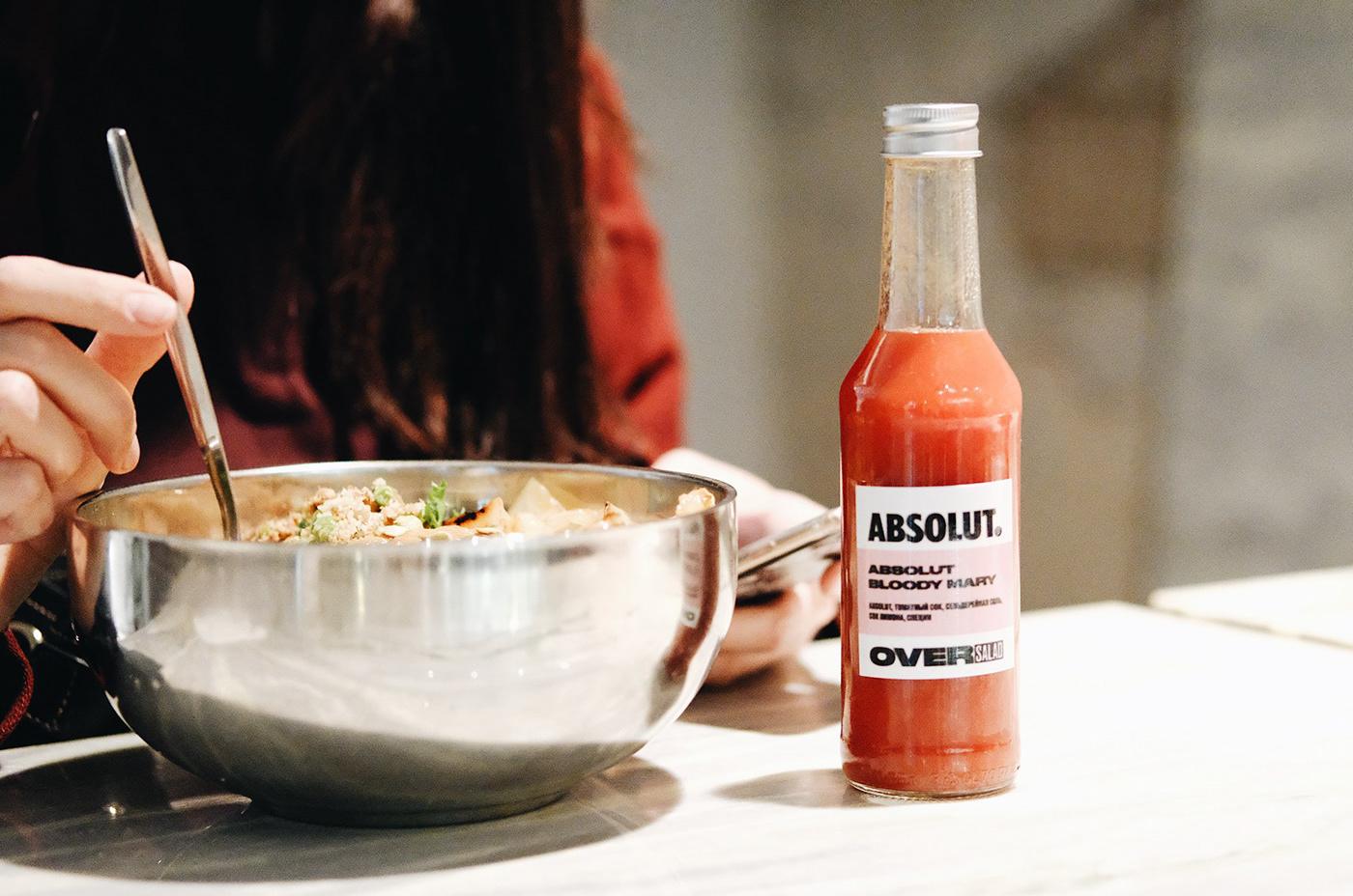
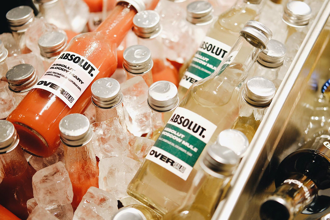
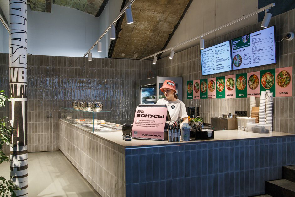
The details are what help make this identity stick. Each touchpoint has been considered and the brand’s bold voice builds with every encounter. This can be seen in the foray into beverages and the interior space where the brand shines.
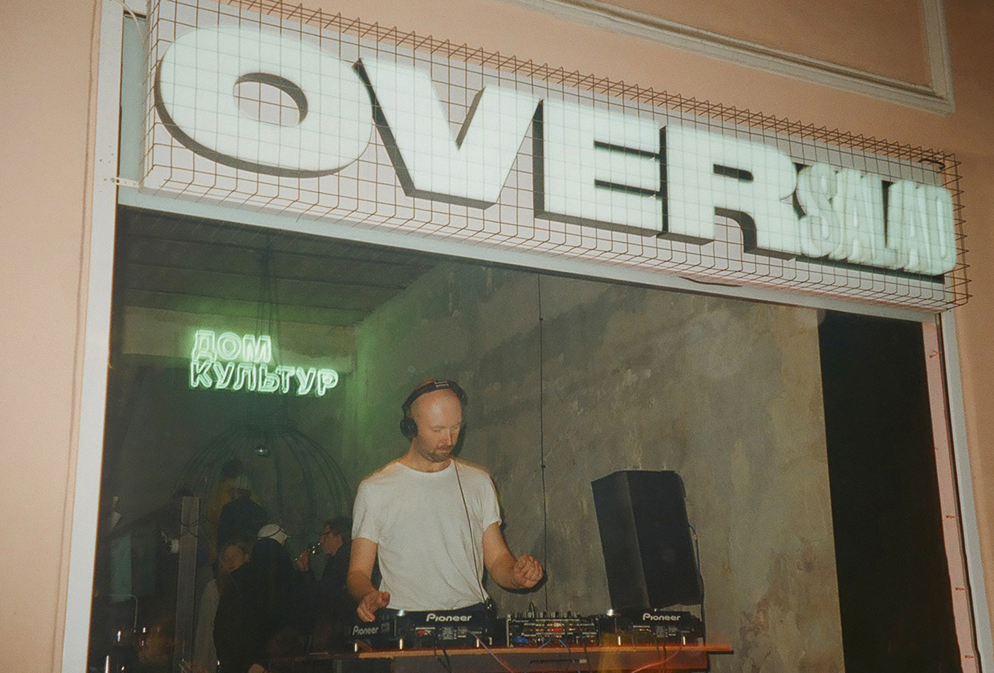
Finally, I’m really digging the caged signage and who doesn’t love a DJ when you woofing down some delicious greens?
Designed by Anastasia Cherepanova


