
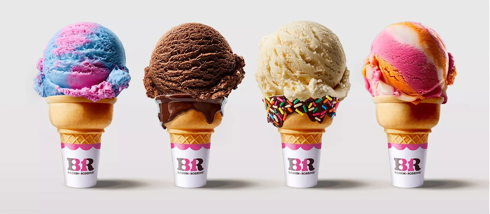
This week, the legendary Baskin Robbins dropped their new brand identity designed by the team at ChangeUp.
Over the years, Baskin Robbins has become a market leader in the ice cream game. Concurrently, their brand identity has been the topic of design excellence, at least from the logo standpoint, because of its clever injecting of the number 31 into its logotype (you can see it at the 00:27 mark in the video below). Every design student has studied this.
However, that clever logo was not where the brand started all those years ago. You can see the evolution starting at the 00:23 mark in the video below.
This week, the brand takes its next steps in maintaining relevance with an evolved identity that simultaneously pays homage to the original logo while ushering in a notable next step that’s modern and sweet.
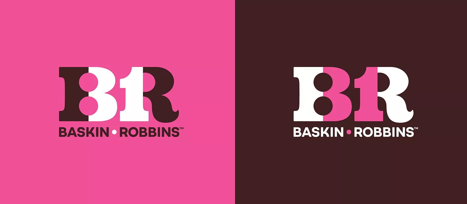
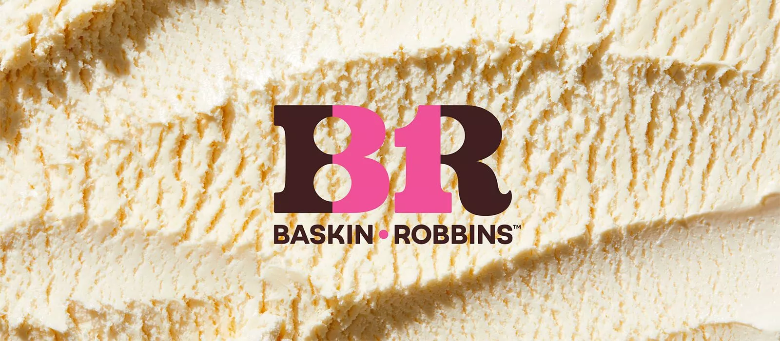
The design team pulled influence from the thick, chunky serif typography found in the original iteration of Baskin Robbins, then introduced a new take on the clever injection of the number 31, which is intended to note the number of flavors Baskin Robbins offered.
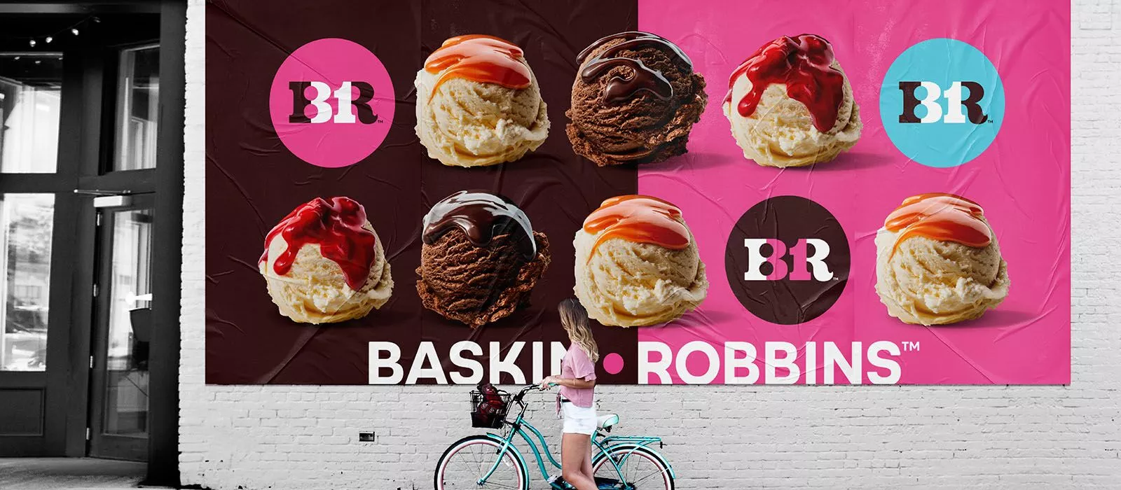
31 maintains its relationship with the brand’s initials, BR. However, in the new iteration there is no visual divider between the letter and number form beyond color. It reinforces the strength of the number, but actually diminishes the readability of the B and R. That may not be a bad thing since a strong logo mark’s goal is to establish and grow recognition, not necessarily readability. In this case, the BR serves as the logo mark.
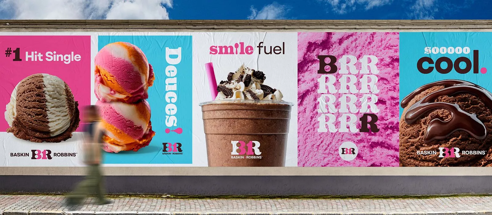
There is a lot to love about the rejuvenated image, but there are some areas that aren’t very remarkable. One is the logo typography. It’s joltingly in opposition to the BR mark creating a flavorless foundation. This is glaringly obvious in the out of home applications where BR is introduced as a tiling mechanism and the brand type, Baskin • Robbins serves as a signoff.
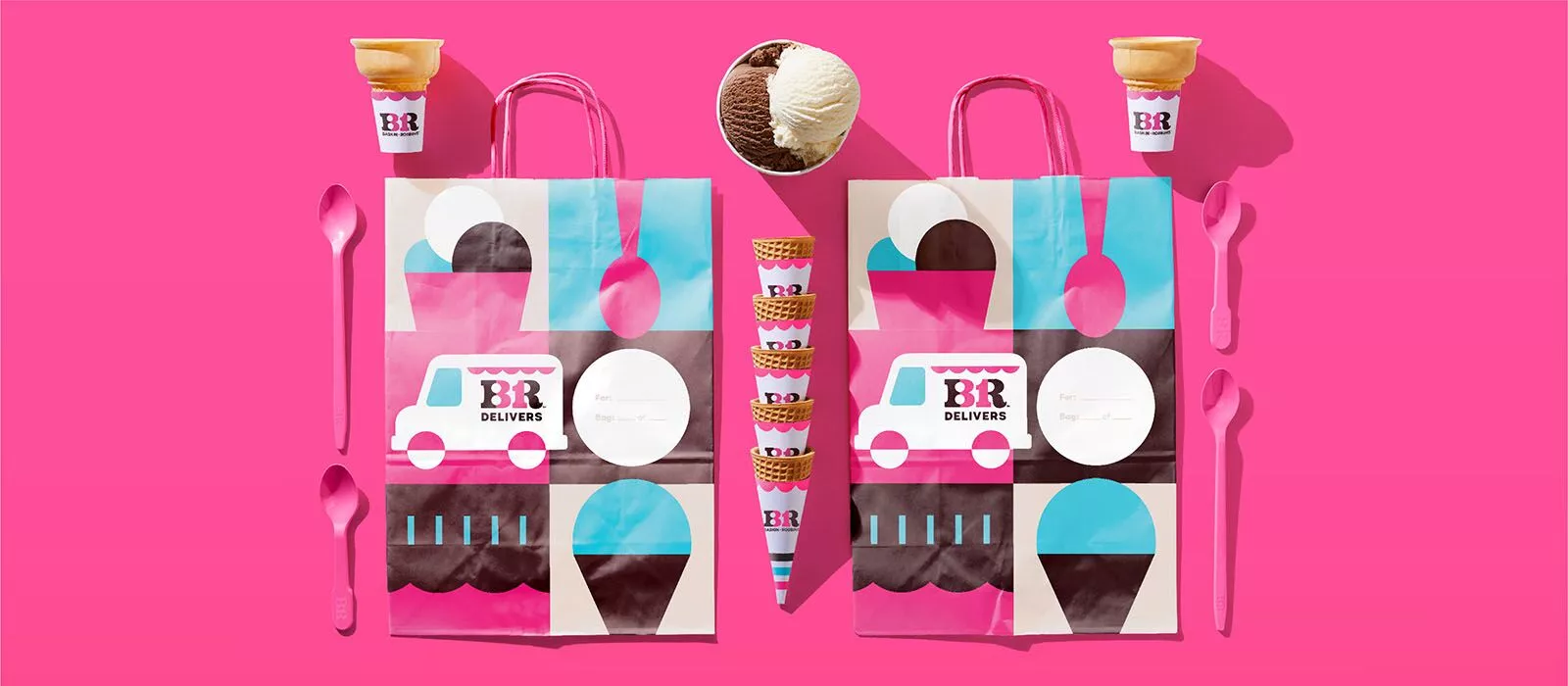
Additionally, the use of color grinding as seen on the paper bag packaging is a style that’s been overused. Same goes for the word blocking seen on the other paper bag design.
Finally, there are instances where the B and R are introduced into copy lines like “Be Bolder” and “Be Happier.” In this application, the B and R maintain the type style as the brand mark, but with the counters of the B and R filled in. The rest of the word is set in a thin sans-serif which creates another instance of jolting opposition. I’m left wondering what the 31 is dropped from the B and R forms in this use.
Overall, I think the shift has merit, but there are multiple places where it falls short.
Designed by ChangeUp


