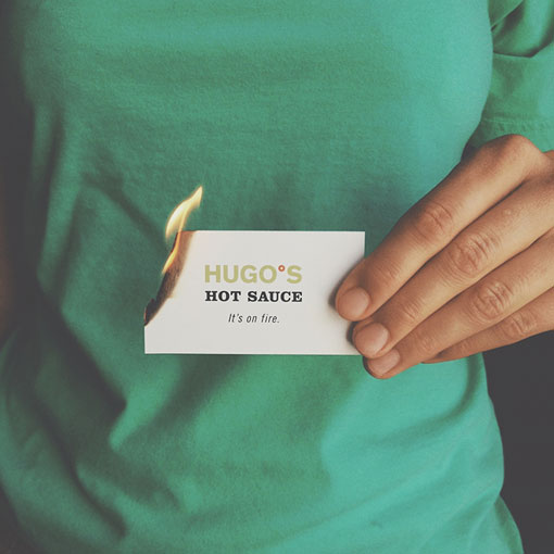
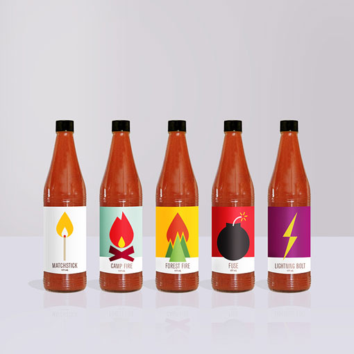
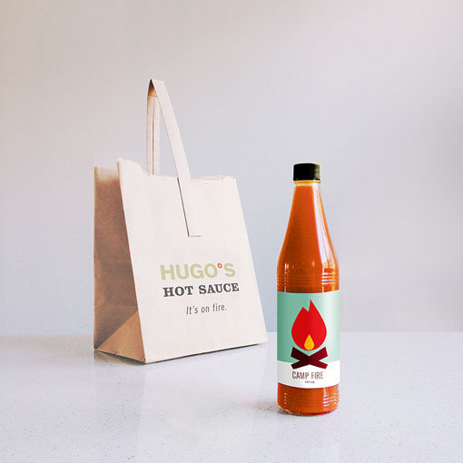
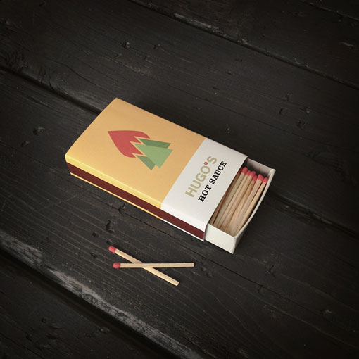
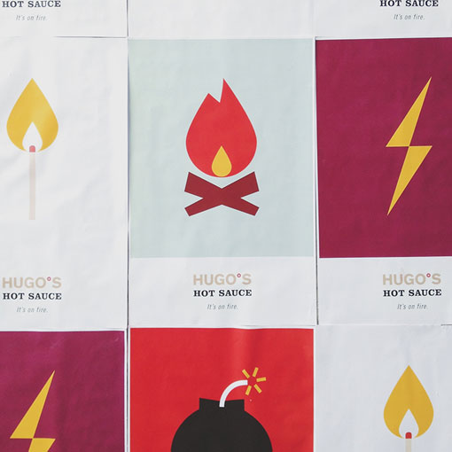
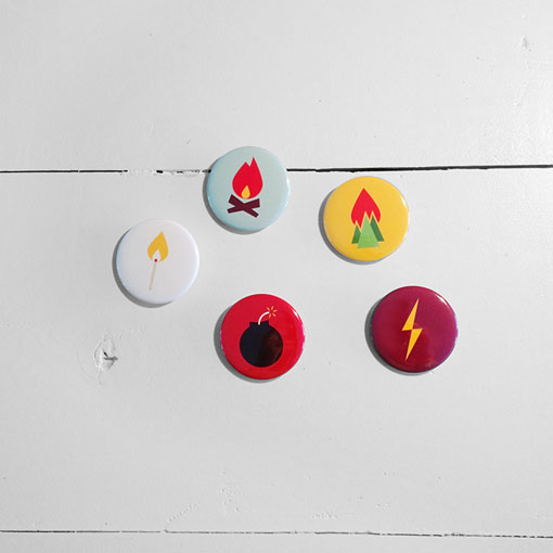
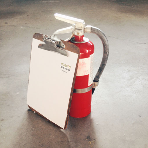
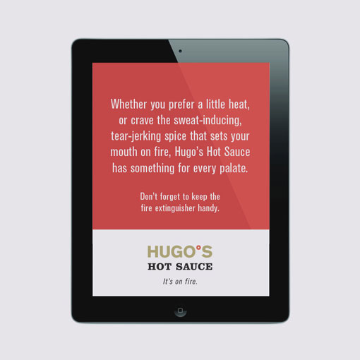
I’m a big fan of breaking things down to basic forms and that’s exactly what Jag Nagra (Page 84 Design) has done for Hugo’s Hot Sauce. Simple, yet poignant, illustrations mark the brand with a unique image in the hot sauce design arena. The logo is just as simple as the illustration work making it easy to identify while never conflicting with the look of the brand across its package design.
