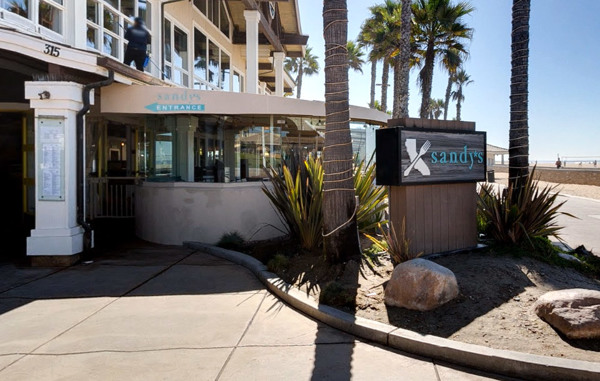
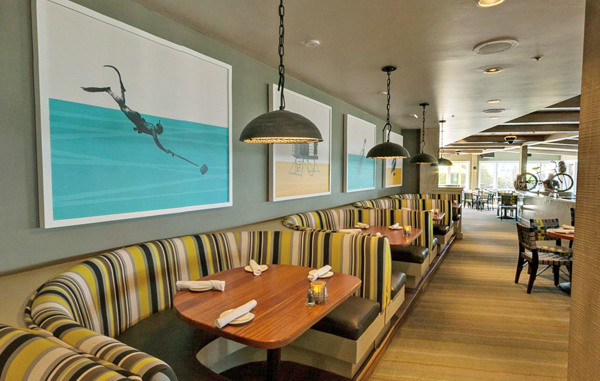
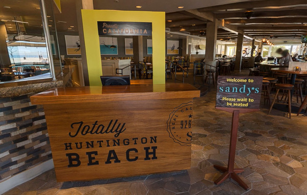
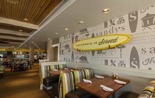
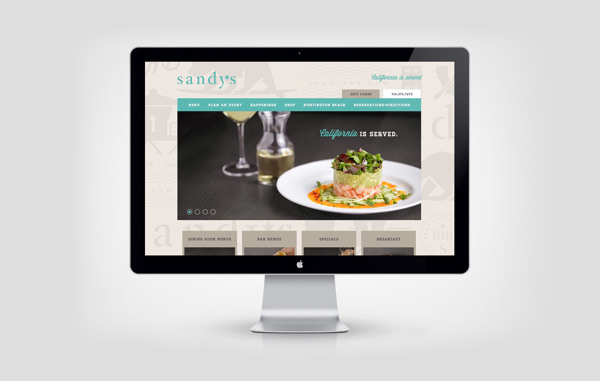
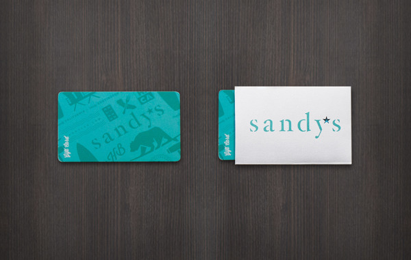
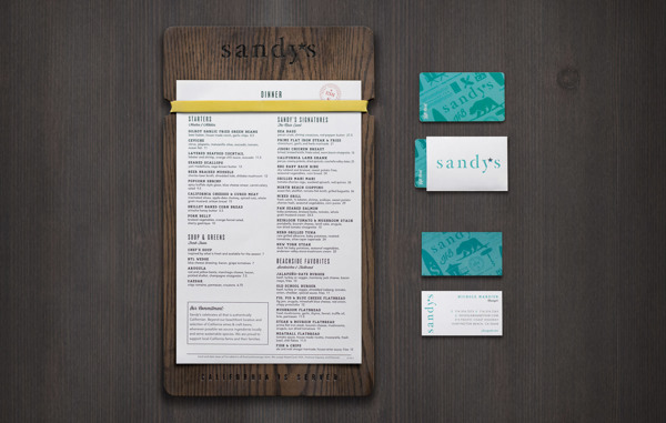
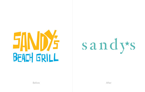
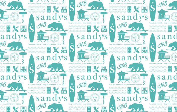
It’s always awesome to see a rebrand that’s successful in it’s efforts. A lot of times things get watered down, or a project doesn’t go as far as it could because the ownership is tied to the past. The rebranding effort for Sandy’s Beach Grill is on point. Designed by Scott Naauao of Wall to Wall Studios, the freshened up design is a thorough improvement. It explores a beach like vibe while remaining new, fresh and approachable. It isn’t cheesy or overdone.
Here are his words on the project:
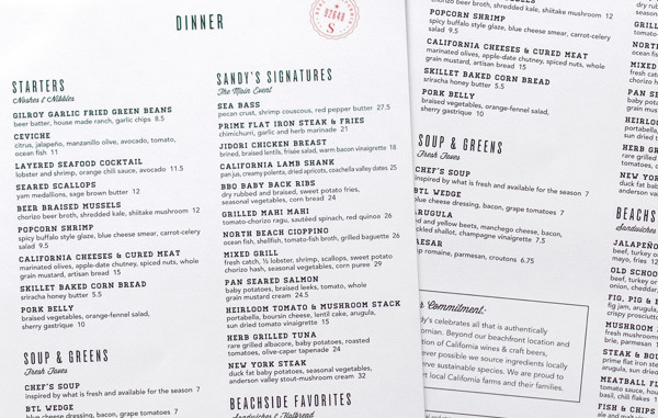
The goal of the project was to refine the brand with a more sophisticated look to match the quality of food and service offered at the restaurant, while maintaining the energetic surf and beach culture of Huntington Beach.
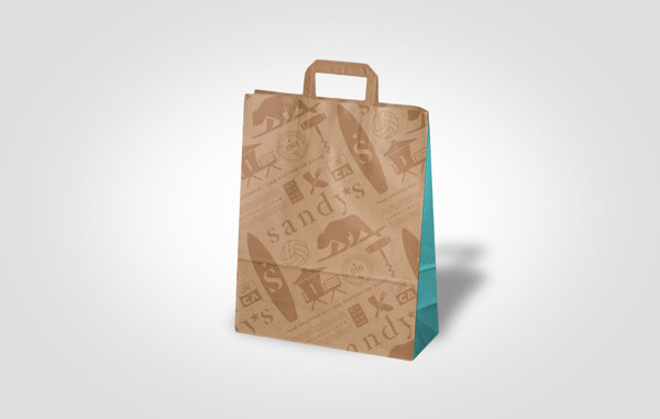
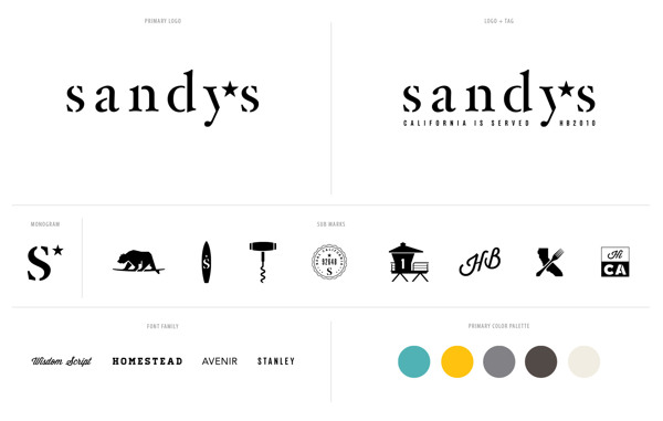
A set of icons reflecting the region and restaurant was developed alongside the logo with a stenciled look inspired by the typography found on nearby lifeguard towers. The icons were then turned into a pattern which became the foundation of the brand.
