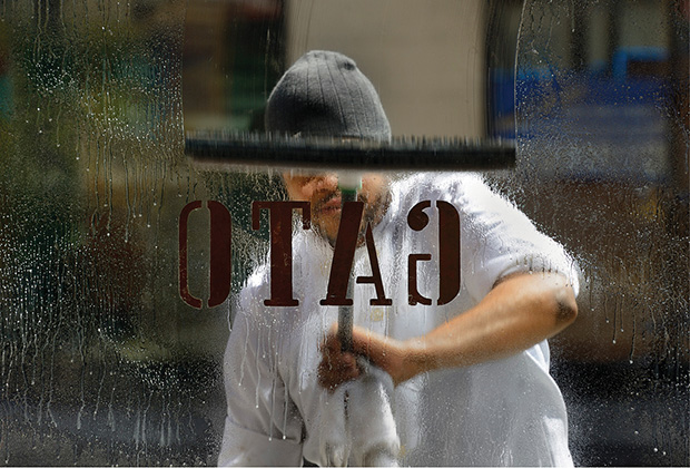
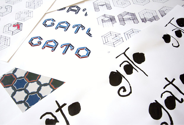
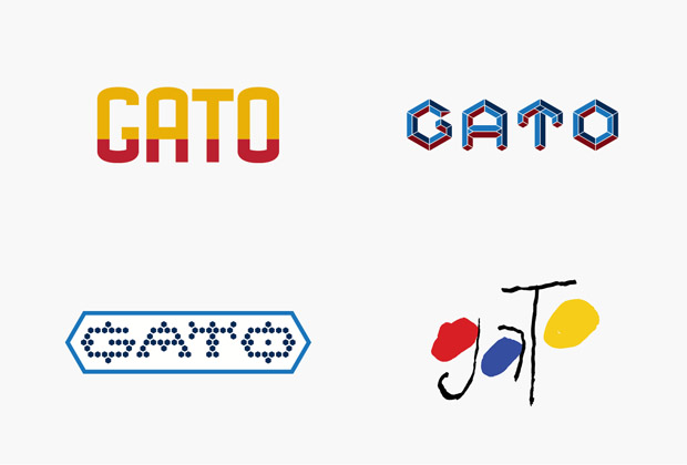
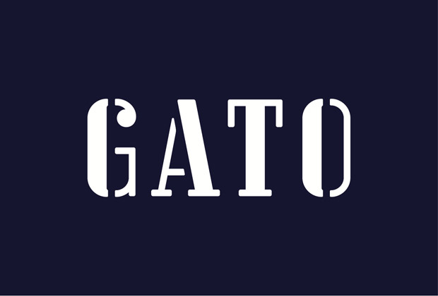
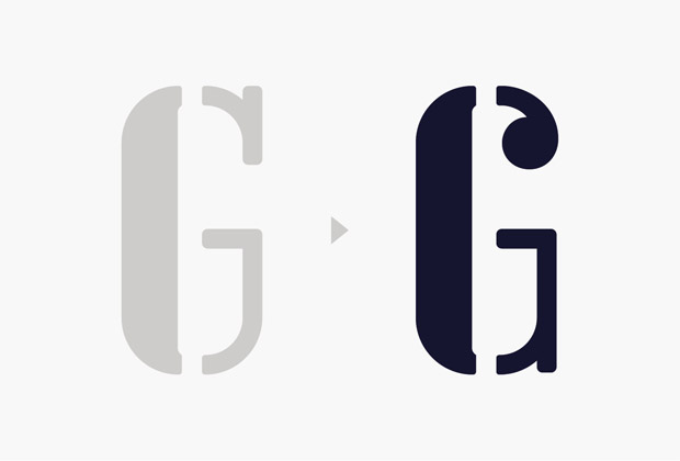
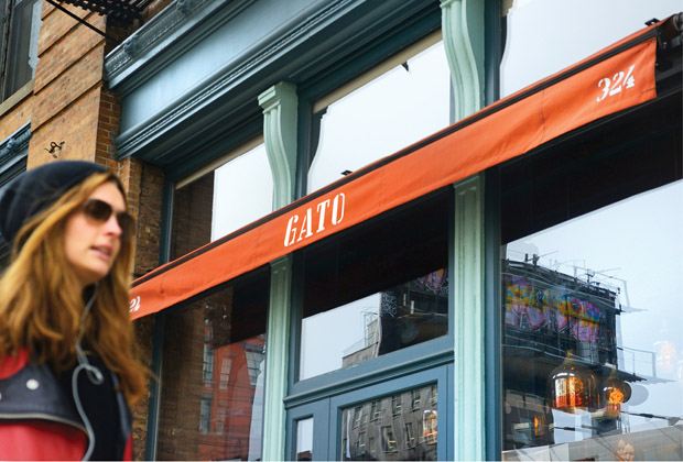
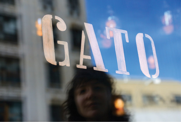
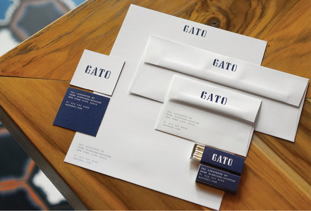
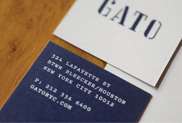
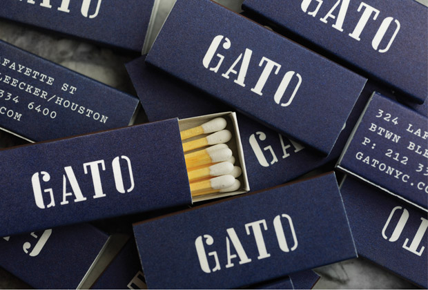
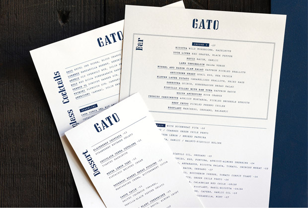
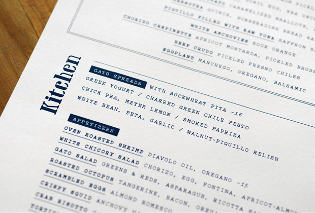
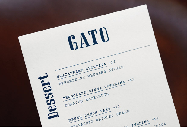
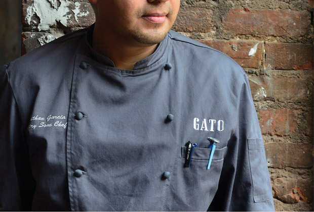
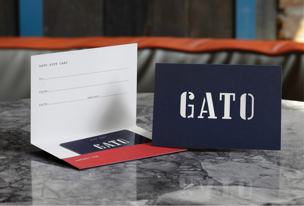
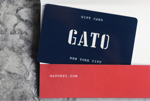
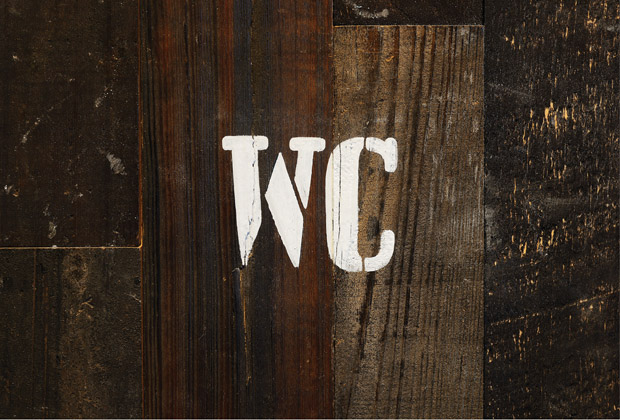
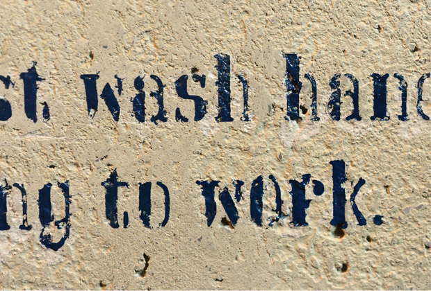
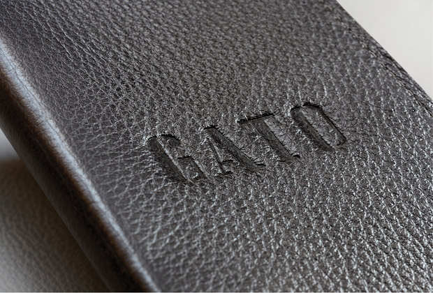
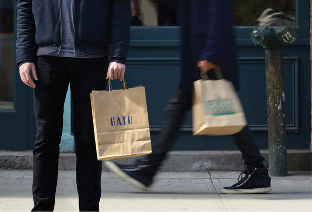
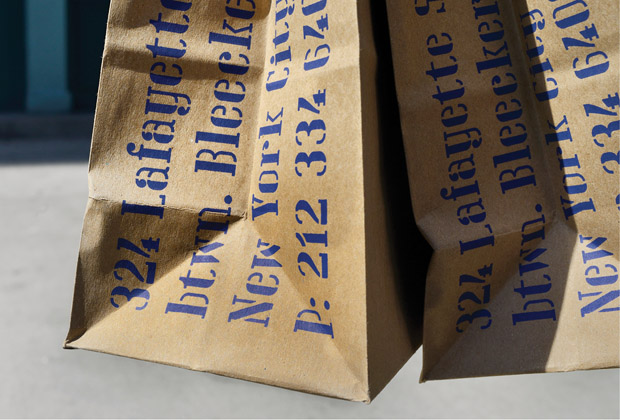
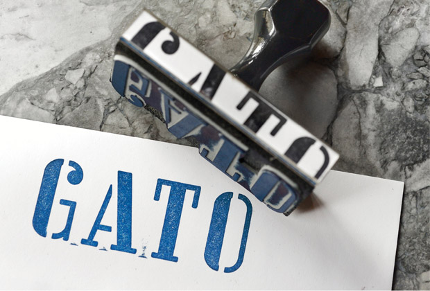
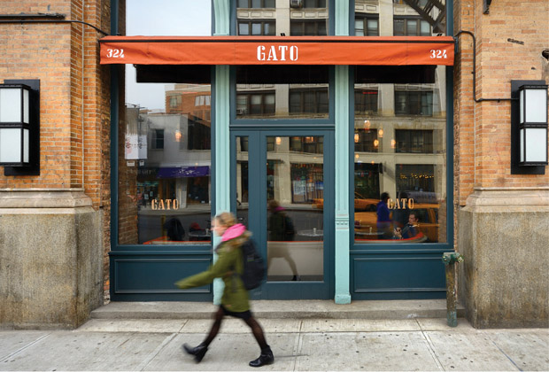
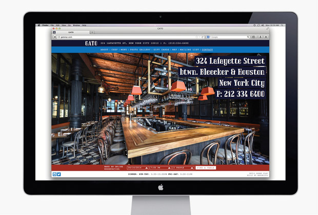
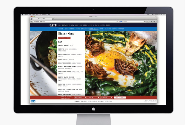
The matchup of Pentagram and Bobby Flay continues with Bobby’s newest restaurant, Gato. As an industrial-chic styled version of classic European dining experiences. The brand identity is applied to a lot of touch points, some are smart and thought out, others are just slapped on something which is rather boring. Now, looking closer at the actual restaurant logo I can’t help but see the original Gap logo. Dark blue square, white semi-serif type that’s uber-condensed. Am I the only one seeing this?
Anyway, here’s how Pentagram describes the project:
This spring legendary chef Bobby Flay makes his long-awaited return to the New York dining scene with Gato, his first restaurant to open in the city in nine years. Gato serves a Mediterranean menu inspired by the flavors of Spain, Italy, France and Greece. For the restaurant’s identity, Flay turned to Pentagram’s Michael Bierut and team, who previously designed the graphics for Flay’s brasserie Bar Americain and popular fast-casual chain Bobby’s Burger Palace. The Gato graphics complement the restaurant’s bold cuisine and industrial-chic NoHo setting with strong typography and a factory aesthetic.
