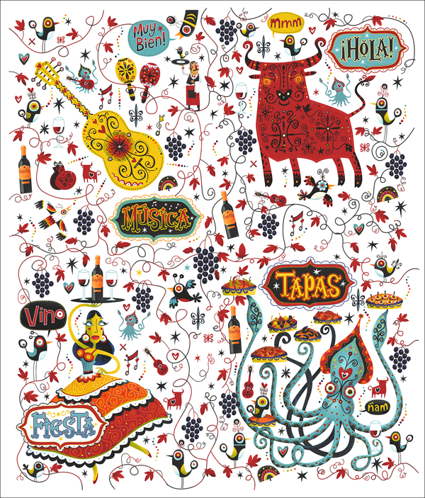
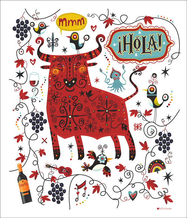
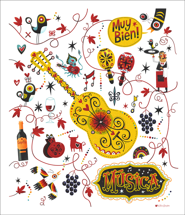
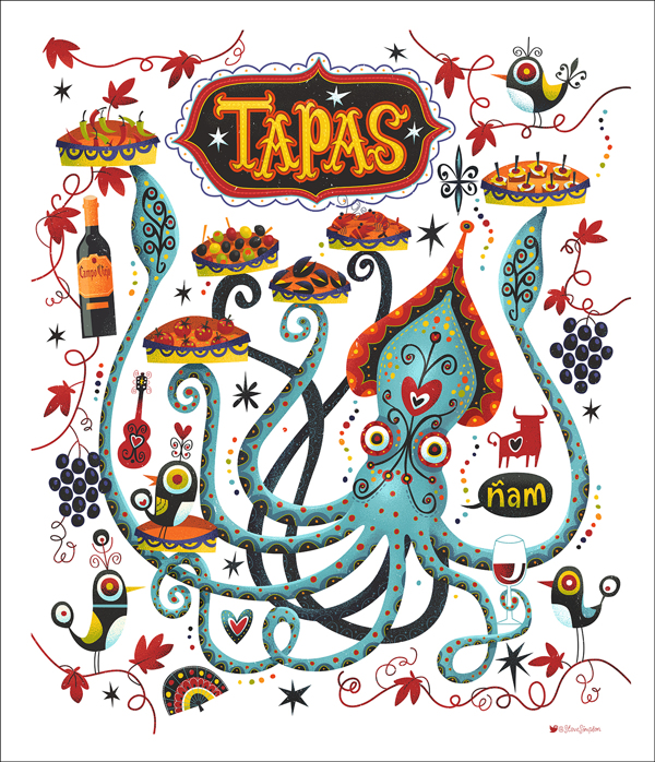
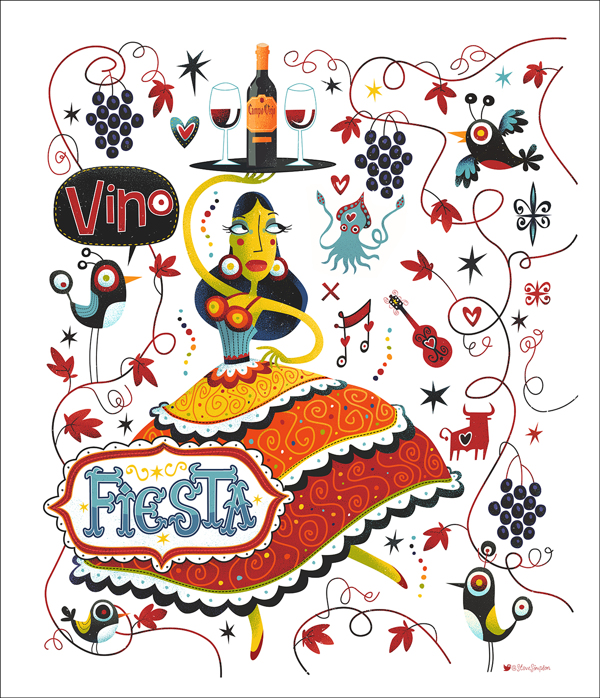
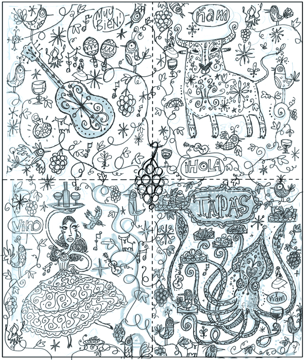
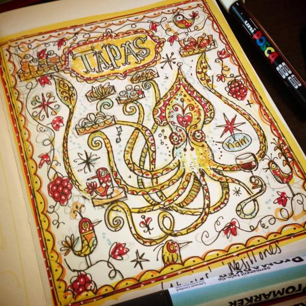
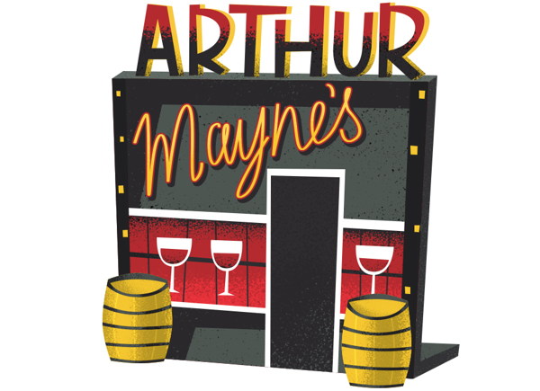
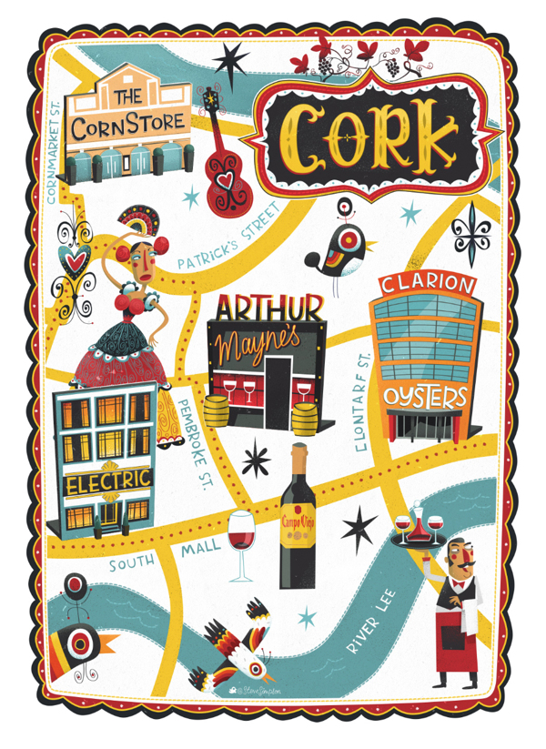
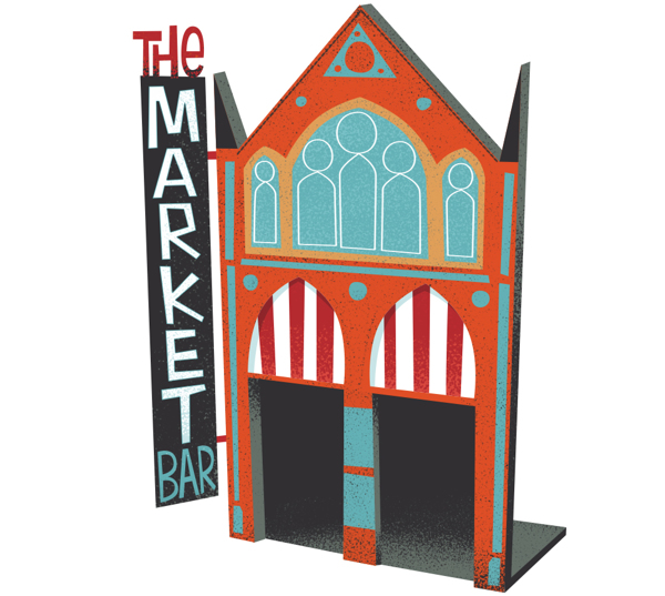
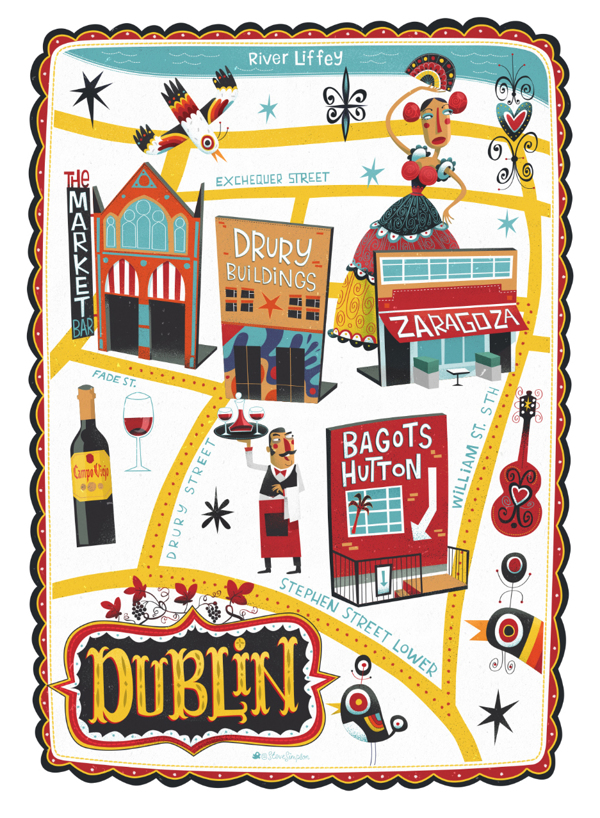
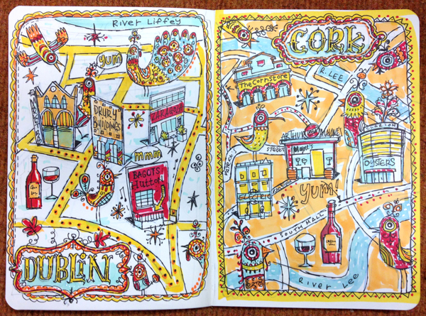
Steve Simpson lays down his illustration excellence for the Campo Viejo’s Tapas Trail campaign. Remember Steve don’t you? He did the radical package designs for Mic’s Hot Sauce. This restaurant event branding is completely defined by his unique style of illustration. Well thought out, the four different elements of the illustrations correlate to one of the four restaurants and their vibe. They also interlock to create one big illustration. Quite well done. Read more on his website.
