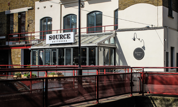
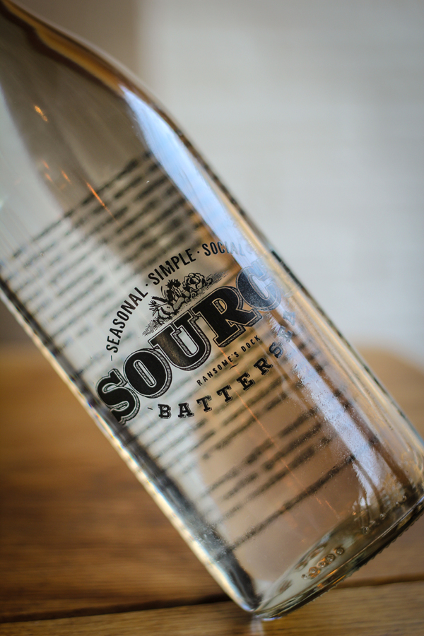
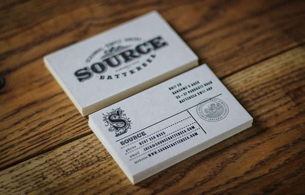
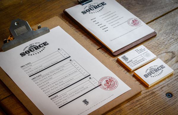
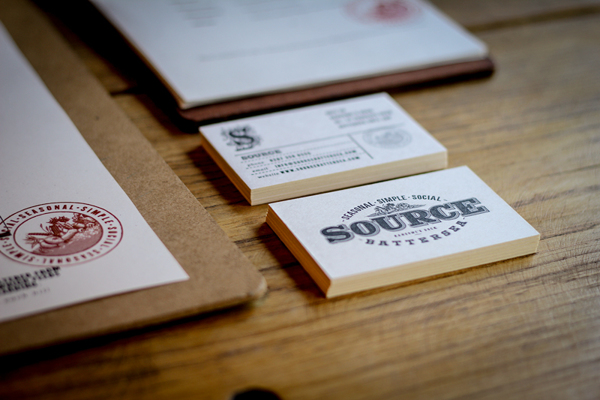
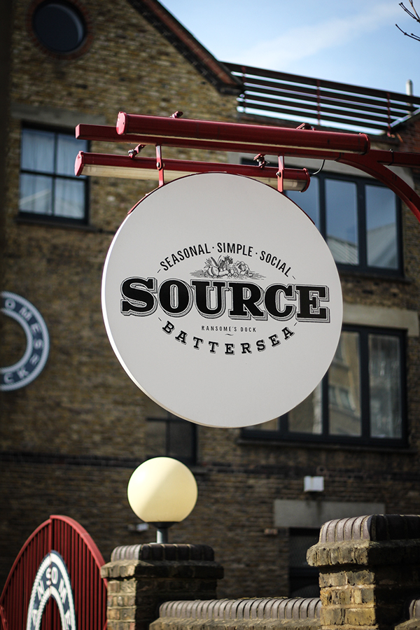
Source is a seasonal, farm-to-table style restaurant with an industrial chic vibe. The identity reflects this style perfectly with classic typographical treatments that are reminiscent of old-timey package designs. The logo and icon are distressed with a texture to give it that old fashion feel. Although the design isn’t groundbreaking or new, it is solid in its approach and execution. It’s well done. Designed by Ginger Monkey.
64f85c9e48023726498e84737b56c737

bde3ecc498209e8b432a7ea8d4a1cc92

f193ad4f4bdcea6c0bff88daa850123d

57392f820b60c8a33095997b721c4106

c09dac66c92638d25c7b98d8f66a45f8

4be9c05ac048d0208911b562cf738c3d

7dc5d5a563ee27878d7f44cb799c8387

cfd1925728f97ff21a2a2fab2c2219a5

1775c24721f3dd1cd276c976eb4f39c4

4a8848bcece14f57a37c8536d3282b27

Discuss this Project

Leave a Reply

This site uses Akismet to reduce spam. Learn how your comment data is processed.

The Forktales Podcast™: Interviews with restaurant industry leaders and visionaries

Restaurant and advertising industry headlines and thinking

Reviews of restaurant experiences from around the globe 

Reviews of our favorite design, business, & restaurant books

Our favorite typography and fonts

Inspiration in your inbox

Get the latest inspiration in your inbox every Monday morning, for FREE!

"*" indicates required fields

This field is for validation purposes and should be left unchanged.

Delicious Bits in your Inbox!

Get the latest and greatest content delivered to your inbox for free!

"*" indicates required fields

This field is for validation purposes and should be left unchanged.