Flying Burrito Brothers restaurant branding

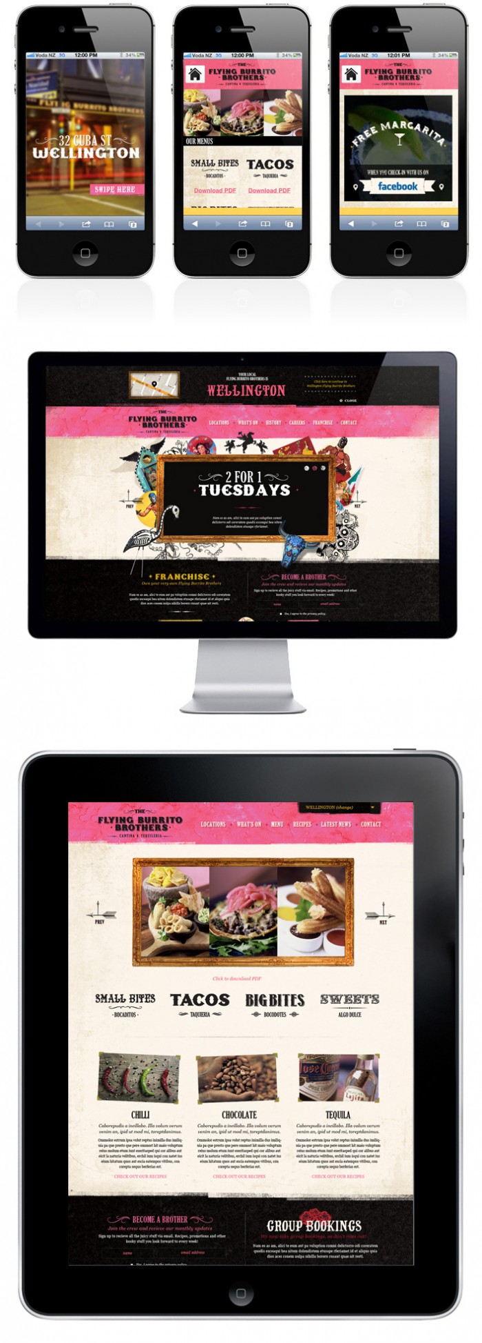
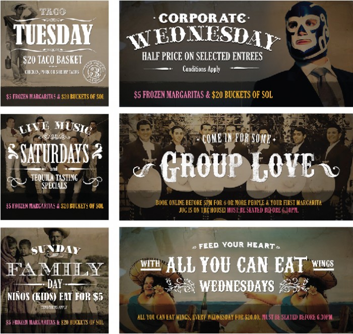
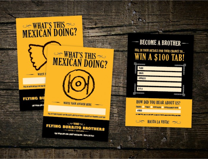
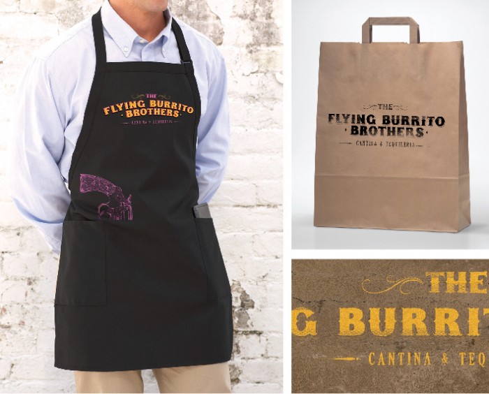
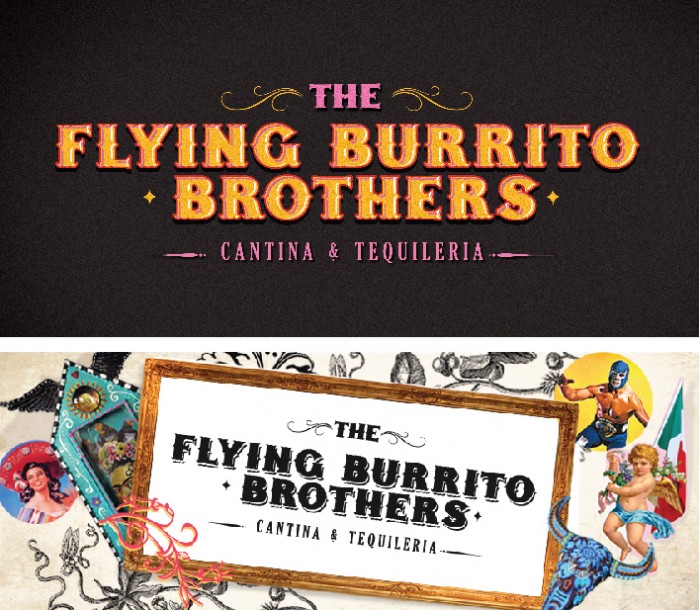
A mix of Mexican styles and circus poster designs make up the brand identity for Flying Burrito Brothers. The rough textures nod to the stucco style imagery of Mexico, while the woodcut type is a mix of circus poster and old west styles. I especially dig the apron design. It has that extra little element that’s unexpected. Designed by Chilli.

fbb1-50c9105cf36d6


705xNxfbb-04-50c91042c9ec4.jpg.pagespeed.ic.iwB2TMwYNn

705xNxfbb-03-50c91021599e6.jpg.pagespeed.ic.tPibnuLbiS

705xNxfbb-02-50c90fe91060a.jpg.pagespeed.ic.DmZvm2xE-4

705xNxfbb-01-50c90fb454bc6.jpg.pagespeed.ic.iPqlmtlZan

Discuss this Project

Leave a Reply

This site uses Akismet to reduce spam. Learn how your comment data is processed.