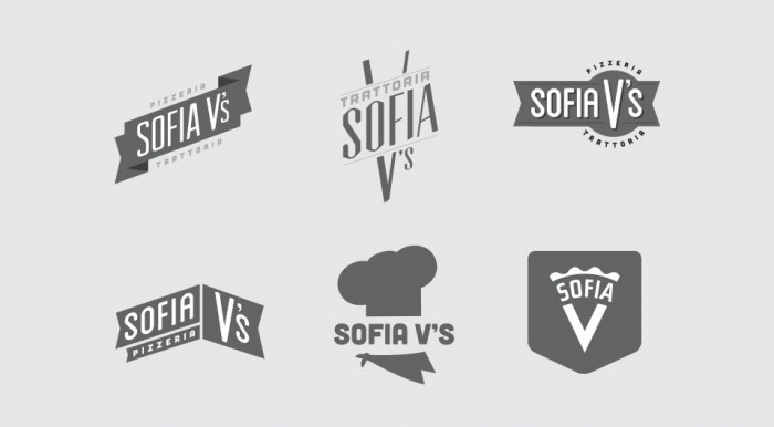
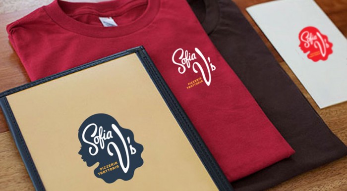
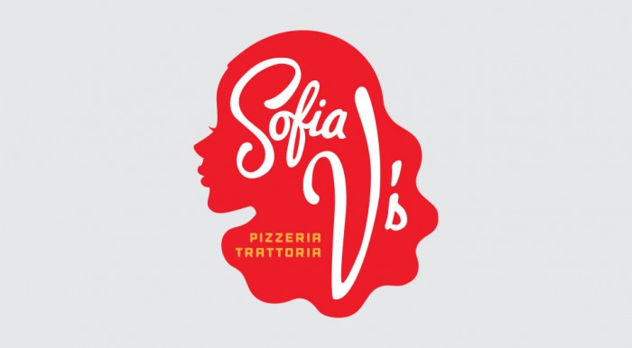
What stands out about the brand identity design for Sofia V’s is its lack of cliche in the design. Pizza restaurants tend to fall into a certain look and feel. God forbid we see one more with red white and green. Sofia V’s logo uses a vignette as a graphic element to define the brand. Smart, new and fresh. Well done by The Working Assembly.


