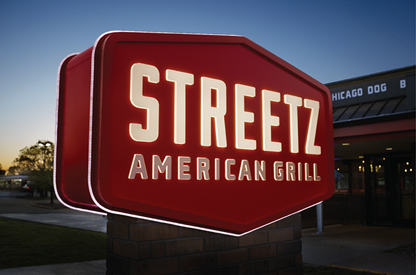
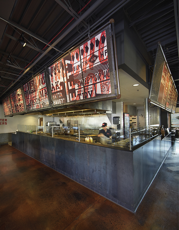
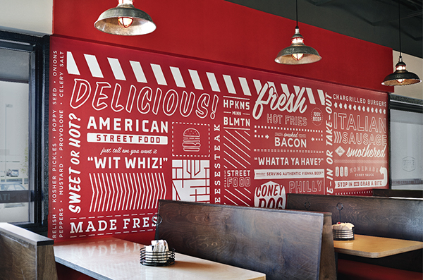
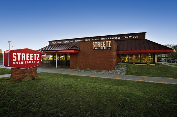
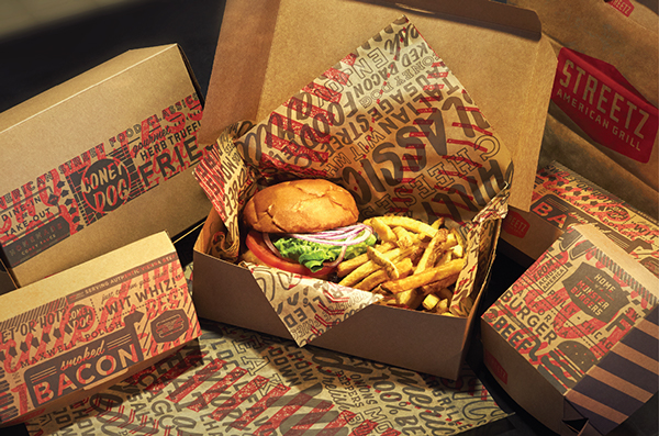
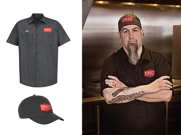
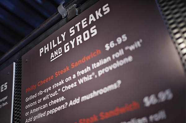
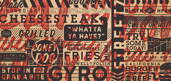
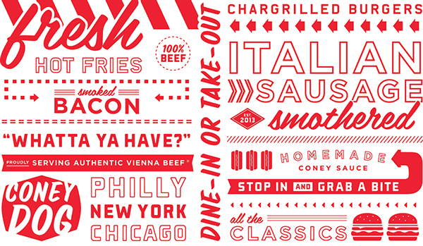
Taking it to the streets with a gritty visual language and excellent, retro-esque design elements. The brand team at Cue really nails the execution on this restaurant’s brand identity. The pseudo screenprinting overlay effects bring the identity down to street style, while simply tyopgraphic layout ensures menus are still readable. The signage is an excellent use of neon and production materials. (Side note: Neon is great when it’s first installed, but it’s expensive and very hard to upkeep. I wouldn’t suggest it for outdoor signage.) Designed by Cue.


One Response
is that even neon – could be strip light / led – you can see its uneven like little bulbs