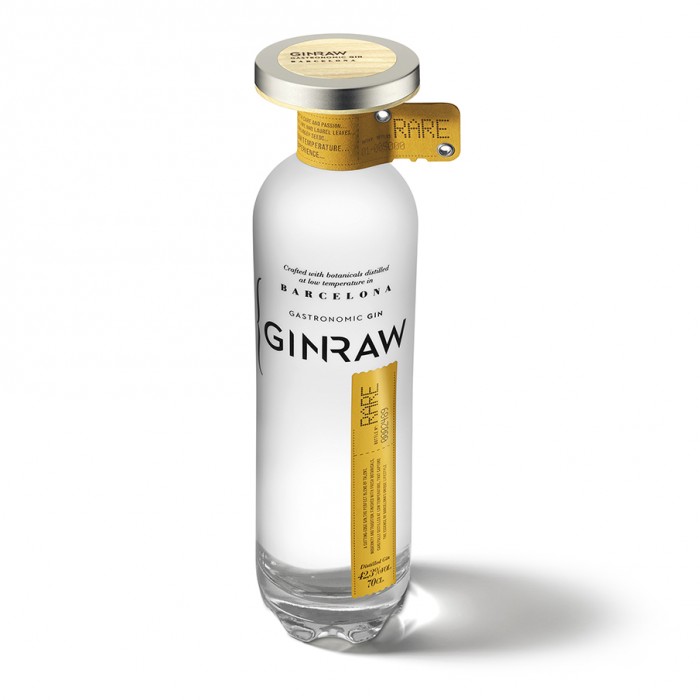
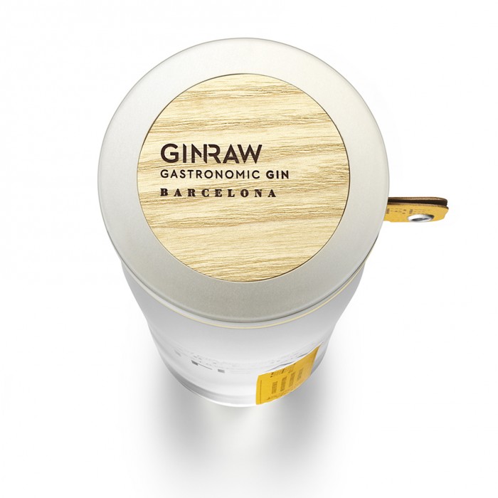
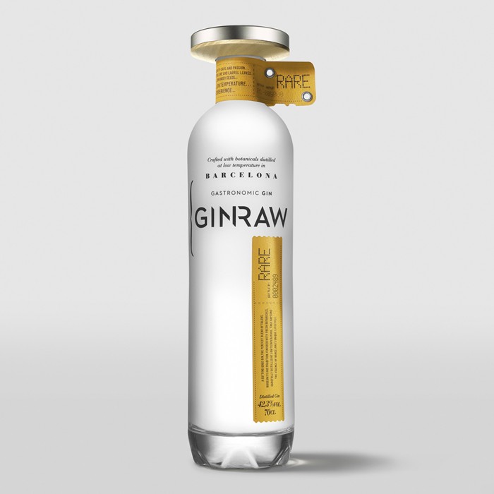
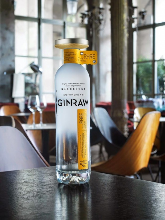
I stumbled upon this gem last week and just had to share first thing. What an excellent package design for a gin brand! I love the natural citrusy feel of the colors and texture. The typography is clean and not overdone. Designed by Series Nemo in Barcelona
54b4f1c416cf8

GINRAW_02_905

GINRAW_03_905

GINRAW_01_905

Discuss this Project

Leave a Reply

This site uses Akismet to reduce spam. Learn how your comment data is processed.

The Forktales Podcast™: Interviews with restaurant industry leaders and visionaries

Restaurant and advertising industry headlines and thinking

Reviews of restaurant experiences from around the globe 

Reviews of our favorite design, business, & restaurant books

Our favorite typography and fonts

Inspiration in your inbox

Get the latest inspiration in your inbox every Monday morning, for FREE!

"*" indicates required fields

This field is for validation purposes and should be left unchanged.

Delicious Bits in your Inbox!

Get the latest and greatest content delivered to your inbox for free!

"*" indicates required fields

This field is for validation purposes and should be left unchanged.