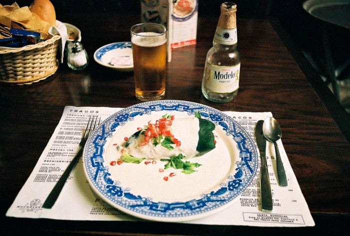
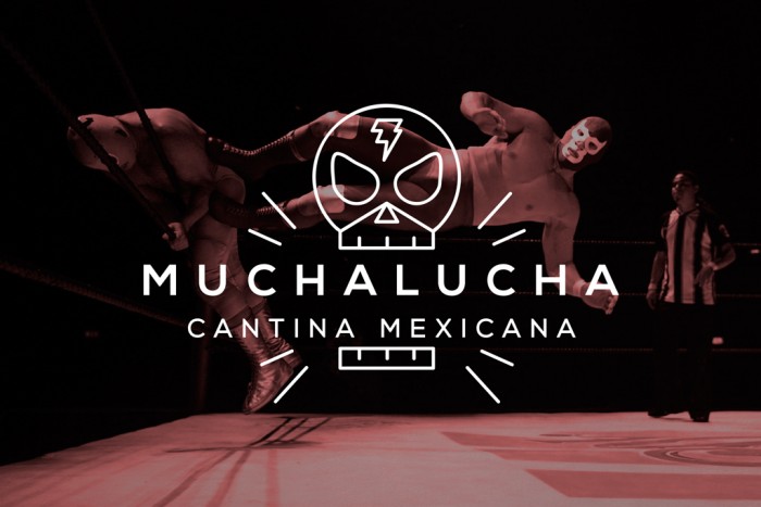
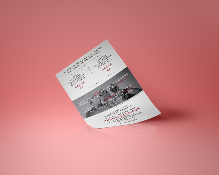
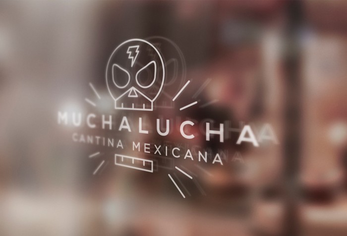
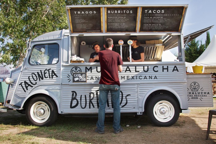
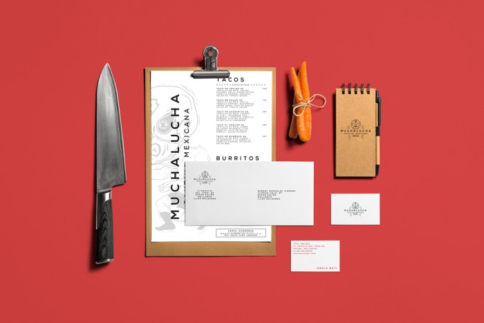
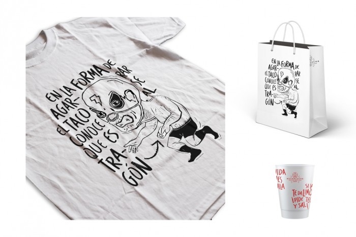
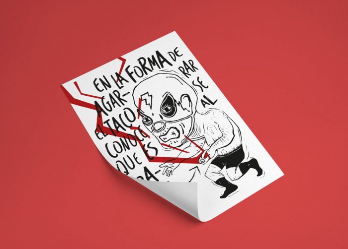
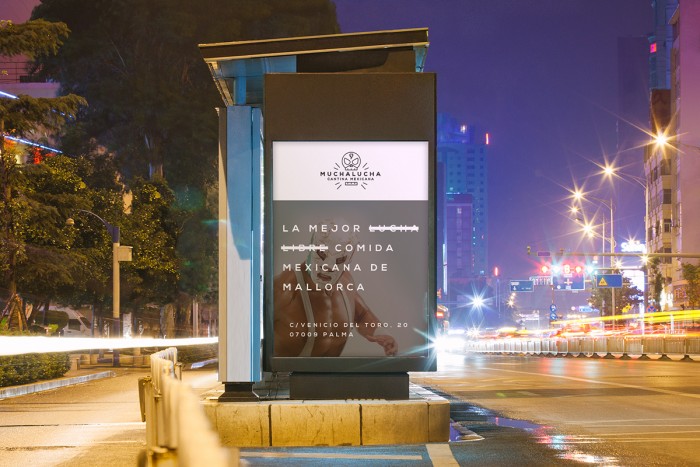
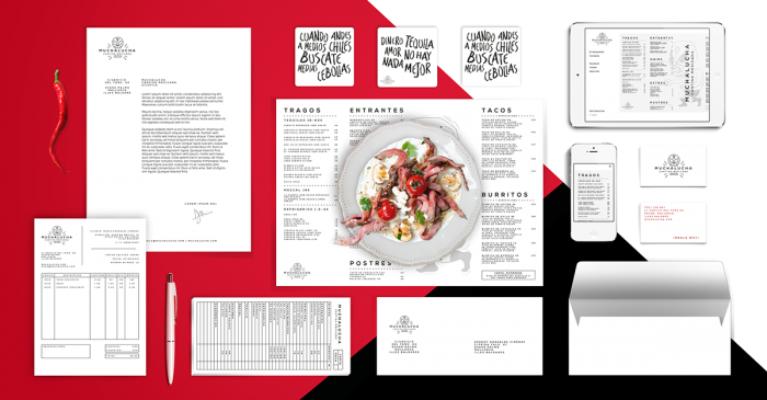
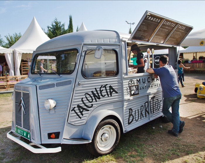
The identity for Muchalucha, a Mexican cantina with a brick and mortar as well as food truck, is a mix of clean and messy. From the illustration styles covering both a clean line technique, and a looser illustration style using pen and ink, the brand covers the bases of a stand-up, buttoned up look while not being too serious. The restaurant’s core graphic mark is a luchadore mask illustration; memorable, direct, and well crafted. What’s excellent is how the typography accompanies this illustration with similar line weights and curves. That creates a graphic marriage making it feel natural. The restaurant’s touch points like menu, poster, etc, all follow similar design styles with the kerning of type, thickness, and capitalization. The brand takes a turn for the quirky with the food truck/van design and associated tshirt. This illustration style is more messy, aggressive, and fun. It offsets the look making it more approachable and upbeat.
Designed by: Alexandre Bonnin