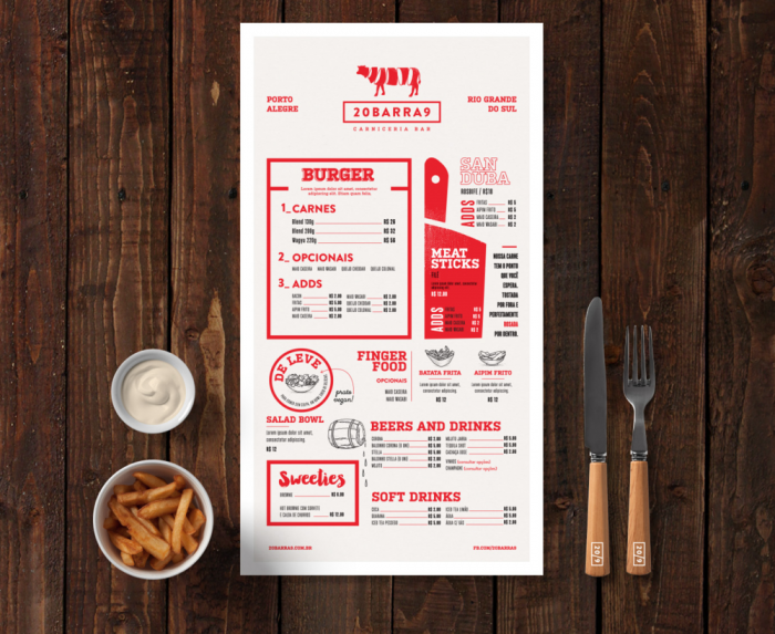
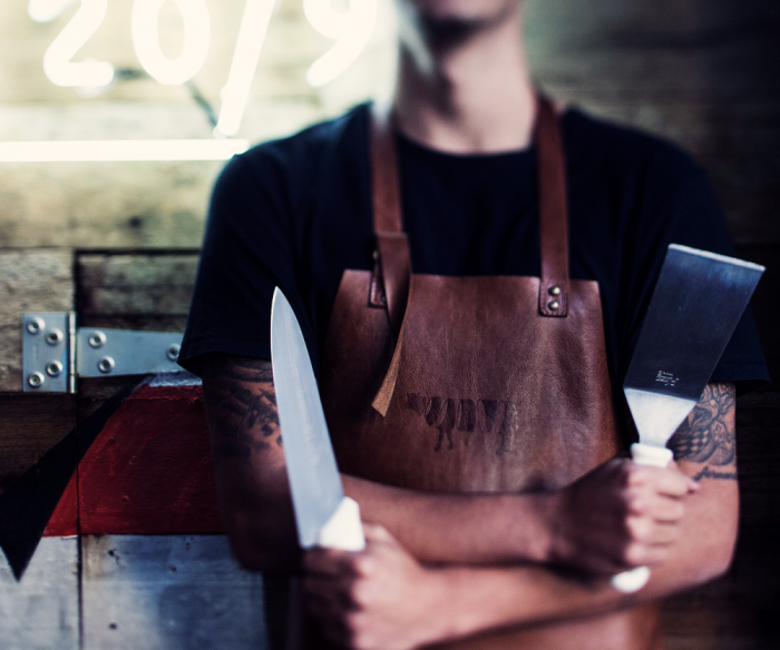
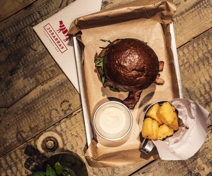
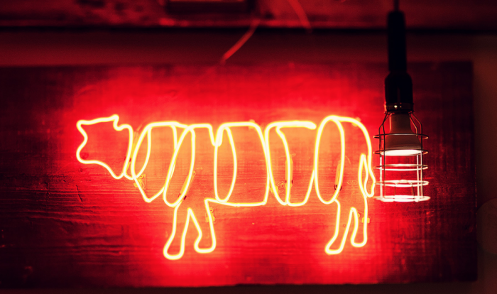
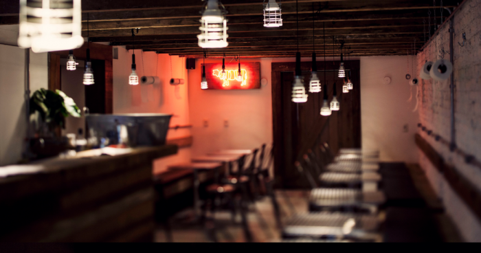
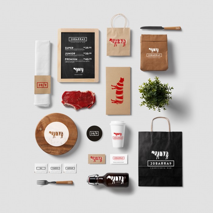
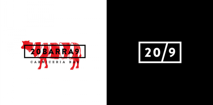
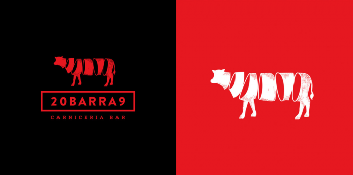
Isabella Rodrigues puts her excellent design skills to good use for this steak bar restaurant brand identity design. You may remember her from her work on Cocoville and Villa Roma brands. The colors used are expected, but they’re used in a fresh way. The logo takes the cliche cow silhouette and pushes it further with a visual representation of butchering. The mark translates well to other applications like neon signage and leather imprinting. The bright reds jump off the beige backgrounds and create a lovely nod to classic woodcut typography without going totally in that style. Lovely work! Can’t wait to see what she pulls together next!
