Just got back from a short trip to London on business. I’ll admit, it was my first time there so I had a bit of tourist in me. Okay… a lot of tourist in me. I didn’t get to do all the things I wanted due to my schedule, but I did get to document what I thought were some standout restaurant brand experiences. It’s safe to say that healthier eating is trending throughout the London fast casual scene. I hate to use the word “trend” as it implies it will go away. I don’t think that’s the case. Nevertheless the brand identity in the London restaurant scene covers the board from refined and upscale to eclectic and fun. I’ve pulled out some of my favorite restaurant experiences for you to enjoy. I stayed primarily in Bankside just for reference.
NOTE: If you’re an agency or designer responsible for one or more elements of any of these restaurant concepts, please email me at joseph [at] vigorbranding [dot] com. I’ll be sure to credit you with a link.
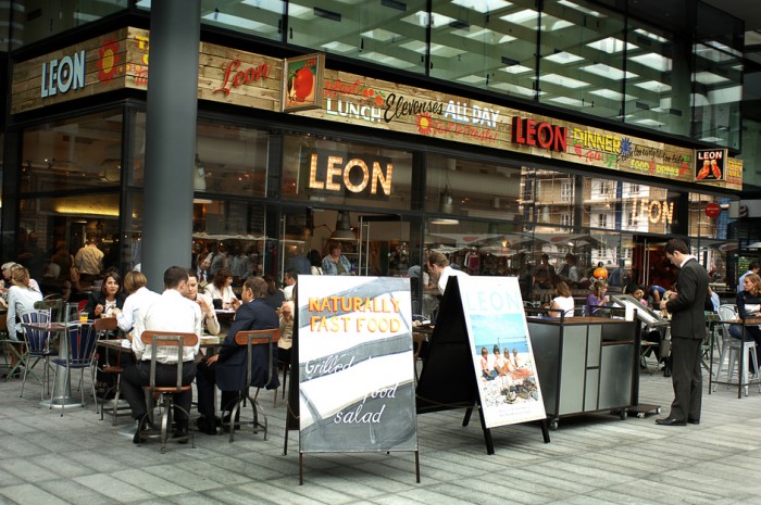
LEON – Naturally Fast food (Fast Casual/QSR)
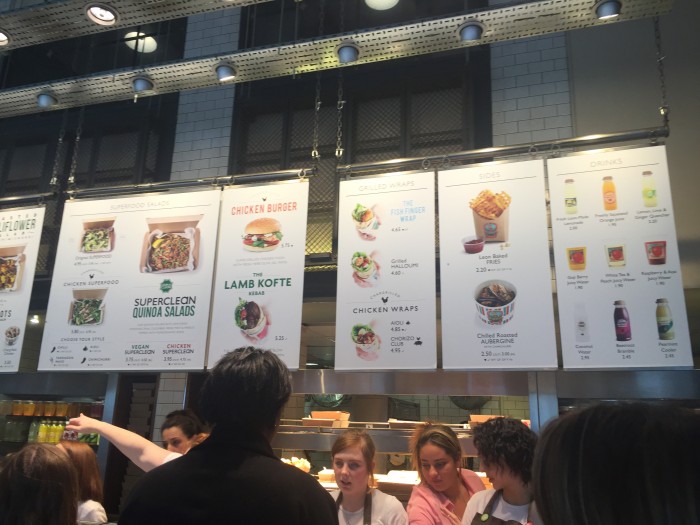
I was absolutely blown away by the experience from soup to nuts. LEON is the perfect example of the fluidity brands must have in today’s world. They’re not rigid, yet you can tell there is a brand voice being orchestrated throughout. LEON’s brand is eclectic, yet quite organized and put together – a quality you don’t find very often in this style of design. I was surprised by the brilliantly clean layout and design of the interior hanging menus. There is something so calming about their simplicity. That calm is accentuated and offset by the awesomely chaotic space and accoutrements throughout. http://leonrestaurants.co.uk/
Camino (Full Service Restaurant / Bar)
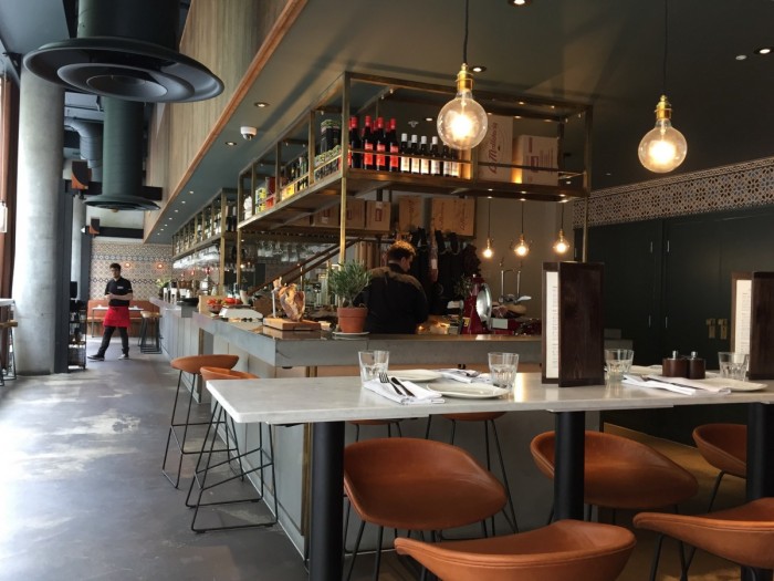
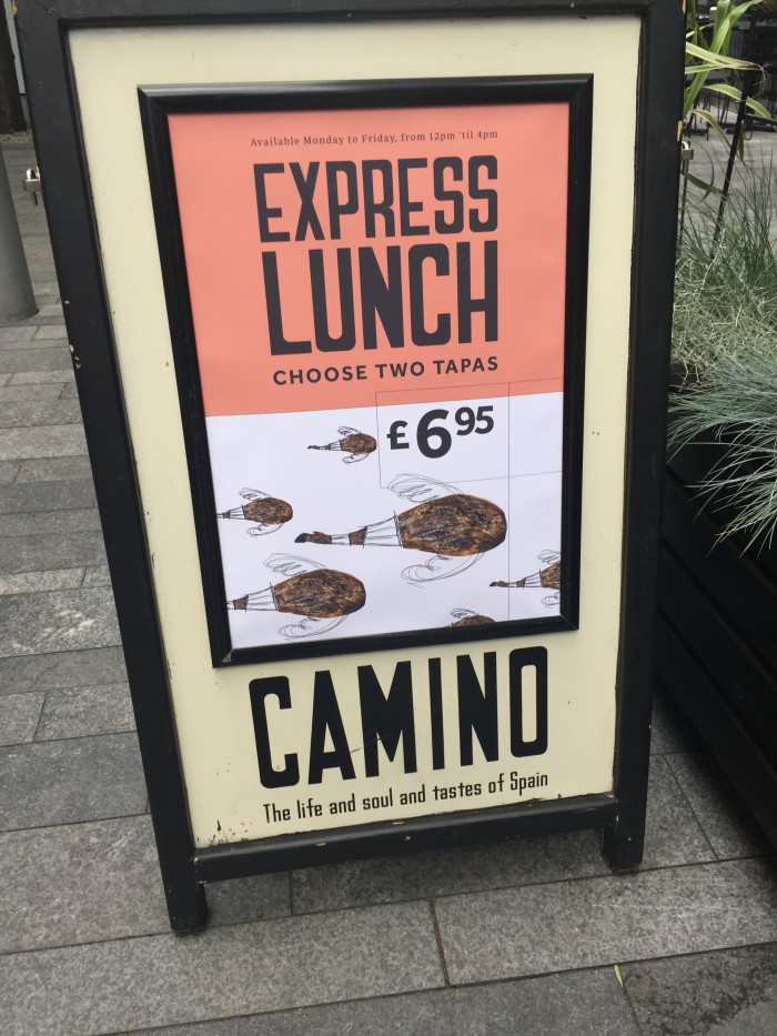
Camino is a full service bar and restaurant serving Spanish tapas. Although the interior design takes an approach seen throughout American bars (urban/industrial chic with foreign influences), the brand identity struck me as interesting. Specifically the advertising that features interesting artwork to deliver a message rather than relying on food imagery solely. They tell a story and guide an expectation that this place is higher end and more ethereal. It’s not salesy. http://www.camino.uk.com/
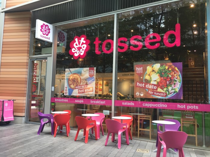
Tossed (Fast Casual/QSR)
This concept jumped at me with it’s bright colors and vibrancy throughout. The interiors and identity play of each other quite nice making for a cohesive experience throughout. http://tosseduk.com/
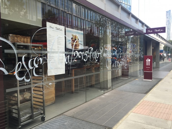
The Table (Full Service Restaurant/Bar)
This one location full service restaurant grabbed my eye with their lovely script typography strewn across their windows. The restaurant’s brand identity was simple, but poignant. It was confident. I do think their website needs to get in line with the interiors and other design touch points, but if that’s the worst thing happening that’s a not too shabby. http://thetablecafe.com/
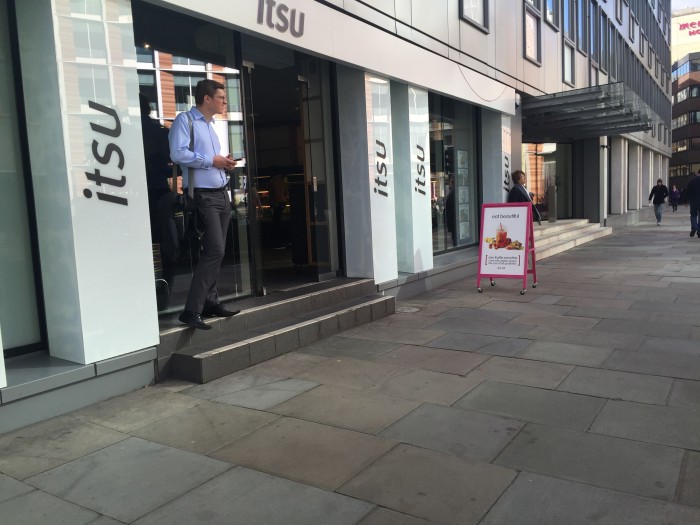
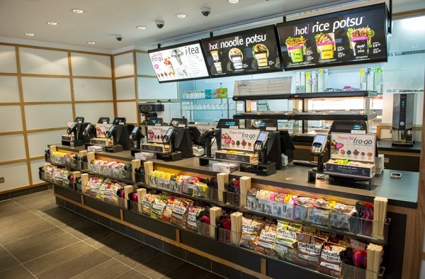
Itsu Soup & Sushi (Fast Casual/FSR)
Itsu is all over the place in London, and for good reason. The brand experience for this asian soup and sushi restaurant is on point. Modern, clean, vibrant with the right amount of subdued dining ambiance. They’ve bucked cliché’s splendidly. It’s where other sushi restaurants should aspire to be. http://www.itsu.com/
Initial brand identity design by Afroditi Krassa
Cafe Nero (Café/QSR)
What struck me about Cafe Nero was that it wasn’t what I expected from an Italian cafe experience. It was more modern, but not too far off to where i felt it was off or trying too hard. The coffee was fantastic, the interiors a breath of fresh air from other, run of the mill, coffee brands. http://www.caffenero.com/
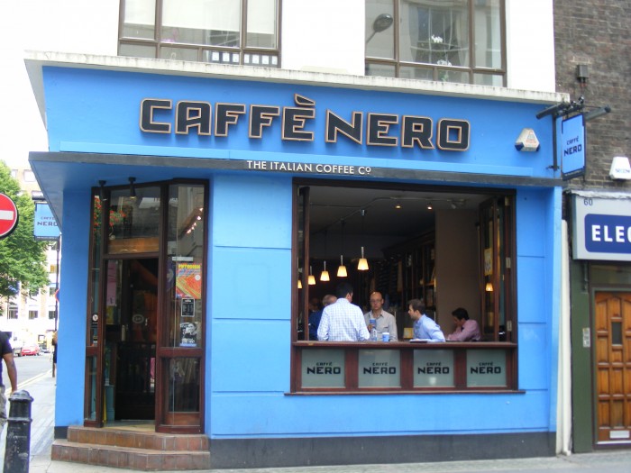
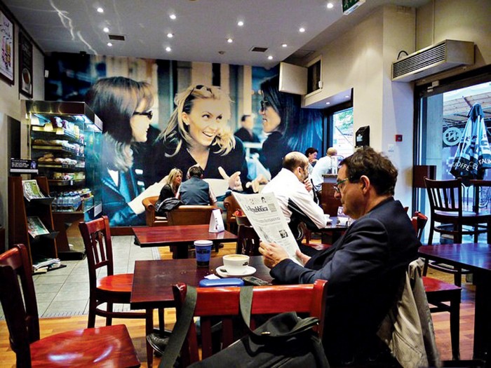
There were a number of other spots I saw that I liked, but they didn’t grab me as much as these. Pret a Manger was one such place. It’s a cafe and quite lovely, but nothing truly different or special. I suggest checking it out however. God knows I was there every morning for a latte an croissant. Breakfast of champions.


