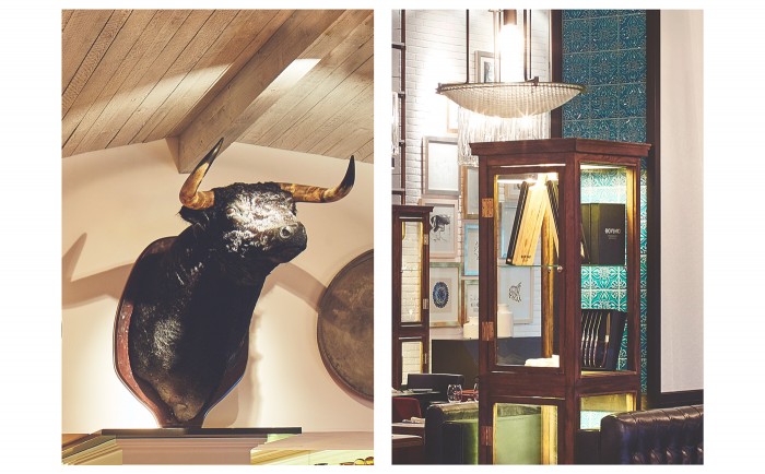
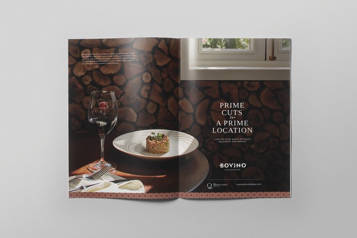
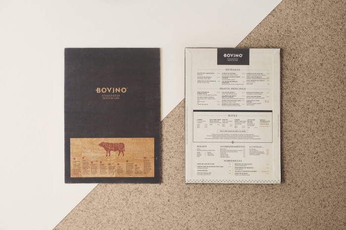
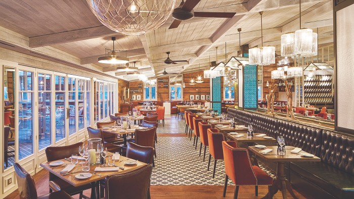
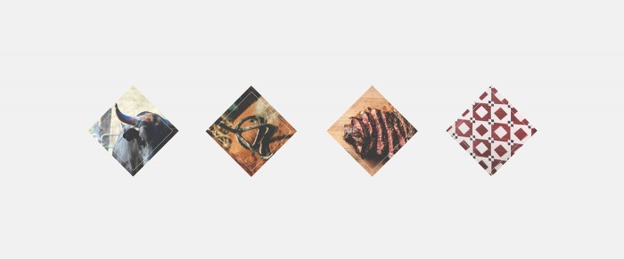
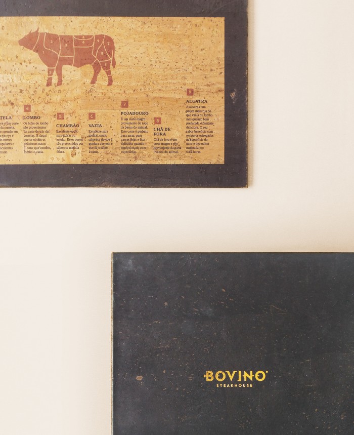
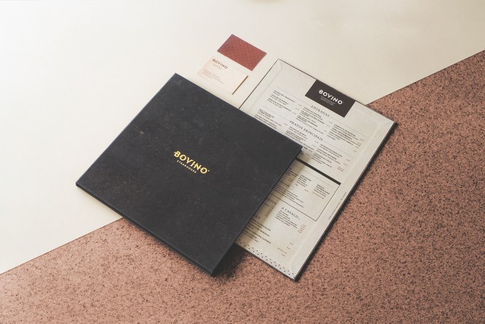
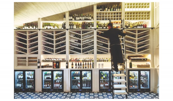
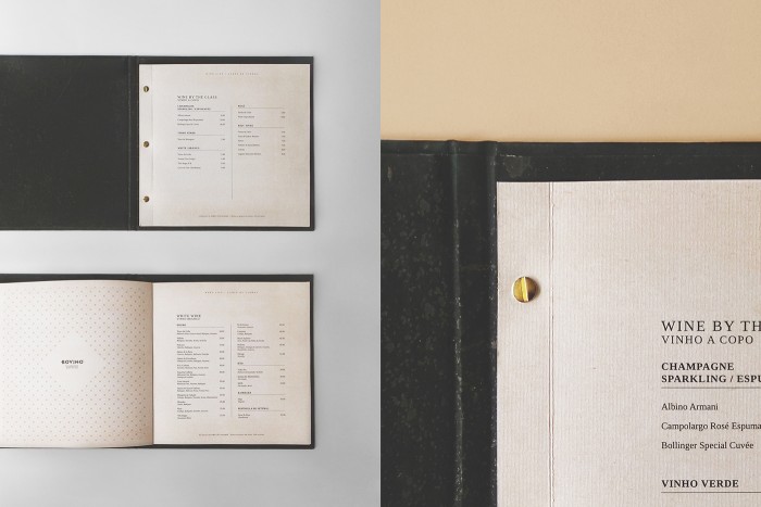
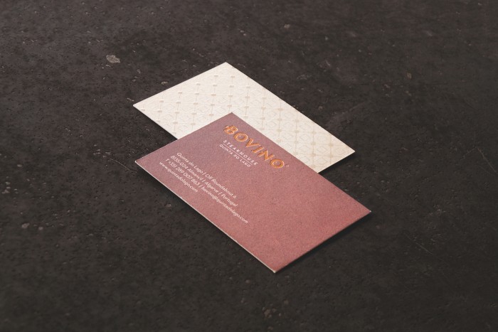
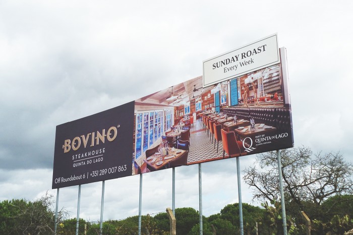
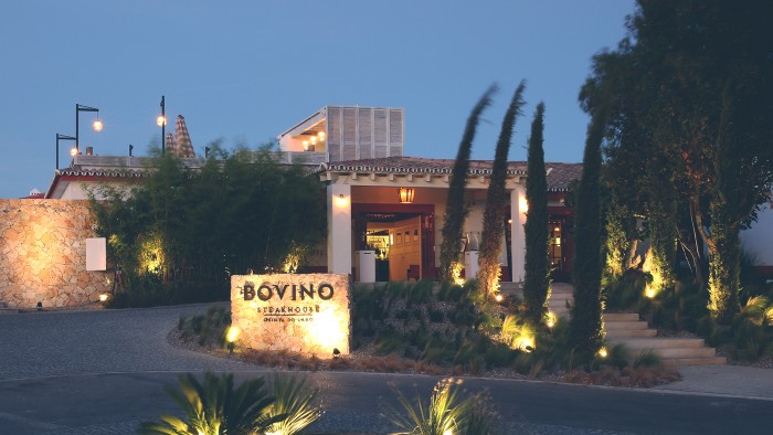
There’s something comforting about the traditional steakhouse experience. I’m not talking about your local Longhorn. I’m talking about that independent, classically upscale steak haven in your local city. Here in at Atlanta we have a few staples: Hal’s, Bone’s, Rathbun’s, and Chop’s. Although they all have that white glove experience you expect, only one really pushes the interior design and atmosphere beyond the rich mahogany woods, and brass accoutrements. Bovino Steakhouse, based in Portugal, is one such example of the quintessential steakhouse re-imagined. From the interiors to the marketing and brand identity design, the TripleSky team pushes the envelope further without losing the upscale, luxury feel. They’ve leveraged smart inspiration and interpreted it excellently.
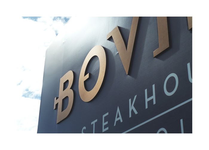
The act of marking livestock with fire-heated irons to identify ownership began in ancient times. This was the insight used to create the Bovino (= bovine cattle in English) logo “branded” in a style reminiscent of the old branding irons. Taking this historic reference as inspiration, we have designed a new font, evocative of the branding iron’s traditional designs, bringing to light in a more contemporary and elegant visual language. (TripleSky project page)
Designed by TripleSky
