I found this lovely work on Behance, and it immediately jumped out at me. Rather than writing a full review, the design studio has a stellar write up that I think is perfect. Call me lazy if you want, but here it is:
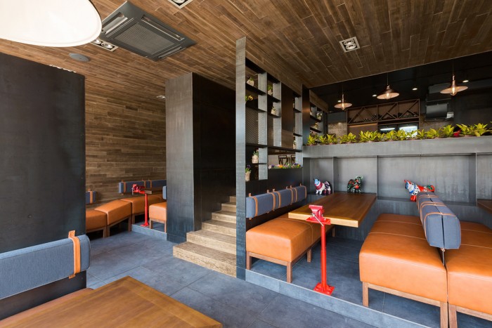
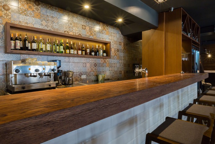
The restaurant consists of two levels. On the ground there is an entrance. The stairs led to the second floor where there is a bar and a distant hall. The designers were challenged to create two zones with different atmosphere to give guests the choice where to stay and how to spend time.
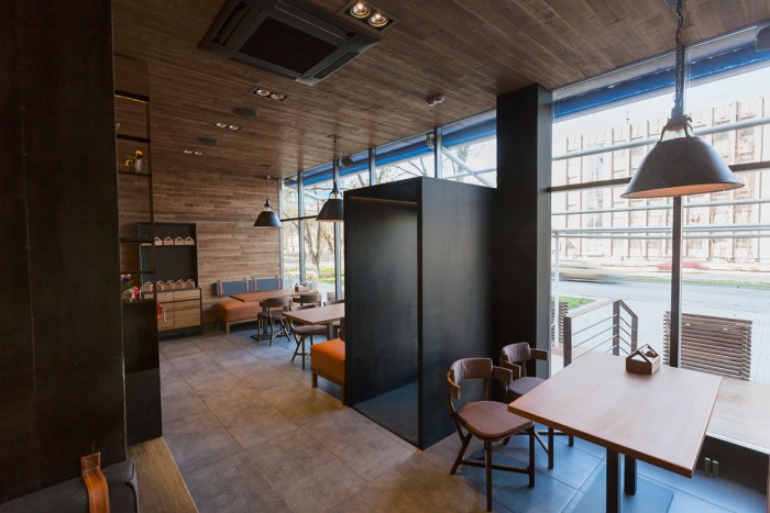
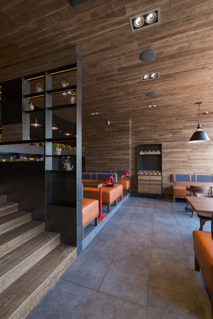
In the first hall there is a stained-glass window and lots of natural light. It was designed for the active pastime. Here the mood is created by walls and ceiling lined with old gray board. The wood texture contrasts nicely with metal panels. In the evening when the lamps are switched on the atmosphere becomes more chamber and cozy.
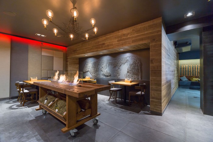
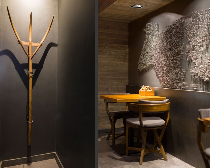
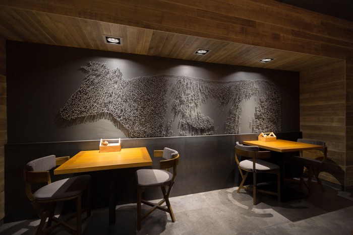
The first room and bar area are united by the rack in the ladder passage. In the distant room there are no windows, so it was decided to create a lounge atmosphere using visually soft fabric panels. Installation from the nails in the form of cow silhouette became a bright memorable accent. It is worth noting that this idea belongs to the customer.
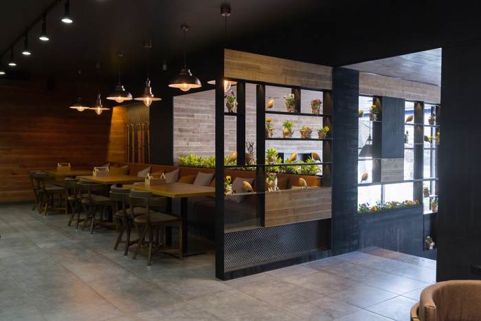
Creating an open space without isolated areas was another task that designers managed to solve. When it was impossible because of the architectural characteristics, designers linked the zones with visually similar materials.
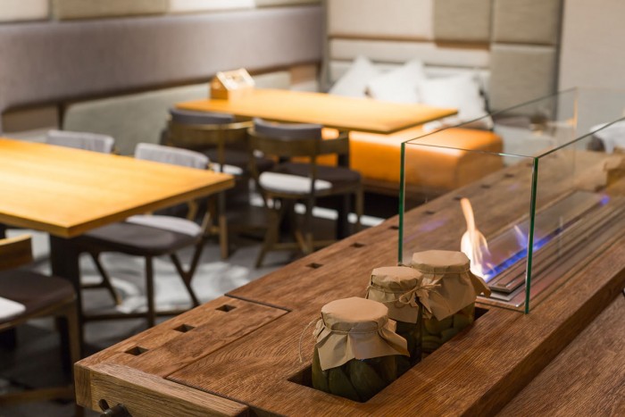
A lot of bright details explain and expand the restaurant name The Village: installation from the pitchfork, a table with bio fireplace looking like a joiner’s bench, vices, live fire and ceramic figures of bulls made by artist Olga Gavrilova for this restaurant. Chairs were made by Ukrainian designer Vladimir Veshtak specially for the restaurant. After adjustments the prototype of this chair was put into serial production.
Designed by YOD Studio
