Thanks to Esther Santos from Errestres for sharing this work. You can share yours too, by going here.
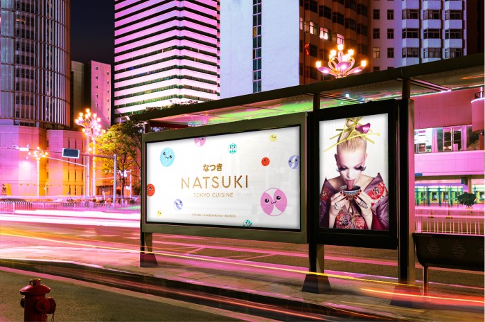
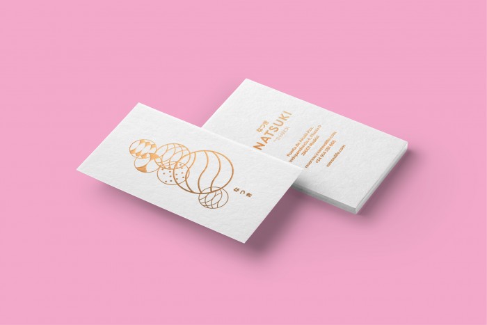
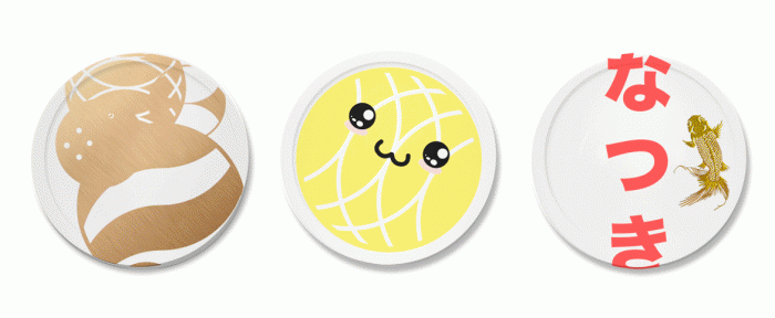
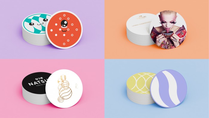
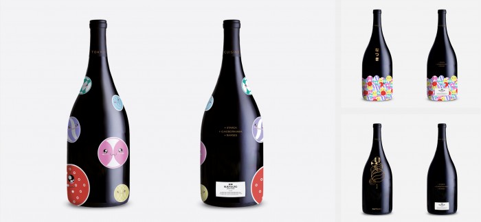
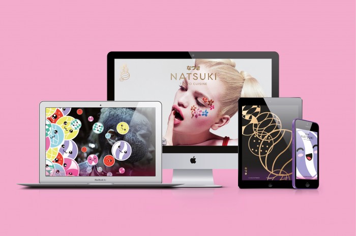
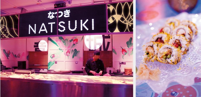
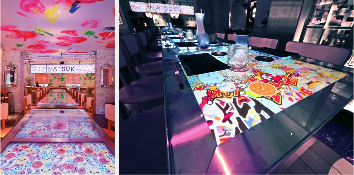
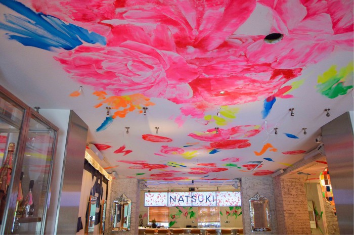
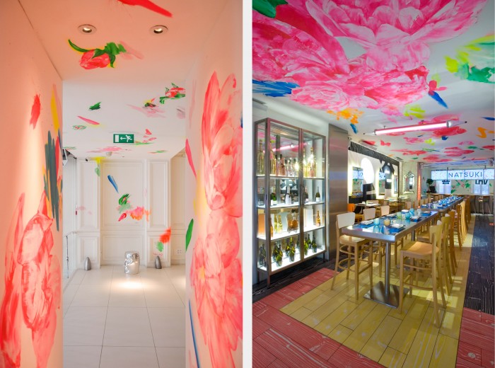
Natsuki in Japanese translates into vegetables and moon, two words. The second word served as inspiration for Errestres’s brand identity design for the Japanese gastronomic experience. This work is very experimental in execution and style. It looks more like a fashion identity and design than a restaurant. And that’s exactly why it’s brilliant. Far too often we as designers fall into the trap of designing for what’s expected; what the quintessential “restaurant” look should be. We forget to push the boundaries and experiment with ideas that break convention.
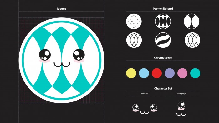
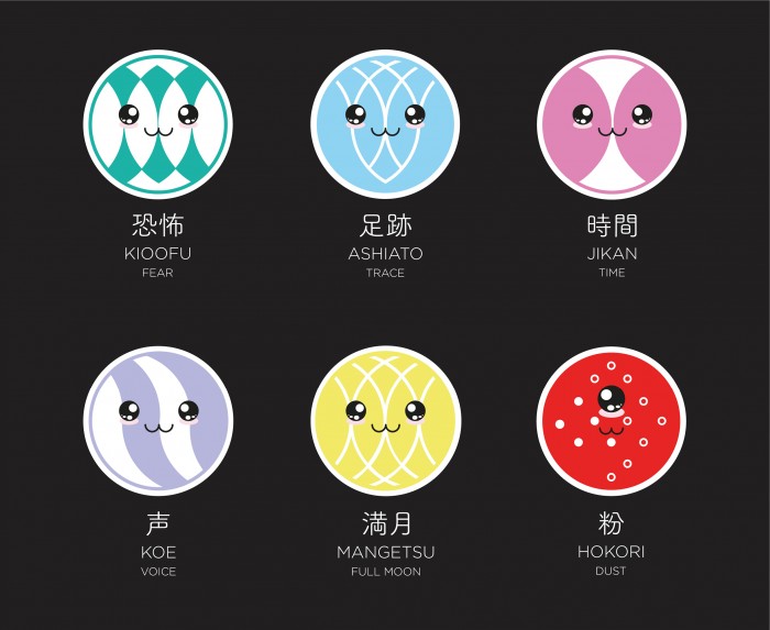
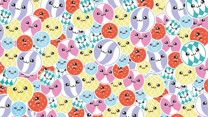
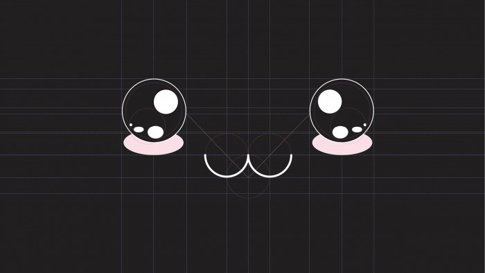
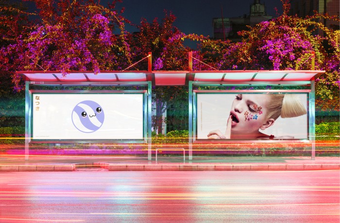
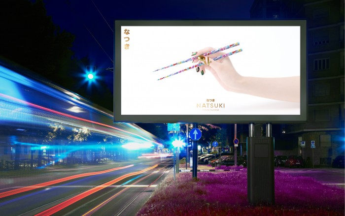
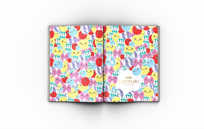
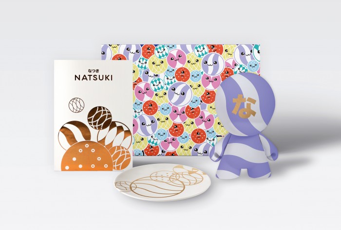
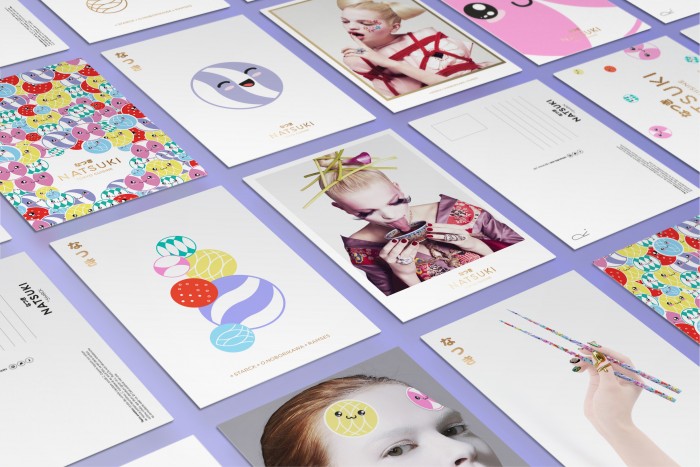
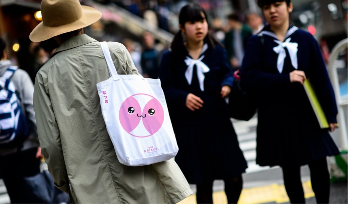
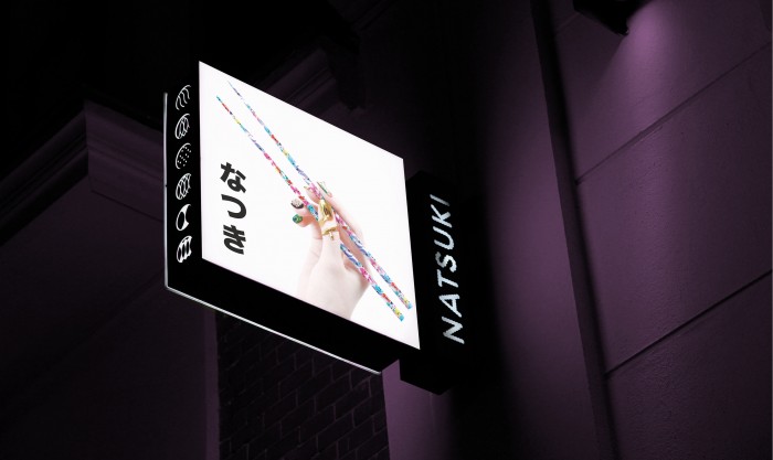
The introduction of the glassy-eyed anime-style illustrations isn’t surprising. However, the team at Errestres really hits a note with the photographic art direction and execution. More specifically, the imagery of the hand holding chopsticks. This hit me hard as a strong visual that says so much without having to work at it. The chopsticks become vehicles for art as does the hand with beautiful jewelry. It communicates a high end, modern experience. It says “Japanese food” without having to show the food. It’s powerful and haunting.
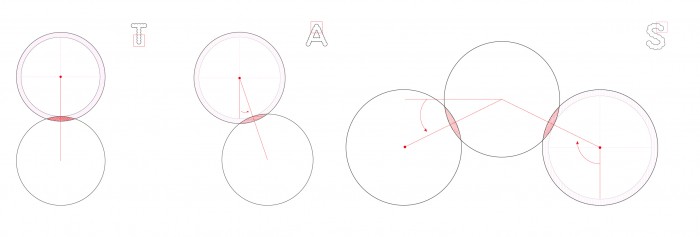
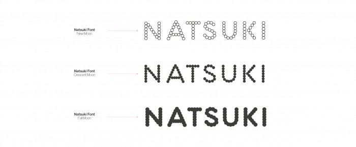
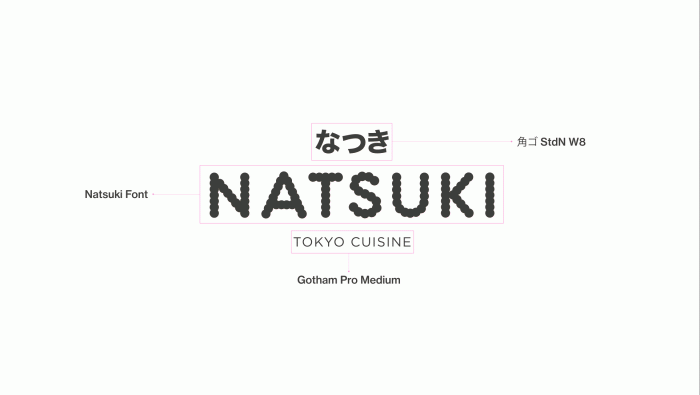
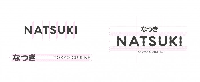
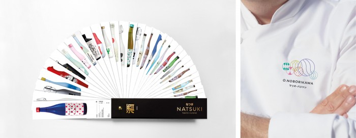
Errestres’s other components are strong with great thought. The typeface for the brand is built from moon phases. Not something blatantly obvious, but a great touch. The menu is a fanbook style menu. Very expensive to produce, but a lovely touch nonetheless.
Overall, I honestly think the anime illustrations take away from the identity.
Designed by Errestres
