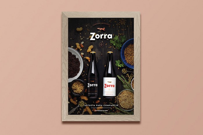
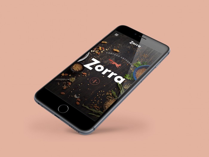
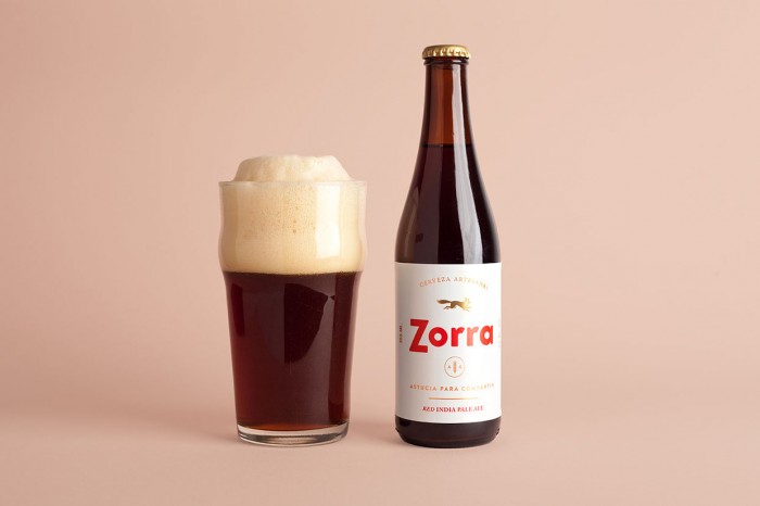
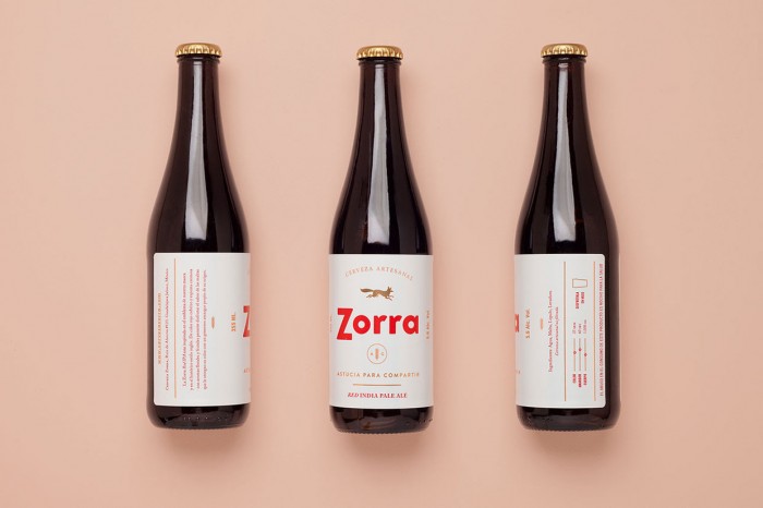
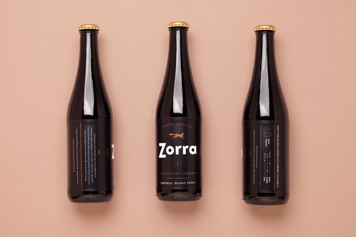
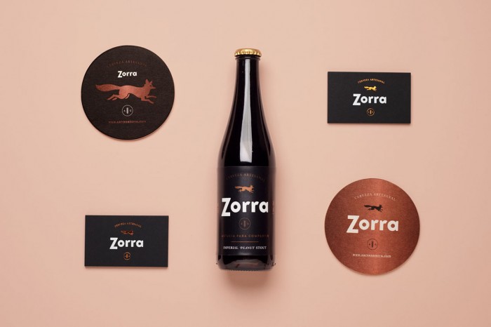
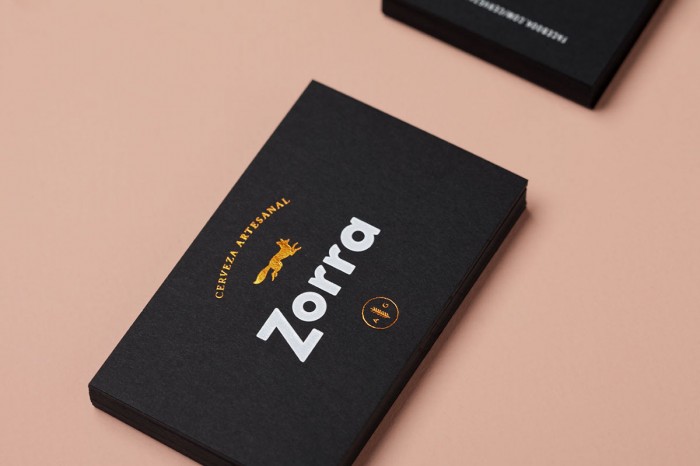
The design for this new craft beer in Mexico combines simple strong typography with a graphic mark of a golden fox. It’s direct and confident in its approaching and doesn’t rely on much else to tell the story of the brand. The simple layouts let the typographic and graphic mark combination speak loudly. In a world where beer brands are so overdesigned and illustrated, this is a breath of fresh air.
Here’s how the Analogo team approached the project:
Our naming and branding proposal combines a strong name treated in a friendly and contemporary way. Two strong beer styles have been selected to make the brand’s first statement. A black strong Imperial Peanut Stout made with a combination of six malts and brewed with roasted peanut and a Red India Pale Ale wich uses a selected variety of hops to bring floral and herbal scents.
Designed by Analogo
