Recently I had the pleasure of working with the design team at starrdesign in Charlotte, North Carolina. I was impressed by the initial meetings, their space, and most importantly, their thinking. I had some time to pull together some questions for Steve Starr, the visionary behind the firm and he was gracious enough to answer. The world of developing and crafting brands is rooted in “design thinking,” not just identity, interiors, and so on. The strategy and thought behind a brand is what makes it succeed or fail at connecting with the masses, and the Starr Design team does a stellar job at interpreting brand strategies into the physical space. Have a read and we’d love to hear your feedback, comments, and thoughts below. Enjoy.
###
I’ve worked with a number of architecture and design firms all over the place. I have to say starrdesign is one of the first that put a huge emphasis on the brand. Most firms seem to pay lip service then run off in whatever direction they want. What led to this appreciation and respect for brand as a holistic approach?
I believe the definition of design is useful art in the service of something. Art is typically not in the service of anything. It may be useful, but it’s not in service. So for me, great design has a sense of delight, economy – and a sense of service. That brings us to the question: what does it service? I’ve spent my career focused on consumer environments, and what I’ve learned is that in order to address those 3 things, you need to be in the service of the brand. The element that connects delight, economy and service in the consumer world is the brand. That’s how we developed our tagline “we connect people and brands through inspired environments.” That is the expression of delight, economy and service. We design to create joy and community, and in the process, we help people make a profit. But the money isn’t at the core of what we do.
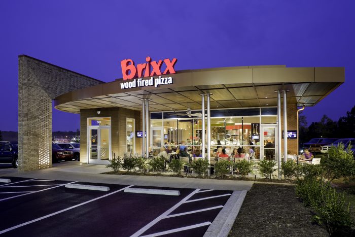
That’s an interesting approach. When crafting “joy and community” how does starrdesign pave a path that transcends trend? Tupelo Honey Cafe gets a bit close with some of those trends like subway tiles, reclaimed woods, and Edison bulbs, but manages to stand on its own. How do you guide clients away from wanting trendy, overused materials?
I think this really depends on where you are in the trend curve. If you look at the diffusion of innovations according to Rogers, innovation is broken into five categories: innovators, early adopters, early majority, late majority and laggards. In design, you have to ask yourself where an item is on this trend curve. But more importantly – is it appropriate to the brand? Does it reinforce the brand messaging? Tupelo Honey Café is about “New South Flavors. Scratch-made Fun.” Their brand takes on the idea of using old materials in a new, fun and creative way. So those things just happened to fit. You also have to keep in mind that these stores were designed almost 2 years ago. At this point, the trends are farther on the side of the majority. But when we designed them, it was still early in the curve. Regardless, it’s still appropriate in the restaurants today, because it’s relevant and authentic for the brand. If we are looking at a material (even if it’s appropriate to the brand) and it’s already at majority – we need to use it in an incredibly different way, or it just goes unnoticed. Otherwise, we simply don’t use that material.
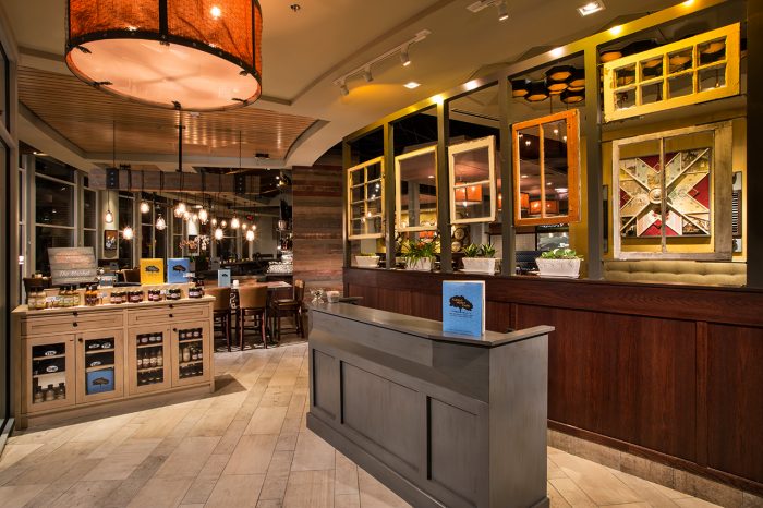
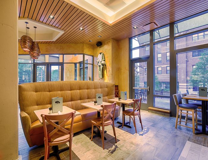
Architecture is a different industry than other creative fields in that architects are required to attain a license to practice. Do you think that affects the quality of creative talent? Obviously it ensures capability, but does creativity take a hit?
I don’t think the attainment of a license affects creativity. Licensed architects can be incredibly creative; however, architects have done an unbelievable job of devaluing themselves. Architecture today is often viewed as a necessary evil. There’s a reason that we are a design firm! We are a group of architects, interior designers and graphic designers – but being a design team is something that is valued higher than an architecture firm.
Additional requirements don’t limit creativity. Instead, they create guiderails that allow you to channel creativity to the most appropriate solution. Architects need to deal with things like gravity and structure and the health, safety and welfare of the public in a built environment. Those are guiding forces – not limiting factors. To create a building within those constraints can take substantial amounts of creativity.
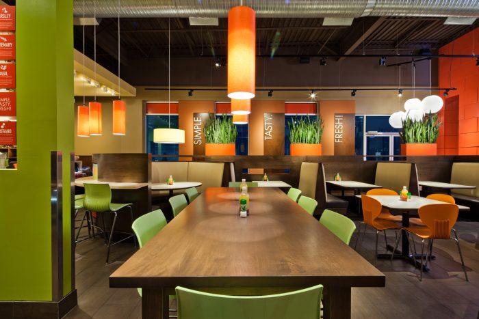
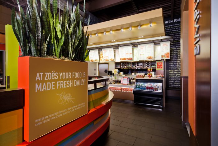
That makes sense, and also seems daunting. You had to have felt a bit overwhelmed on your first project. What was that first restaurant project designed by starrdesign? What went wrong? What went right? Still proud of that work?
When I left my previous firm and started what’s now known as starrdesign, the first restaurant we did was New South Kitchen and Bar. This was a rebranding of a café here in Charlotte, and the budget was $150,000 all in. Everything we did had to be incredibly cost effective. I’m absolutely still proud of our work – we dramatically changed the feel of the restaurant, which changed the clientele and gave the owners another decade of success when the old concept was dying. The restaurant is still there today!
As far as what went wrong, there were a number of things we tried to relocate and use in order to save money (wine display, millwork items, etc); however, when we went to move them, they actually fell apart. On the other hand, we did a lot of cool things for $150,000. We used linoleum on both the bar and the ceiling above the bar area, which created an interesting piece. For décor, we bought old kitchen items like dutch ovens and ladles – and spray painted them. We then bought old frames, removed the glass, and used them to frame the objects as 3D artwork. It really turned out to be a neat space.
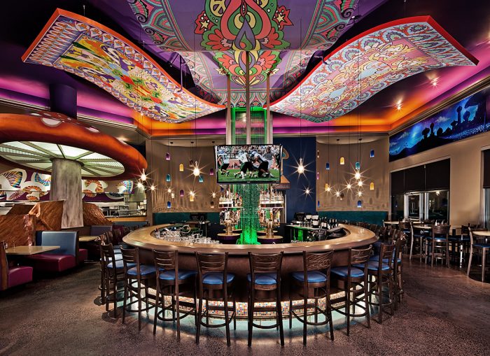
I’ve always seen architecture and ID as creating new worlds. In the Mellow Mushroom work you take that nearly literally. What was the inspiration? Was is hard to “sell” the client on the idea?
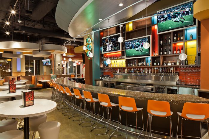
I’ve always thought about the design of buildings and spaces in certain terms. And if it’s brand appropriate, then clearly defining the outside world from the inside world can be important. I truly believe that restaurants are an inexpensive, very accessible, very approachable means to escape the mundane world of everyday lives. They become sacred spaces. They’re an inexpensive means of entertainment and escape. In designing any sacred space, you have to design a boundary between what is sacred and what is not. This is very appropriate for Mellow Mushroom, as part of their brand reinforces this idea of escapism into a different world. It was very intentional. And it absolutely was literal for us. In this specific store, the inspiration was midcentury modern as seen through a Mad Men lens. The restaurant is located in a high-rise building in uptown Charlotte, in the middle of the business district. Unlike some other Mellow Mushroom locations, it wasn’t intended to be about families and children – and we made our design reflect that.
Sounds like they were a great client. There are good clients and bad ones, and a lot of times it’s hard to see a bad one coming. How do you ascertain whether or not a client is going to be bad or good?
In the early days of our firm, we determined three areas that a project could fall into. It may fulfill our why, fuel our economic engine as a profitable project, or fall into the realm of what we do best. We use this intentional diagram to make decisions when taking on new clients. A potential project must meet at least 2 out of 3 of these areas in order for us to consider taking it; however, there are also times where I wish I would listen to my gut and intuition more than my head!
As some of readers venture into the field/world of interior design, what advice would you like to leave them with?
[My advice is to] Have fun with your design! It’s important to put extensive thought into your work upfront, especially when determining function, operations and practicality. But when it comes to design, don’t be afraid to think outside the box and stretch yourselves. The best designs are the ones you are passionate about – and those are the spaces that truly connect with people.
###
There you have it, folks. Great advice and insights. What are your thoughts on some of the topics discussed? Agree or disagree with Steve Starr’s approach and thinking. Let’s here it and please do share this if you found it insightful and valuable.
Cheers!
Joseph


