Pao Con Carne branding & typography

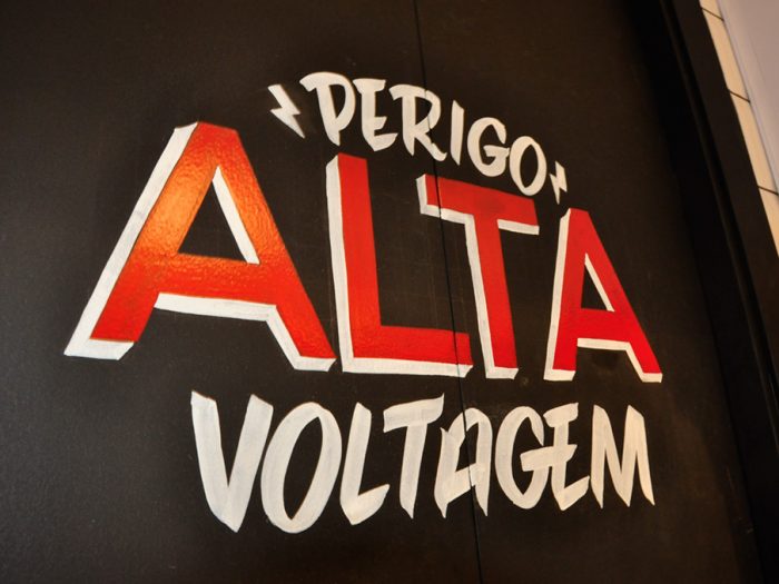
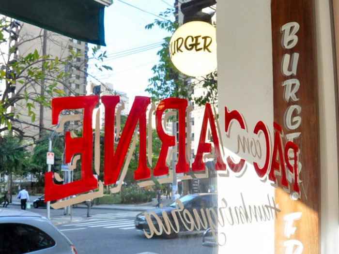
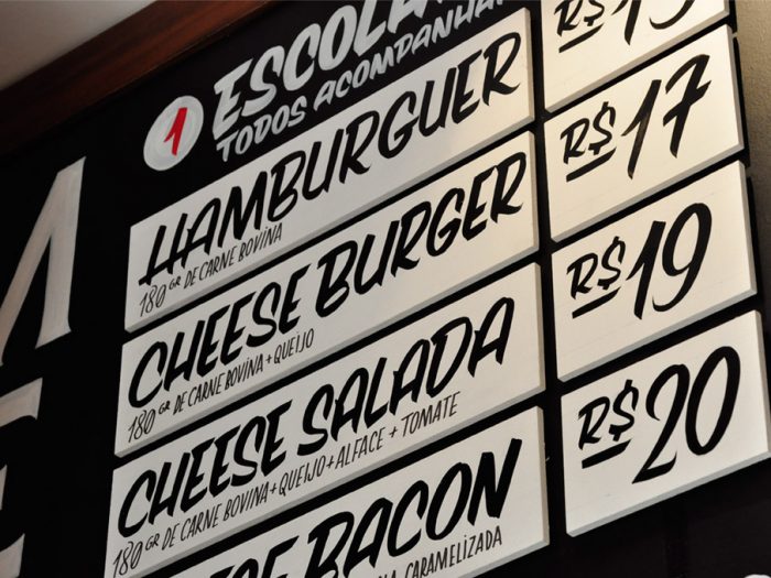
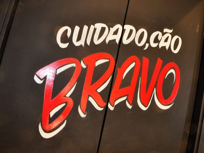
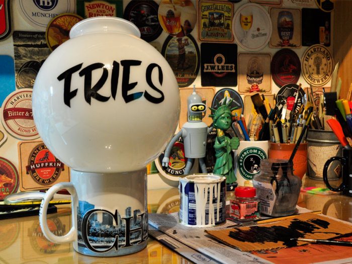
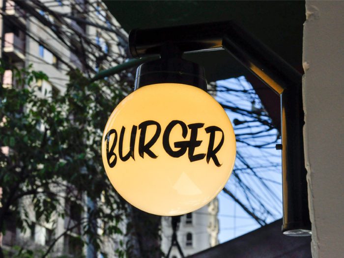
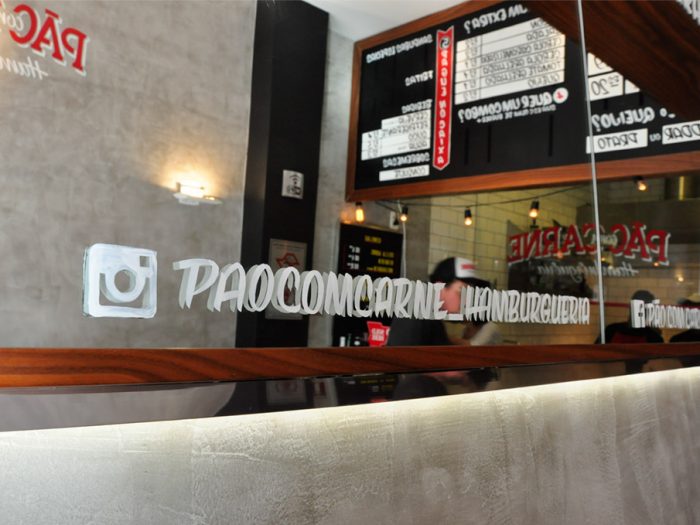
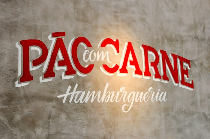
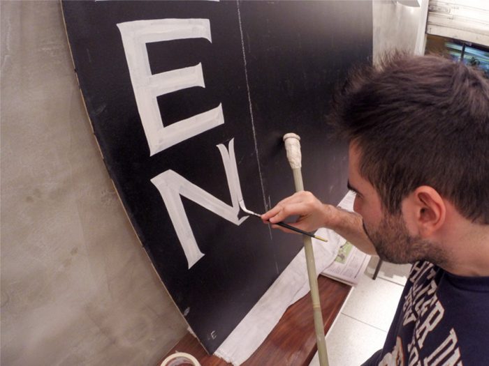
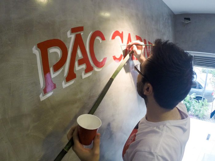
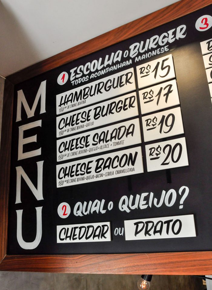
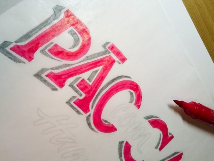
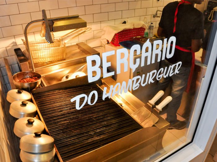
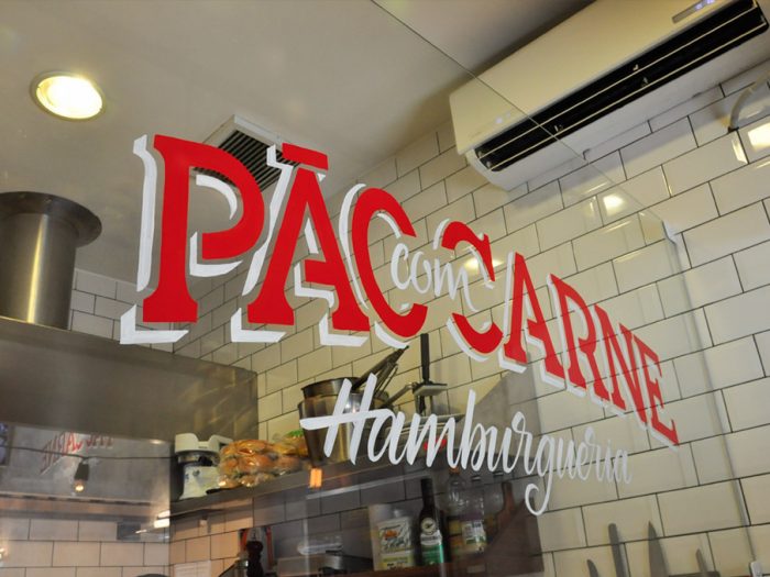
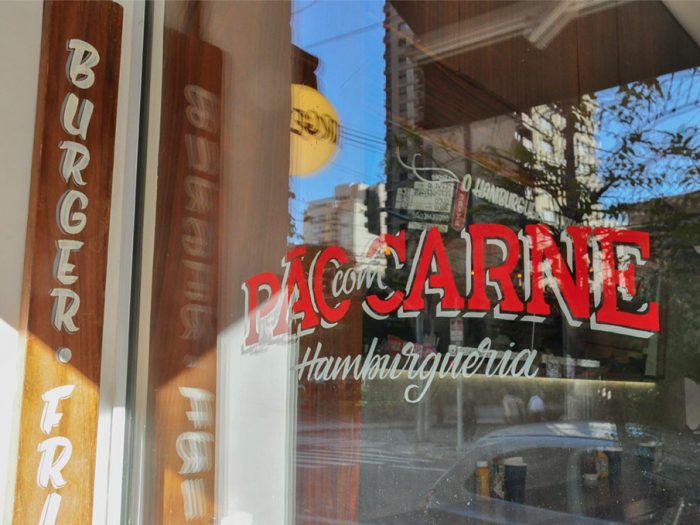
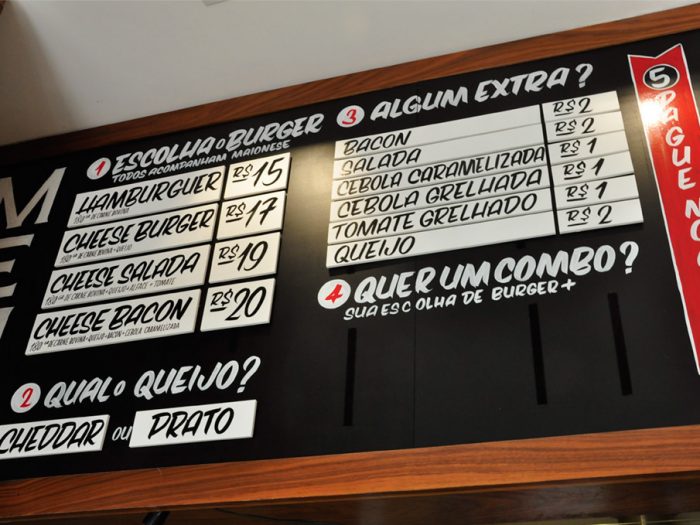
Where have all the signpainters gone? It was such a lost art, but has rapidly jumped to the forefront of the design world as creatives have reclaimed type as a beautiful form of art. The brand identity for Pao Con Carne, a burger joint located near Sao Paulo in Brasil, take the sign painting skill and runs with it. The typography is absolutely beautifully hand crafted and has all the character of classic design before the dummy-box (computer) make things easy to mimic. However, there is no computer that can execute the perfectly imperfect style of hand drawn typography. Soak up these beautiful images.

Created by Victor Tognolio
2ced8a29075967.55e0976a7c516

2d0b5929075967.55e0976a855d3

3b67b629075967.55e095a4c8b2f

3f18a029075967.55e0976a7db85

116a8a29075967.55e0976a82102

819be429075967.55e095a4cca94

0941c429075967.55e095a4ca9aa

61791c29075967.55e097d2bffc2

67999229075967.55e095a4c0b37

73217529075967.55e0976a79a22

a683dc29075967.55e095a4c3bab

b6052529075967.55e0976a7f449

bc62e829075967.55e095a4c1afd

c7e57229075967.55e0976a80c0a

df2de229075967.55e097fb21ea1

ea752b29075967.55e095a4c9b53


The Forktales Podcast™: Interviews with restaurant industry leaders and visionaries

Restaurant and advertising industry headlines and thinking

Reviews of restaurant experiences from around the globe 

Reviews of our favorite design, business, & restaurant books

Our favorite typography and fonts

Inspiration in your inbox

Get the latest inspiration in your inbox every Monday morning, for FREE!

"*" indicates required fields

This field is for validation purposes and should be left unchanged.

Delicious Bits in your Inbox!

Get the latest and greatest content delivered to your inbox for free!

"*" indicates required fields

This field is for validation purposes and should be left unchanged.