Mustilli wine packaging & branding

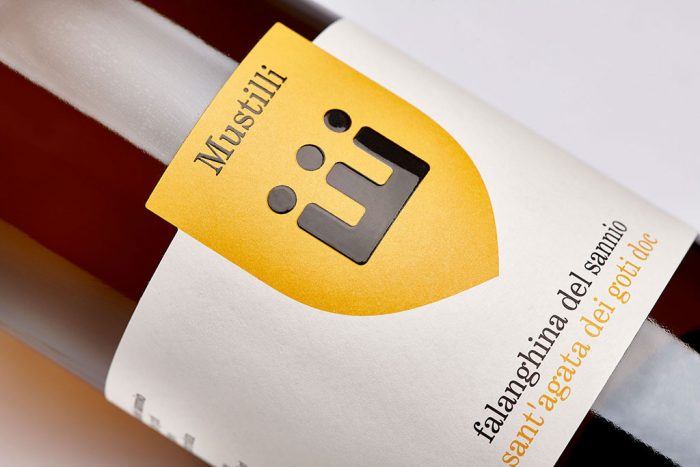
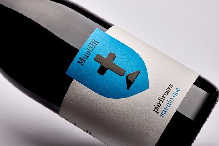
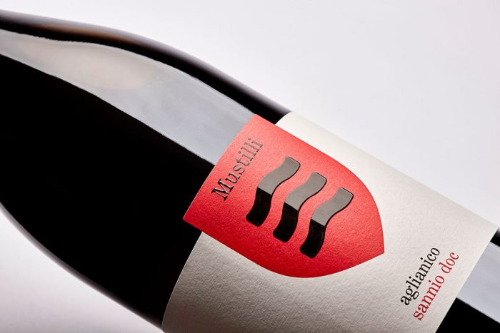
There is so much wine out there that standing out with design is a complex and arduous task. From classic to modern the bases have been covered three times over if not more. However, there are those label and package designs that seem to break through. Mustilli is one of them.

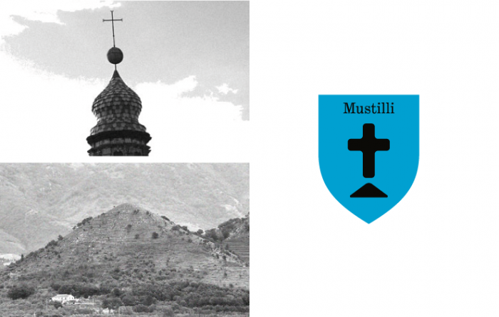
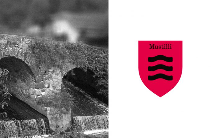
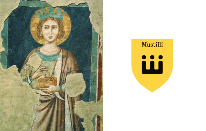
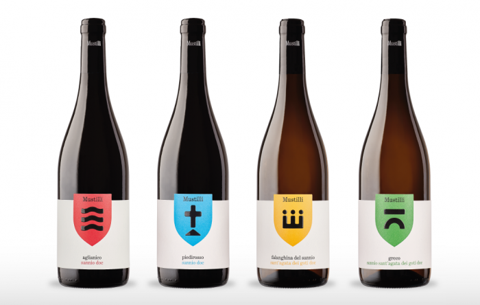
Taking inspiration from landmarks and architecture found in the region of origin, the designer crafts a simple, modern brand identity. The four elements of inspiration were the Isclero river water, the Sant’Agata’s crown, the pyramidal Ariella hill, the icon of the bridge that cross the medieval hamlet.

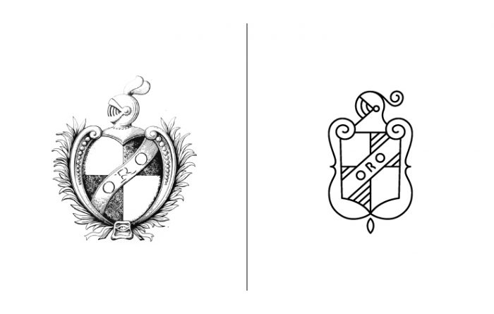
This melding of new and classic creates a forward facing brand with roots in heritage. Using a primary color palette helps keep things simple and rudimentary in a good way. Nothing is overdone or over designed creating an air of confidence. Very good things for a longstanding brand like Mustilli.

Designed by NJU Communications in Eboli, Italy

4cd40837314563.573f2f7953ca9 6041af37314563.573c29f3cf724 c56a4037314563.573c29f3cfd16 32d0d537314563.573c29f3d1bfb 1f6b8a37314563.573c29f3d0864 0d145037314563.573c29f3d1165 0bd27b37314563.573c29f3d1783 ede1f837314563.573c29f3d031c 6e9d6437314563.573c29f3cedaa

The Forktales Podcast™: Interviews with restaurant industry leaders and visionaries

Restaurant and advertising industry headlines and thinking

Reviews of restaurant experiences from around the globe 

Reviews of our favorite design, business, & restaurant books

Our favorite typography and fonts

Inspiration in your inbox

Get the latest inspiration in your inbox every Monday morning, for FREE!

"*" indicates required fields

This field is for validation purposes and should be left unchanged.

Delicious Bits in your Inbox!

Get the latest and greatest content delivered to your inbox for free!

"*" indicates required fields

This field is for validation purposes and should be left unchanged.