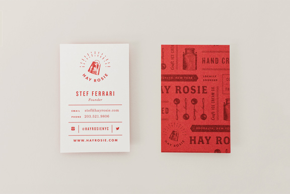
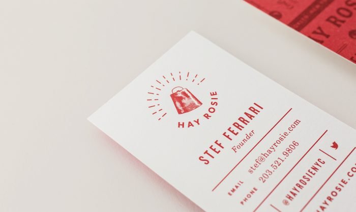
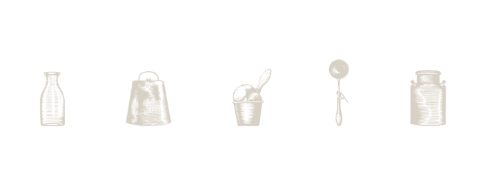
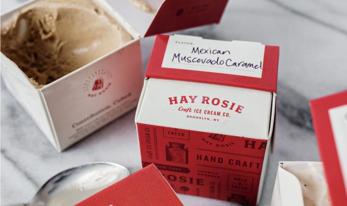
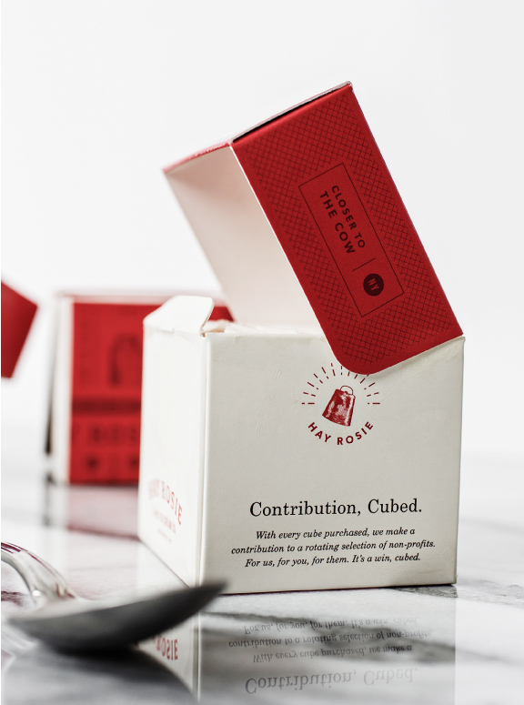
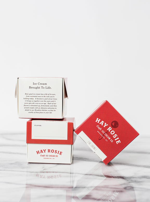
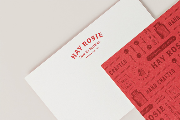
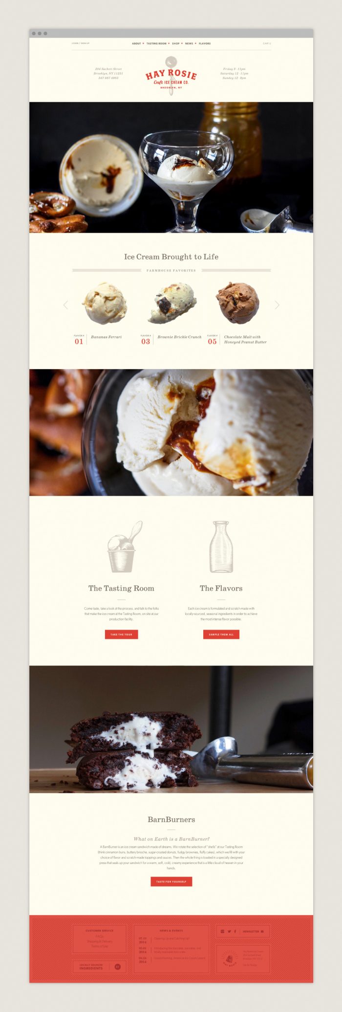
This brand identity is so beautifully classic and fresh at the same time. Studio Nudge, the design team behind the work, handles the many elements of the brand with confidence and, well, craft. The limited color palette, and classic illustrations help drive home the idea of the farm to glass creamery in a fresh way that melds modern design style with classic technique.
One of the main things that stand out in this work is the copywriting. It’s smart, semi-witty, and doesn’t rely on forced puns to drive home the voice. The copy is given glory with beautiful typography that accentuates the words while leading the reader into to details. It’s hard not to read it all!
Designed by Studio Nudge
