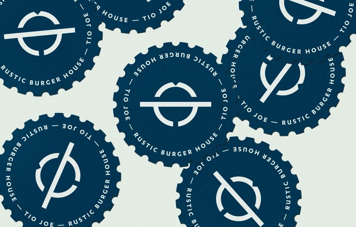
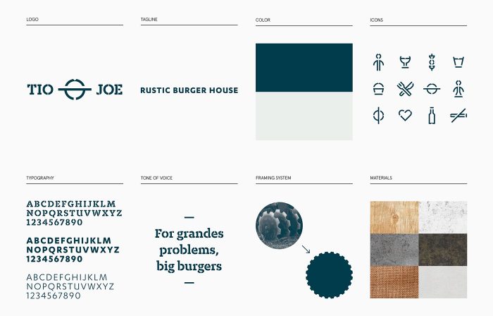
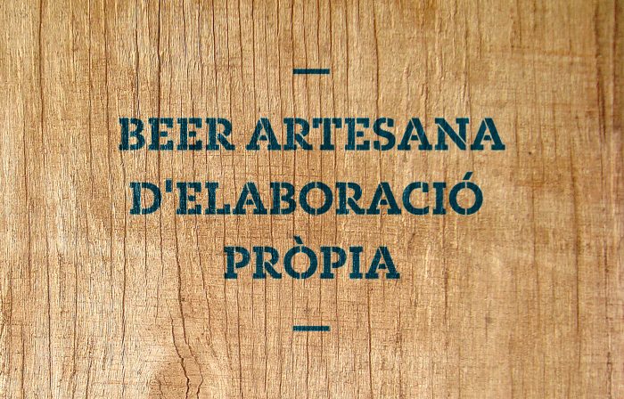
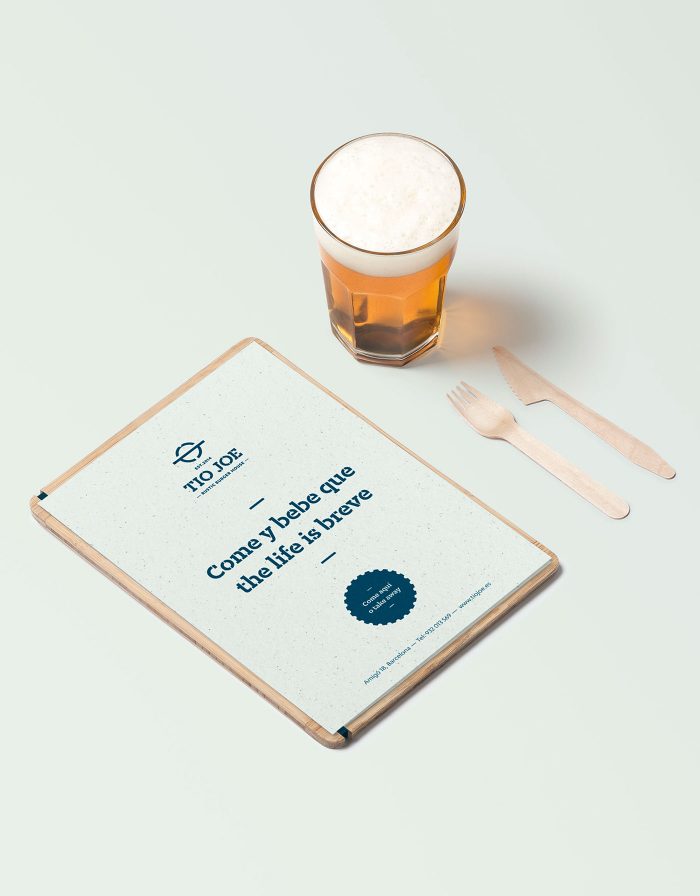
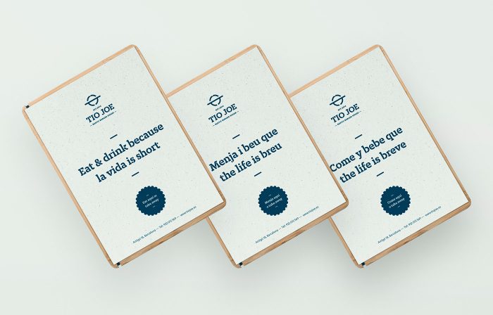
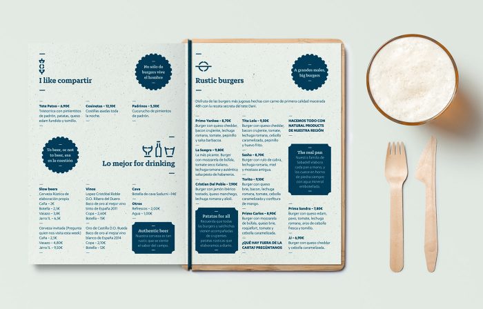
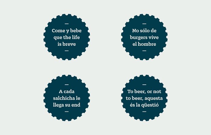
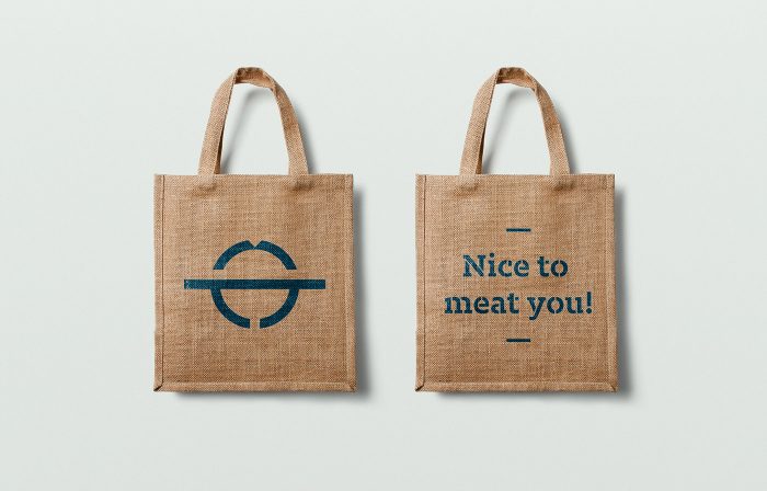
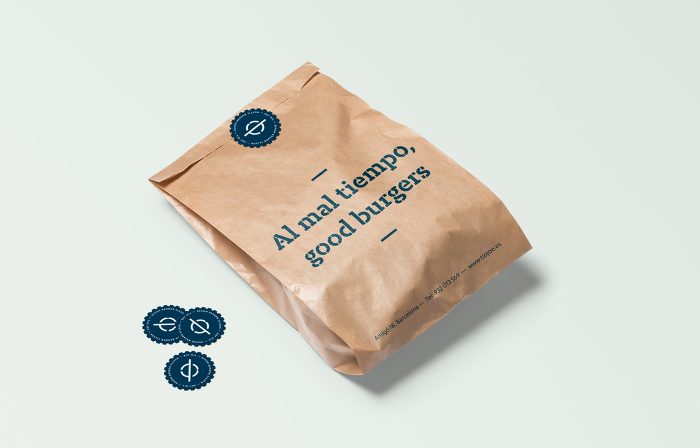
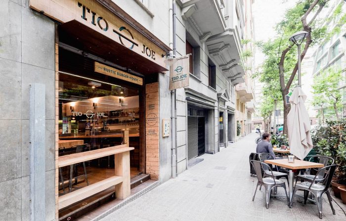
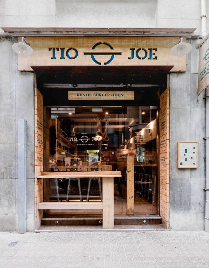
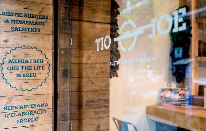
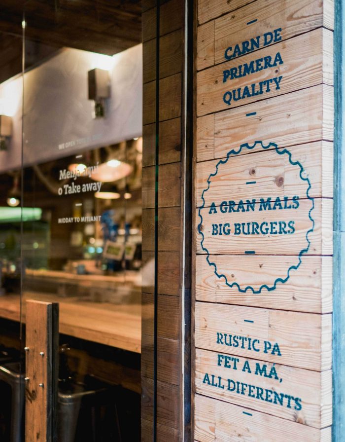
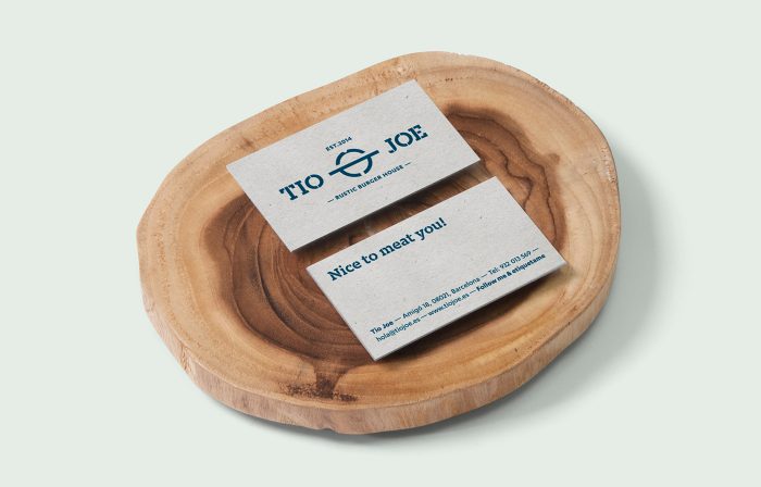
Maybe because it’s my name and I am an Uncle with Spanish roots. Maybe it’s because it’s beautiful simple design. Either way, the brand identity design for Tio Joe, a rustic burger restaurant in Barcelona, Spain, is absolutely fantastic. From the simplified burger icon through the slab serif, stenciled logotype, the identity creates a super strong, easily identifiable look. It’s super industrial but maintains this modernist feel that’s clean, simple, and fresh. When literally stenciled onto shipping crate reclaimed wood, it really starts to hit its stride. Beautiful work.
Designed by Diferente
\