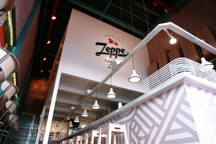
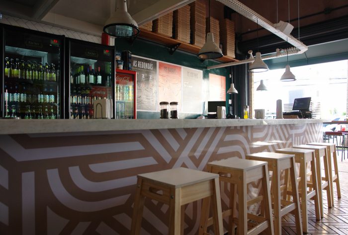
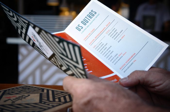
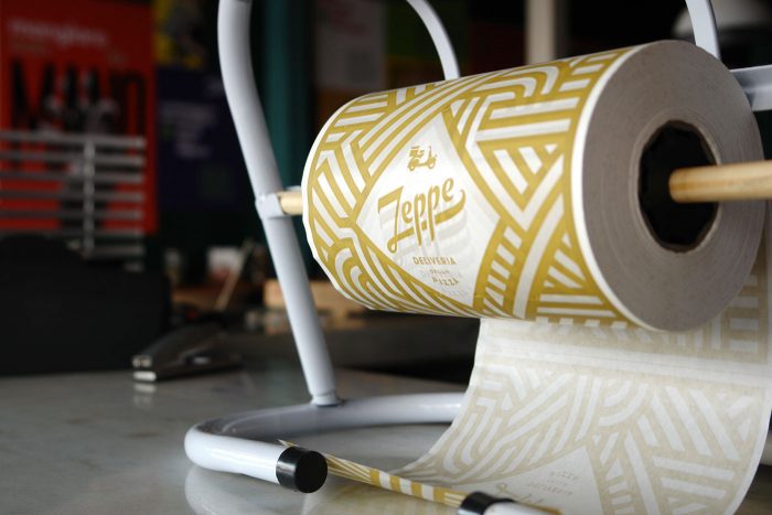
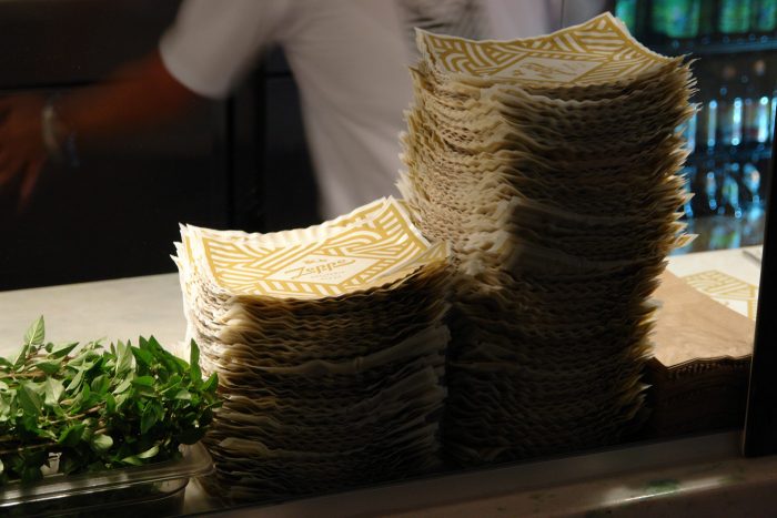
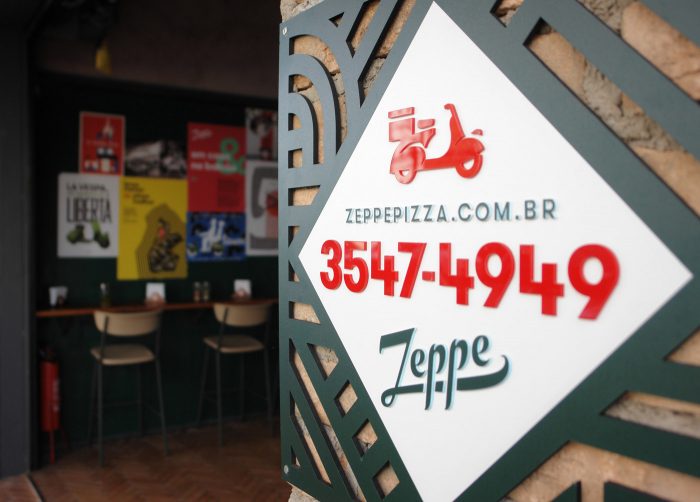
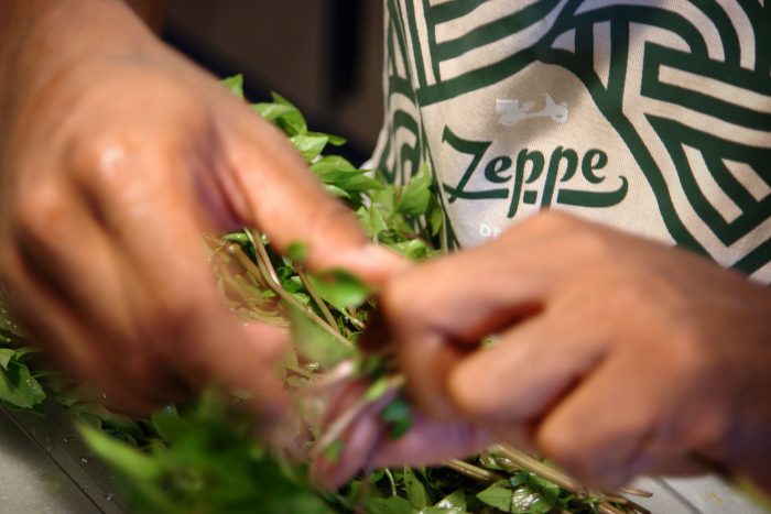
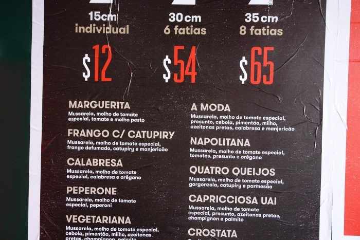
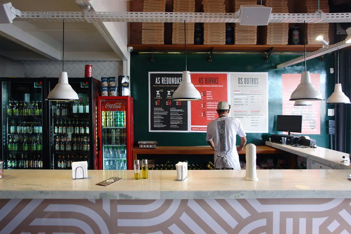
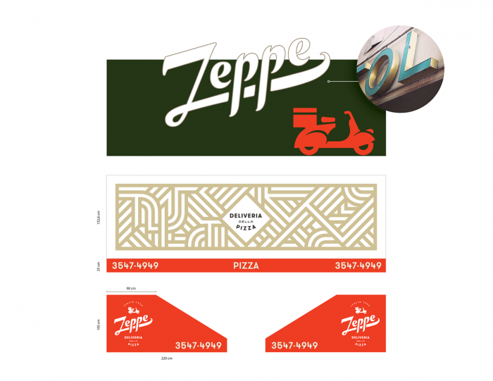
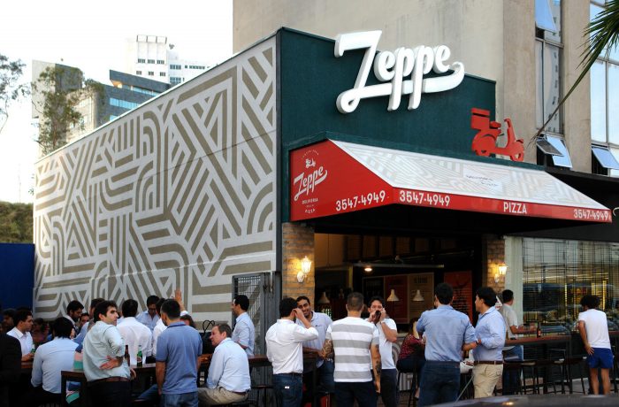
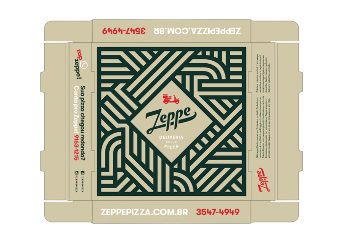
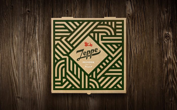
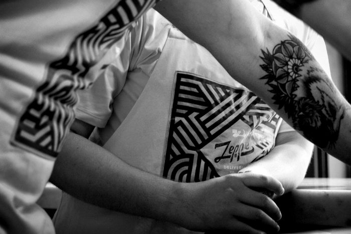
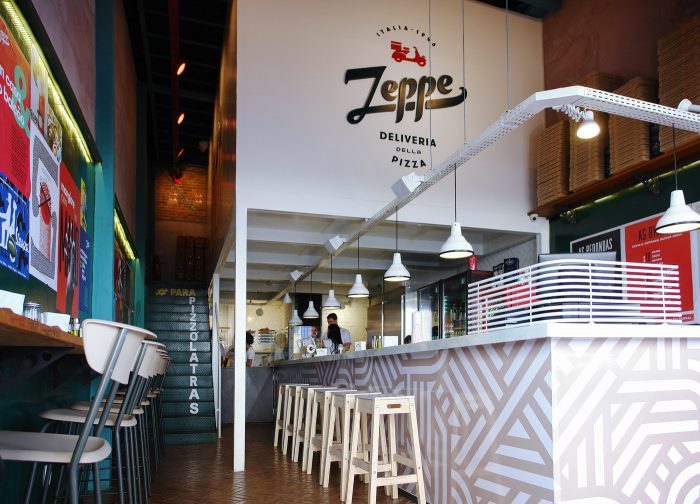
The first thing that jumped out at me with the Zeppe identity is how it played out perfectly through interiors into menu and packaging and into digital. It’s a perfect marriage of every touch point of the brand which creates a cohesive messaging. The patterns are found throughout many touch points, but done in fresh ways that honors the medium perfectly.
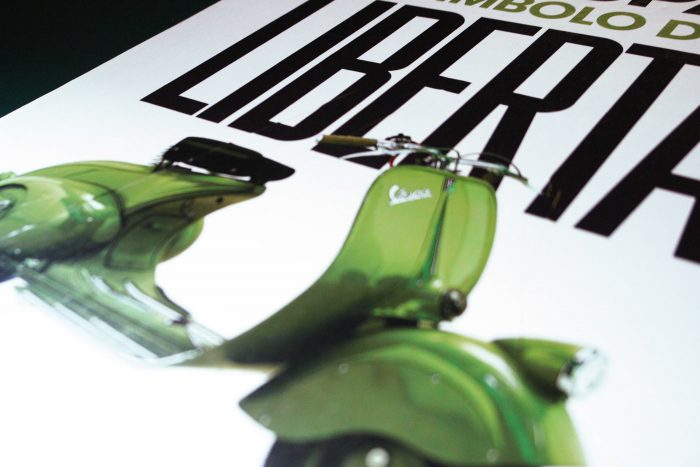
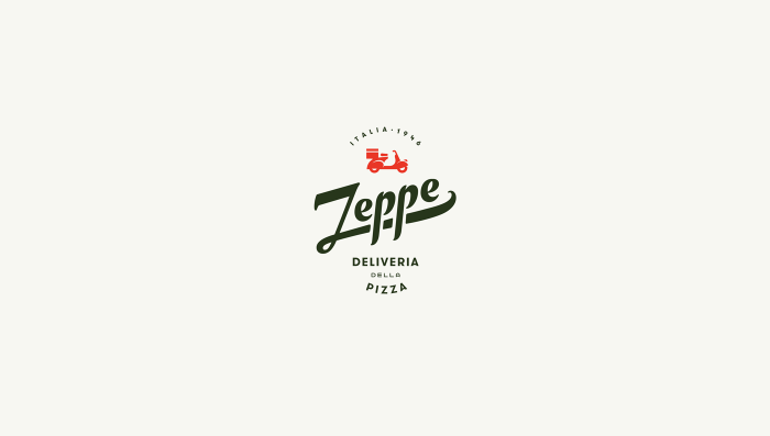
Zeppe’s logotype takes inspiration from the Vespa identity which solidifies that authentic Italian feel. The logo even features a scooter icon that really pulls the whole thing together.
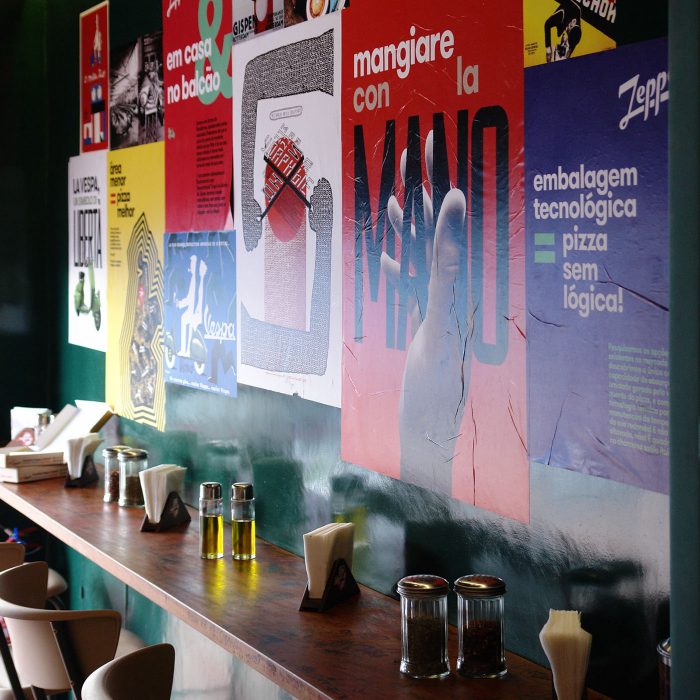
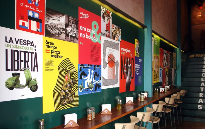
The brand really takes its stride with the marketing and advertising touchpoints. Pulling from Art Deco and Constructivist styles, the design team crafts an energetic, street-style approach. This brings the brand forward and away from the traditional sense of Italian food and into a fresh area of design and restaurant marketing.
Designed by Pos Imagem Design
