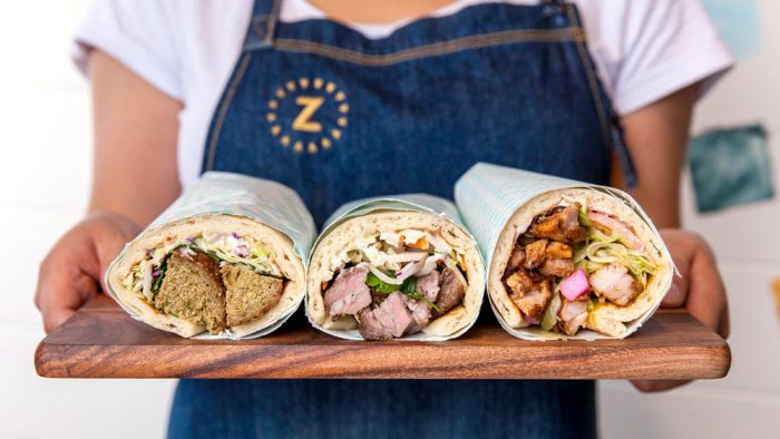
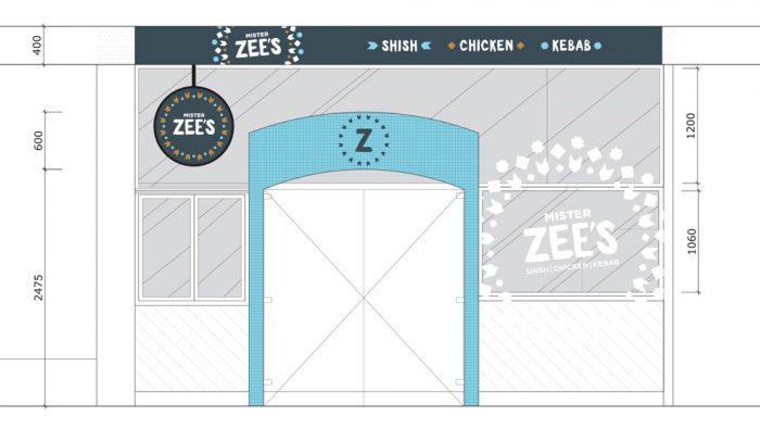
Mister Zee’s shish kebabs restaurant branding

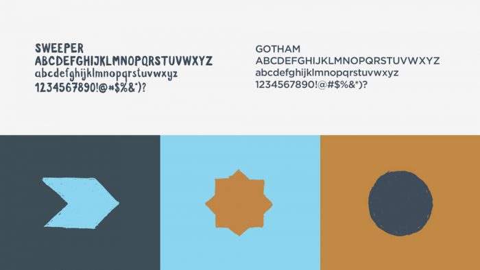
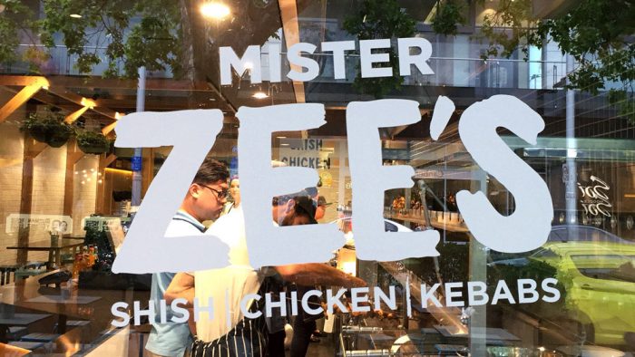
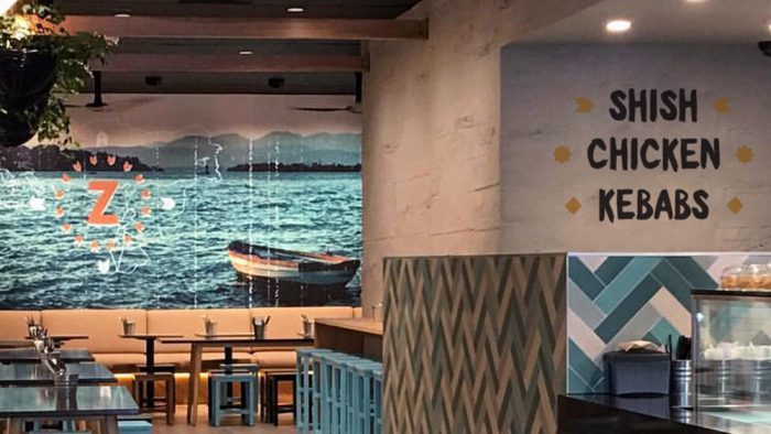
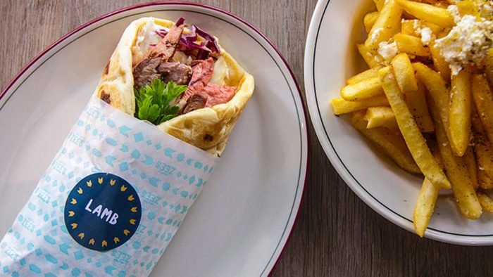
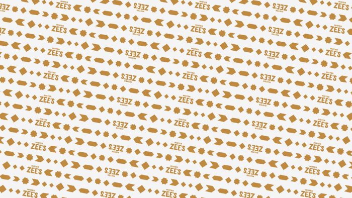
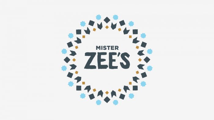
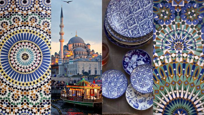
The brand identity for Mister Zee’s leverages cool blues reminiscent of the Mediterranean mixed with golden brown that evokes the feel of baked goodness. Coupled with hand drawn typography offset with the modern style of Gotham, the brand has a fun, crafted feel. The uniqueness of the typography style lends itself well to other illustrations that are repurposed throughout the brands mulitple touch points. This gives each moment its own focus while avoiding a logo slapped everywhere. Beautiful work by Messy.

Identity designed by Messy
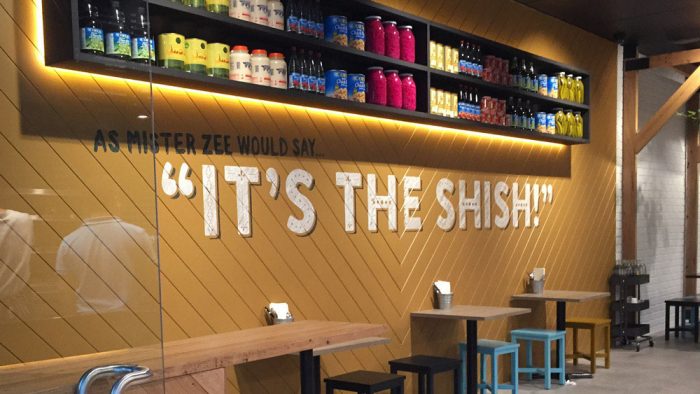
Interiors by Brad Ward Design


The Forktales Podcast™: Interviews with restaurant industry leaders and visionaries

Restaurant and advertising industry headlines and thinking

Reviews of restaurant experiences from around the globe 

Reviews of our favorite design, business, & restaurant books

Our favorite typography and fonts

Inspiration in your inbox

Get the latest inspiration in your inbox every Monday morning, for FREE!

"*" indicates required fields

This field is for validation purposes and should be left unchanged.

Delicious Bits in your Inbox!

Get the latest and greatest content delivered to your inbox for free!

"*" indicates required fields

This field is for validation purposes and should be left unchanged.