The peeps at Five & Dime in Denver, Colorado sent over their stellar work for Nightshift, a new bao-bun food truck brand. Their explanation is stellar so I’ll post it and leave it at that. Enjoy!
Owner Dan Grund loves all things food, but had noticed that food cart had become synonymous with expensive menu and long wait times. Nightshift aimed to provide a rotating menu that was affordable, fresh, and fast. It was important to Dan that the brand emulate his belief that high quality food doesn’t need to be pompous, but can be cheeky and approachable.
In our discovery phase of the project we found that most food trucks followed the “name your truck what you serve” approach. We realized that the average person in Night Shift’s market did not know what a bao bun was. So instead of focusing on delivering that message via the name of the truck we focused on creating visual intrigue so that customers were drawn to the uniqueness of the truck. Once you had them at the truck, questions would follow which allowed a more organic conversation between the business and customer.
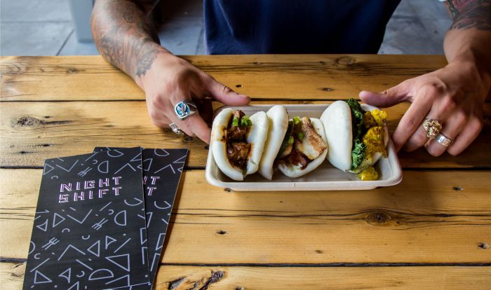
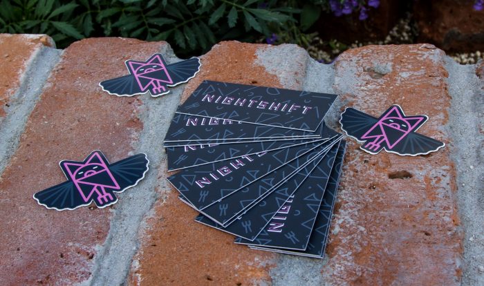
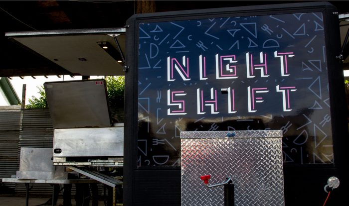
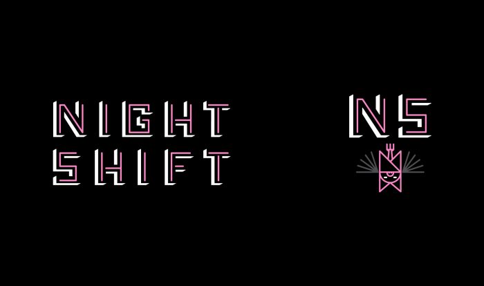
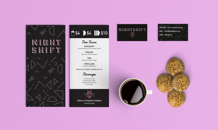
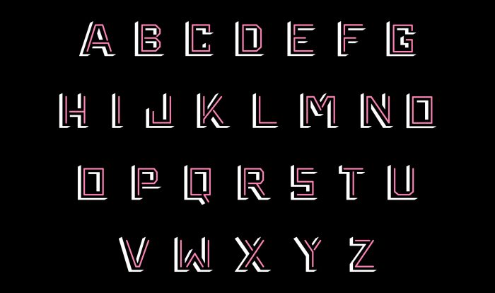
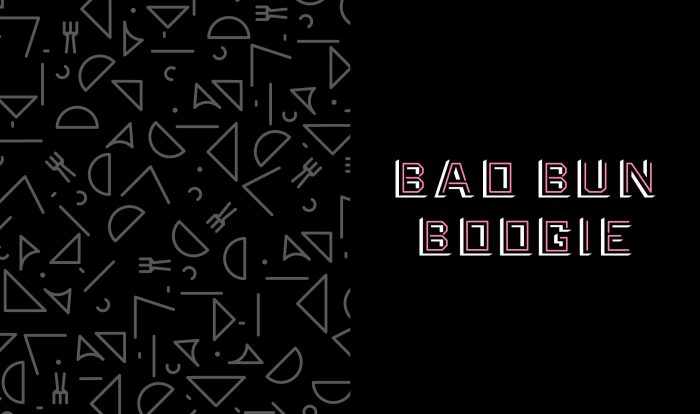
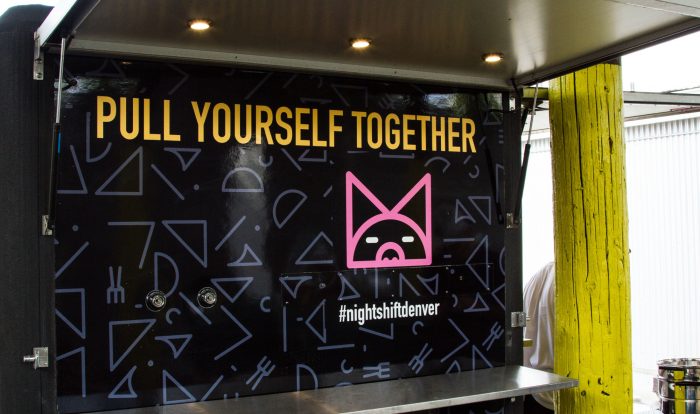
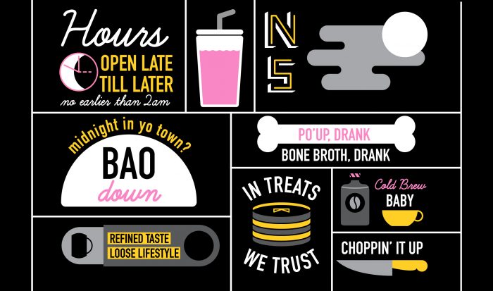
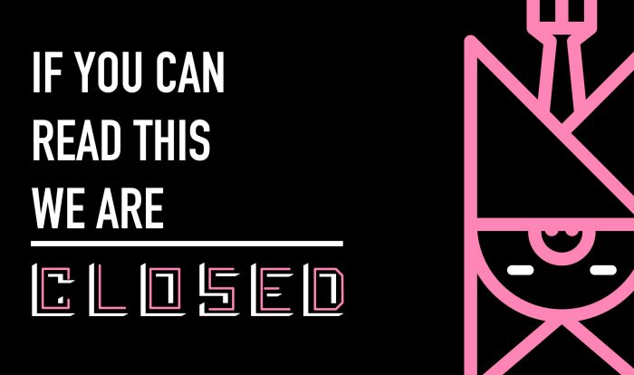
We designed and produced menus and business cards. We used icons developed for the system and designed a vehicle wrap for the cart. The icons reinforced the visual language of the brand as well as helped to illustrate some of the menu items that were a little out of the ordinary like bone broth and nitro cold brewed coffee.
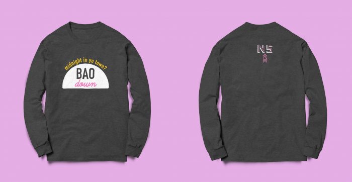
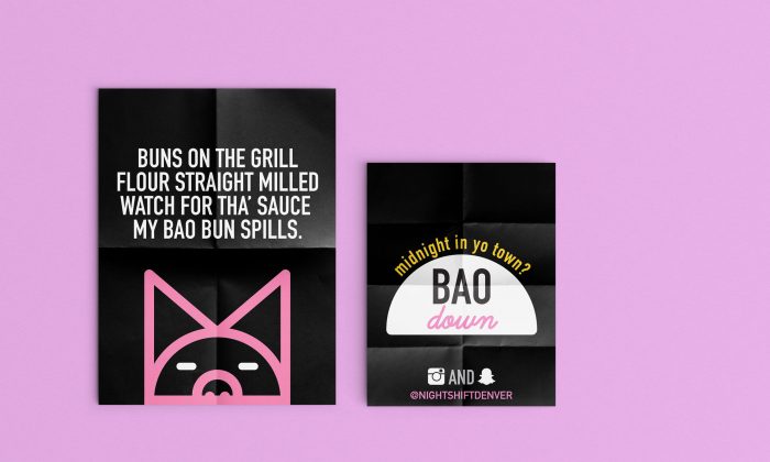
We combined the owners sense of humor with his love for music to create posters for the opening launch of the cart. We took popular lyrics from songs and rewrote them to be about bao buns. We then printed the posters out and wheat pasted them all over the neighborhood where Nightshift was going to be debuting the cart. The same week that we installed the posters we went to surrounding businesses and dropped off stacks of mini info cards and stickers. We also had a limited number of printed shirts that we created to give out on launch night.
Designed by Five & Dime
