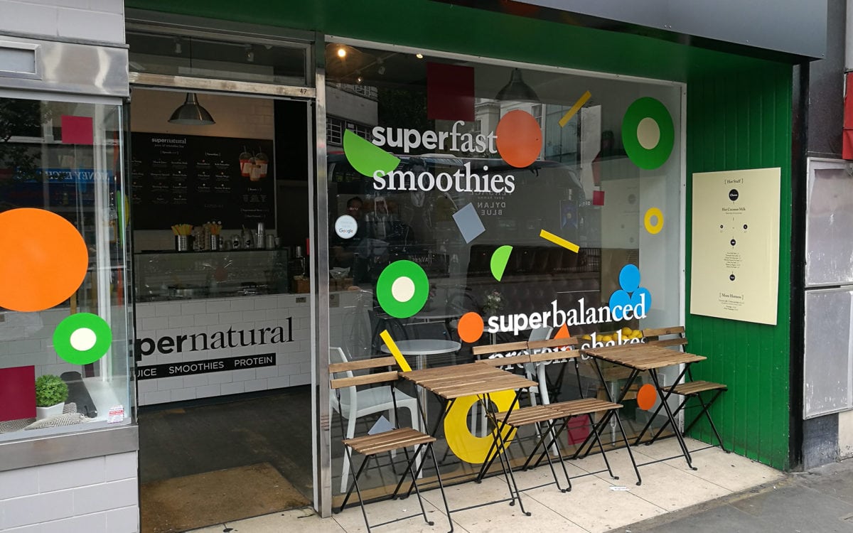
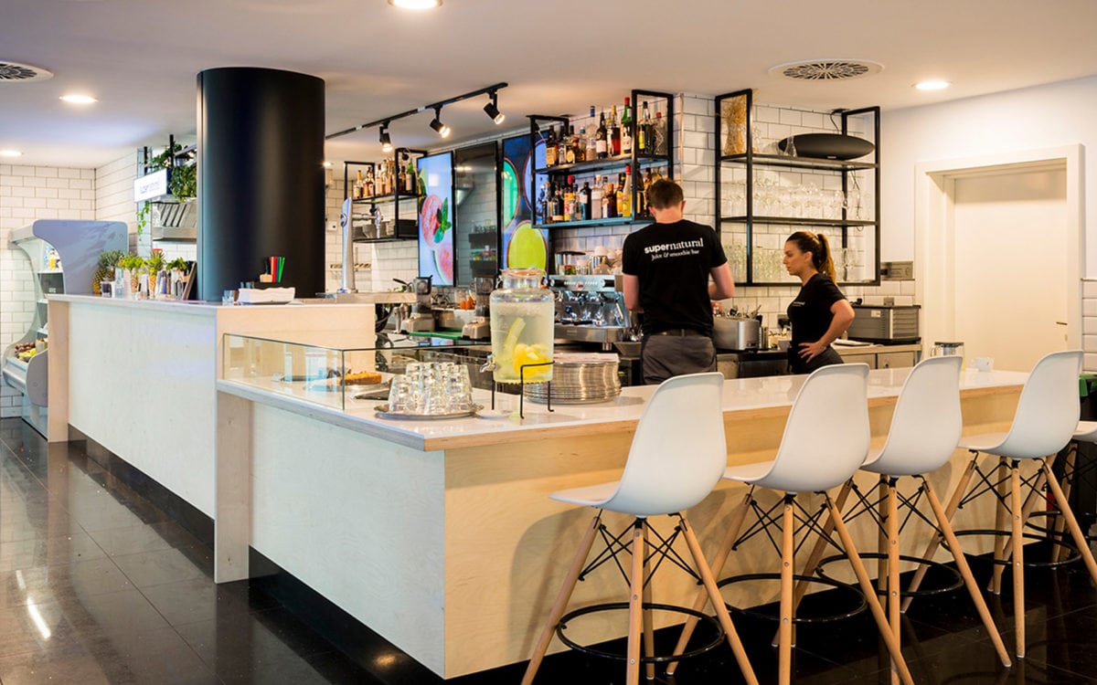
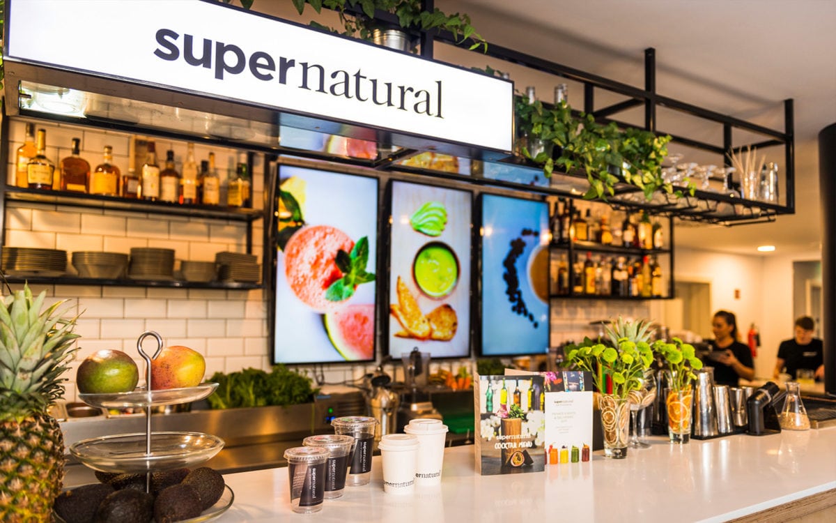
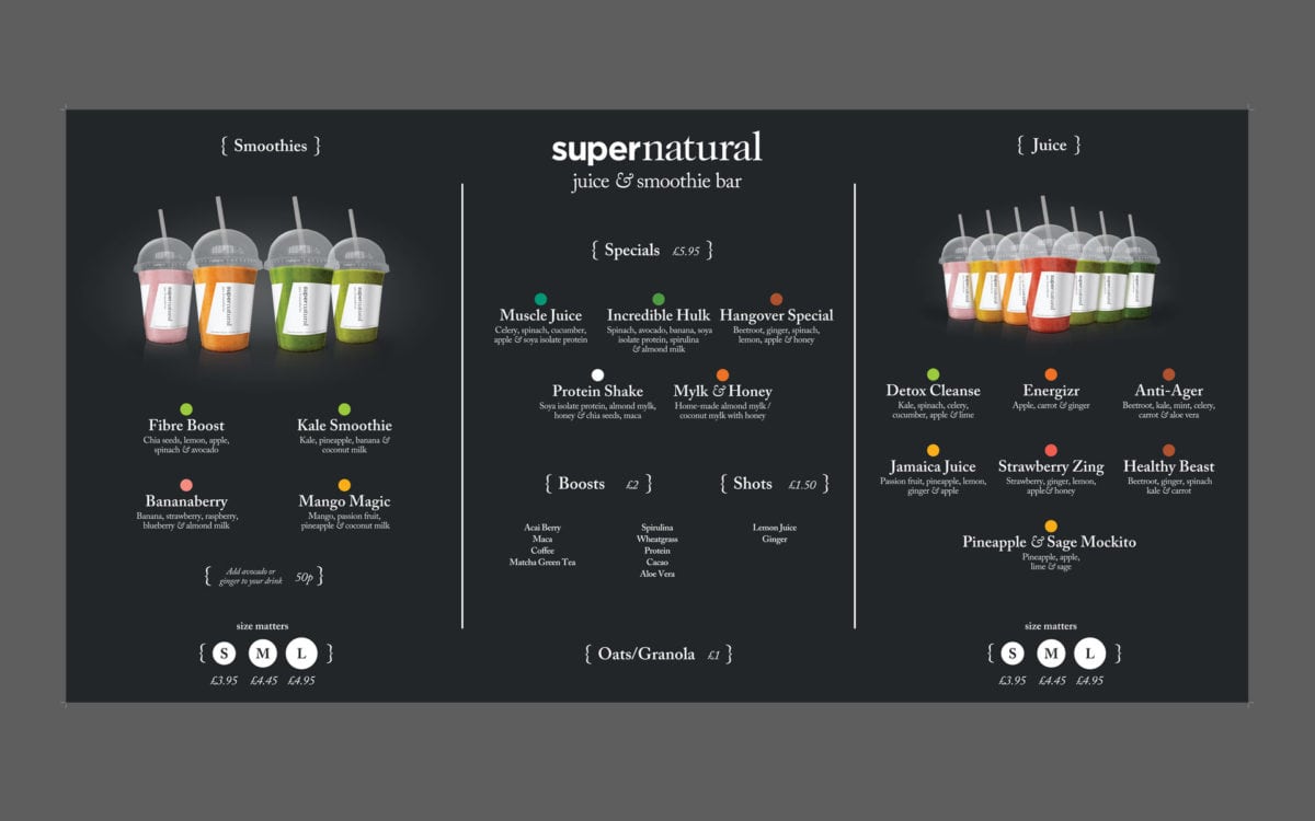
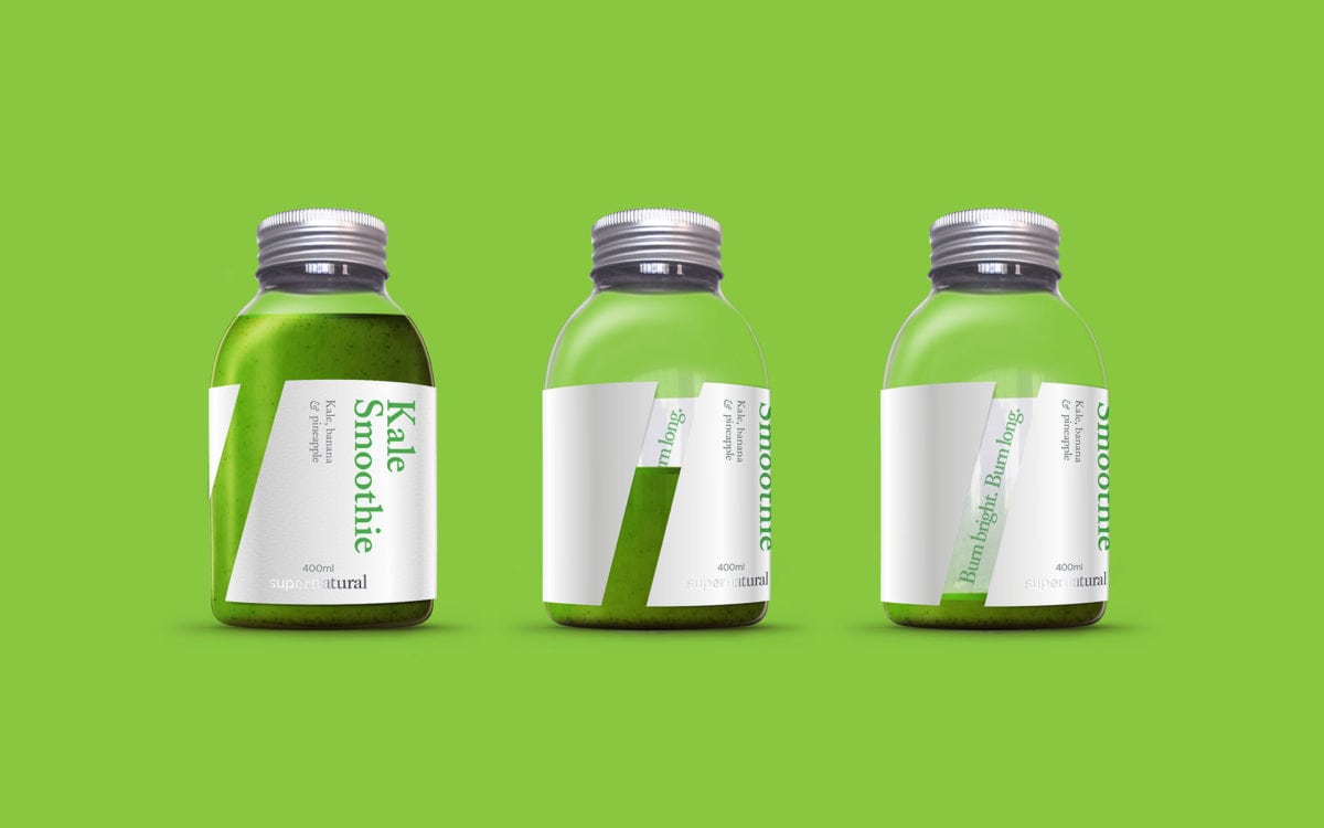
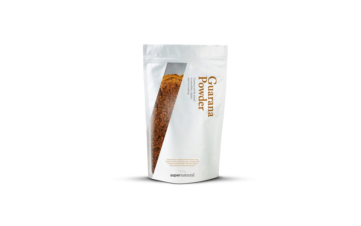
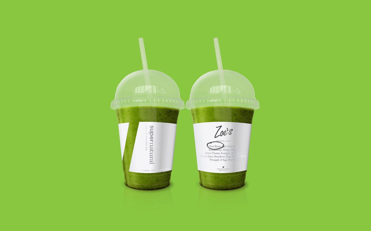
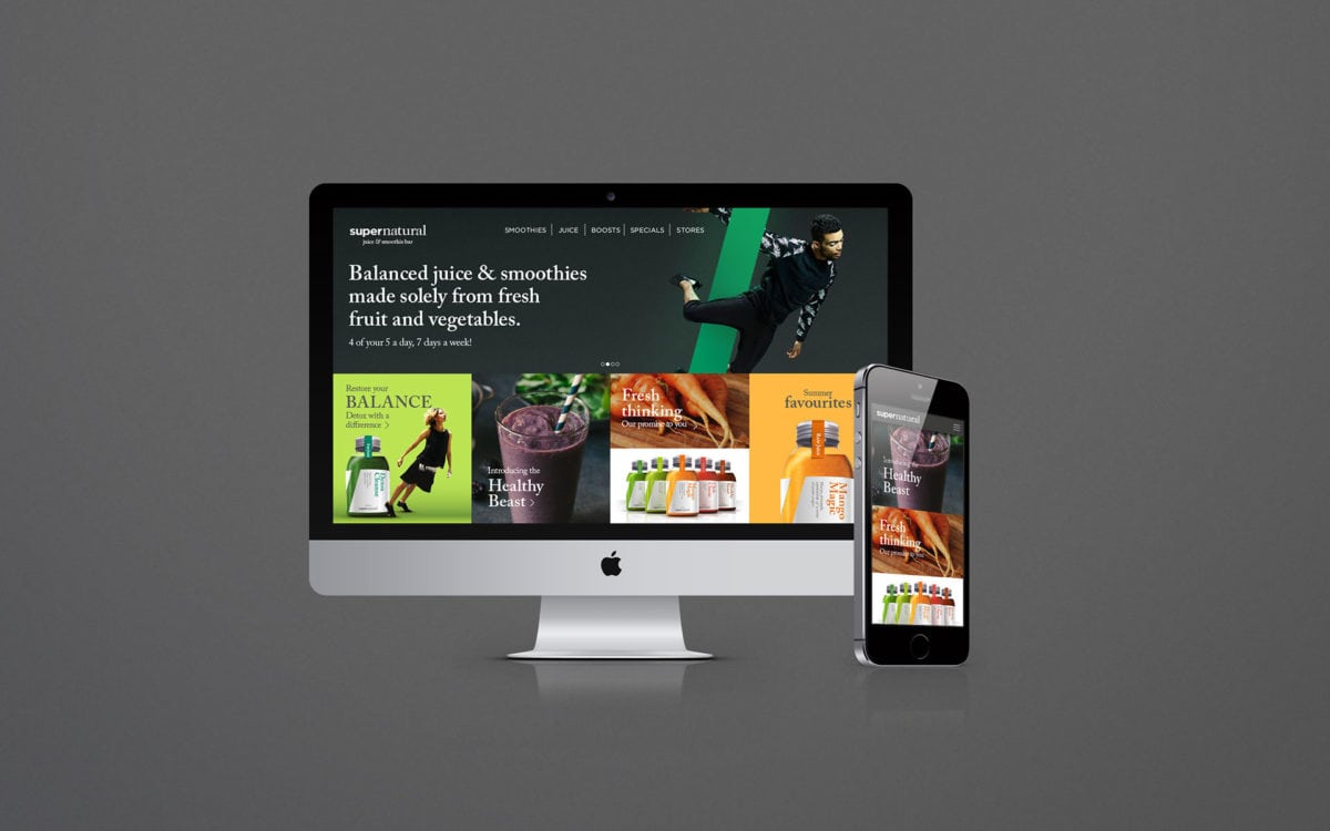
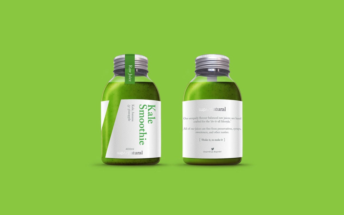
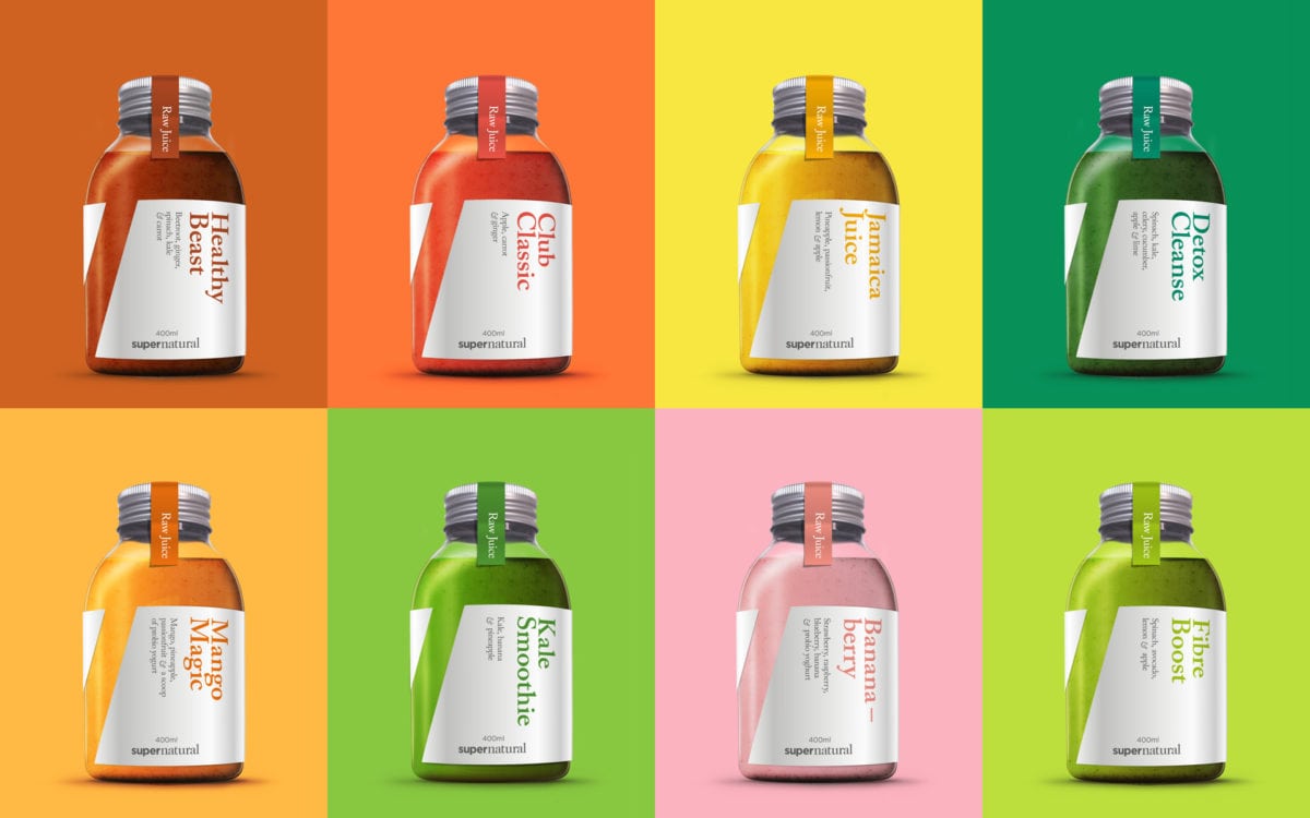
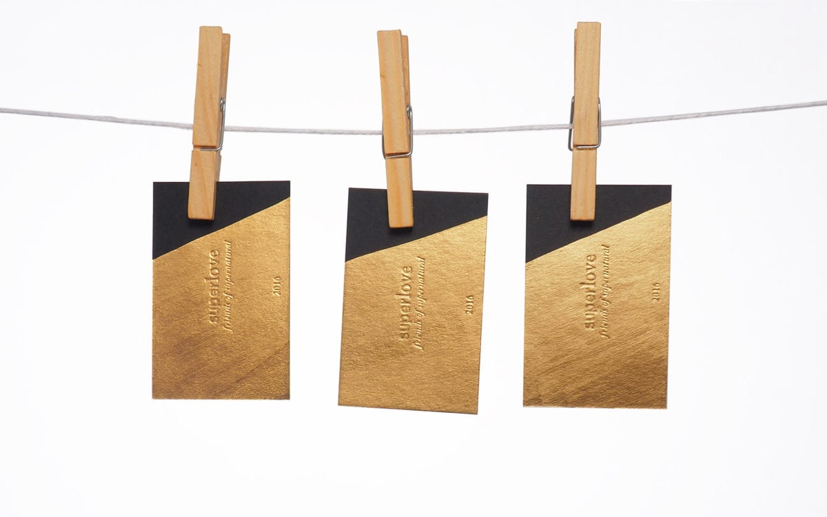
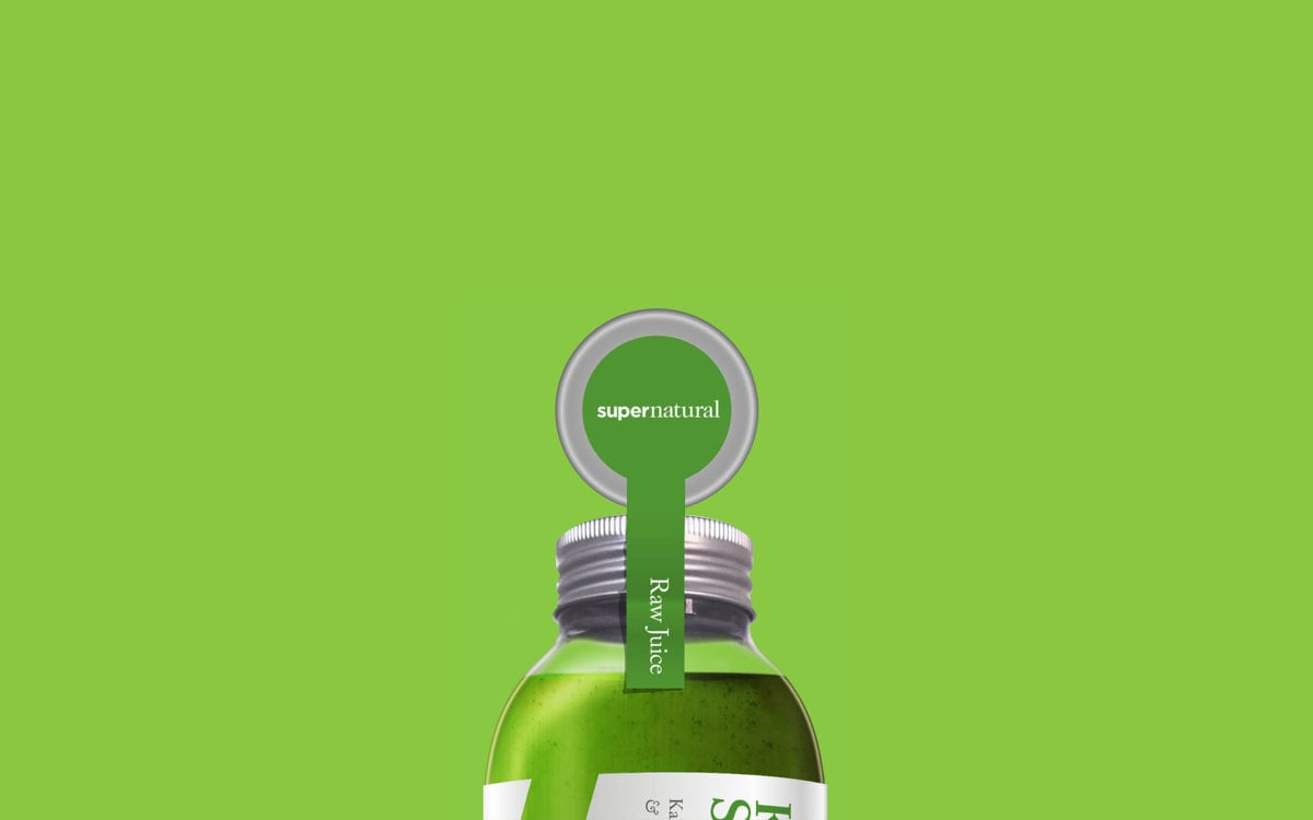
Supernatural provides healthy products, namely juices and smoothies, to busy Londonites. Formerly known as Juice Club, Lyon & Lyon was approached with the challenge of turning a pop-up juice shack into an enduring lifestyle brand. They came up with the brand mission of living an ‘impossibly balanced’ life, embodying it in what they refer to as the ‘life line’. To quote their case study, the life line is “a 15 ° angle that represents living life at its pinnacle limit, echoing the lifestyle of today’s city dwellers”.
I really enjoy how this life line is applied throughout the brand; its use on the juice bottles is brilliant, especially when drinking the juice reveals the hidden message within the lifeline. The life line also represents transparency; in each iteration, it reveals the product and conceptually ties the brand back to the idea that everything is natural, no hidden ingredients. Where most health-oriented brands either take the yogi, holistic approach or the super clean, almost clinical look, Supernatural lands somewhere in the middle. It’s a refreshing take on a niche industry that tends to follow one of two approaches almost to a fault.
Supernatural Juice Branding, Packaging, and Art Direction by Lyon & Lyon.
