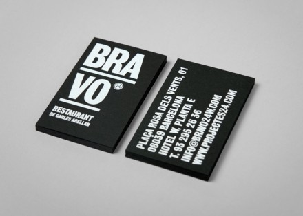
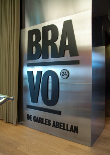
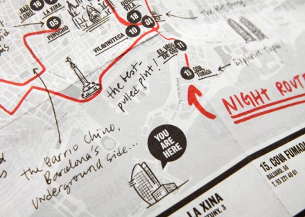
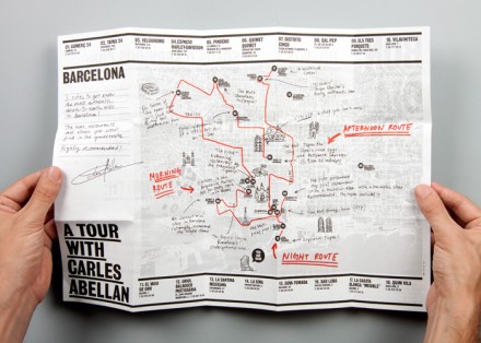
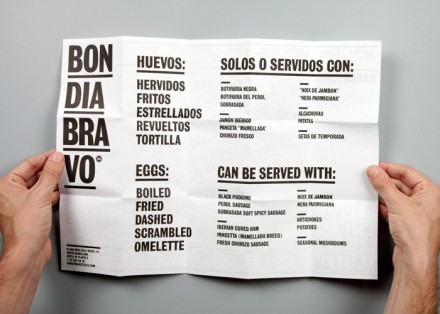
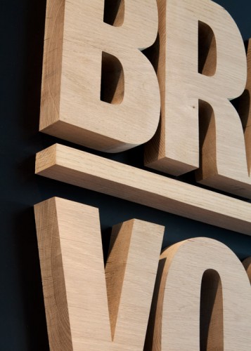
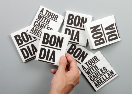
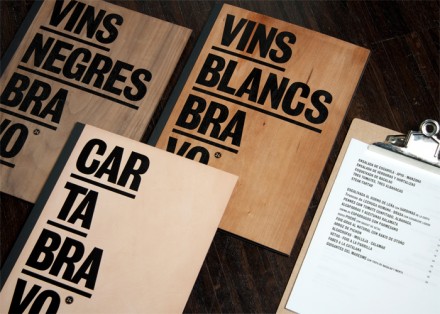
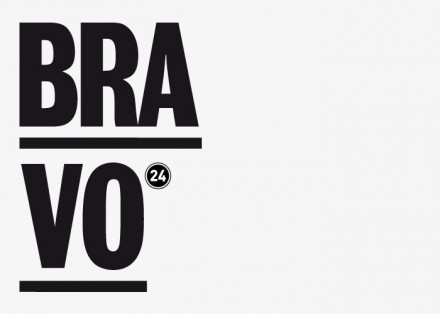
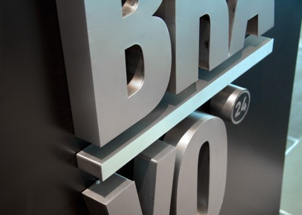
This bold identity was designed by Claret Serrahima AKA Cla-se. Strong black and white, high contrast, and bold typography is used to make a statement. Raw materials are used to give the brand depth and texture. It’s simple, but poignant. I especially love the signage.
The Forktales Podcast™: Interviews with restaurant industry leaders and visionaries
Restaurant and advertising industry headlines and thinking
Reviews of restaurant experiences from around the globe
Reviews of our favorite design, business, & restaurant books
Our favorite typography and fonts
Inspiration in your inbox
Get the latest inspiration in your inbox every Monday morning, for FREE!
"*" indicates required fields

