Subway has had its ups and downs, but is always a mainstay in Anytown, U.S.A. In the past the refreshes of the brand have been baseline where they move the needle forward without ruffling too many feathers. More recently, in the wake of the Jared Debacle, the brand overhauled its iconic identity to one that’s a bit more dull and pedestrian. It is well covered over at Brand New.
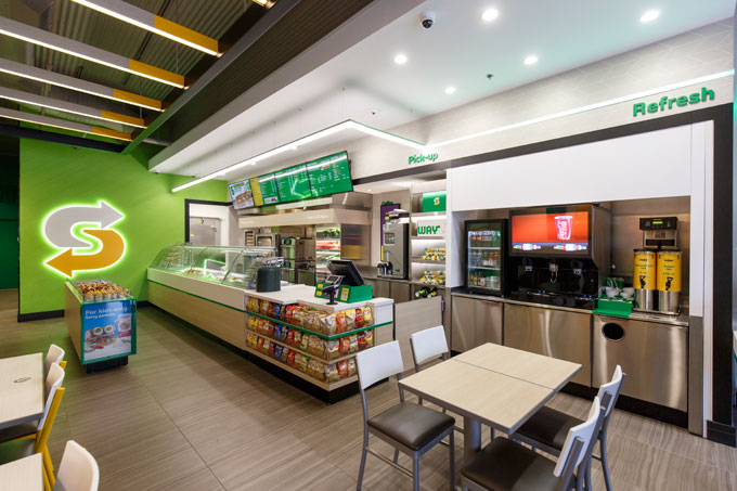
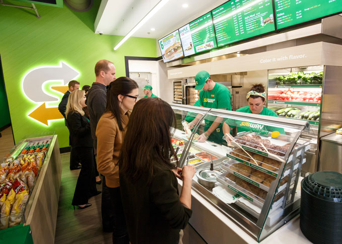
Yesterday we ran across the new concept store for Subway, and our reactions were quite similar to the identity redesign: underwhelmed.
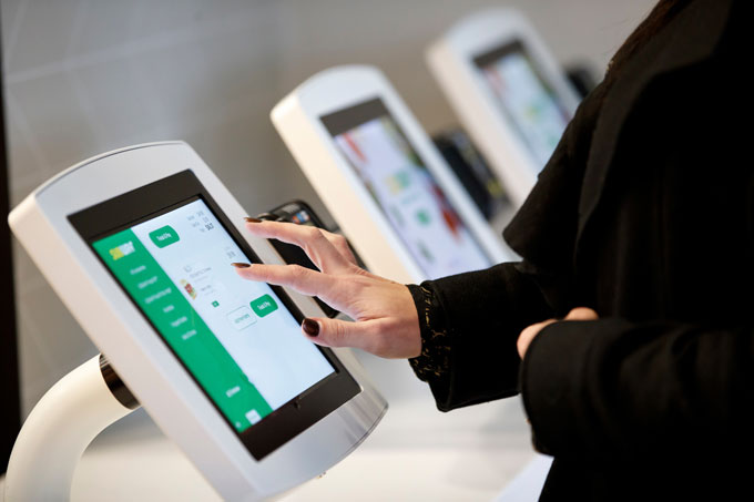
The Good: They’ve integrated kiosks for self-ordering. Even though they’re not in plain sight from these images, the kiosks should make the DIYer quite happy. It’ll streamline the process and make things quicker with a pleasant consumer experience.
The brand dropped the classicly dated materials in exchange for newer, fresher decisions. Say goodbye to the faux brick. Overall, it’s a nice step forward, but…
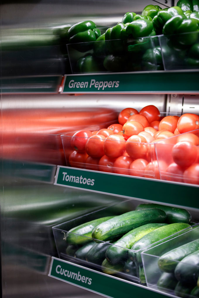
The Bad: This experience is pedestrian and forgettable. It’s safe making sure to not make any real strong statement, while concurrently being better than bad. There are clear attempts at “tapping into millennials” that I’ve become familiar with seeing. Case in point: The vegetable display. This feature works when there is something special about the produce. Green peppers, tomatoes, and cucumbers aren’t special and they don’t serve as cues for freshness or a heightened menu. To us it seems that someone in the room said, “millennials like fresh vegetables” and so this solution was born.
The Ugly: This looks like a cheap hospital cafeteria.
Designed by FRCH Worldwide
Identity designed by Turner Duckworth


