Who doesn’t suffer from a case of the Mondays every now and again? Well, never fear! The Grits & Grids blog is here to get you caffeinated and raring to go with some coffee company branding and packaging.
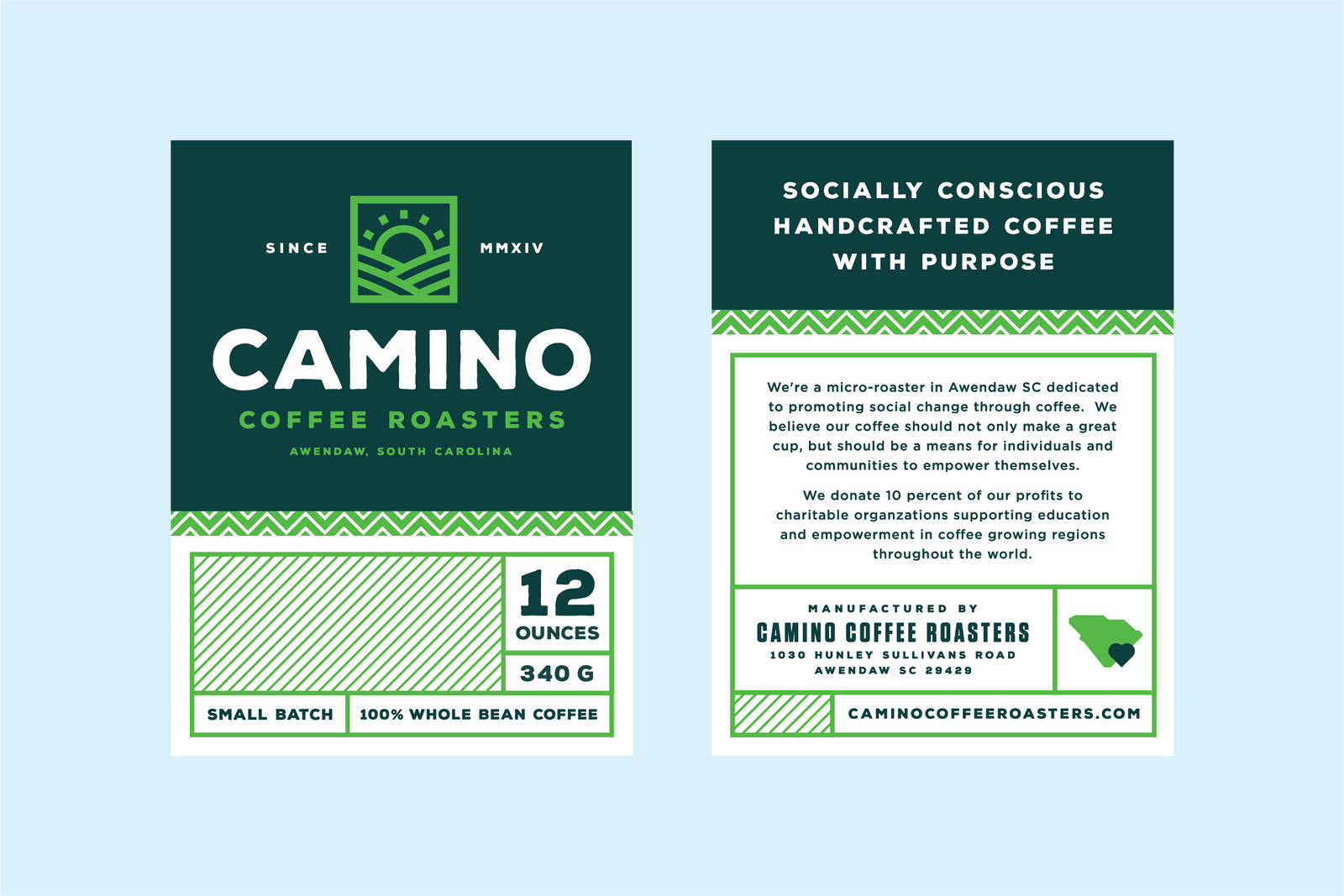
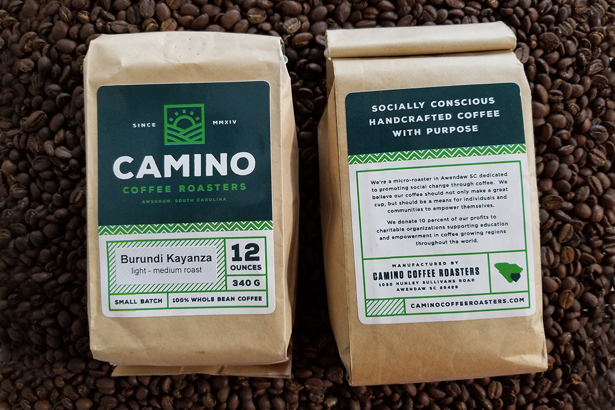
Today we’re featuring the lovely logo and package created for Camino Coffee Roasters by Ryan Prudhomme. He has a knack for creating great logo lockups and systems (I mean it, look at his website or dribbble) and Camino is especially nice. I love the subtle wobble given to Camino, it goes nicely with the kraft bags that house the coffee beans. I also love how the different patterns work well together, and how Prudhomme took into consideration that these labels were going to be printed and used for several different kinds of roasted coffees, and left a location for the type of roast to be added. Not to mention, got to support a good-looking product with a good cause. Camino donates 10% of its profits to grassroots NGOs that provide education and social development in coffee farming regions.
Design by Ryan Prudhomme.


