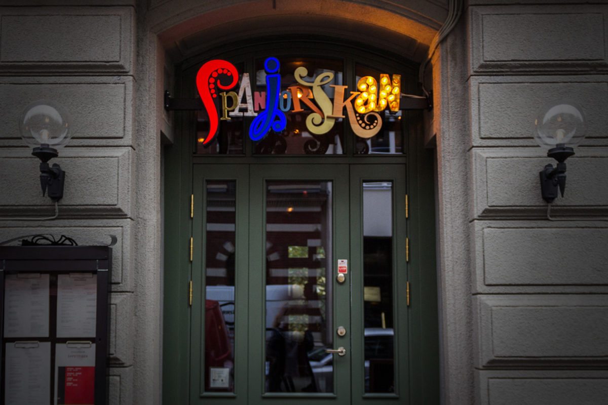
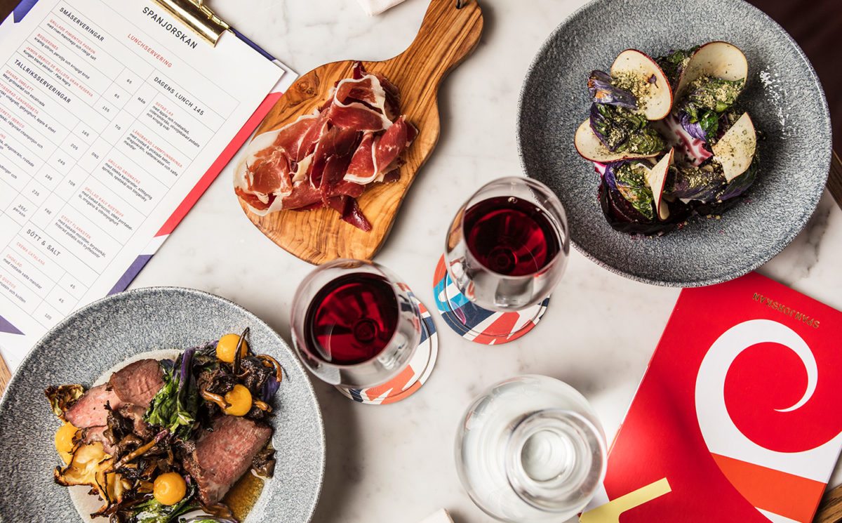
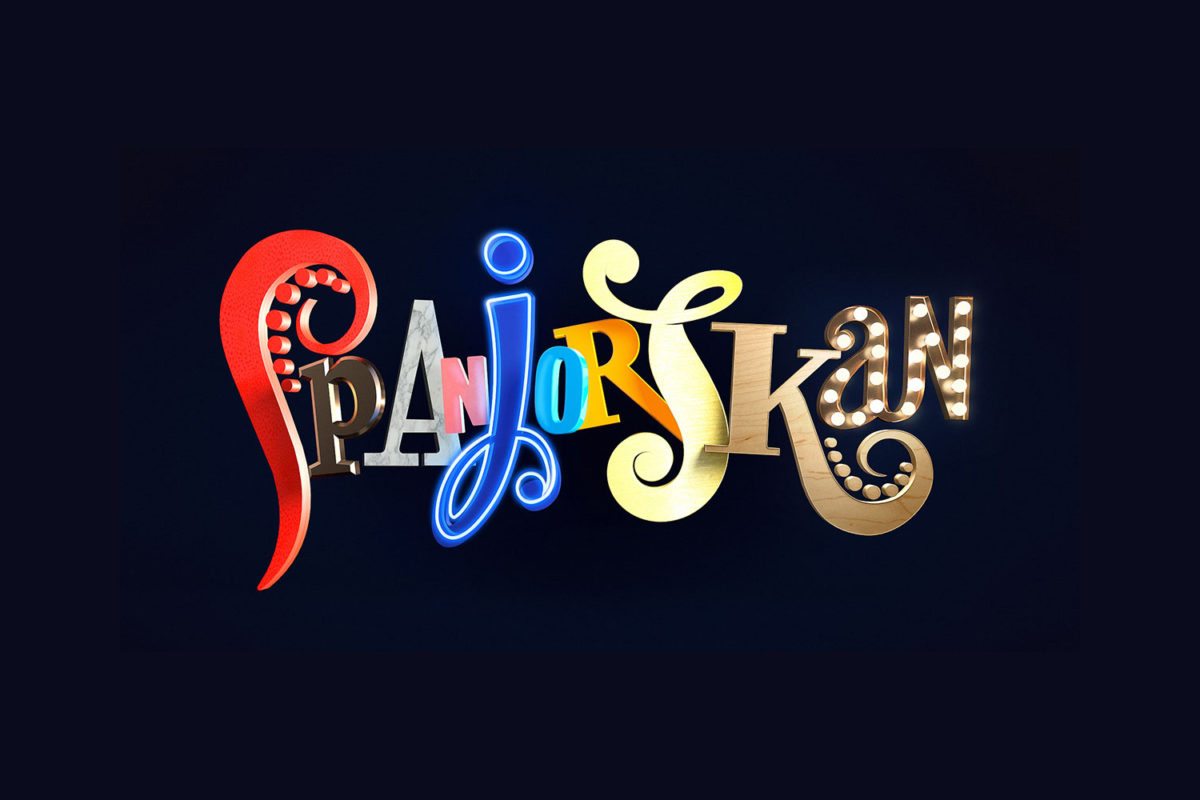
Spanjorskan is a restaurant that serves Spanish food in Stockholm, Sweden. If that sounds odd, that’s because it is, but the branding captures this strange idea perfectly, meshing the Scandinavians eye for design with a Spanish penchant for flair. The logotype is a mishmash of colors, typefaces, and textures; it’s not a look that suits everyone but it certainly is memorable and to me, captures the array of boldness and the theatrics of the menu, which composes of mostly sharable dishes.
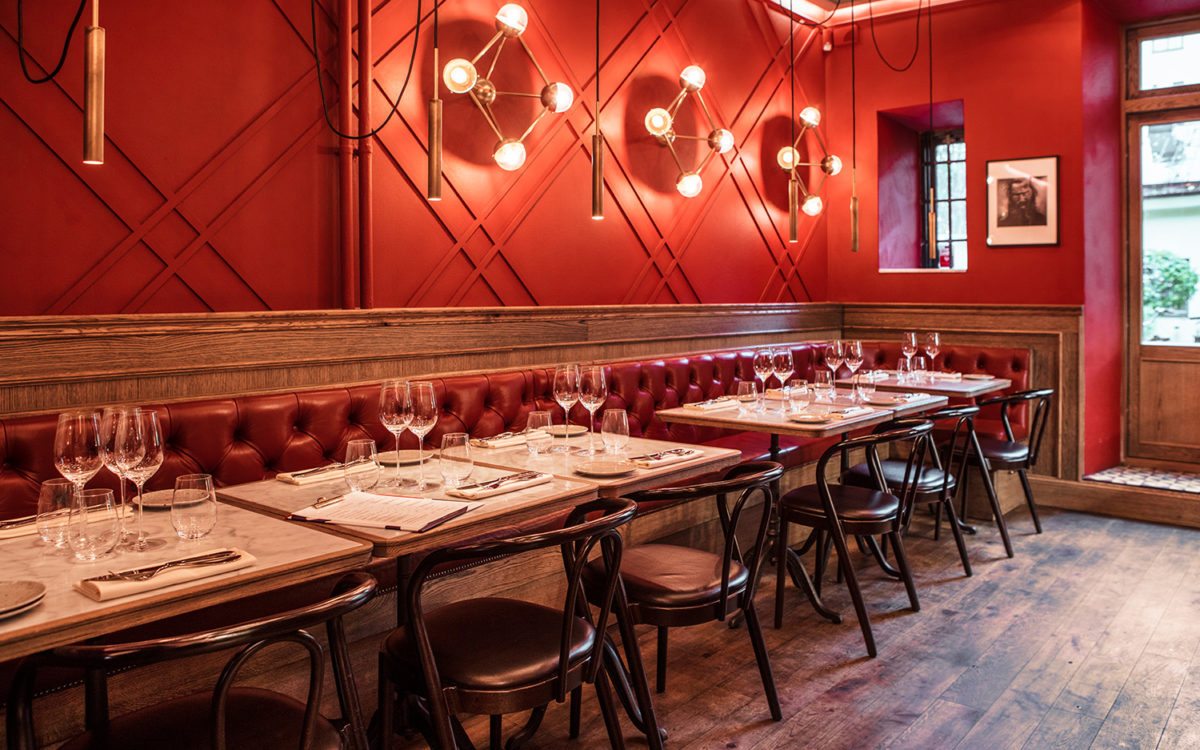
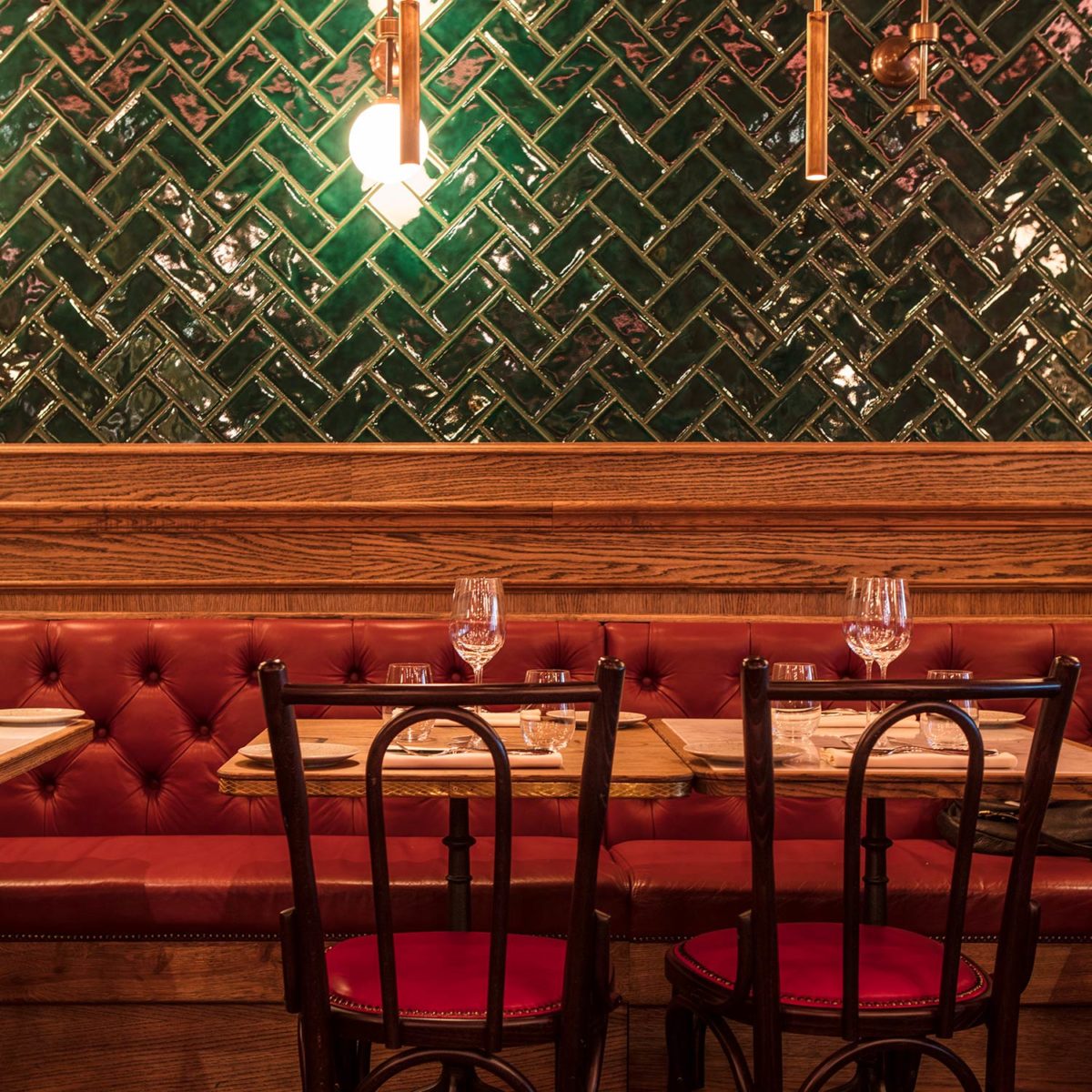
Speaking of the space, the interiors are warm and feature traditional details; wood, tiles, and comfortable fabrics contrasted sharply with exposed wiring, interesting lighting fixtures, and bold fields of color. Their exterior signage is a perfect replica of the logotype, displaying each uniquely textured and/or lighted letter proudly. It stands out fabulously in an otherwise unassuming doorway.
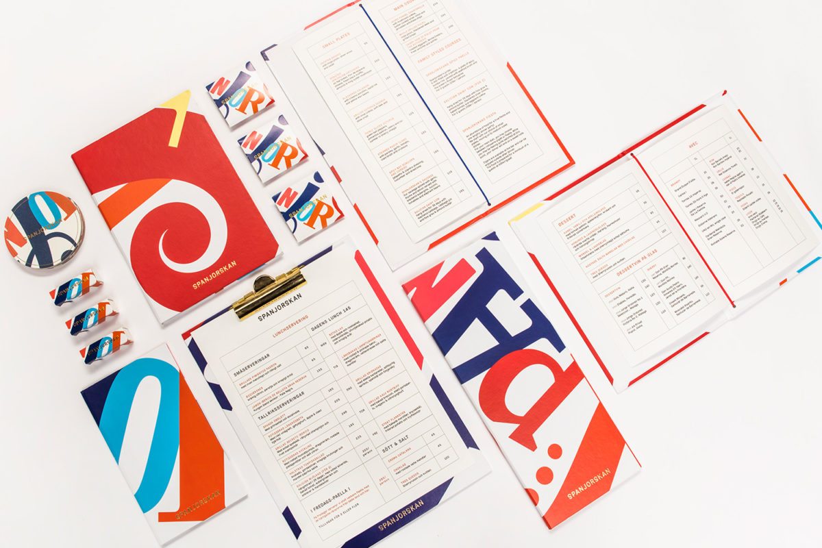
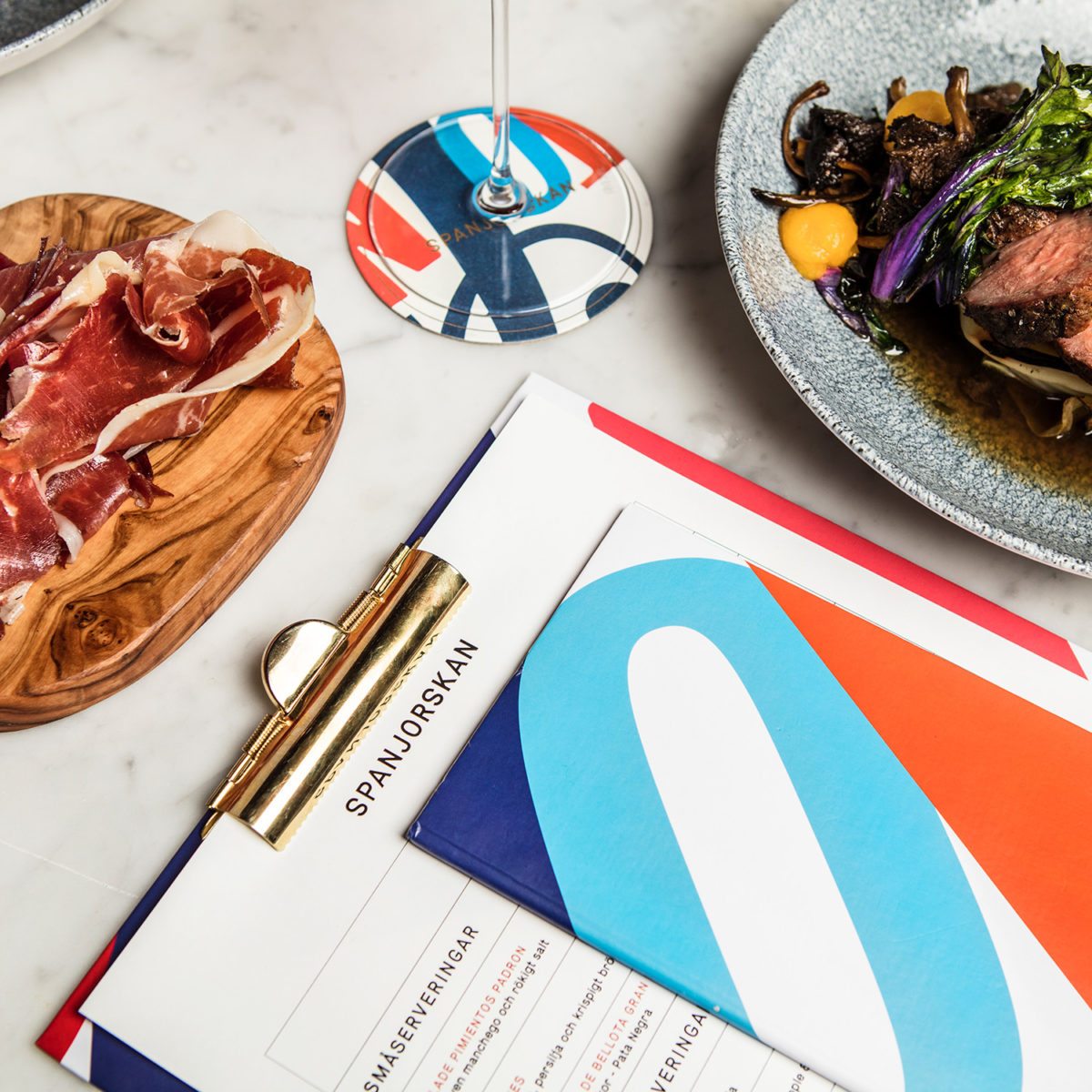
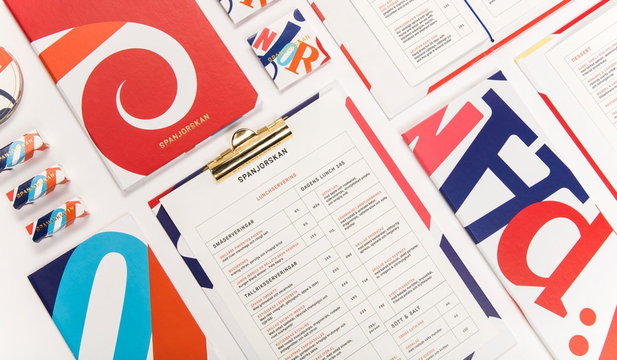
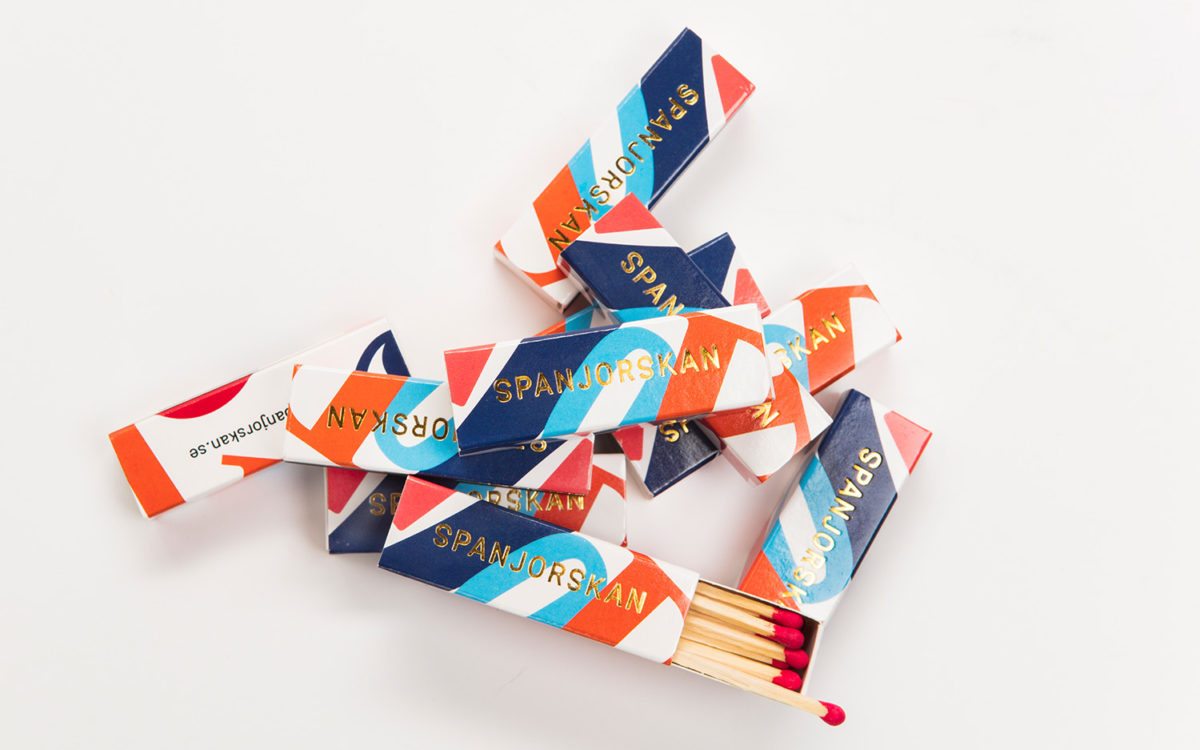
The brand carries this sense of drama across its print collateral; coasters, menus, matchboxes, etc. Size, cropping, orientation and layering relay a jovial boldness and levity to each piece, and a gold-foiled simple wordmark acts as an anchoring piece. It looks like a riot of a good time.
Spanjorskan Restaurant Identity, Collateral & Interior Design by Lobby Design.
