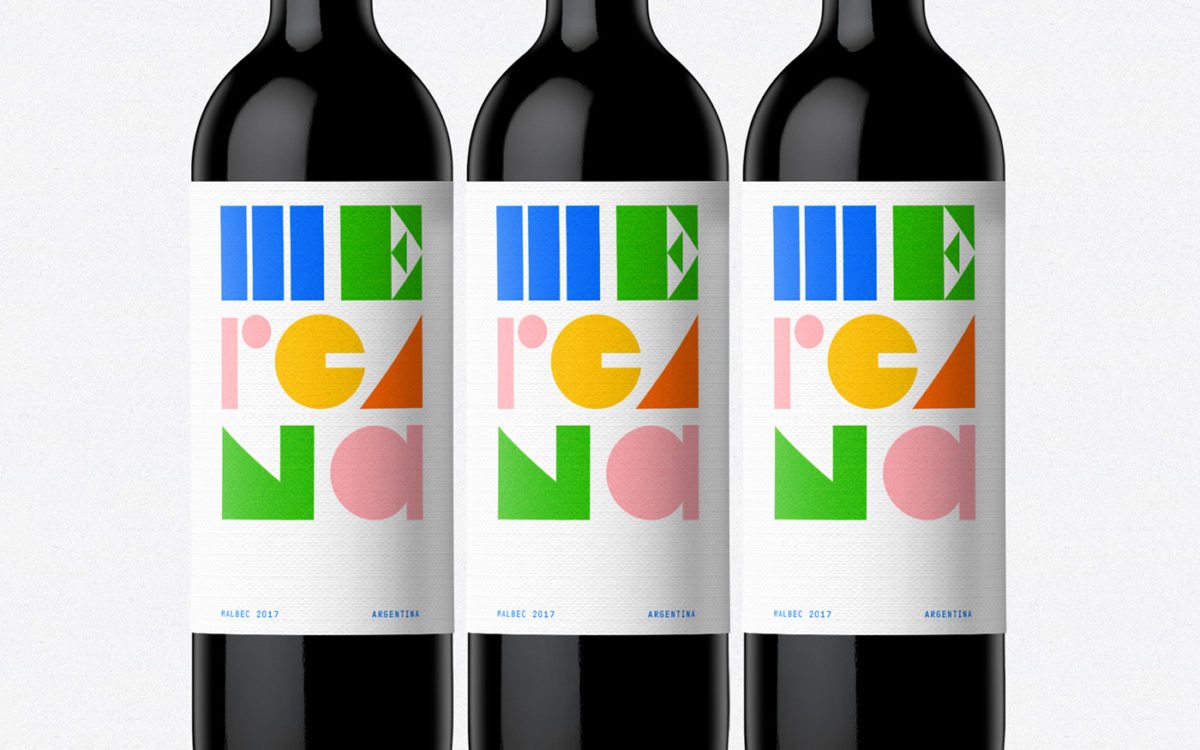
Mercana is a wine based out of Argentina. Today’s post features the conceptual directions leading up to the final label design, which you can see at the end. I personally feel that the two previous directions are stronger than the final outcome, but hey, I can’t judge too much considering I don’t know what the brief was. The two conceptual directions are both looks based on the abstractions of the geographical location of the vineyard, and of the elements that go into making great wine. Both of these visually sticking directions would have stood out strongly against the competition on the shelves with their compelling diecuts.
Mercana Branding & Packaging by h3l.


