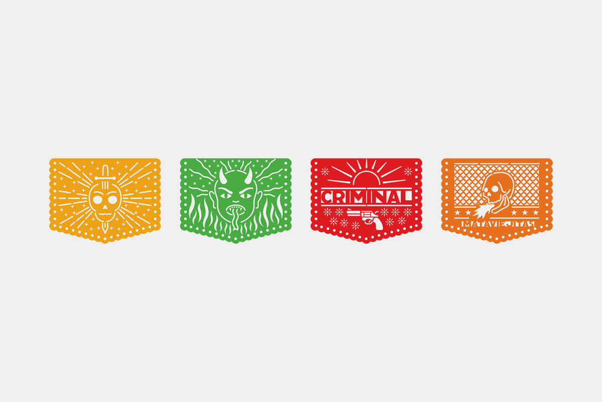
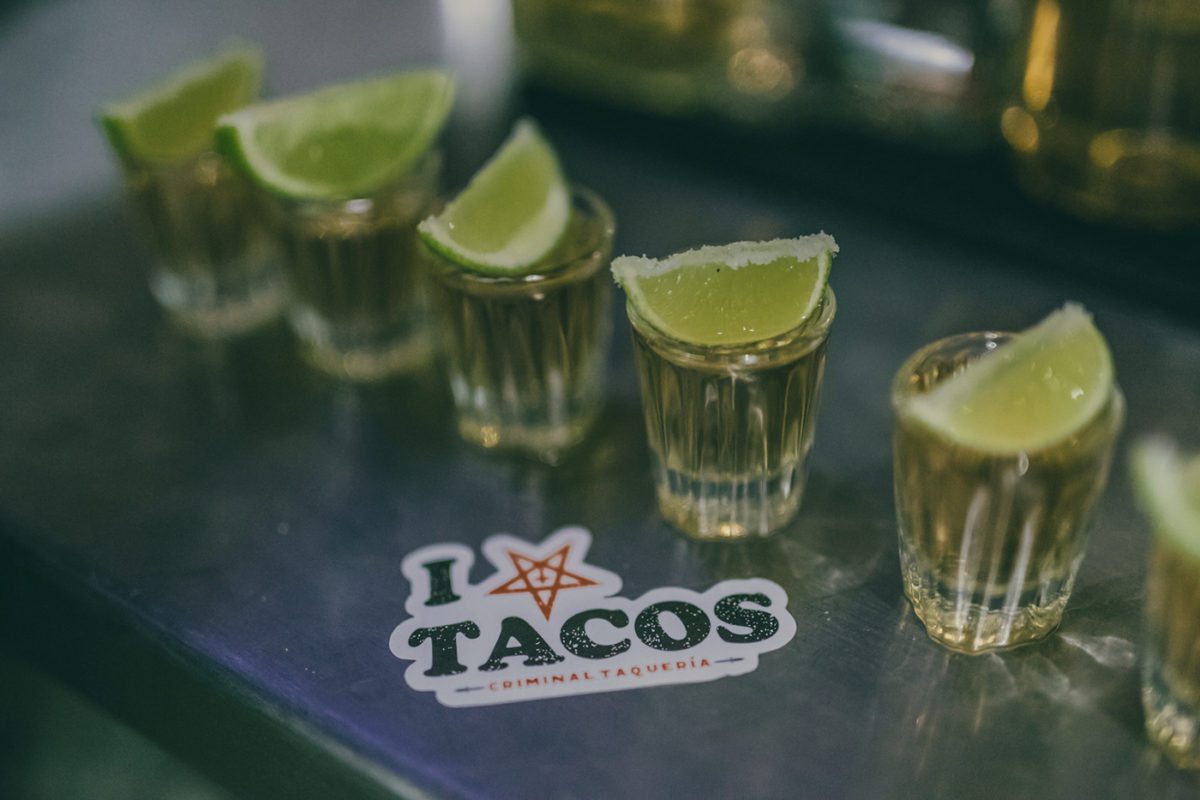
Criminal Taqueria features a fun and eclectic branding system, appropriating (rather ‘stealing’ seems to be more inline with the brand) some imagery from more well-known brands. It’s a smart, funny, and a little dark at times approach; the copy on one of the aprons translates to “and in the end we all end up as skeletons.” Take that as you will, but to me, it just suggests that we should eat as many tasty tacos as we can while we’re still kickin’. The mixed imagery and wide range of typefaces used make this feel zine-like to me; using whatever is available to the designer to make something grungy and cool. Adding in some traditional Mexican mediums (the papel picado, references to Mexican hand-painted signage, etc) Criminal Taqueria’s look is a street-forward approach to criminally good, authentic tacos in Colombia.
Criminal Taqueria Branding and Collateral Design by Masif.


